Champläte | Luxury Jewelry Website Concept

Jetmir Shala


Desktop view
Overview
Champläte is a self-initiated concept project exploring the intersection of digital luxury and web performance. The brief was to design and develop a digital storefront for a fictional fine jewelry brand that breaks away from generic e-commerce templates. The goal was to create an immersive, premium web experience that communicates exclusivity and elegance through typography, motion, and interactive 3D elements.
My Role: UX/UI Design, Frontend Development, 3D Implementation, and Motion Design.
The Approach
The visual system was built around a sophisticated dark palette (deep emeralds and soft mints) paired with high-contrast serif typography to evoke a sense of timeless luxury. To make the brand feel tangible, I avoided standard static landing pages and instead focused on spatial rhythm, generous negative space, and deliberate motion. Every touchpoint, from the custom cursor to the fluid layout shifts, was designed to feel intentional, tactile, and premium.
Key Interactions
Interactive 3D Hero: The centerpiece of the landing experience is a real-time 3D diamond. It responds dynamically to user input and environmental lighting, simulating physical brilliance and instantly engaging the user.
Immersive Product Browsing: Rather than a standard product page, the collection uses a custom full-screen lightbox modal. Clicking a piece smoothly scales the image into focus, accompanied by elegant typography and detailed descriptions to simulate a private boutique viewing.
Fluid Responsive Motion: The experience is designed to hold its premium feel on small screens, with entry animations, staggered layout reveals, and hover states across mobile and desktop viewports.
Built With
React & Vite: Provided the fast-compiling foundation for the single-page application.
Three.js & React Three Fiber: Powered the rendering, lighting, and interactivity of the 3D diamond scene directly in the browser.
Tailwind CSS: Used to enforce the design system, manage the custom color palette, and handle responsive grid layouts.
Motion (Framer Motion): Handled layout transitions, spring physics for the lightbox, and fade-ins that keep the UI feeling alive.
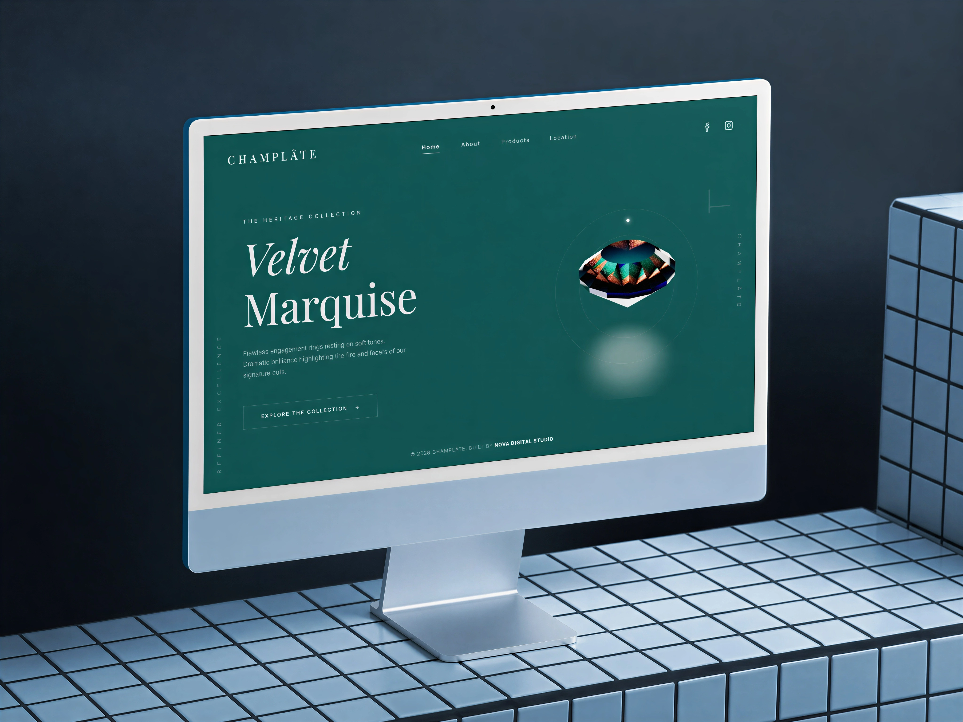
Champläte jewelry website mockup
Like this project
Posted Aug 27, 2026
The goal was to create an immersive, premium web experience that communicates exclusivity and elegance through typography, motion, and interactive 3D elements.
Likes
0
Views
10