FitCore – Fitness Brand Identity Case Study
Muhammad Naseer
Client: FitCore Fitness
Industry: Health & Fitness
Scope: Full Brand Identity Design
Deliverables: Logo Design, Color System, Typography, Visual Language, Social Media Templates, Brand Guidelines
FitCore is a performance-focused fitness brand built for individuals who are serious about strength, discipline, and measurable transformation.
The mission was simple:
Create a bold, powerful brand identity that doesn’t look like every other gym.
The Challenge
The fitness industry is saturated. Most brands look the same — aggressive fonts, random colors, and no strategic positioning.
FitCore was facing:
No defined visual identity
Inconsistent social media presence
Weak brand recall
Generic gym-style aesthetics
No emotional positioning
The brand needed clarity, authority, and distinction.
The Objective
The goal was to:
Build a strong, recognizable brand identity
Position FitCore as a performance-driven brand
Create a scalable system for digital & print
Attract ambitious individuals (18–35 age group)
Establish premium brand perception
Research & Strategy
We analyzed leading performance brands such as:
Gymshark
Nike
Under Armour
Key insight:
Top fitness brands sell identity and emotion — not just workouts.
Brand Positioning Statement
FitCore is a performance-driven fitness brand built for individuals who train with discipline and demand real results.
Core Brand Attributes:
Strong
Bold
Energetic
Disciplined
Competitive
The Solution
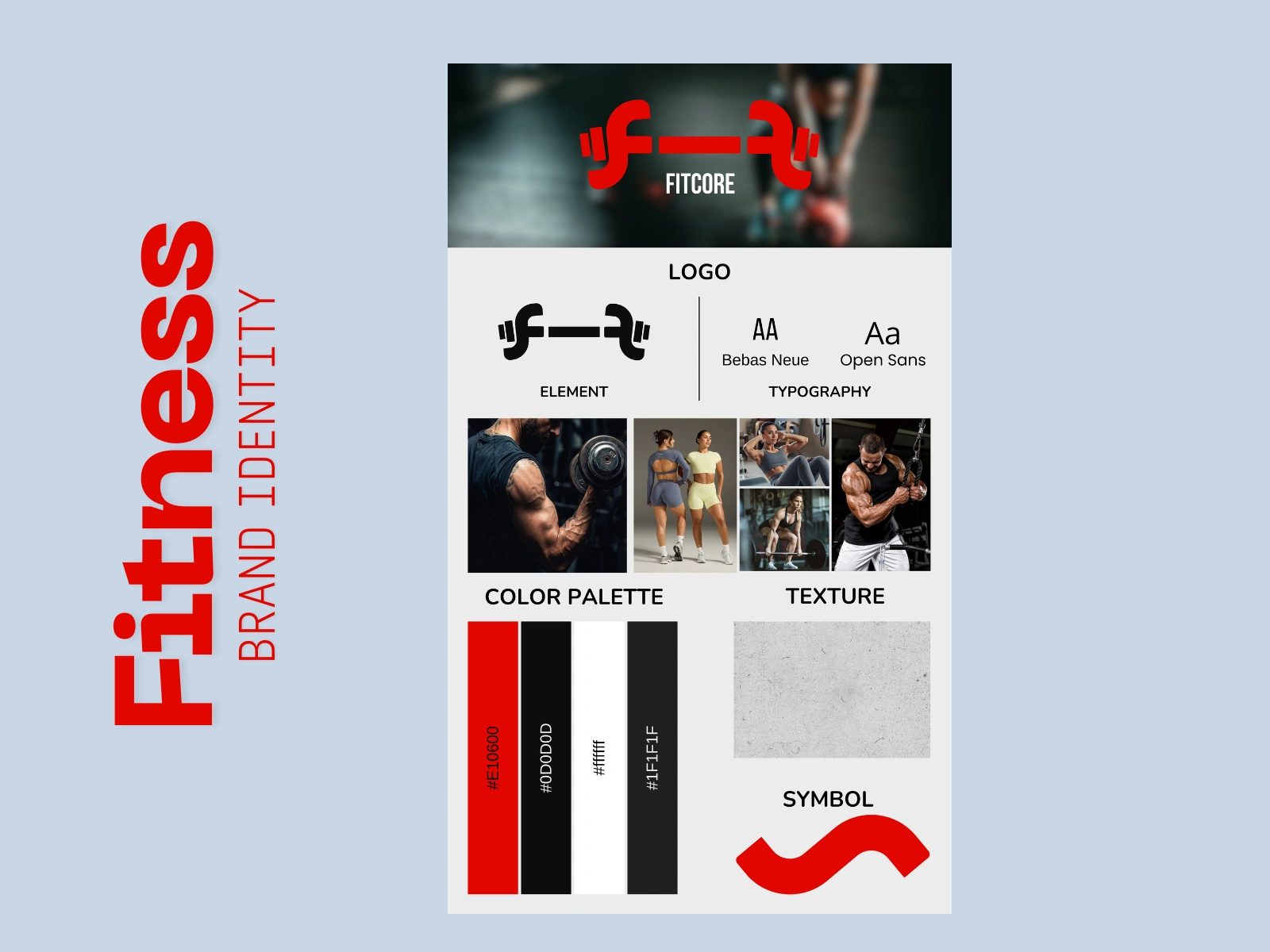
1️⃣ Logo Design
The logo combines a strong geometric wordmark with a custom symbol representing upward motion and strength.
Design direction:
Sharp edges → Discipline
Bold weight → Power
Clean structure → Professionalism
The mark is versatile across apparel, gym walls, digital, and merchandise.
2️⃣ Color System
Primary Colors:
Electric Red – Energy & intensity
Deep Black – Authority & power
White – Balance & clarity
Supporting tones were added to maintain digital flexibility and brand consistency.
The high-contrast palette ensures visibility in gym environments and strong social presence.
3️⃣ Typography System
A bold sans-serif typeface was selected for headlines to communicate dominance and strength.
A clean secondary font ensures readability across website, ads, and social content.
Typography hierarchy was clearly defined for:
Headlines
Subheadings
Body text
Call-to-actions
4️⃣ Visual Identity System
To avoid a “generic gym look,” we built a structured visual system:
High-contrast black backgrounds
Red accent highlights
Dynamic diagonal graphic elements
Motivational, direct messaging
Intense training photography
The identity reflects:
Movement. Discipline. Strength. Progress.
5️⃣ Brand Voice
Tone of voice is:
Direct
Motivational
Confident
Results-focused
Example Messaging:
Train Harder.
Strength Over Excuses.
Discipline Builds Results.
Brand Guidelines
A complete brand guideline document was delivered including:
Logo clear space & minimum size
Incorrect usage examples
Color codes (HEX, RGB, CMYK)
Typography rules
Social media templates
Visual composition system
Photography direction
This ensures long-term consistency as the brand grows.
Results
After implementing the new identity:
Stronger visual recognition
Clearer positioning in the fitness market
More premium brand perception
Higher engagement consistency
Better alignment with serious fitness audience
The brand now communicates authority, strength, and purpose.
Conclusion
Branding is not decoration — it is positioning.
By aligning strategy, psychology, and visual identity, FitCore transformed from a generic gym concept into a bold performance brand with clarity and confidence.
Like this project
Posted Feb 15, 2026
FitCore is a performance-focused fitness brand built for individuals who are serious about strength, discipline, and measurable transformation.
Likes
1
Views
4