BilliMD Credentialing Platform Design
Anushka Garg
BilliMD is a US healthcare credentialing company that helps medical providers (doctors) get verified by insurance companies; a mandatory process before any doctor can legally practice or receive insurance reimbursements.
Before this project, the entire process was handled manually. Sales Representative (Patricia) guided providers through insurance selection over the phone. Credentialing Specialist (Golla) chased documents, verified licenses, and tracked everything through spreadsheets and back-and-forth emails. It worked but it didn't scale.
I joined as a Product Designer to help build BilliMD's first ever digital product from scratch along with another designer and the product team.
Medical credentialing is the mandatory process every healthcare provider must complete before they can legally practice or receive insurance reimbursements. It verifies a provider's qualifications, licenses, certifications, and background against national standards primarily through CAQH ProView, the centralized database used by US insurers. Without it, a doctor cannot see insured patients or get paid by insurance companies.
The process spans 7+ stages, involves dozens of documents, and typically takes 3 to 6 months to complete. For most providers, it's the single most painful administrative burden in their career and for clinics managing multiple providers, it's an operational nightmare.
Without credentialing, doctors can’t bill insurers, see insured patients, or appear in directories, making it the first step for any new or relocating provider.

Credentialing is slow, opaque, and a complex process
How might we digitize the credentialing process so providers can independently track and manage their journey while enabling BilliMD to serve more clients without proportionally growing headcount?
Our research was primarily internal, we worked closely with the people who knew this world best: Patricia, Golla, our in-house doctors, the product owner, and a focused user group of medical providers we tested each iteration with before broader rollout.
These sessions, combined with desk research into CAQH provider standards, healthcare UX conventions, and competitive analysis of MedTrainer and Modio Health, formed the foundation of every design decision. Every direction was pressure-tested before engineering picked it up.
Credentialists and sales representatives spent hours: chasing the same documents repeatedly with multiple rounds of validation and errors due to slow communication.
Providers weren’t frustrated by credentialing itself: but by not knowing what comes next, where they are in the current process and how much more time it will take to get credentialed.
Clinics managing multiple providers had no unified visibility across their team's credential statuses
Providers routinely needed hand-holding — the process felt opaque and stressful, especially for smaller practices
Both MedTrainer and Modio Health cater primarily to large enterprise healthcare systems. Their platforms are powerful but carry a steep learning curve — too complex and overwhelming for individual practitioners and smaller practices.
The gap was clear: no solution existed that balanced the depth of a full credentialing platform with the simplicity that smaller providers actually needed.
Working with stakeholders, we identified three distinct user types the platform needed to serve, each with fundamentally different goals and mental models.
Before any wireframe was drawn, we defined the principles that would keep every decision grounded especially when navigating between user pain points and BilliMD's values.
A solo physician and a clinic admin managing 15 providers shouldn't feel like they're using different tools.
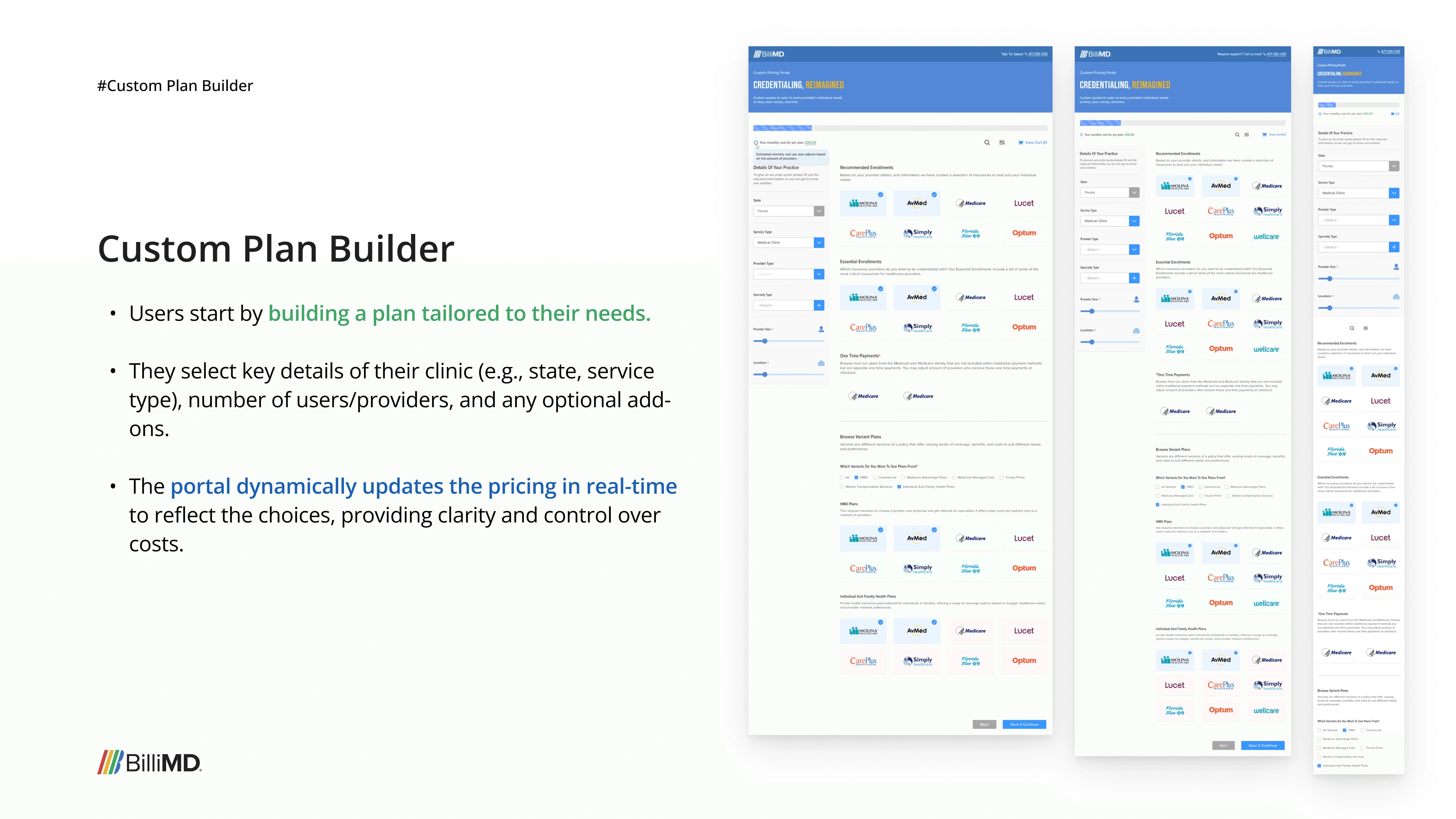
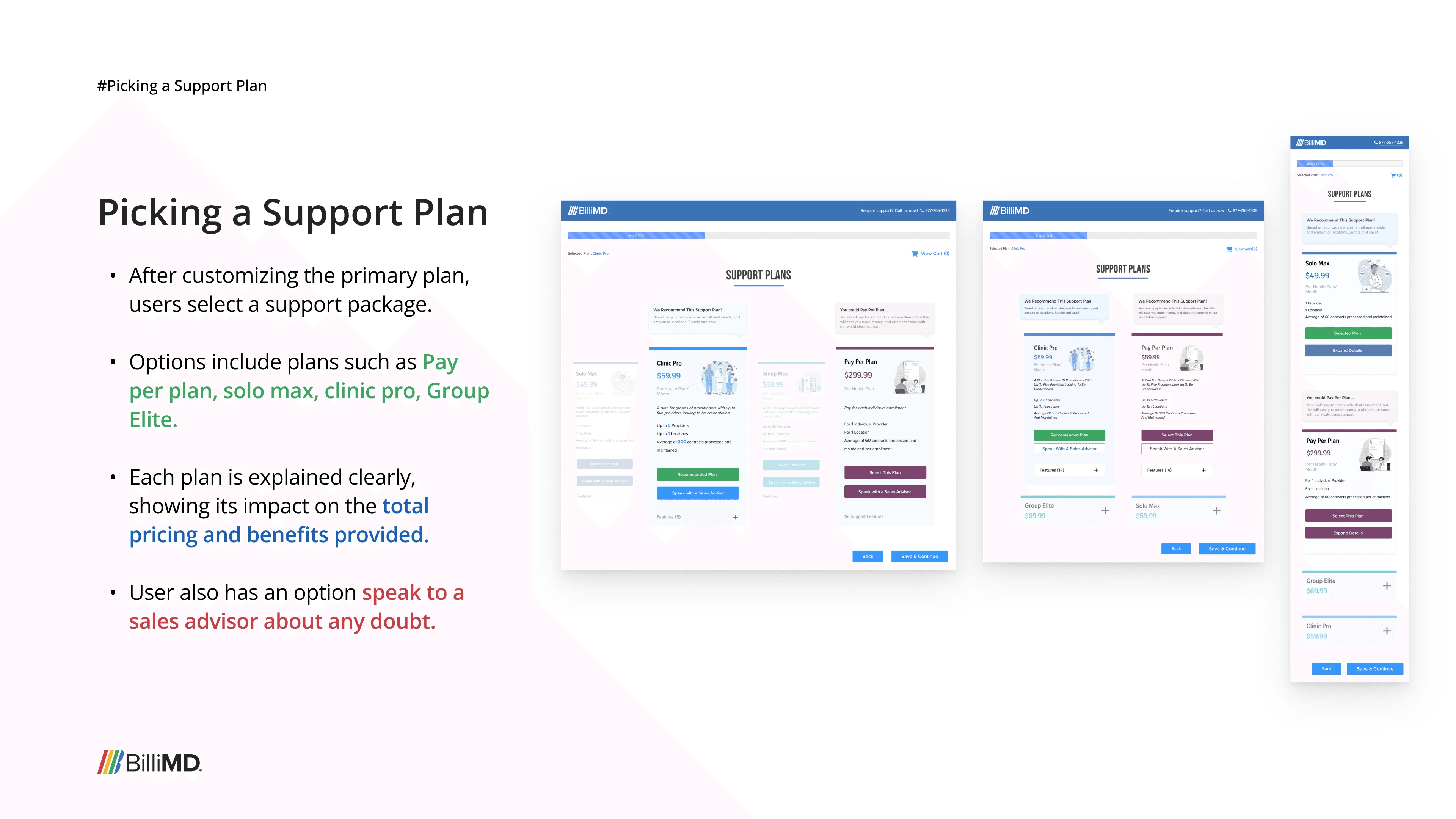
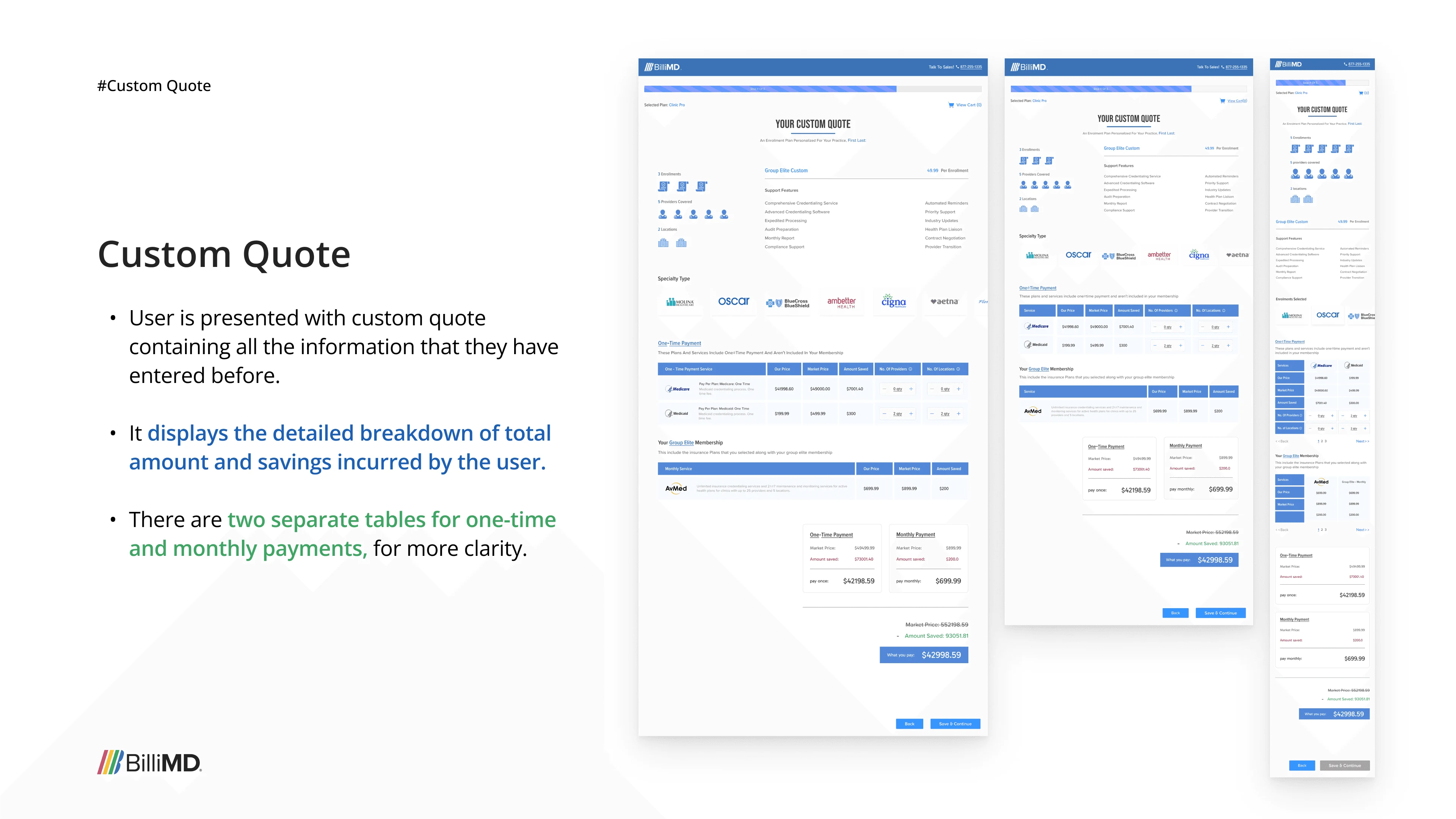
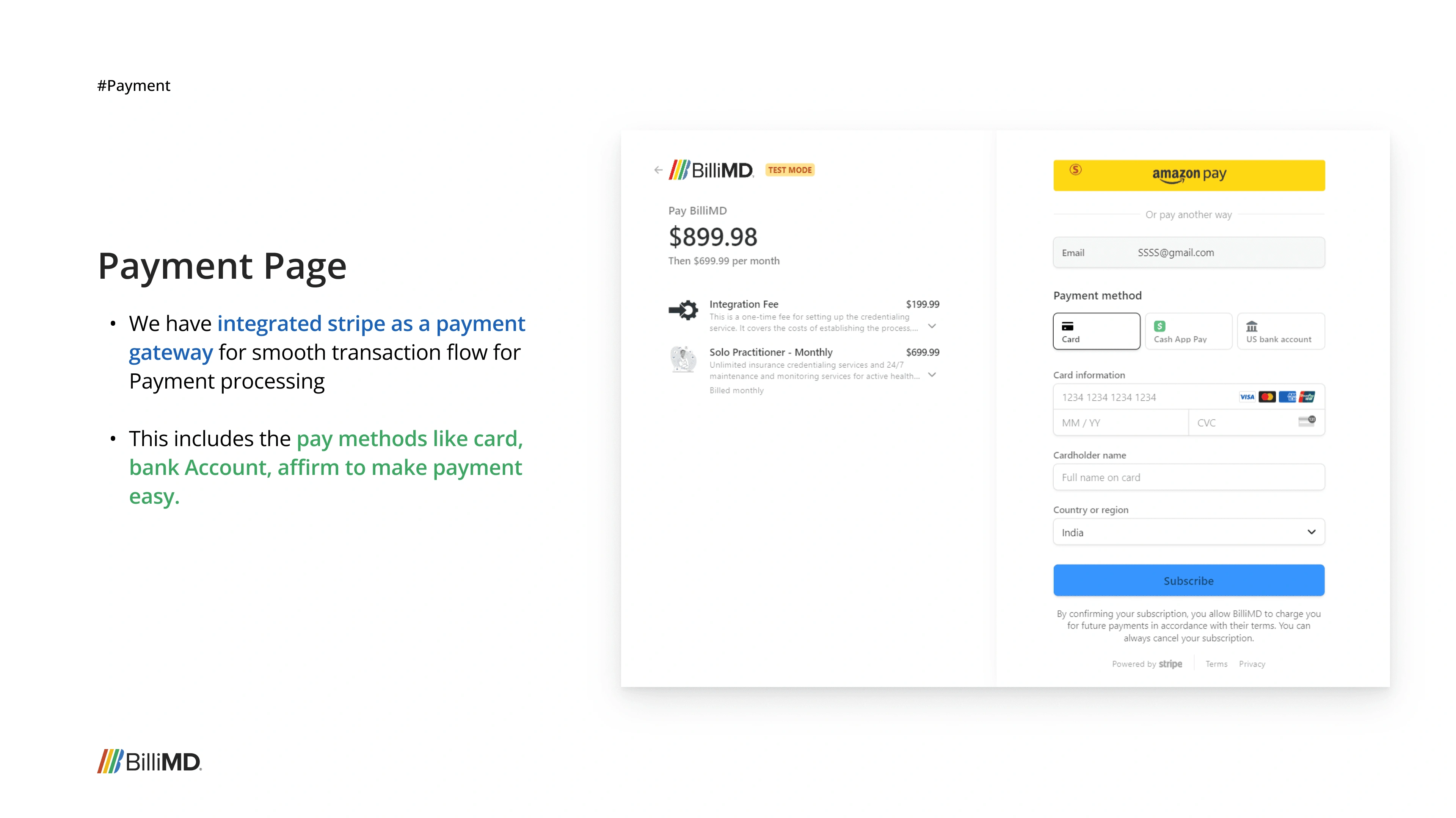
The first product we built wasn't the credentialing platform. It was a Custom Pricing Portal (CPP), a self-checkout tool that let healthcare providers independently browse insurance plans, configure their practice details, get a custom price quote, and check out all without talking to a sales rep.
The idea was logical: if we could automate the front-end insurance selection process (Patricia's job), we'd free up BilliMD's sales team and give providers more control. We designed it fully, built it, and launched it to a focused group of real users.
The platform was built. Users had access. It didn't stick.
After launching to our focused user group, the feedback came back clearly — and it wasn't about the design. Insurance selection isn't where the credentialing journey starts. Our users were already familiar with the physical, relationship-based process of choosing a plan through Patricia. They trusted it, they understood it, and automating it didn't solve a pain they actually felt. The CPP solved a business efficiency problem, not a user problem.
The product owner and our focused user group made it clear: the credentialing platform itself — the document management, tracking, and verification — was the real problem to solve first. Insurance selection would eventually be integrated there, not live as a standalone product.
The CPP wasn't a failure: it was the most important alignment exercise we ran. Going through the full design and build cycle revealed exactly what our users valued and what they found disruptive.
It also gave us a clear mental model for insurance selection that we later integrated directly into the credentialing platform. So the learning wasn't lost, it was absorbed.
Don't automate what users aren't asking to do themselves. The gap was credentialing visibility, not purchasing.
With the CPP learnings in hand, we redirected to what users actually needed; a place to manage their entire credentialing journey end-to-end. I led the research and ideation, and co-designed every feature of the platform. Every decision was continuously tested with our focused user group through stakeholder presentations and live product sessions before being handed to engineering.
Credentialing involves multiple interconnected steps; forms, documents, verifications, status tracking. I mapped these complex backend operations into a modular structure that reflects how users naturally progress, rather than how the system processes data behind the scenes.

Every feature went through the same filter: does this solve a real user problem, does it serve BilliMD's business goals, and can we actually build it within our MVP scope?
One of the core design challenges was building a single platform that could serve fundamentally different users without creating confusion. Each role sees a tailored experience.
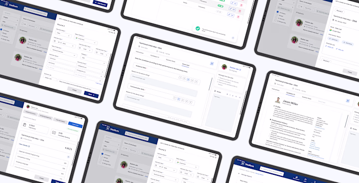
Credentialists who review provider progress, assign documents, leave comments, send custom notifications, and flag issues on the platform.
Purchases and manages the BilliMD plan. Controls user access, tracks enrollment statuses across all providers under their account, and interfaces with BilliMD's team.
Fills out their credentialing information, uploads documents, tracks personal progress, and completes identity verification. The core user of the platform.
A single, unified platform that turns what was once a phone-and-spreadsheet operation into a transparent, trackable, and automated credentialing experience.
Gives providers a real-time overview of their credentialing progress, pending actions, and active alerts, turning what was previously opaque into something clear and motivating.
Progress is visible. Actions are obvious. Nothing is buried.
Credentialing forms are notoriously long and complex. CAQH ProView alone spans dozens of sections across personal info, specialties, practice locations, hospital affiliations, disclosures, and more.
The Information feature breaks this into structured, digestible steps with the option to import directly from CAQH, auto-filling large sections of the form. Each section is validated in context so errors are caught early, not at submission.
Providers can browse 1,500+ insurance plans, select enrollments, and track their processing status. A queue system show which month each insurance is being processed, and real-time visibility on blocked, in-progress, and completed enrollments.
What once took a 30-minute call with Patricia now takes under 5 minutes.
Documents
The documents feature consolidates everything into a structured, status-driven table: Requested, Pending, Approved, Rejected.
Providers upload once, see exactly what's needed, and get notified when something expires or needs attention. Admins can assign document requirements and review uploads without leaving the platform.
Version 1: Not continued due less modern and disorganized in terms of information.
Version 2: Another iteration
Admins can select individual client accounts, review their credentialing progress, assign documents, leave comments on specific sections, send custom notifications, and flag accounts for review.
Everything Golla did via email and spreadsheets now lives in one place.
One of the core design challenges was building a single platform that could serve fundamentally different users without creating confusion. Each role sees a tailored experience.
Our focused user group of medical providers, tested iteratively after each build, gave us feedback that no desk research could have. The CPP pivot came from them, not from us. Building that loop early saved months of work.
Complexity demands collaboration
Designing a healthcare platform from scratch with multi-stakeholder workflows, and zero legacy code, required constant alignment with engineering, the product owner, and QA. Weekly syncs and stakeholder decks were non-negotiable.
Designing from scratch is hard. Designing from scratch in healthcare is harder.
Every decision had downstream consequences: on compliance, on trust, on the real people trying to practice medicine. That weight made this project the most challenging as well as interesting
Like this project
Posted Apr 9, 2026
Designed a B2B SaaS Platform to streamline the process of medical credentialing for US Healthcare Providers.
Likes
0
Views
2
Timeline
Jul 31, 2024 - Jul 30, 2025
Clients
BilliMD