Shopify Cold-Traffic Offer System for VYRA

JunHao Zhong


VYRA — Shopify Cold-Traffic Offer System
Short Description
A complete Shopify cold-traffic funnel combining advertorial design, conversion-focused PDP UX, bundle strategy, A/B testing, and reusable Replo components.
Project Overview
VYRA is a fictional premium hydration and focus supplement brand created as a conversion-design case study for Shopify DTC businesses.
The objective was to demonstrate how I would transform finished direct-response copy into a complete cold-traffic customer journey—from the first paid advertisement through the advertorial, product page, bundle selection, checkout, and offer-testing process.
Instead of designing only a visually attractive product page, I created a full offer system focused on three commercial goals:
Increasing customer trust before the product page
Improving conversion rate through clearer purchasing decisions
Increasing average order value through bundles, gifts, and subscriptions
The project was designed with a Figma-first workflow and structured for implementation in Shopify using Replo or GemPages.
The Challenge
Cold-traffic customers usually have limited awareness of the product and may not be ready to purchase immediately after clicking an advertisement.
Sending these visitors directly to a traditional Shopify product page can create several problems:
The customer does not fully understand the problem
Product benefits feel disconnected from their daily experience
The offer is introduced before sufficient trust is established
Bundle choices may feel complicated or overwhelming
Discounts can increase conversion while reducing profitability
Mobile users may lose access to the purchase action while scrolling
The challenge was to create a journey that educates the customer first, introduces the product naturally, makes the offer easy to understand, and creates clear opportunities to increase both conversion rate and order value.
My Role
For this concept, I was responsible for the complete offer-design and implementation strategy, including:
Customer journey planning
Advertorial and pre-lander UX
Shopify product page design
Replo-ready section architecture
Bundle and volume-pricing interface design
Subscription and gift-with-purchase logic
Mobile purchase-flow optimization
Offer experiment design
Profit-per-visitor reporting structure
Reusable component-library planning
Tracking and quality-assurance requirements
The copywriting and final pricing strategy would normally be developed with a Creative Strategist and the brand founder. My responsibility would be turning those decisions into a polished, technically functional, and measurable customer experience.
Customer Journey Strategy
I designed the journey around six connected stages:
1. Paid Social Advertisement
The advertisement introduces a clear outcome:
“Clean hydration. Sharper focus.”
The creative communicates the most important product benefits without overwhelming the customer. Its purpose is to generate curiosity and send qualified traffic to the pre-sell experience.
2. Advertorial Pre-Lander
Instead of immediately presenting a product offer, the advertorial begins with an educational headline:
“Why Your Afternoon Energy Crash May Have Nothing to Do With Coffee.”
The page uses an editorial, publisher-style design to make the experience feel informative rather than aggressively promotional.
The content structure moves through:
Problem → Education → Symptoms → Ingredients → Proof → Product → Offer
This creates a natural transition from the customer’s problem to the VYRA product.
3. Product Detail Page
The product page continues the same visual and messaging direction established by the advertorial.
The above-the-fold section includes:
Product gallery
Customer rating and review volume
Clear benefit statements
Flavor selection
One-time purchase and subscription options
Bundle selection
Shipping information
Money-back guarantee
Secure payment signals
Primary add-to-cart action
This continuity prevents the customer from feeling like they have arrived on an unrelated page after leaving the advertorial.
4. Bundle Selection
The bundle interface presents three simple purchasing levels:
Starter
One pouch for customers who want to try the product.
Most Popular
Three pouches with a free shaker and a visible per-serving saving.
Best Value
Six pouches with a free shaker, travel container, free shipping, and the lowest cost per serving.
The structure avoids presenting bundles as simple quantity discounts. Each tier communicates a different level of commitment, value, convenience, and expected use.
5. Cart and Checkout
The cart experience reinforces the selected offer and reduces last-minute friction.
Important elements include:
Product and bundle summary
Savings confirmation
Free-shipping progress
Gift confirmation
Express checkout methods
Secure-checkout messaging
Delivery expectations
Guarantee reminder
The goal is to maintain confidence and prevent unnecessary surprises before payment.
6. Testing and Optimization
The final stage measures whether the offer is actually improving business performance.
The testing framework evaluates:
Conversion rate
Average order value
Revenue per visitor
Product cost
Discount cost
Shipping cost
Gift cost
Profit per visitor
Statistical confidence
This ensures that an offer is not declared successful only because it generated more orders.
Advertorial Design
The VYRA advertorial uses a premium editorial layout with warm neutral backgrounds, high-contrast typography, ingredient imagery, product photography, and clear reading hierarchy.
The main sections include:
Advertorial disclosure
Editorial headline and introduction
Expert or author information
Hydration and energy explanation
Three common symptoms
Ingredient-benefit cards
Product comparison table
Customer testimonials
Trust and quality badges
Product-offer transition
Final call to action
The design is intentionally less transactional at the beginning of the page. Product and offer elements become stronger as the customer progresses through the story.
The mobile version keeps paragraphs short, spaces sections clearly, and maintains visible navigation toward the offer.
Product Page Design
The product page was designed to answer the customer’s most important purchasing questions as quickly as possible:
What does the product do?
Is it suitable for me?
Which flavor should I choose?
Should I buy once or subscribe?
Which bundle offers the best value?
How much am I saving?
Is shipping included?
What happens if I do not like it?
Can I trust the product and checkout?
The buy box uses guided choices instead of forcing the customer to process too many options simultaneously.
The recommended bundle is visually highlighted, while customers can still compare every option clearly.
A sticky mobile add-to-cart bar keeps the selected product, price, and purchase action accessible throughout the page.
Bundle and Offer Architecture
The bundle system combines several offer mechanisms:
Volume Discounts
Customers receive stronger per-serving value as quantity increases.
Gift With Purchase
The free shaker and travel container increase perceived value without relying entirely on deeper discounts.
Subscription Savings
Customers can receive an additional saving by choosing recurring delivery.
Free-Shipping Threshold
The shipping threshold encourages customers to select a larger bundle rather than purchasing only one pouch.
Dynamic Buy Box
When the customer changes the bundle, flavor, or subscription option, the buy box updates:
Product quantity
Included gifts
Total price
Original price
Total savings
Cost per serving
Shipping eligibility
Delivery frequency
Add-to-cart label
This gives the customer immediate feedback and reduces uncertainty.
Experiment Design
I created two example offer variants to demonstrate how the bundle could be tested.
Variant A — Discount-Led Offer
Three pouches
20% discount
No free gift
Customer pays shipping
Variant B — Value-Led Offer
Three pouches
15% discount
Free premium shaker
Free shipping
Variant A uses a stronger headline discount.
Variant B uses a smaller discount but adds more perceived value and removes shipping friction.
The test dashboard compares both variants against the control using:
Sessions
Conversion rate
Average order value
Revenue per visitor
Profit per visitor
Probability of beating the control
The displayed results are simulated for presentation purposes. They demonstrate how I would structure the experiment and communicate the outcome to a founder or client.
The winning decision would be based primarily on profit per visitor and statistical confidence—not conversion rate alone.
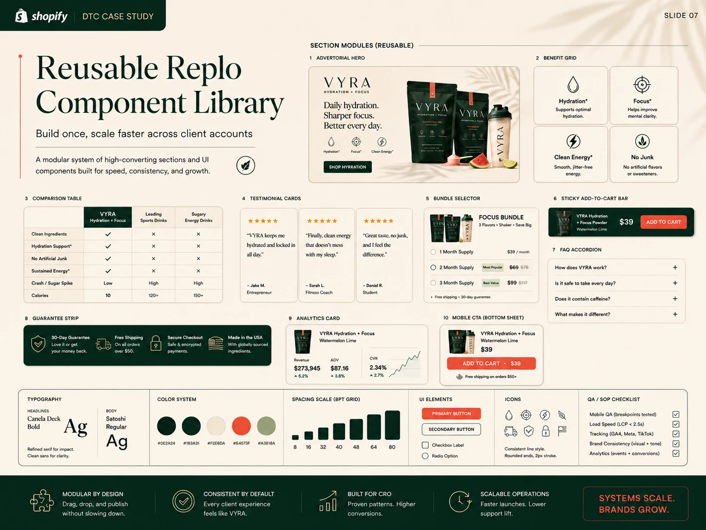
Reusable Replo Component Library
To make future Shopify client work faster and more consistent, I designed a modular Replo component system.
The library includes:
Advertorial hero
Editorial content blocks
Benefit grid
Ingredient cards
Comparison table
Testimonial cards
Product-offer transition
Bundle selector
Subscription selector
Gift-with-purchase module
Guarantee strip
FAQ accordion
Sticky add-to-cart bar
Mobile bottom purchase sheet
Analytics card
Shipping and trust sections
These sections can be adapted for different products and brands without rebuilding the entire page from the beginning.
The system also includes reusable typography, colors, spacing, buttons, icons, responsive behavior, and component states.
Tracking and Analytics Plan
The implementation would include tracking for the complete customer journey through Meta Pixel, GA4, Shopify analytics, and Triple Whale.
Important events include:
Advertorial page view
Advertorial scroll depth
Offer CTA click
Product page view
Flavor selection
Bundle selection
Subscription selection
Gift activation
Add to cart
Checkout initiated
Purchase completed
Revenue
Discount value
Average order value
Profit contribution
All events would be validated before launch to ensure that reports reflect actual customer behavior.
Quality Assurance
Before publishing, I would complete a structured QA process covering:
Responsive Design
Desktop
Tablet
Small mobile
Large mobile
Sticky purchase behavior
Bundle-card stacking
Text readability
Touch-target sizing
Ecommerce Functionality
Product variants
Bundle quantities
Subscription plans
Discount logic
Gift triggers
Add-to-cart behavior
Cart contents
Checkout handoff
Performance
Image compression
Lazy loading
Font optimization
Script review
Core Web Vitals
Mobile load speed
Tracking
Meta Pixel
GA4 events
Triple Whale
Shopify purchase data
UTM persistence
Test-variant attribution
Brand Consistency
Typography
Color use
Product imagery
Messaging hierarchy
Button styles
Mobile and desktop consistency
Visual Direction
The VYRA identity was designed to feel premium, modern, credible, and performance-oriented.
The design system uses:
Warm ivory backgrounds
Deep forest-green typography
Coral accents for savings and calls to action
High-contrast editorial serif headlines
Clean sans-serif interface typography
Ingredient and lifestyle photography
Minimal iconography
Clear conversion hierarchy
Soft natural textures
Consistent modular spacing
The visual direction avoids the appearance of a generic Shopify template while remaining practical to implement in Replo.
Tools
Figma
Shopify
Replo
GemPages
Intelligems
GA4
Meta Pixel
Triple Whale
Shopify Analytics
Hotjar or Microsoft Clarity
Skills Demonstrated
Shopify landing-page design
Replo page design
Advertorial design
Listicle design
Product-page UX
Conversion-rate optimization
Bundle and pricing UX
Subscription design
Gift-with-purchase logic
Mobile ecommerce design
A/B-test planning
Profit-per-visitor analysis
Analytics implementation
Design systems
Reusable component libraries
Responsive quality assurance
Ecommerce performance optimization
Project Outcome
The final concept demonstrates a complete Shopify cold-traffic offer system rather than a standalone product page.
It connects customer education, product presentation, offer design, bundle selection, checkout, testing, analytics, and reusable implementation systems into one consistent experience.
The project is designed to show how I can collaborate with a Creative Strategist, founder, and client to turn approved copy and offer direction into a live, measurable, and scalable Shopify customer journey.
All brand information and performance data shown in this case study are fictional and were created for demonstration purposes.
Like this project
Posted Aug 4, 2026
Designed a Shopify cold-traffic funnel with A/B testing and reusable components.
Likes
1
Views
7