
Project Overview
A website hero section concept for Growly, a B2B growth agency. The design focuses on communicating the brand's value proposition, building immediate credibility and encouraging visitors to take action.
The project explores a bold visual direction with strategic content placement, social proof, prominent CTAs and responsive layouts.
Project Details
Project Type: Website UI Component
Industry: B2B / Marketing & Growth
Scope: Hero Section Design
Deliverables: Desktop & Responsive UI
Focus Areas: Visual Design, Conversion-Focused Design, Responsive Design
B2B Growth Agency Landing Page UI Design
The Challenge
A website's hero section has a small window to make a strong first impression.
Visitors should quickly understand what a business offers, why they should trust it and what action they can take next.
For Growly, the objective was to explore how a single hero section could communicate all three without overwhelming the visitor.
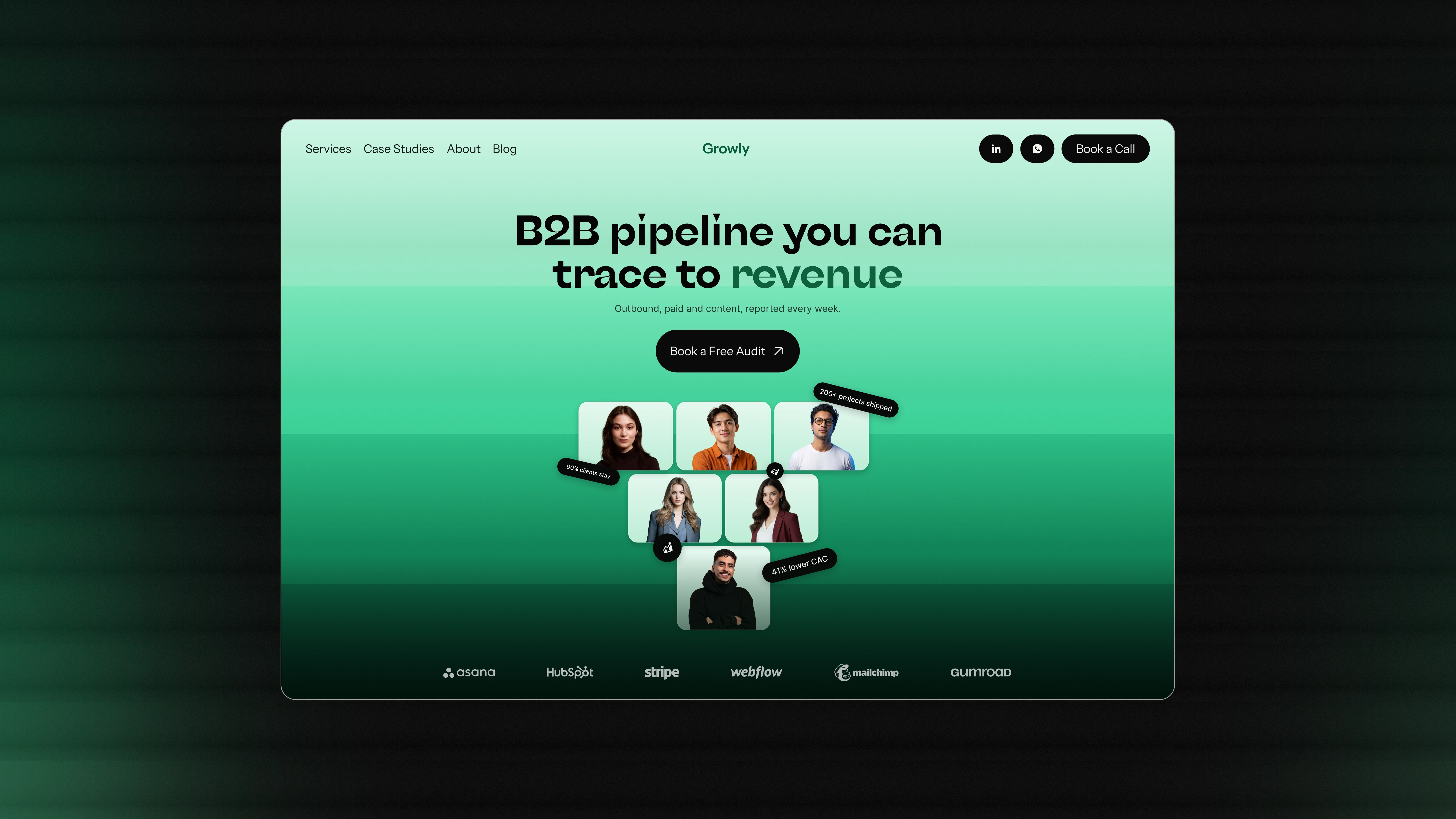
Hero Section UI Design For Growly
Design Decisions
01. Centered Brand Identity
Positioned the Growly logo at the center of the navigation to create visual balance and give the brand a stronger presence.
02. Prioritized Navigation
Placed Services, Case Studies, About and Blog on the left, following a natural left-to-right reading pattern.
The ordering prioritizes the sections most relevant to potential clients.
03. Accessible Contact Options
Positioned LinkedIn, WhatsApp and the primary booking CTA on the right.
This gives visitors quick access to brand information, direct communication and the next step.
04. Value-Driven Hero Messaging
Designed a bold headline around Growly's core offering:
"B2B pipeline you can trace to revenue."
The supporting text adds context by highlighting outbound, paid and content strategies, making the value proposition easier to understand.
05. A Lower-Commitment CTA
Introduced "Book a Free Audit" as the primary action.
Instead of immediately asking visitors to commit to a call, the free audit offers a more approachable first step.
06. Social Proof Through People
Introduced a pyramid-style arrangement of client portraits to bring human credibility into the hero section.
The visual arrangement makes social proof a prominent part of the first impression rather than hiding it further down the page.
07. Floating Performance Metrics
Added floating pills featuring three key metrics:
200+ projects shipped
90% clients stay
41% lower CAC
These elements complement the client portraits with numerical proof points and add visual movement to the composition.
Visual Direction
The visual language combines a layered green gradient background, bold typography, rounded containers and high-contrast black elements.
The gradient creates depth across the composition, while the floating elements add dimension and visual interest.
The overall direction aims to make Growly feel modern, confident and approachable.
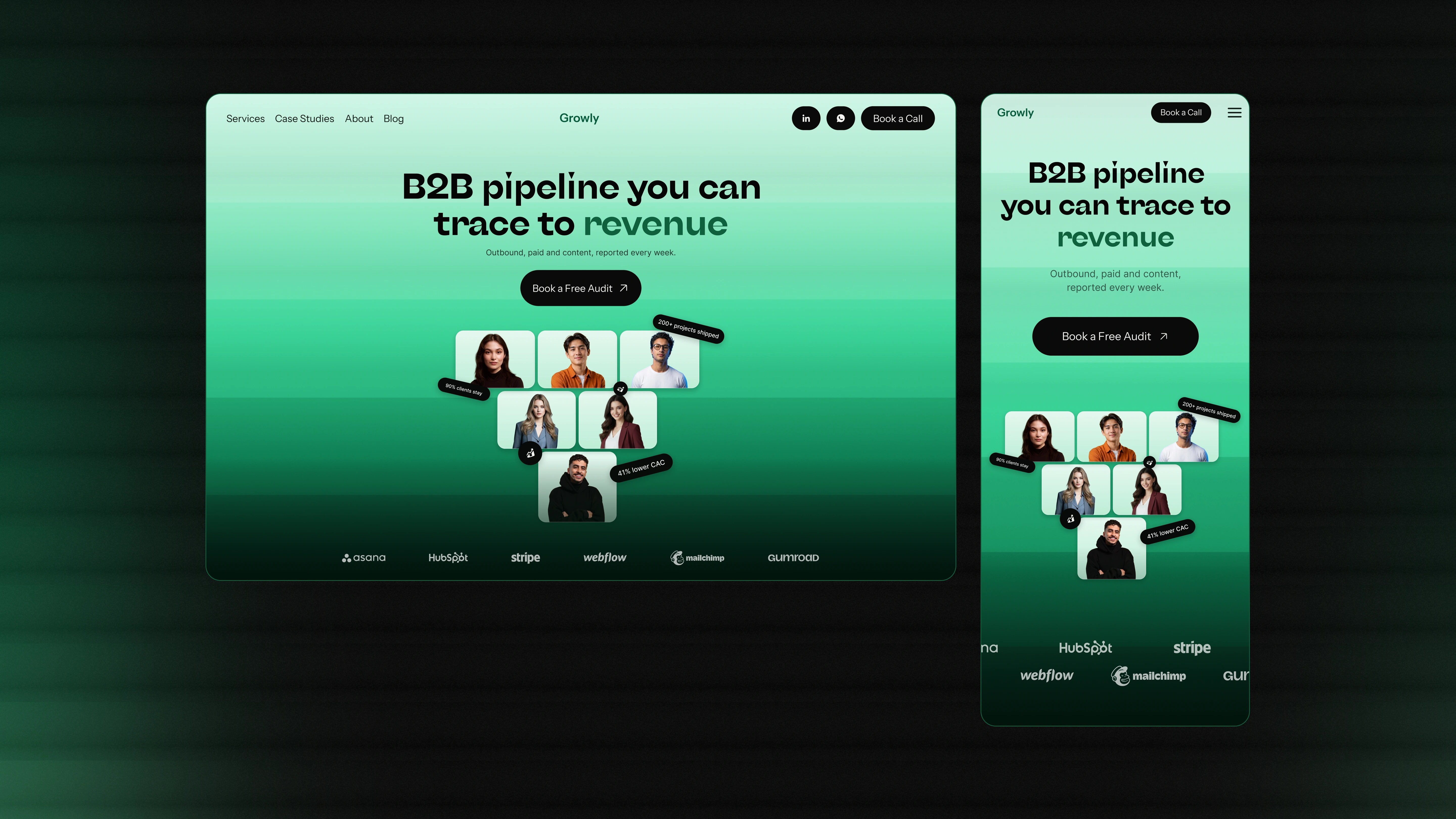
Responsive Website Design For Growly
Responsive Design
The hero section was also adapted for responsive screens, maintaining the visual identity and content hierarchy across different screen sizes.
The responsive version focuses on preserving readability, accessibility of key actions and the overall composition without losing the character of the original design.
Final Thoughts
A hero section is more than a headline and a CTA.
Every element, from navigation placement to social proof and visual hierarchy, contributes to how visitors understand and interact with a brand.
This exploration was about making a limited amount of screen space communicate more, with every design decision serving a purpose.
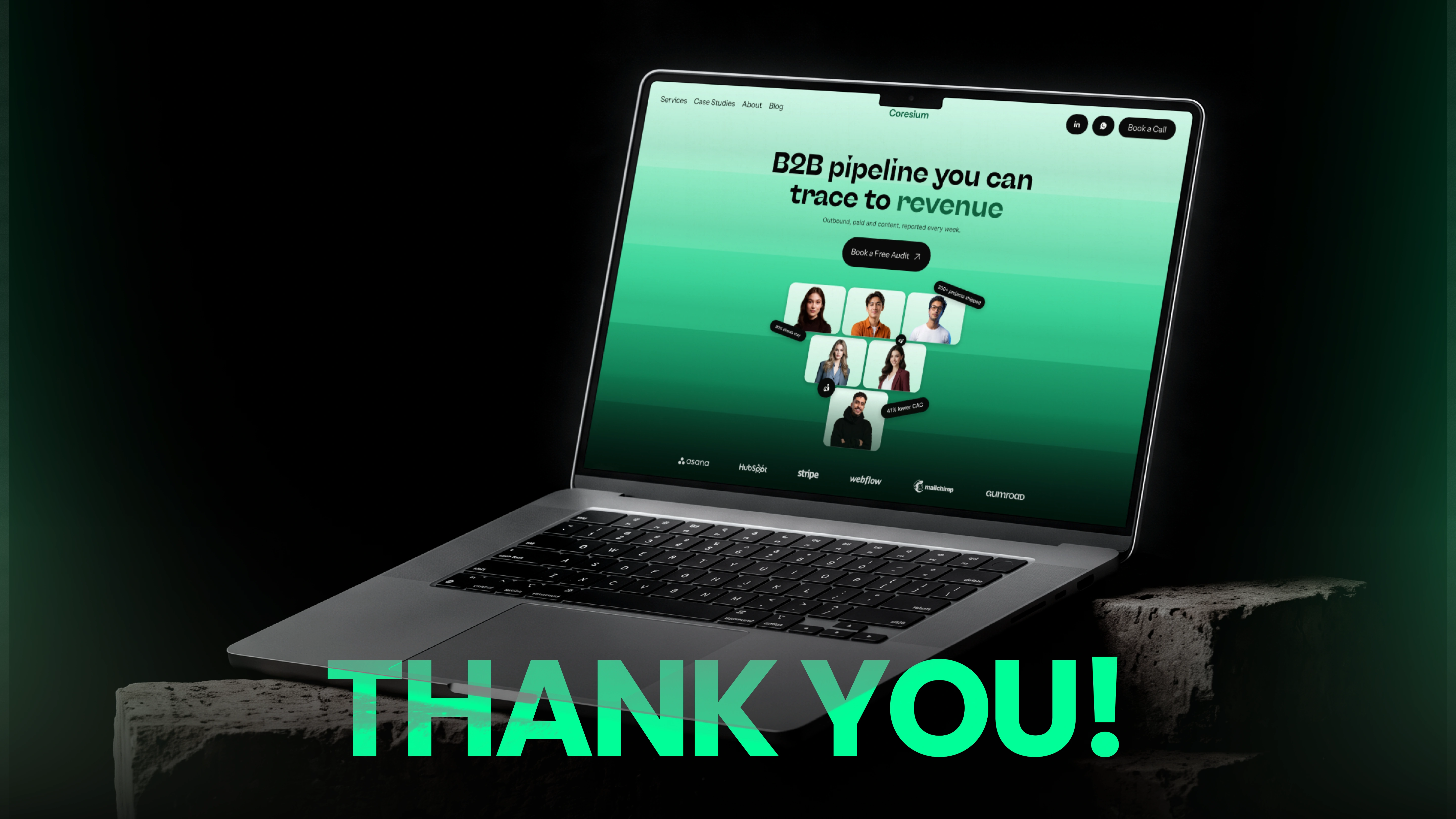
Agency Website Design
1 like · 7 views · Nov 21, 2026
Explore Growly's B2B website hero section design featuring bold messaging, strategic navigation, social proof, conversion-focused CTAs and responsive layouts.
Tags


Collaborators
