Built with Framer
Shaping Breakout’s Voice -Elevating Inbound AI
Studio Huncho
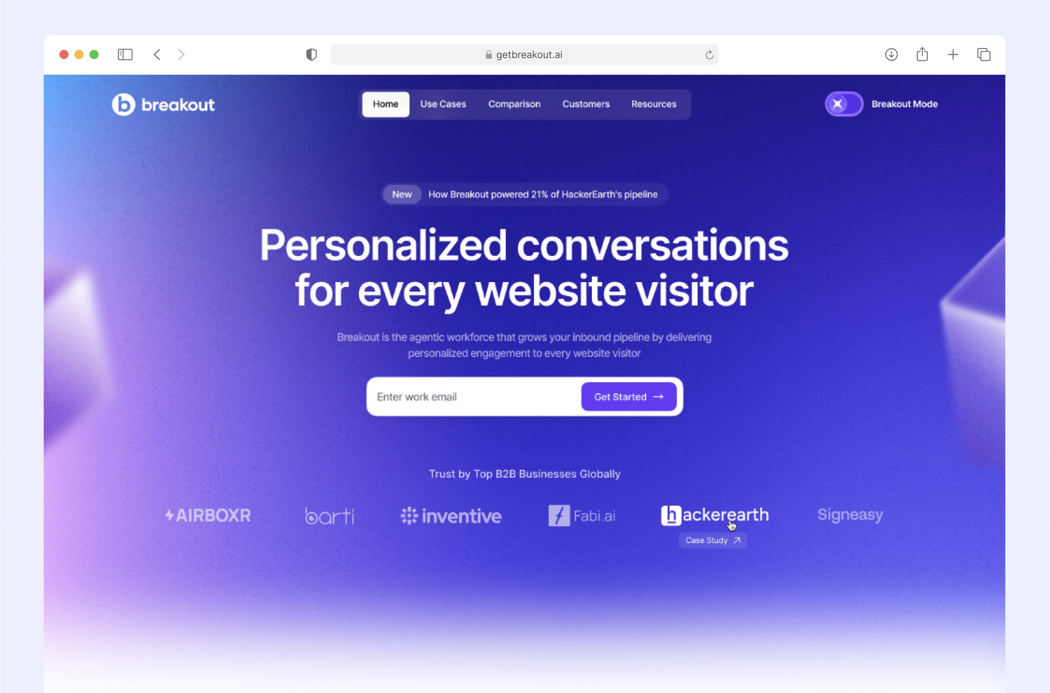
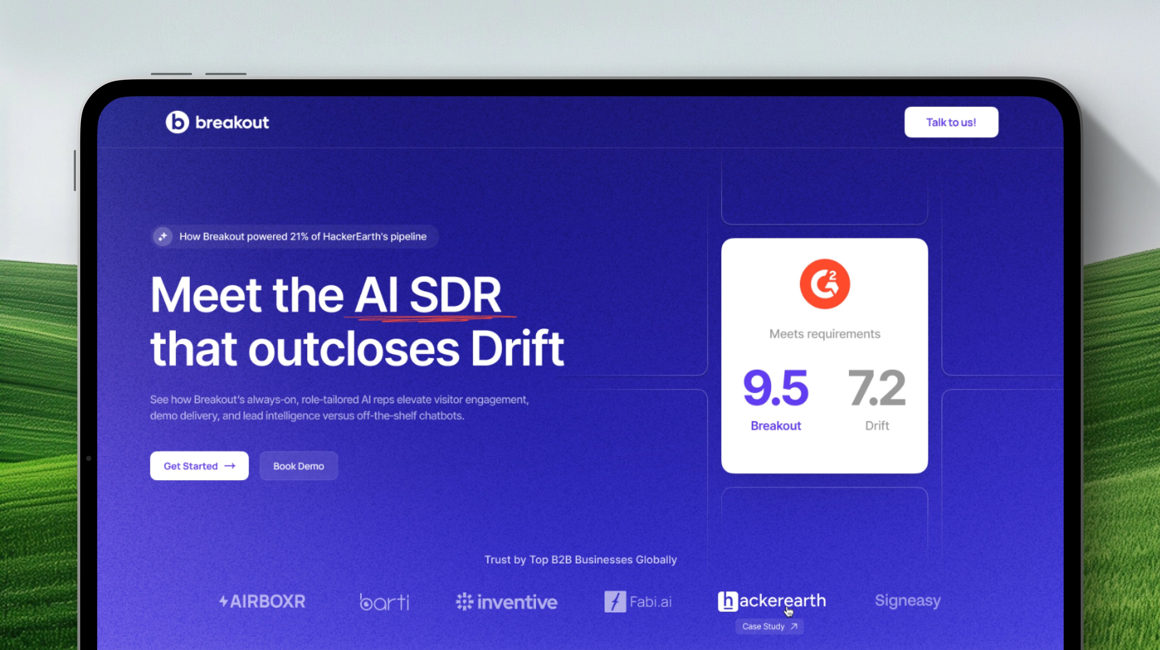
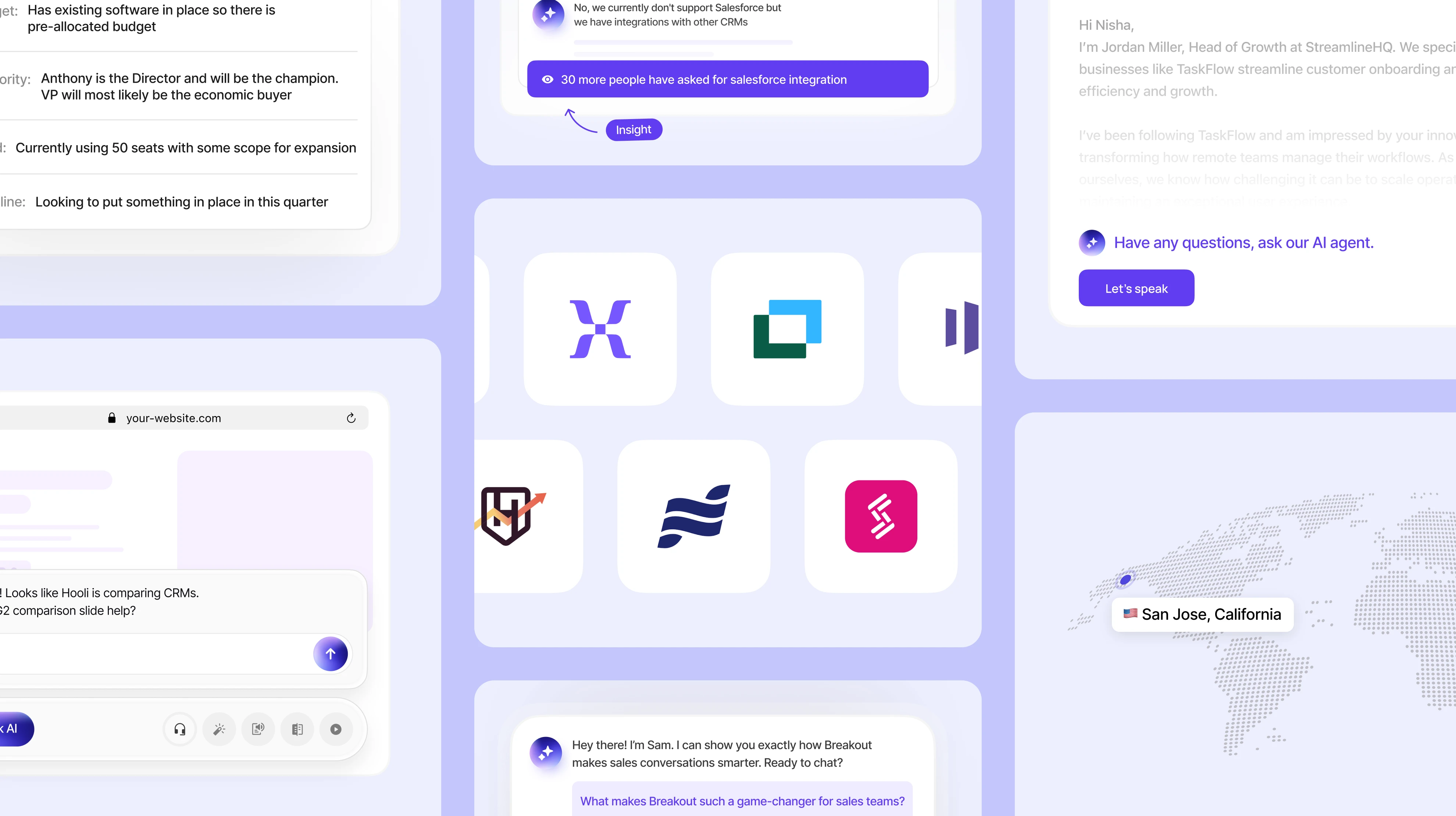
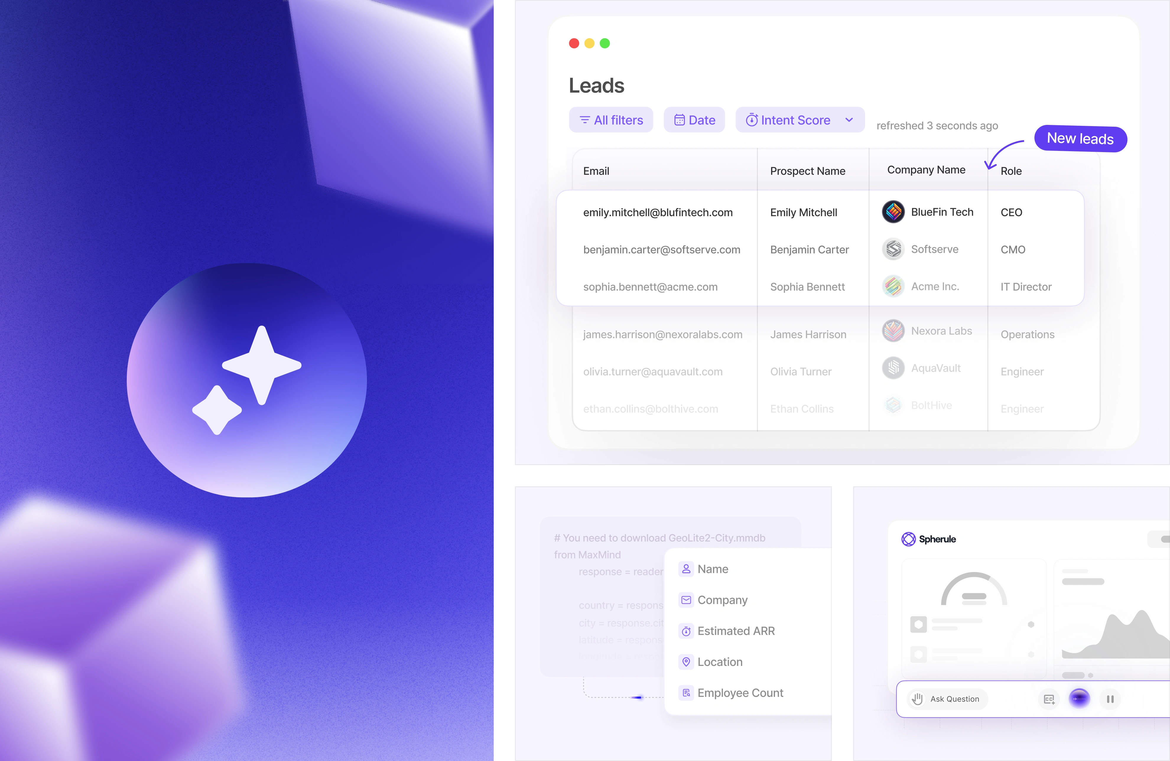
Turning visitors into leads, and leads into conversations
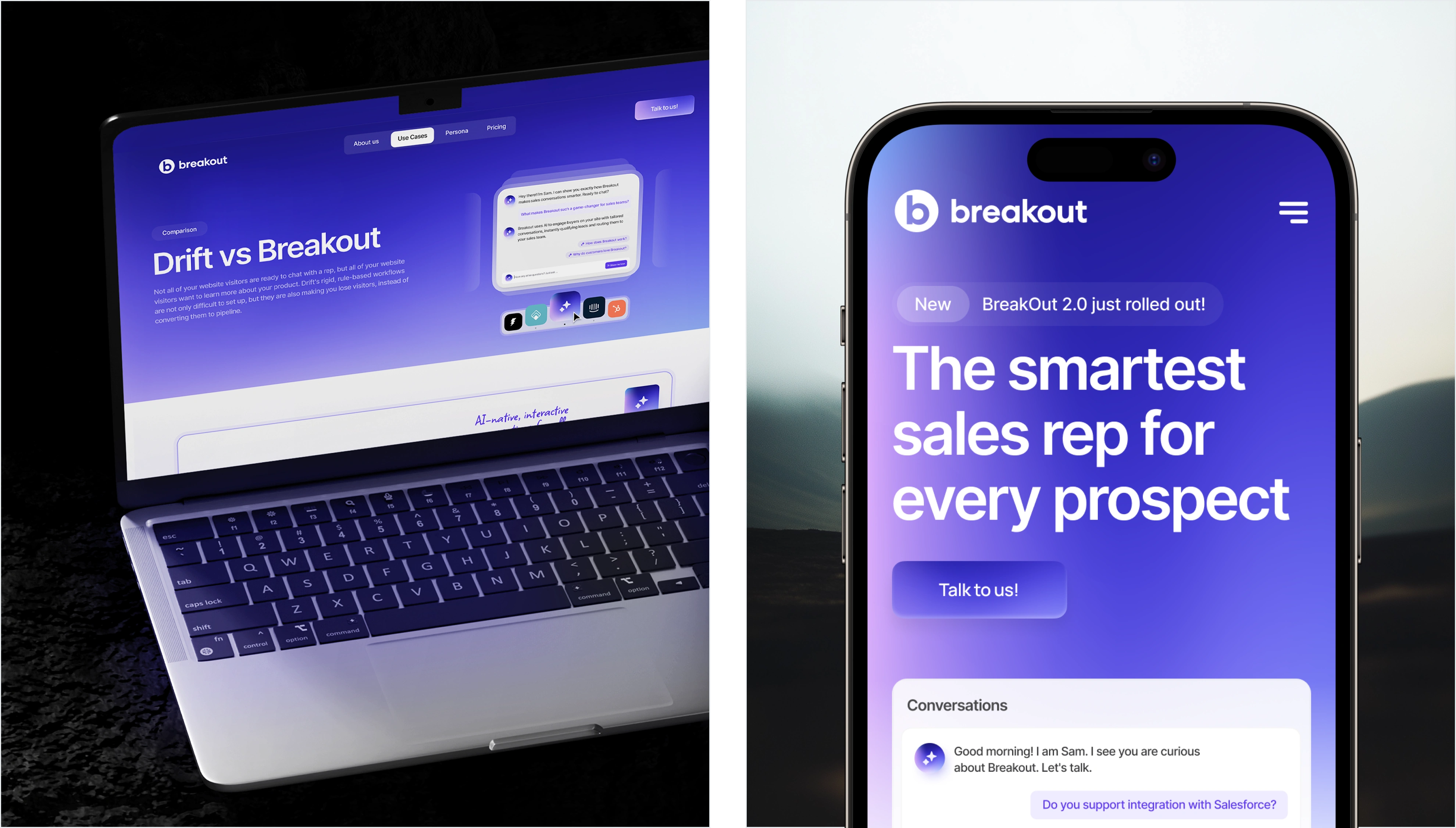
In a category filled with clunky bots and forgettable forms, Breakout stands out by delivering a smarter, sharper experience.
Their AI SDR doesn’t just answer — it understands. Tailored demos, contextual conversations, and always-on availability come together to create a seamless new way to sell.
The Problem
Breakout was building a powerful AI SDR platform that reimagined inbound sales — but their outward presence didn’t reflect the innovation under the hood. They needed more than just a website; they needed a cohesive visual identity and an experience that felt as intelligent and sharp as their product.
The challenge was to translate a deeply technical, high-context product into a clear, compelling, and visually memorable experience for prospects landing on their site.
The Strategy
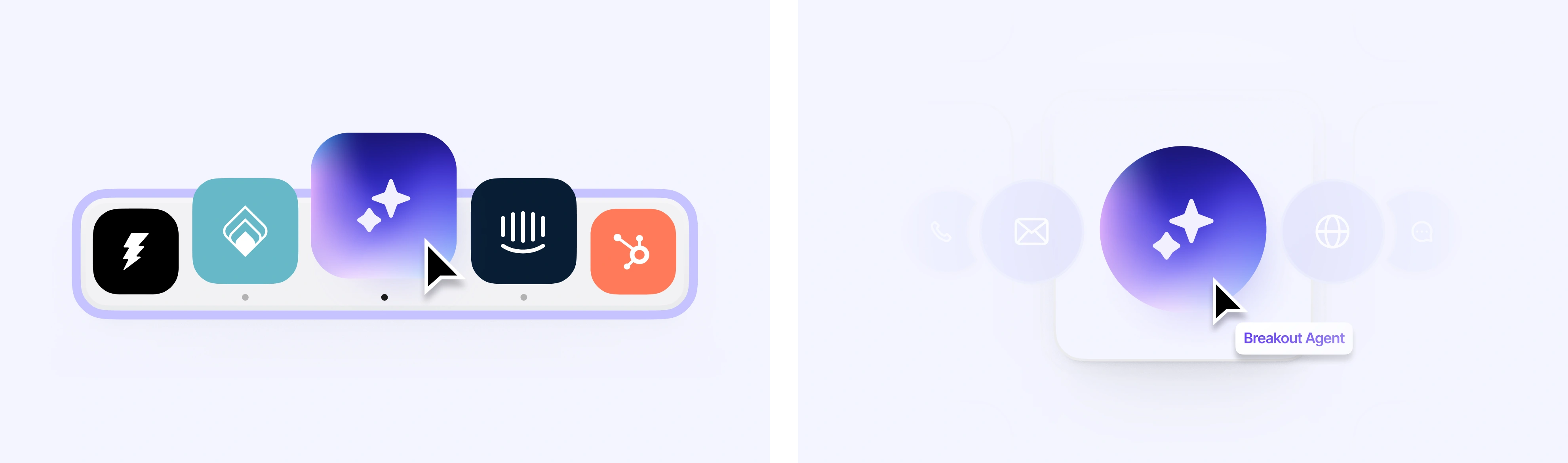
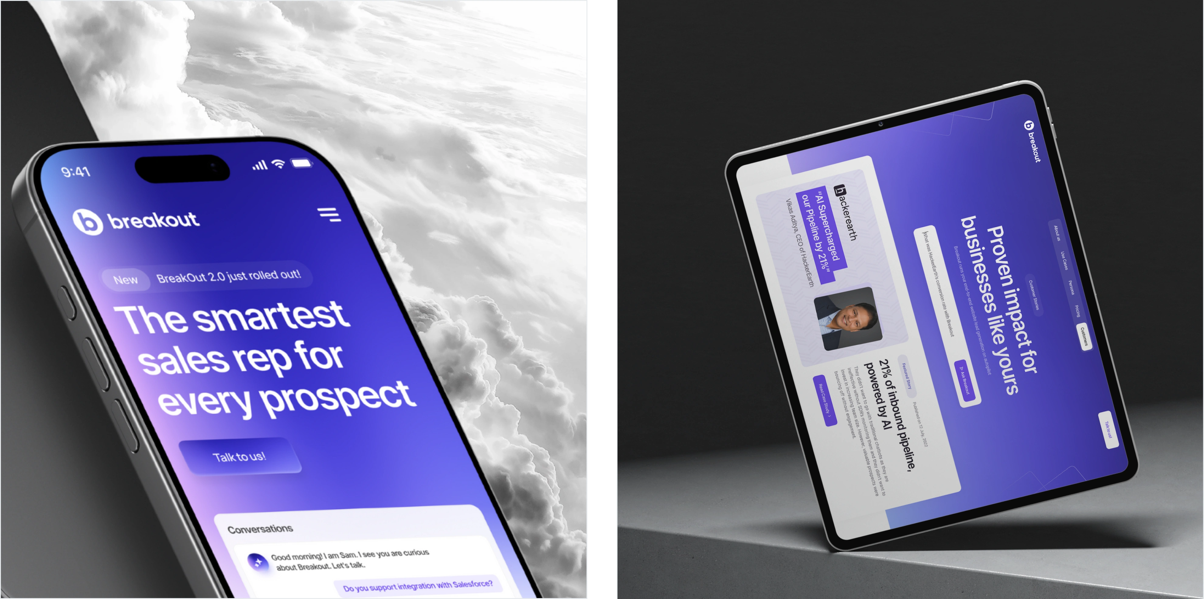
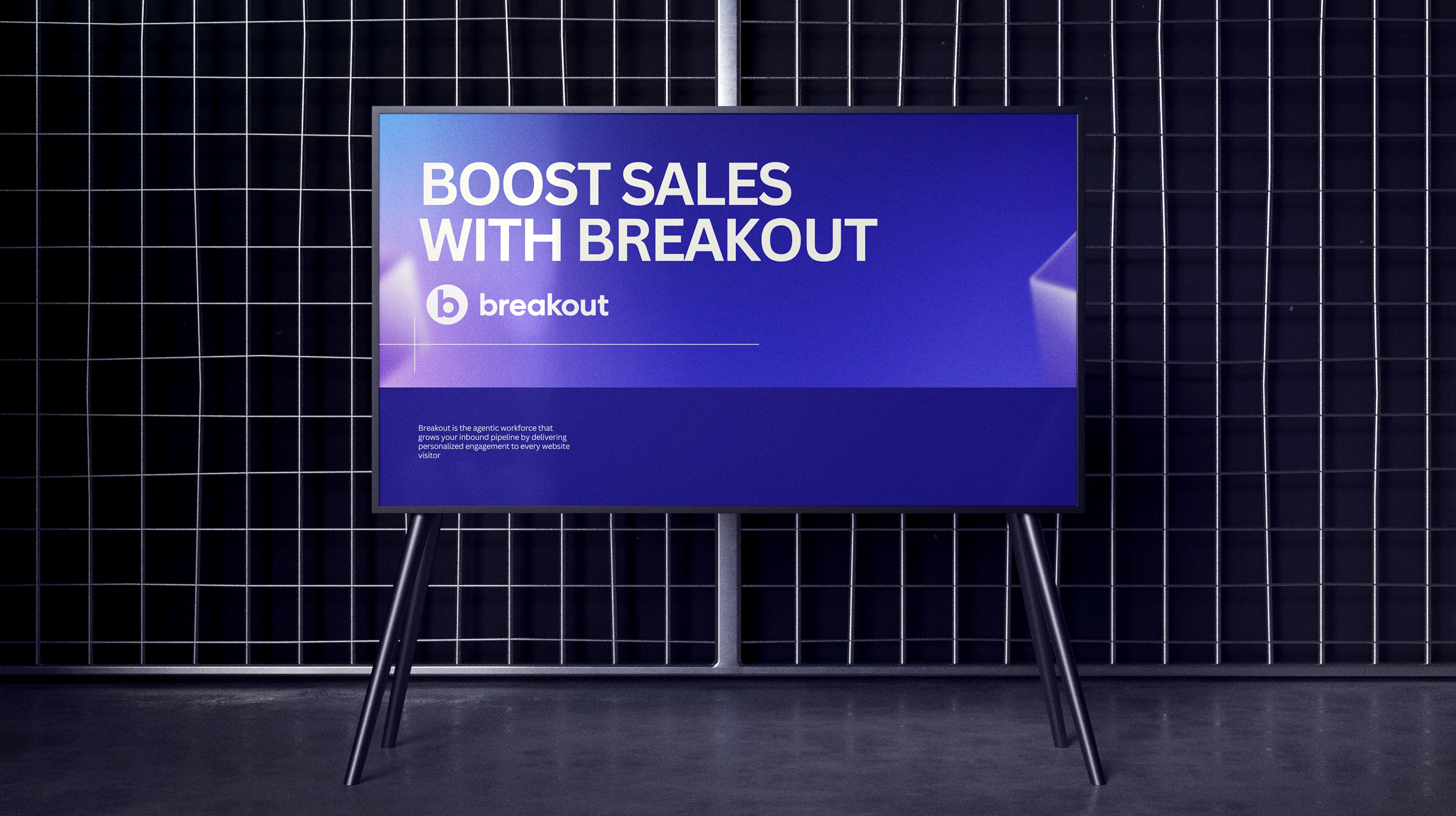
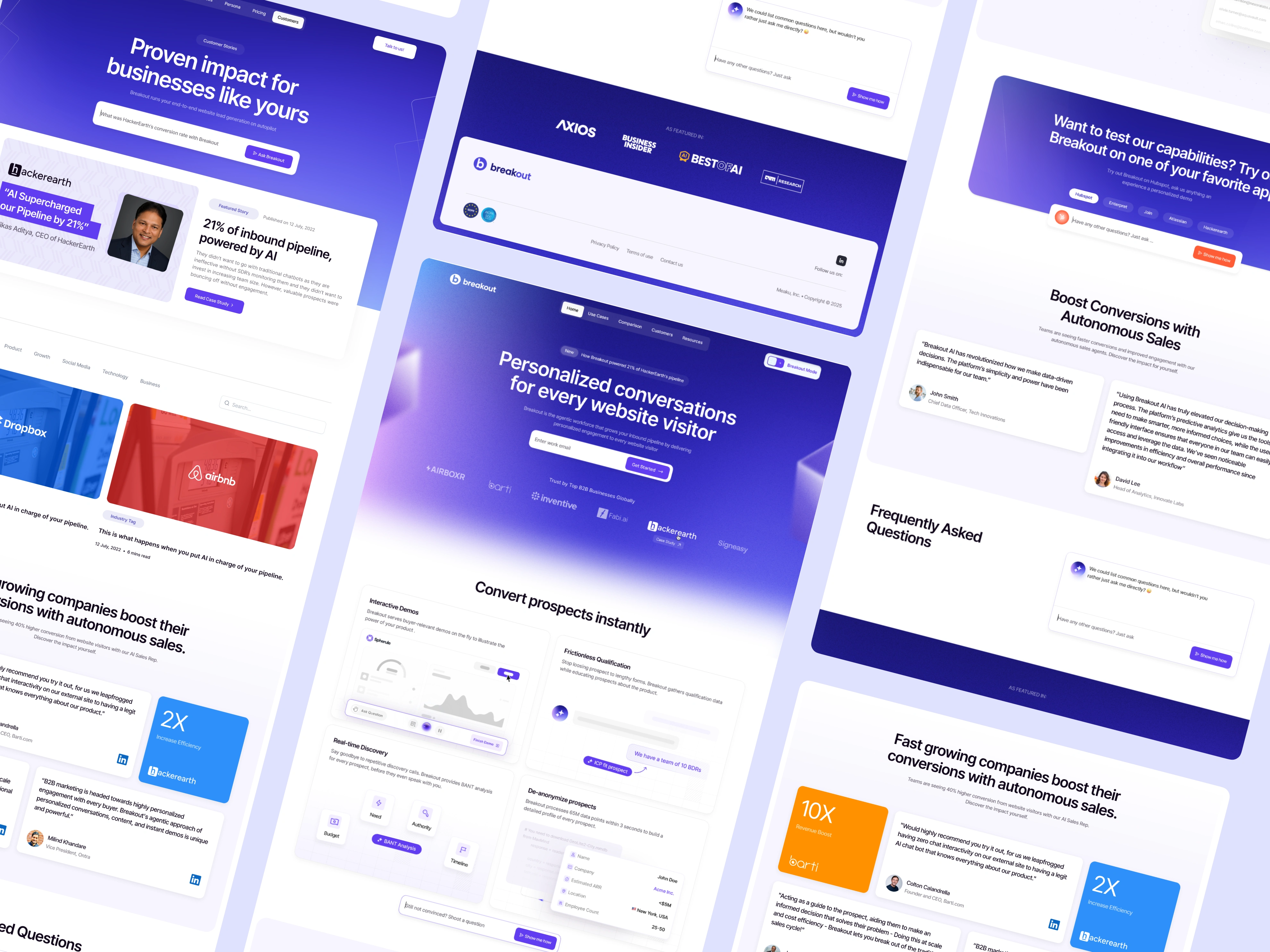
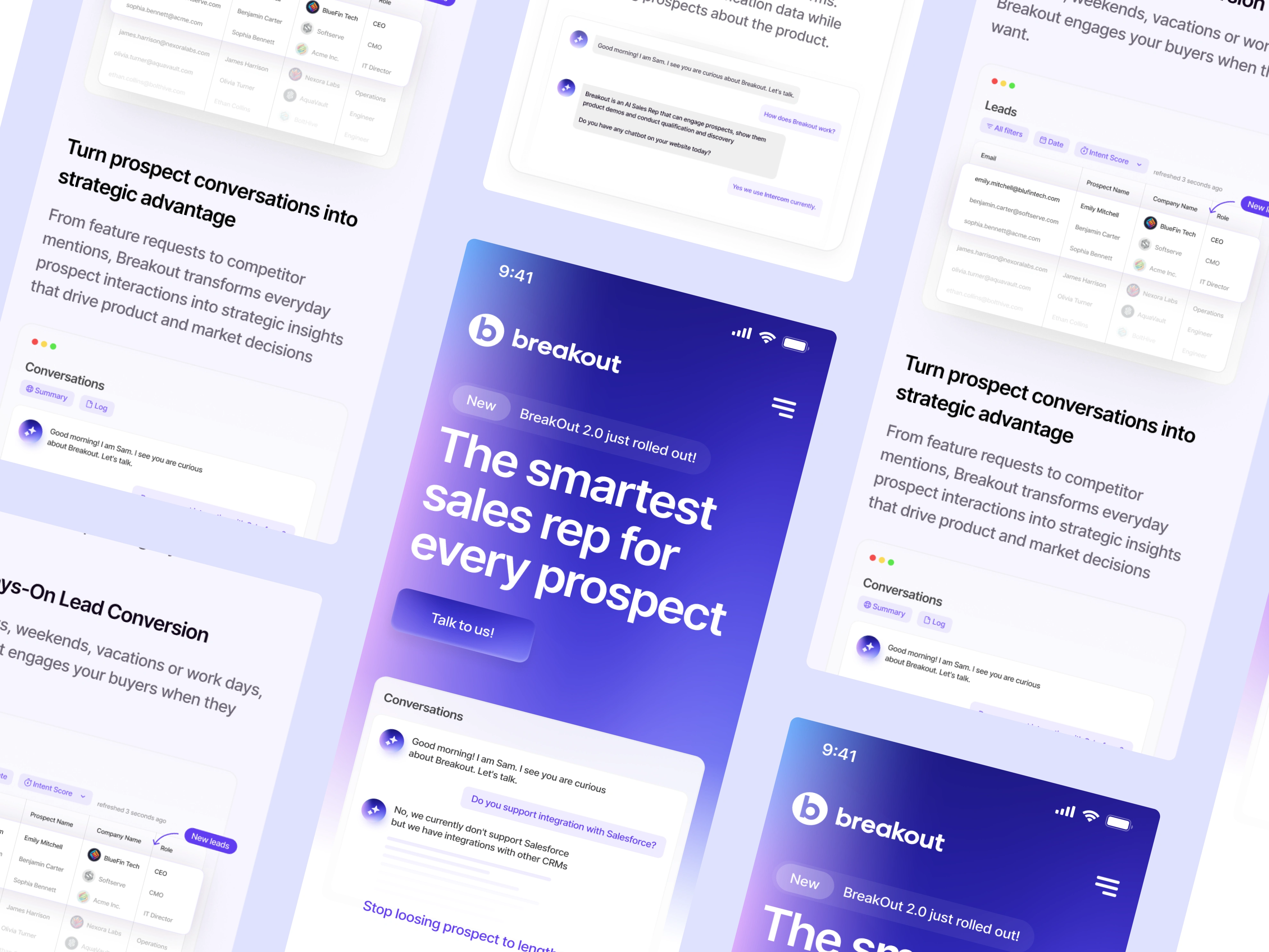
We approached the project by first identifying what Breakout stood for — speed, intelligence, and clarity. From there, we crafted a visual identity that was bold yet approachable, functional yet expressive. The web experience became an extension of the product itself: structured, fast, and insight-driven. We introduced motion to convey intelligence, interactive visuals to explain value, and a clean UI that put the product at center stage — all while ensuring consistency across every asset, from brand to build.

The Result
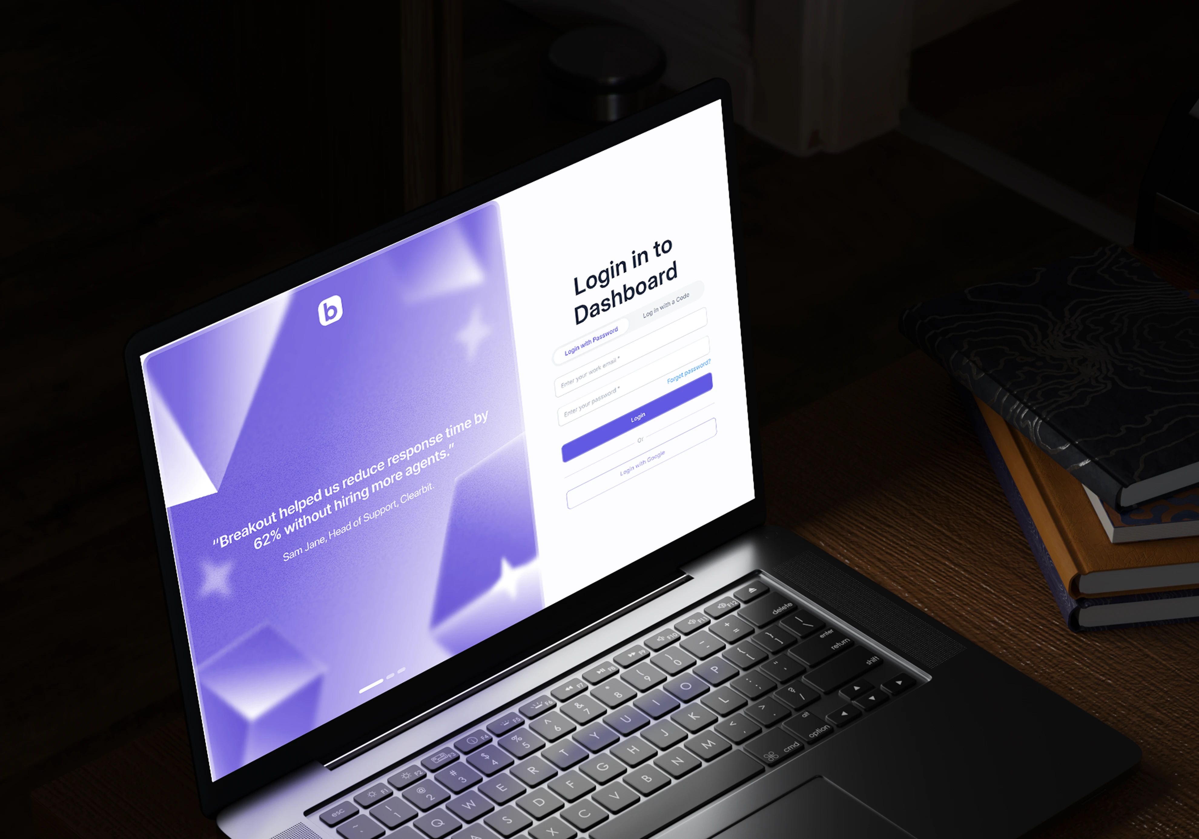
The new identity and website gave Breakout a sharper, more aligned first impression — one that matched the strength of the technology. Users now encounter a site that feels alive, confident, and high-converting. Internally, the team found the system easy to adopt and scale. Externally, the product story is now told with clarity and personality — turning visitors into leads, and leads into conversations.
Like this project
Posted Aug 12, 2025
Designed & developed a Cohesive visual identity and website for Breakout's AI SDR platform.
Likes
1
Views
27
Clients
Breakout