ATMOS Studios Brand Identity Design
Mohammad Wakil Uddin
ATMOS Studios — Modern Identity with Meaningful Minimalism
Presenting
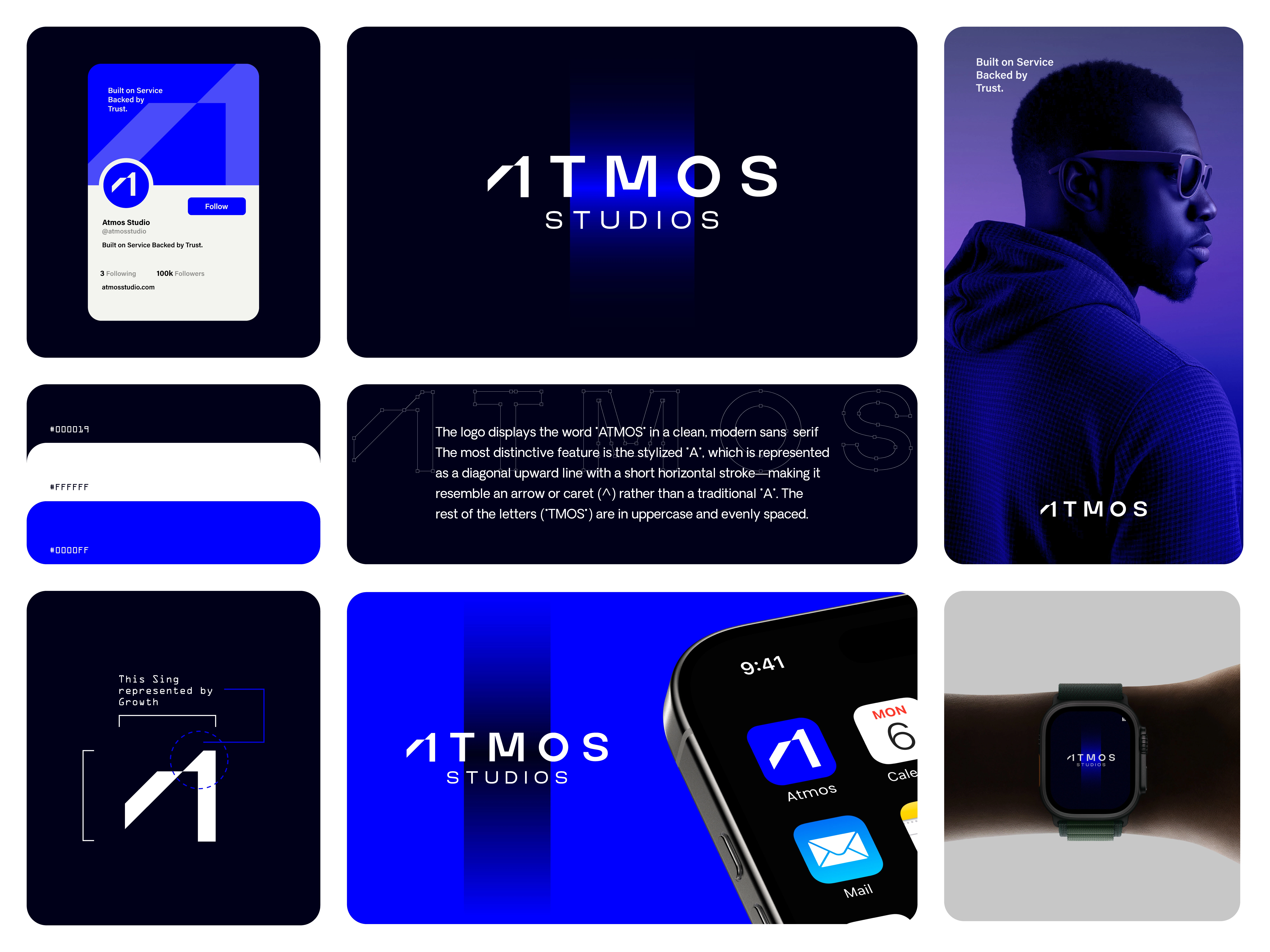
The brand identity design for ATMOS Studios, a modern and tech-driven company built on trust and service.
The logo features a clean, sans-serif wordmark with a powerful symbolic twist — the stylized "A" is transformed into a rising arrow shape (^) that represents growth, ambition, and upward momentum. This minimal yet meaningful approach reflects the studio’s core values: innovation, clarity, and progress.
Let me know what you think!
Your feedback is always welcome.
Have a branding idea in mind or need something similar for your business?Feel free to DM me anytime — I’d love to help craft something powerful and unique for your brand. Let’s build something amazing together.
Like this project
Posted Jul 7, 2025
Presenting The brand identity design for ATMOS Studios, a modern and tech-driven company built on trust and service.
Likes
13
Views
19
Timeline
May 10, 2025 - May 29, 2025