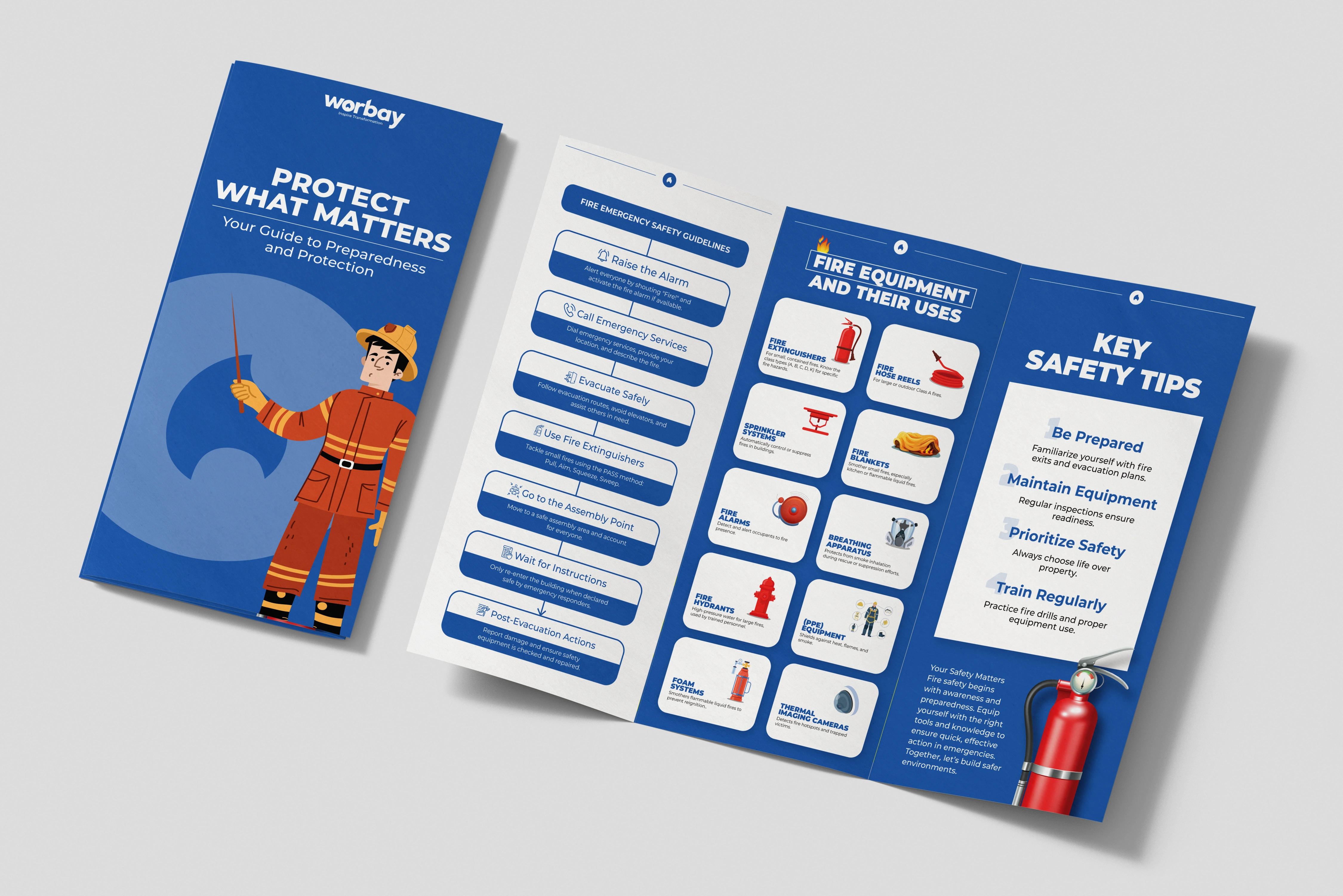
Fire Safety Leaflet Design
Parth Cholera
Overview:
This leaflet was designed to educate users on fire safety with clear, engaging visuals and concise information. The aim was to create a user-friendly guide that ensures essential safety tips are easy to understand.
Design Approach:
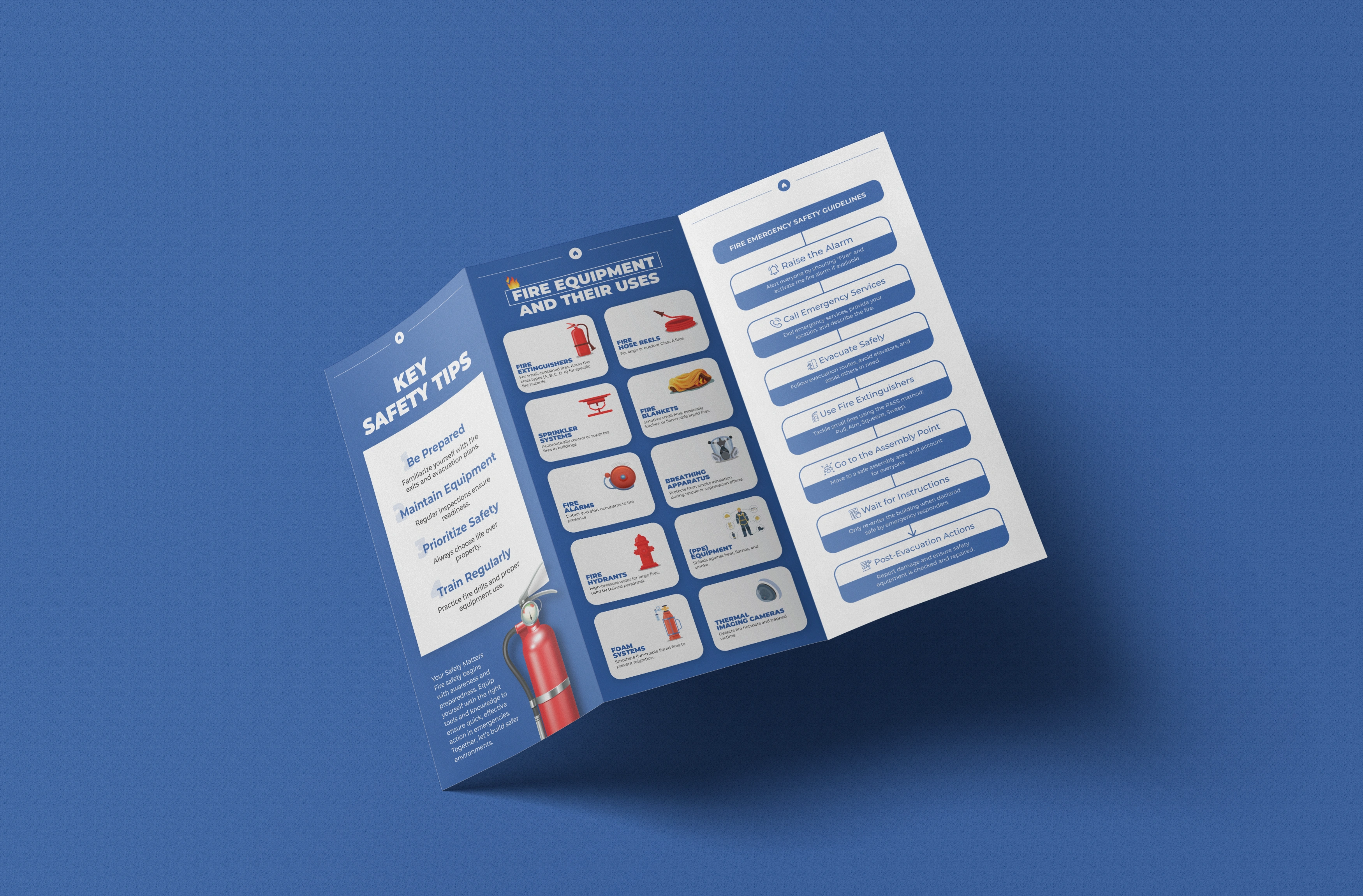
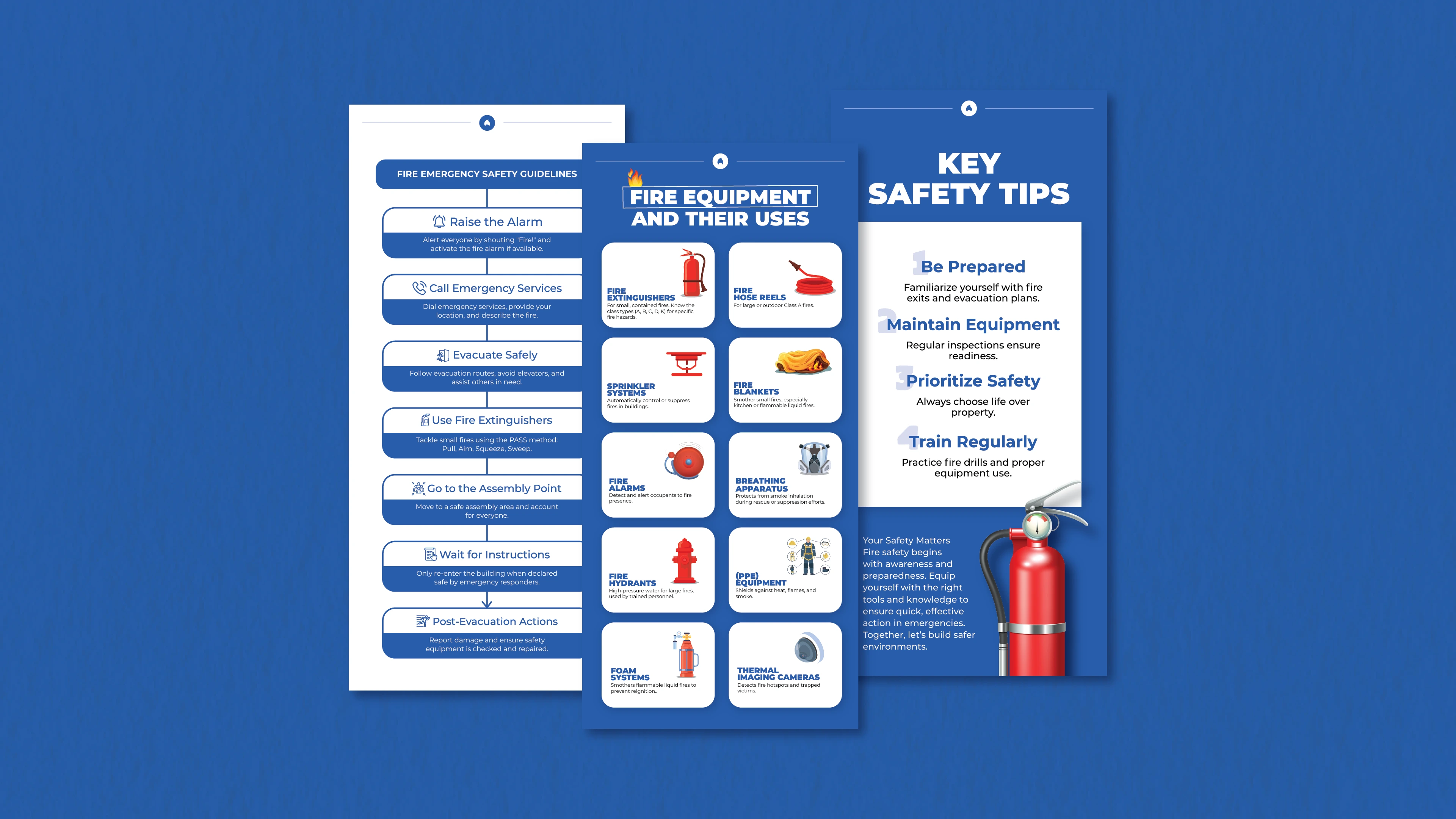
Typography & Layout: Clean fonts and a structured layout for readability.
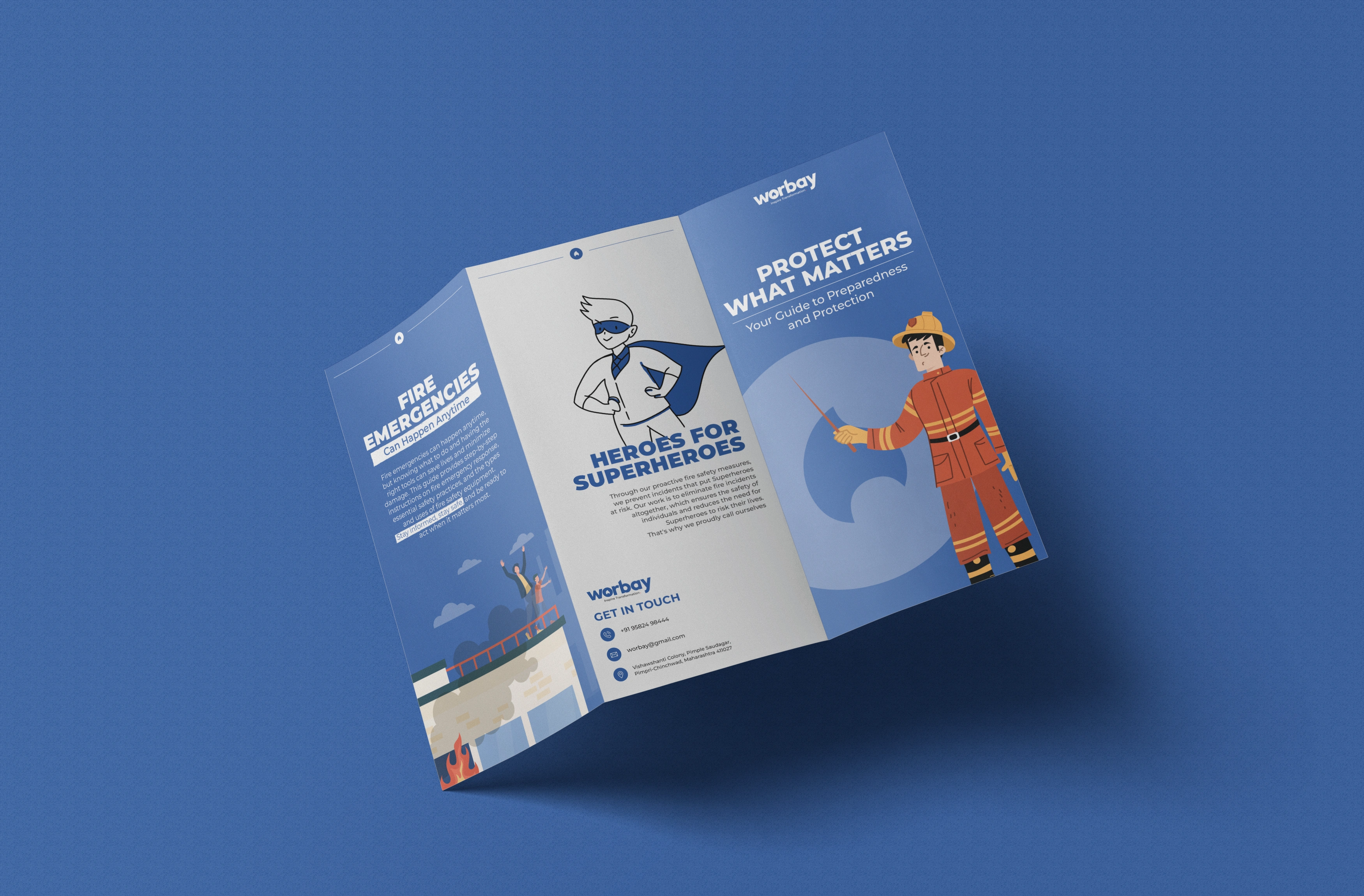
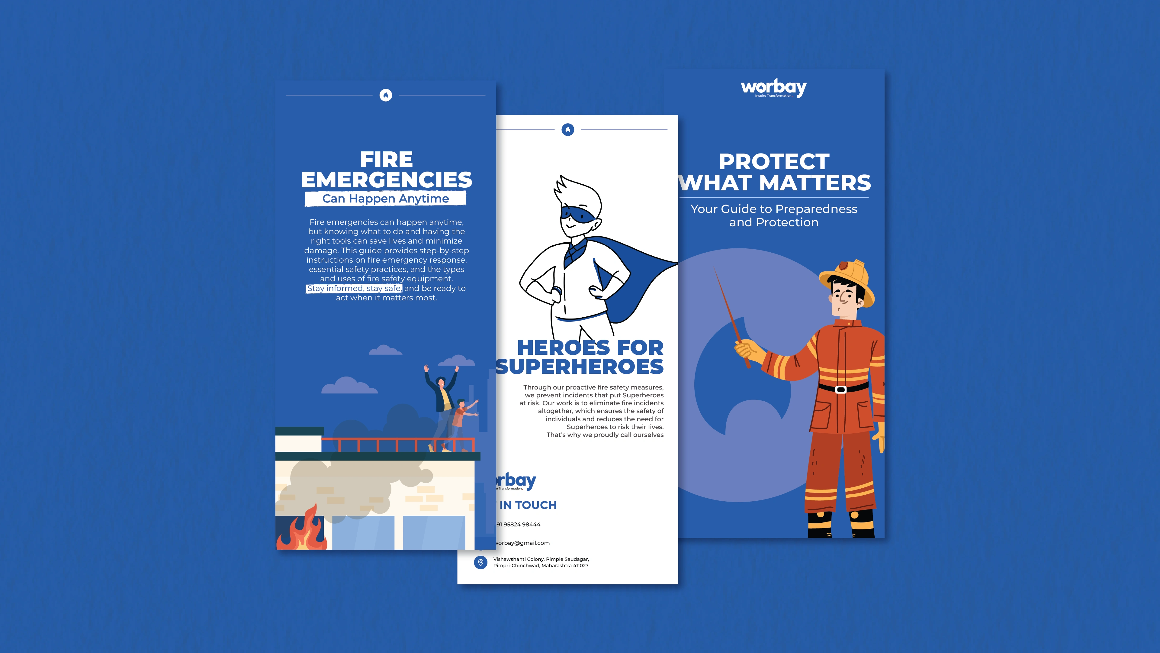
Illustrations & Colors: Custom firefighter illustration and a bold blue palette to convey trust, complemented by red for urgency.
Content Organization: Panels focus on emergency guidelines, equipment uses, and safety tips.
Results:
The final design blends functionality with aesthetics, presenting critical safety information in an accessible, visually appealing format. It highlights my ability to turn complex information into clear, professional designs.
Like this project