
For Zwei, a specialty café, I started with conversations, not color palettes.
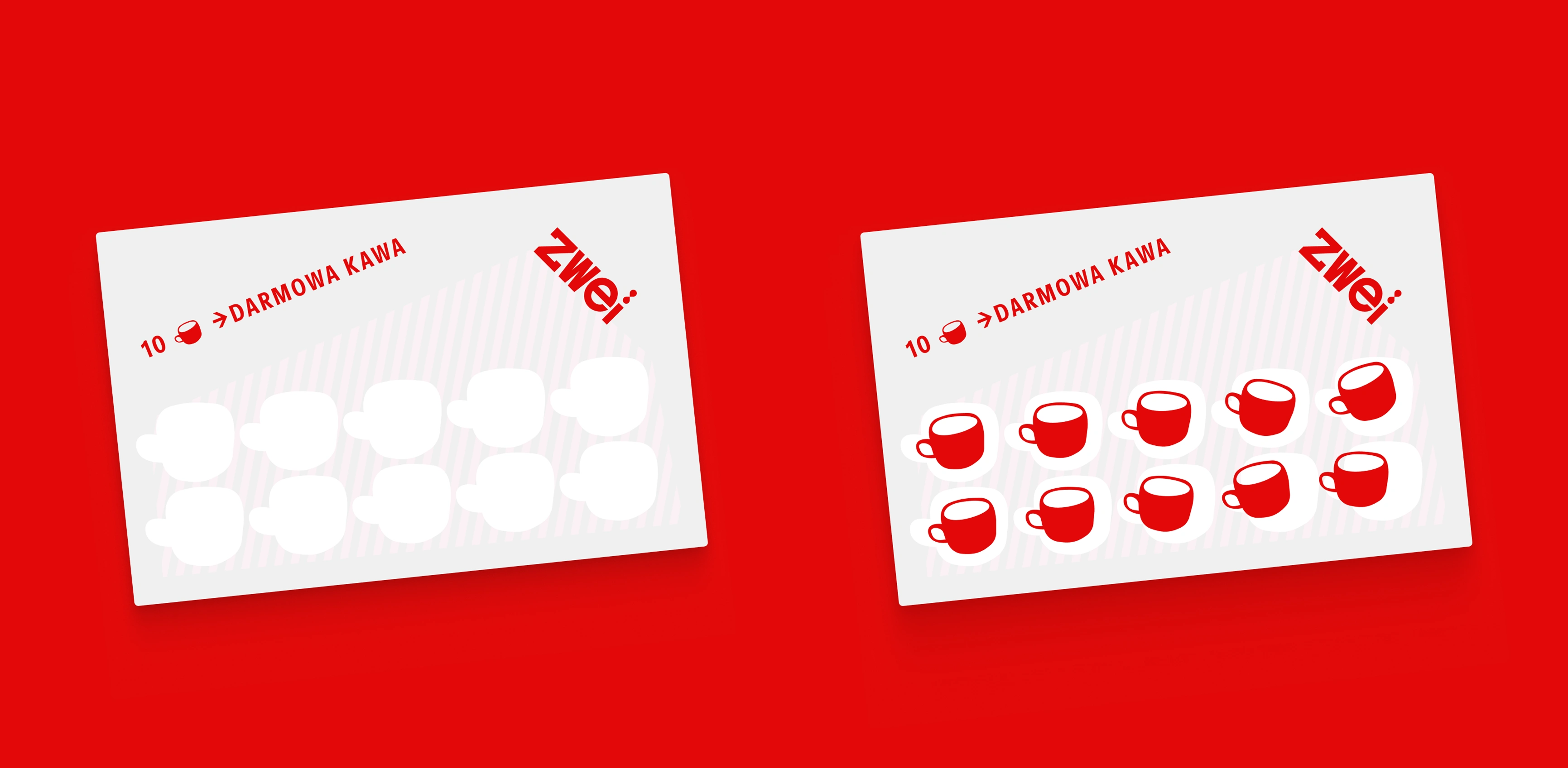
loyalty cards
The founders wanted a calm, slightly nerdy “coffee first” place, not another loud, Instagram-driven spot – so the brand had to feel quiet, warm and a bit bookish.
I explored a few directions and tested them directly on photos of the real space to see what actually fit the interior, light and furniture. Once the direction felt right, I turned it into a small but practical identity system the owners can use without a designer on call: logo files, type scales, color tokens, layout examples and simple rules for posters, menus, social posts and signage.
My role
Brand strategy and positioning
Visual identity (logo, typography, color, graphic language)
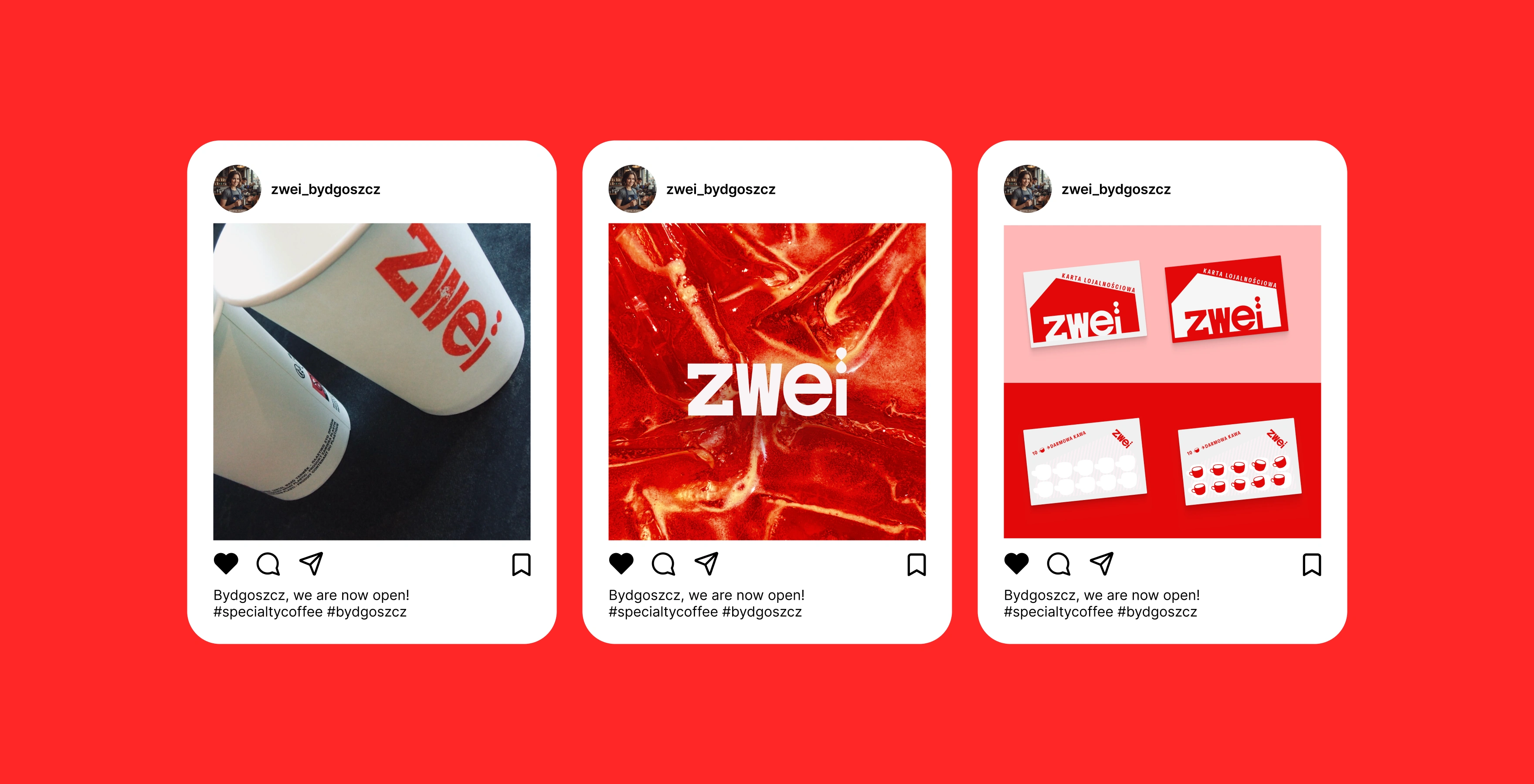
Content design and templates for print and social
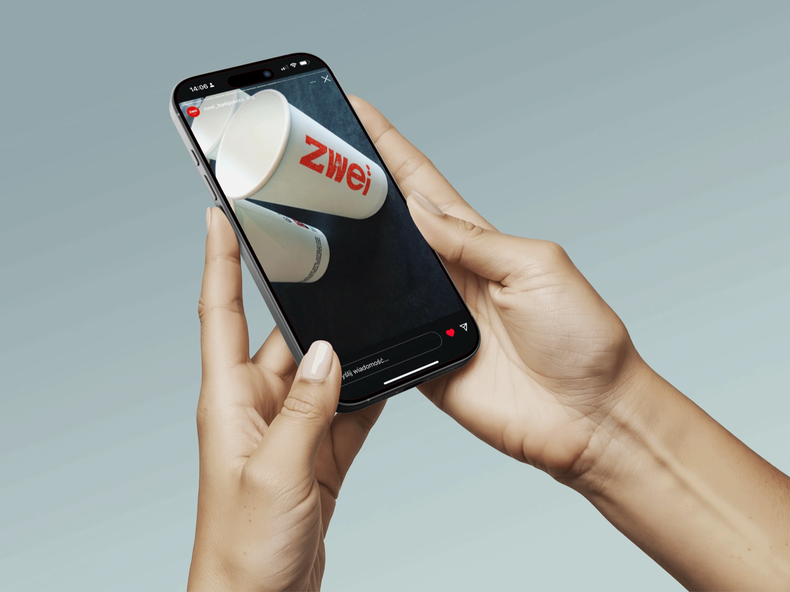
The goal wasn’t a 100-page brand book, but a lightweight, reusable kit that keeps Zwei consistent across print, digital and interior details – so the whole experience feels like one, thoughtful brand.
0 likes · 5 views · Oct 9, 2026
Done: logo, typography, color system, layout rules and simple templates for posters, menus, social - practical kit that keeps the designs consistent.


