A client rejected 3 of

Shayan Preceptor

A client rejected 3 of my poster concepts.
Same layout. Same photo. Same colors.
I couldn't figure out what was wrong.
Until I changed one thing.
The font.
Nothing else. Just the font.
Suddenly the exact same design looked "expensive" to him.
That's when it hit me —
Nobody ever says "I love your typography."
But everyone feels it the second it's wrong.
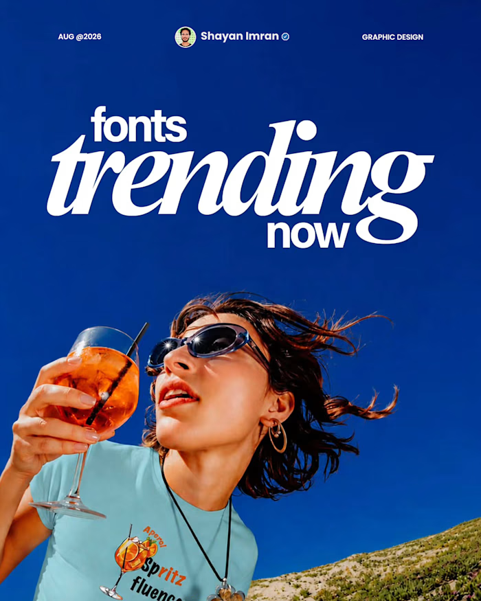
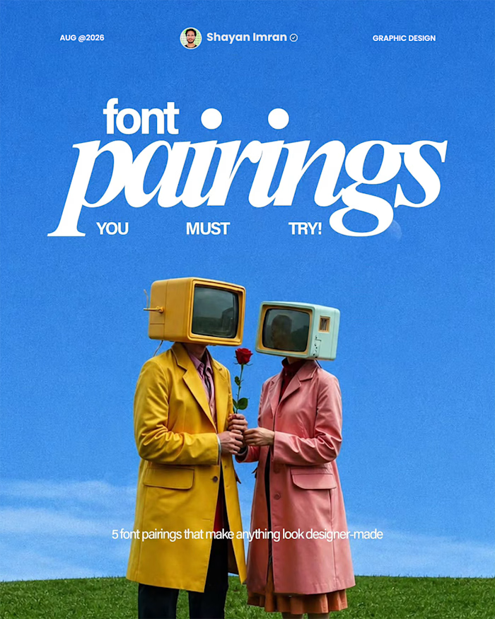
So I started collecting fonts that actually carry weight. The kind that look cinematic before anyone even reads the words.
5 of them. Free. Sitting in my personal library right now.
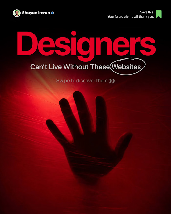
Save this post.
Next time a client says "something feels off" and can't tell you why — check the font before anything else.
— Shayan Imran
Like this project
Posted Sep 7, 2026
A client rejected 3 of my poster concepts. Same layout. Same photo. Same colors. I couldn't figure out what was wrong. Until I changed one thing. The font. N...
Likes
0
Views
3