MIRAGE Website Design
0
Brand Designer
Web Designer
UI Designer

Adobe After Effects

Adobe Photoshop

Figma
The Brief:
This project was based on an ISTD brief for 'Big Data'. The aim was to create a web app that can allow users to manage, view and control their data privacy. The visual direction was inspired by classic analogue devices and interfaces, as well as lofi-scifi. The end result was a unique looking website that pays homage to pre-1990s computing, whilst retaining a contemporary structure that can be easily navigated by users.
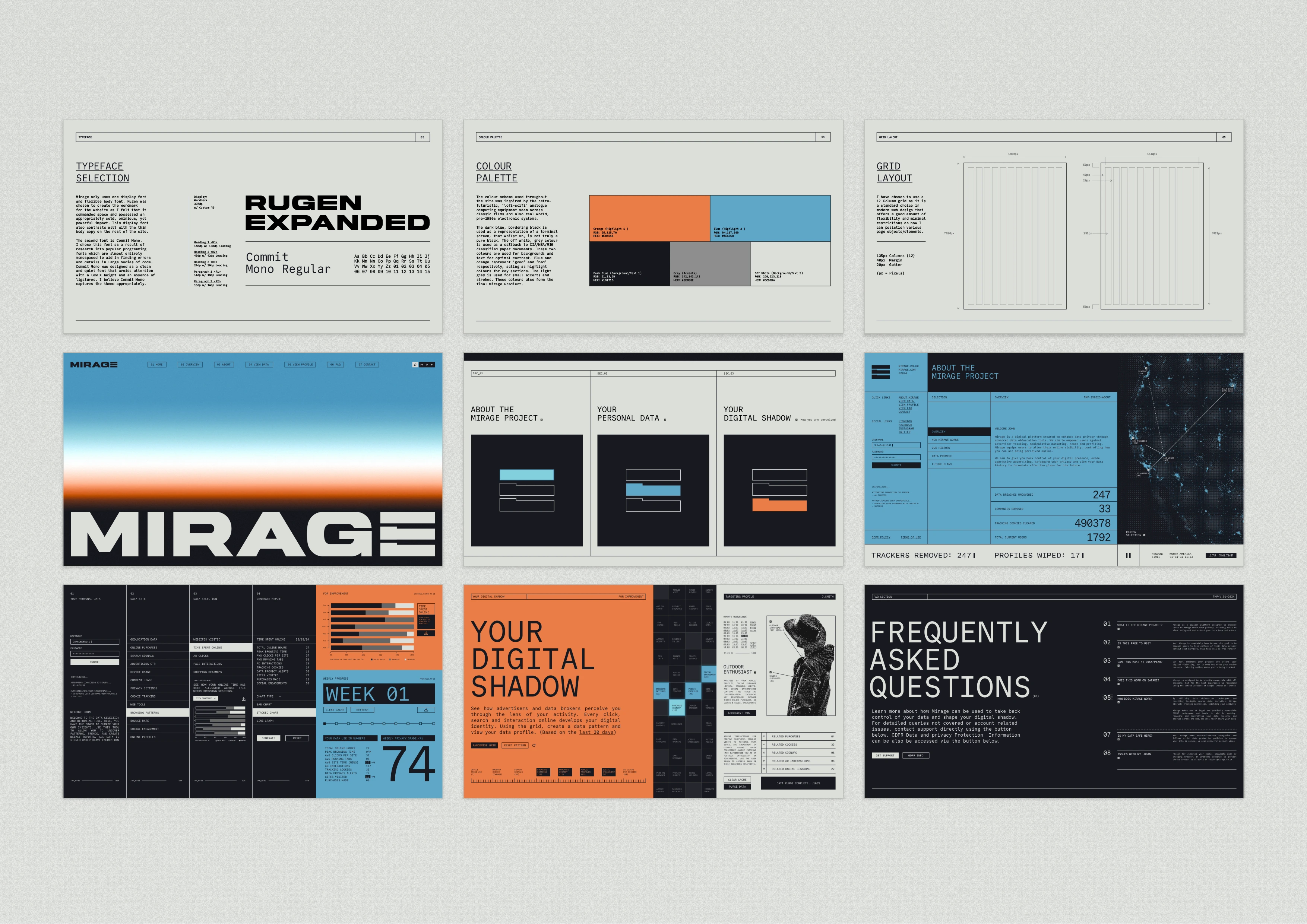
MIRAGE Sections
Initial Explorations
The first step was going to be the name and logo design. I knew the name needed to convey themes of perception, concealment and masking. Ultimately, "Mirage" was chosen because it represents the user's ability to obfuscate and mask their data without completely removing it entirely.
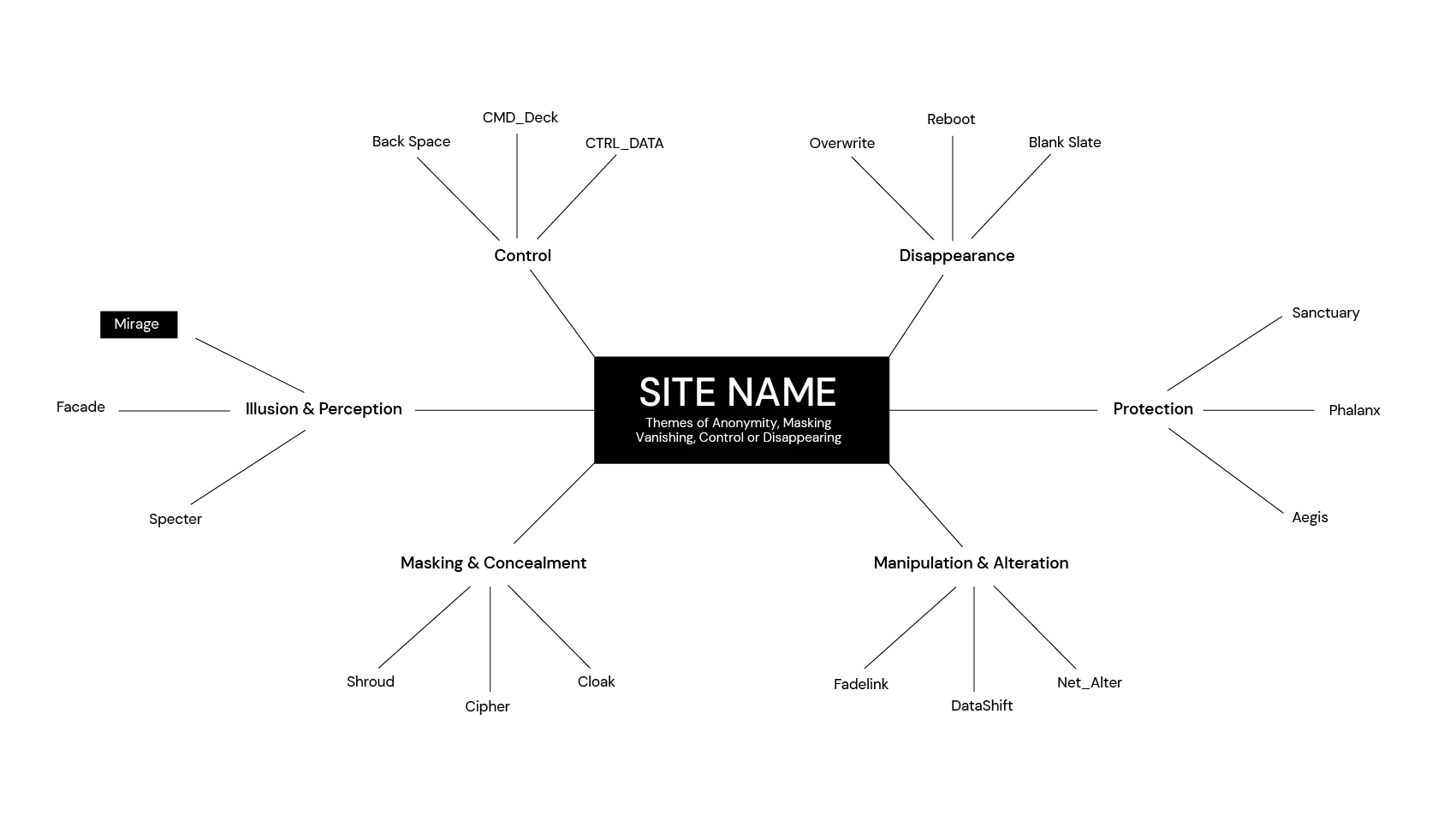
Initial Naming Mind map
Logo/Wordmark
The site design would lean heavily into typography, with monospaced fonts used to reference command terminals and old school interfaces. As such, I wanted a big, bold wordmark that could capture attention and contrast heavily against the much smaller copy that would follow it. This wordmark would 'Span the horizon' of the page, paired with a mirage themed gradient and server icon in the place of the 'E' to represent data storage.
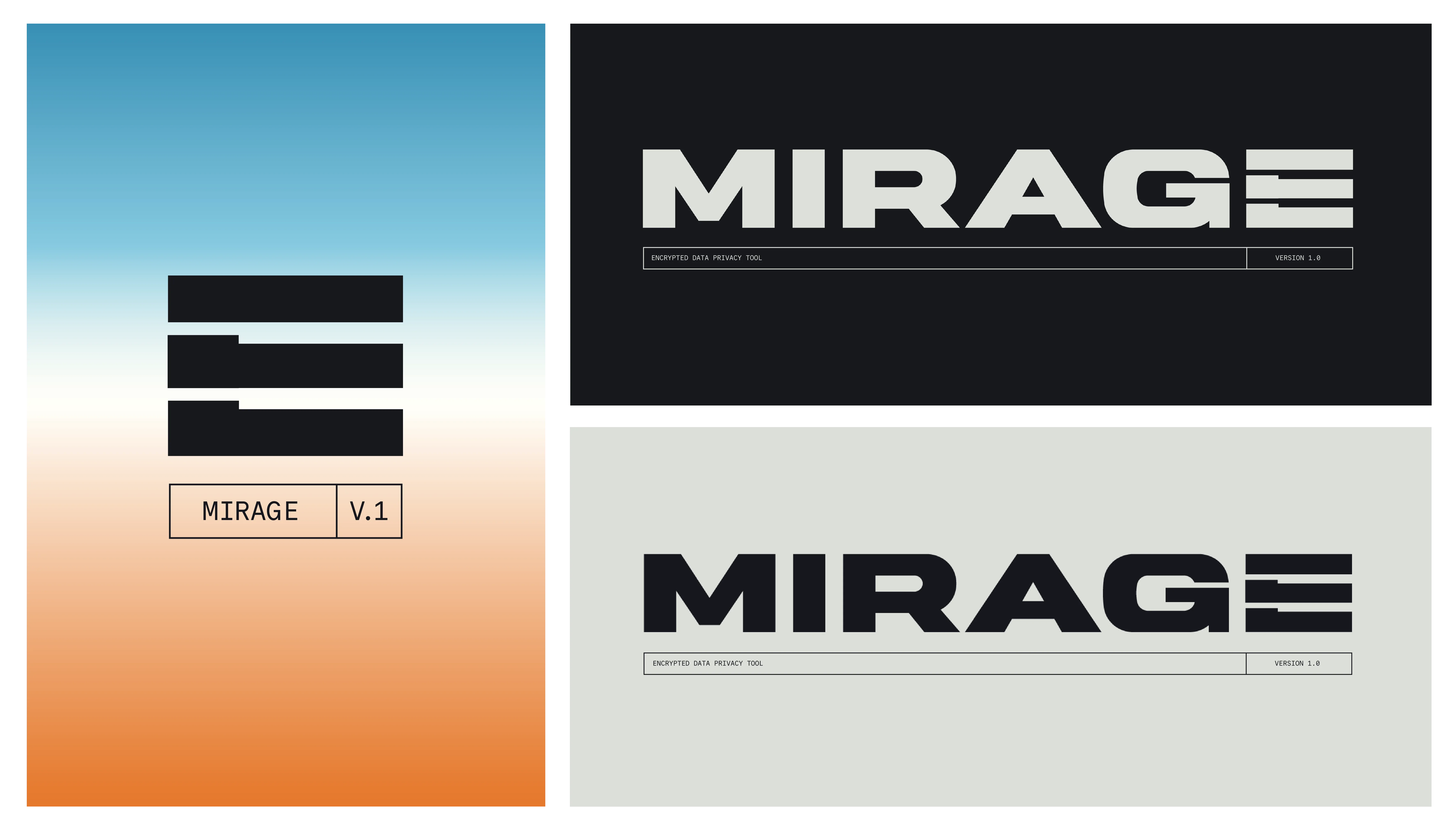
Wordmark & Logo Colorways
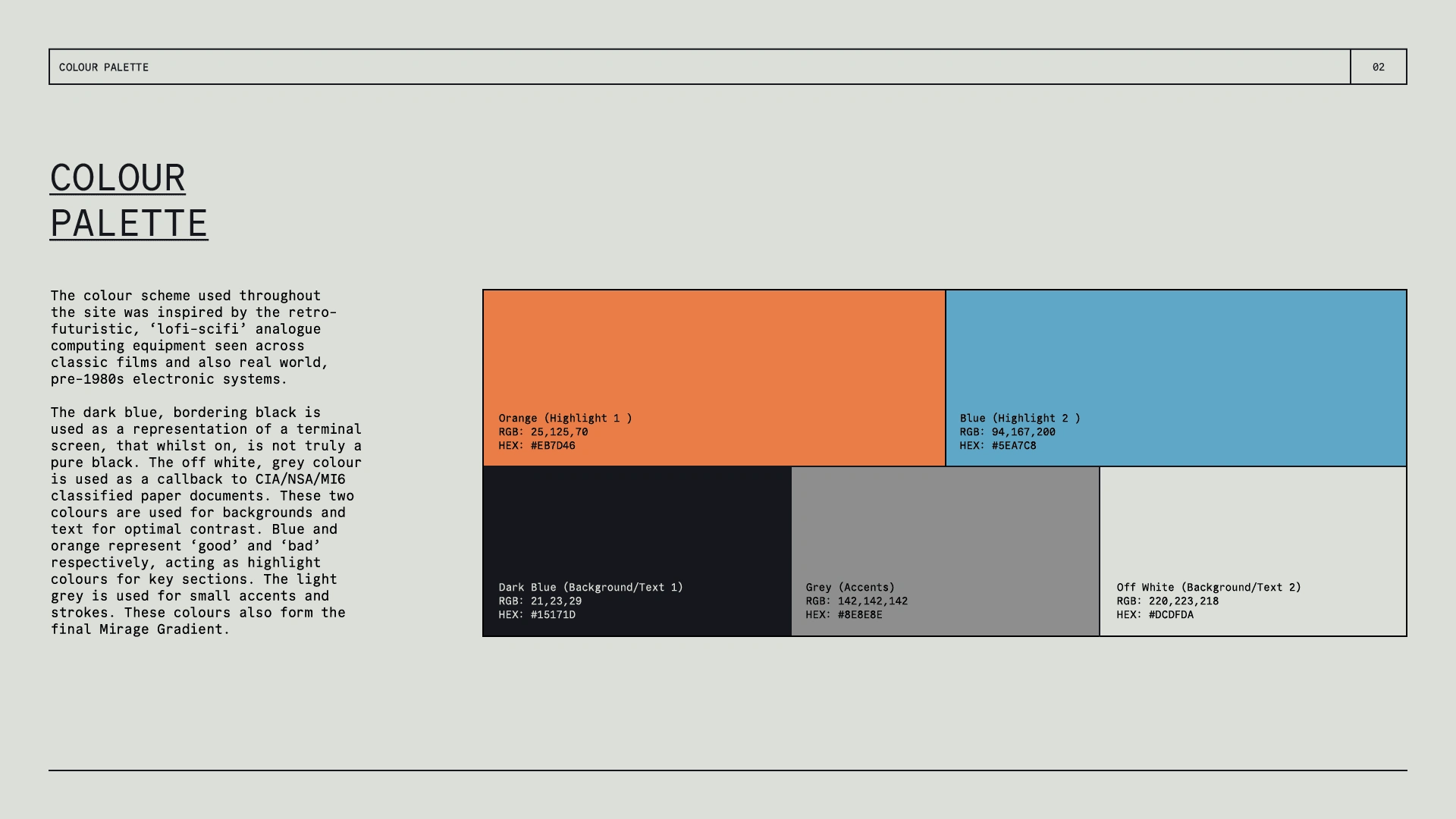
Typeface & Color Palette
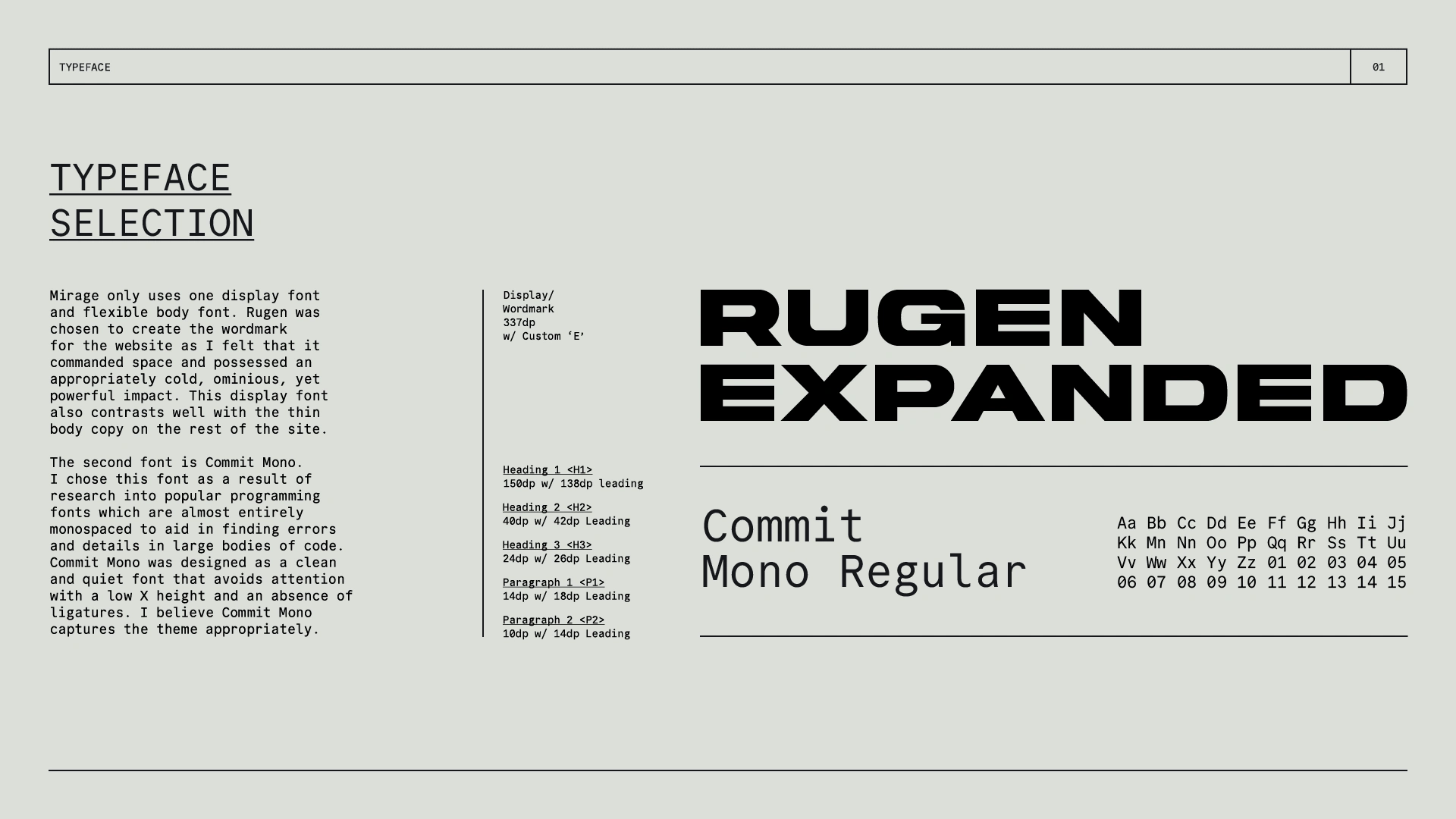
Systems & Layout Concepts
The next step was figuring out how to layout the site and approach the design of various interactions in way that could be easily understood by users. I wanted to retain the 'techy' terminal direction, whilst keeping the overall structure contemporary and intuitive.
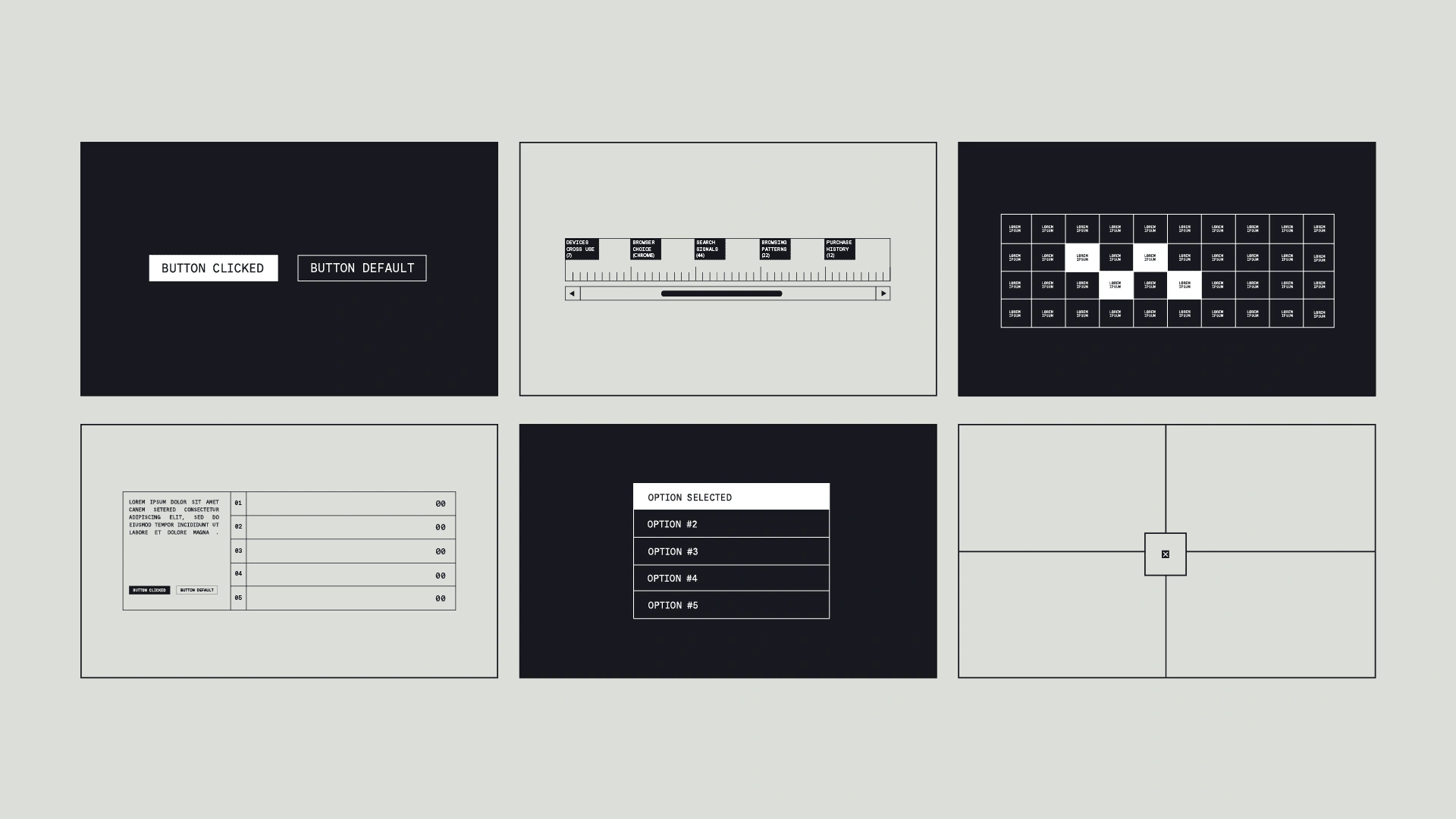
Systems Exploration
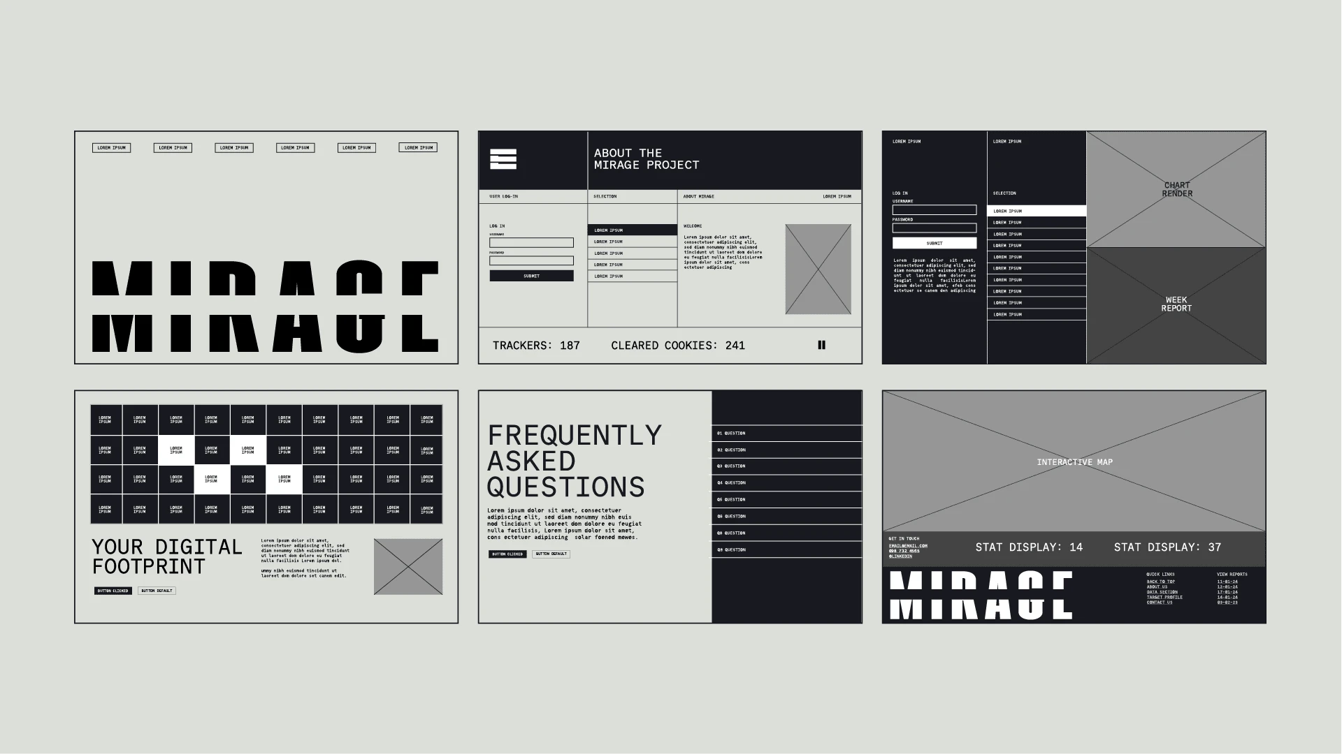
Early Section Wireframes w/ Placeholder Wordmark
Final Outcome
Learn more and view the full motion walkthrough at: www.cmdr.design/mirage
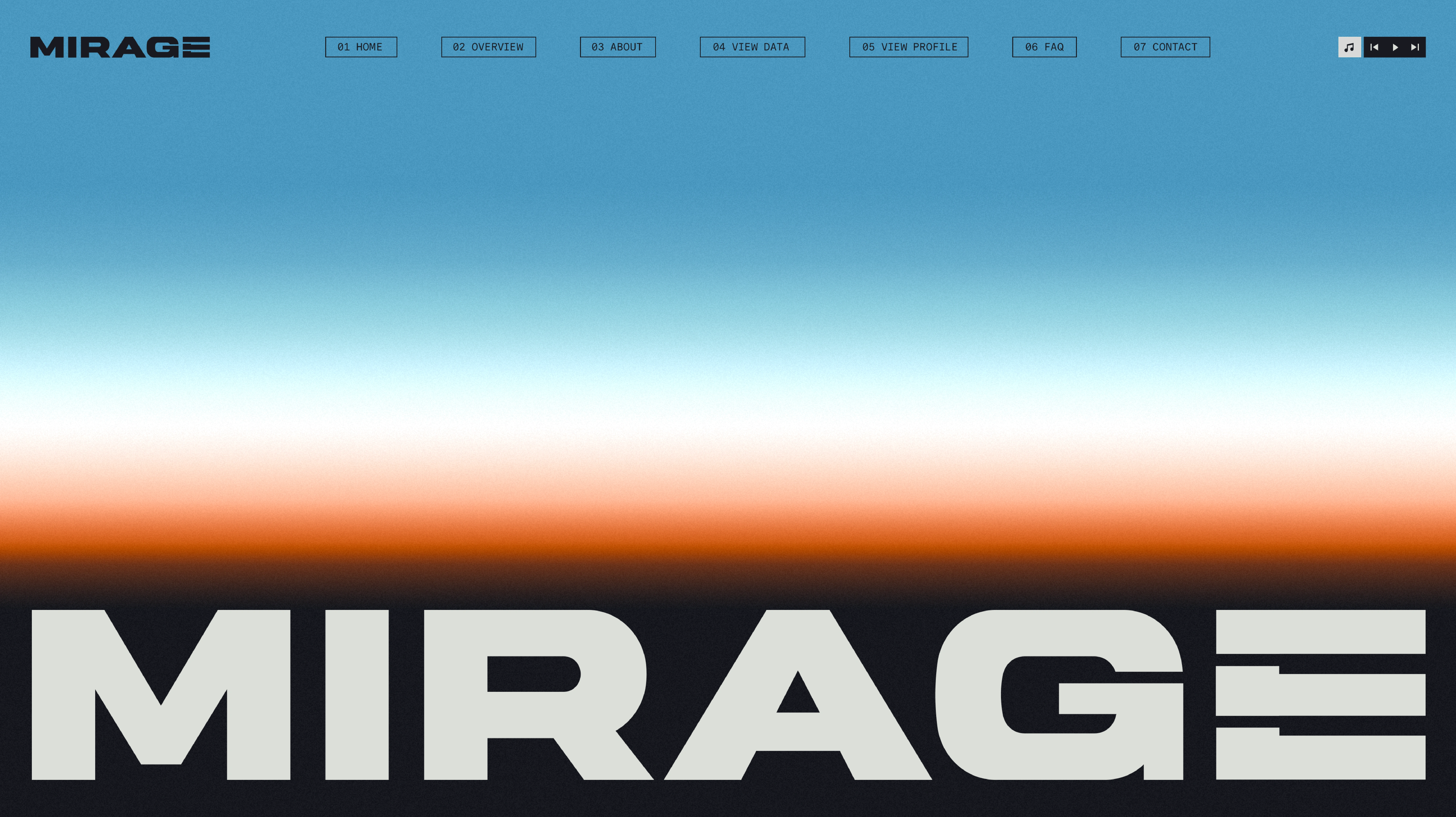
Hero Section
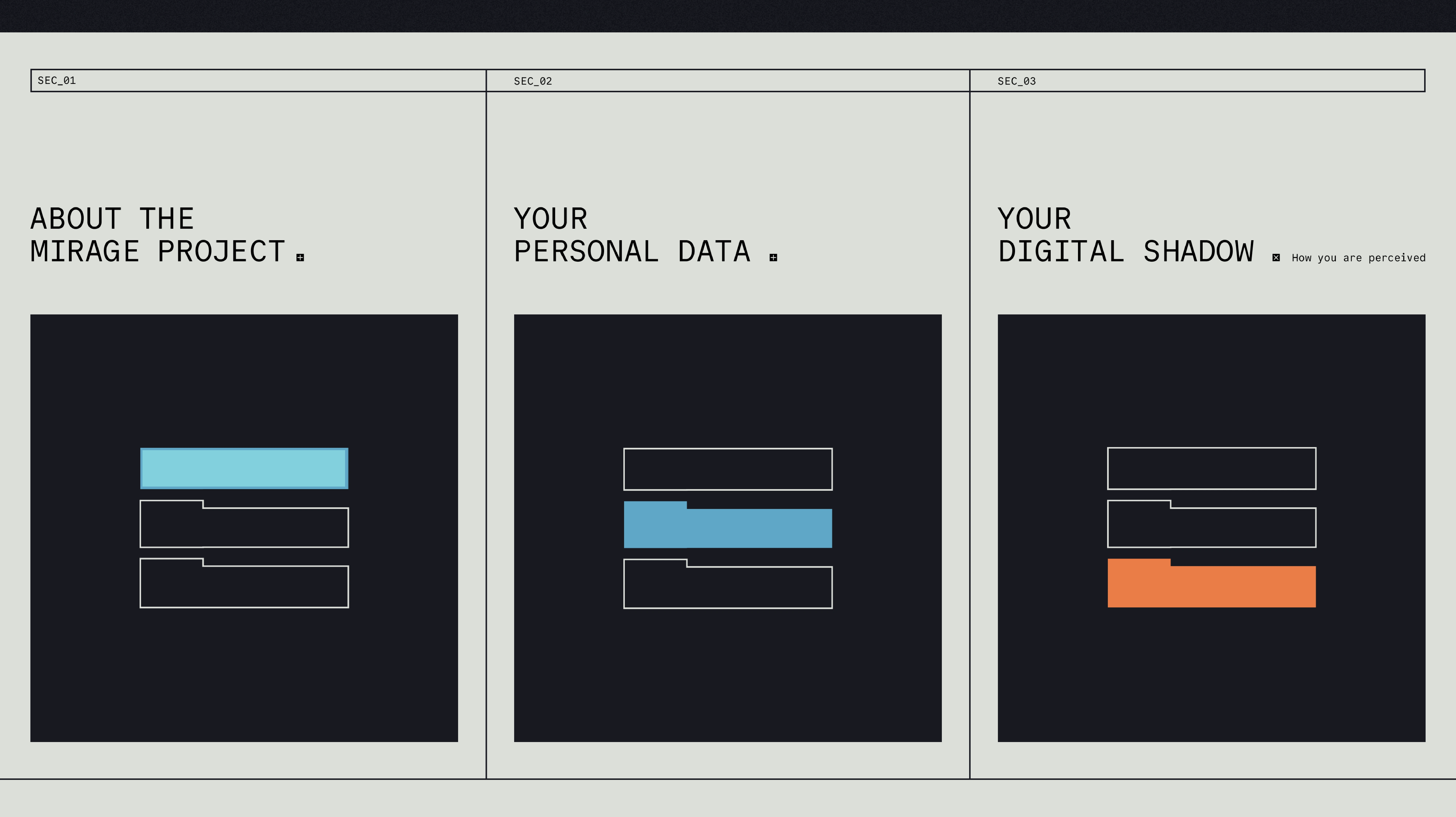
Signpost Section
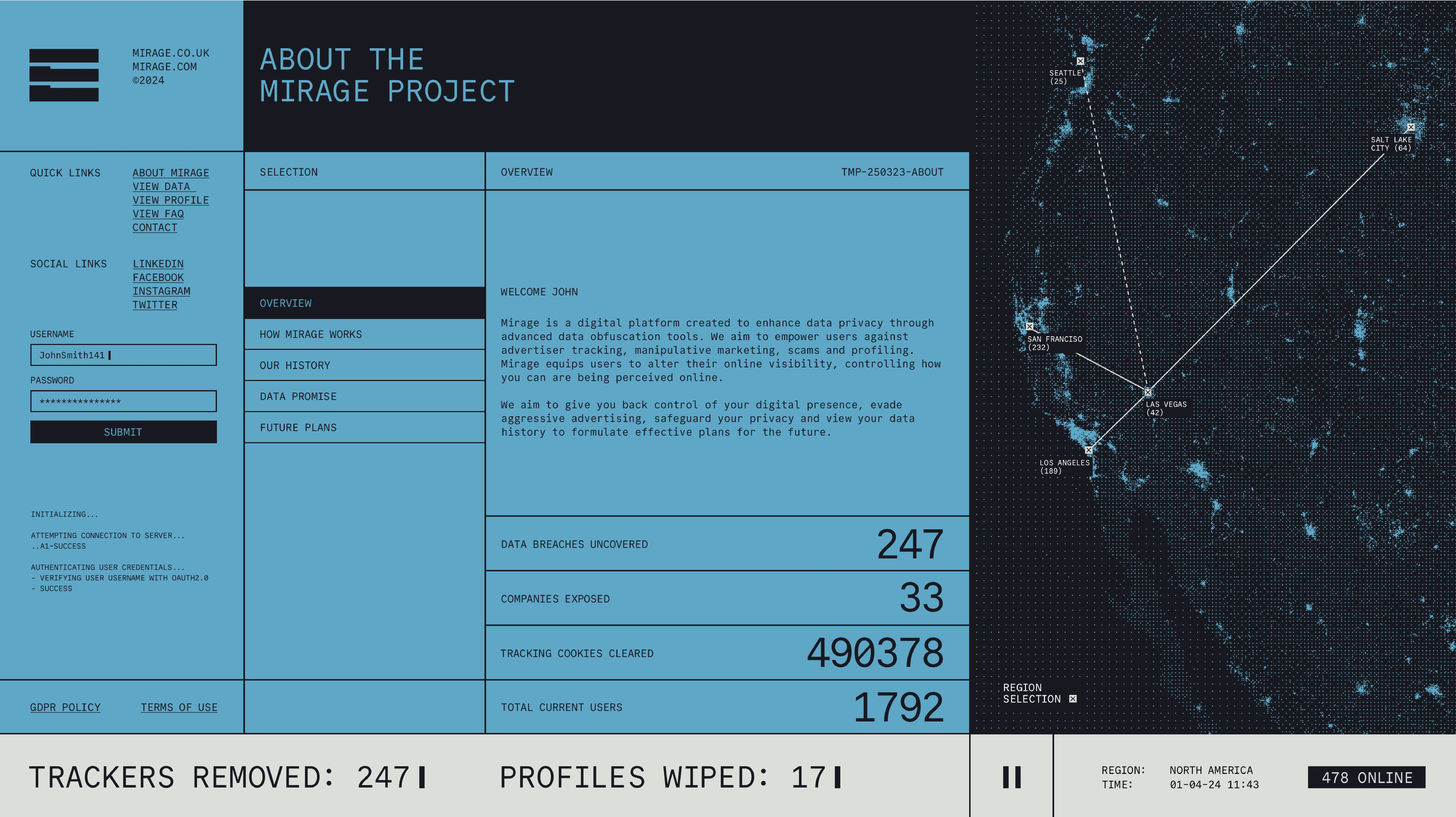
About/Stats Section
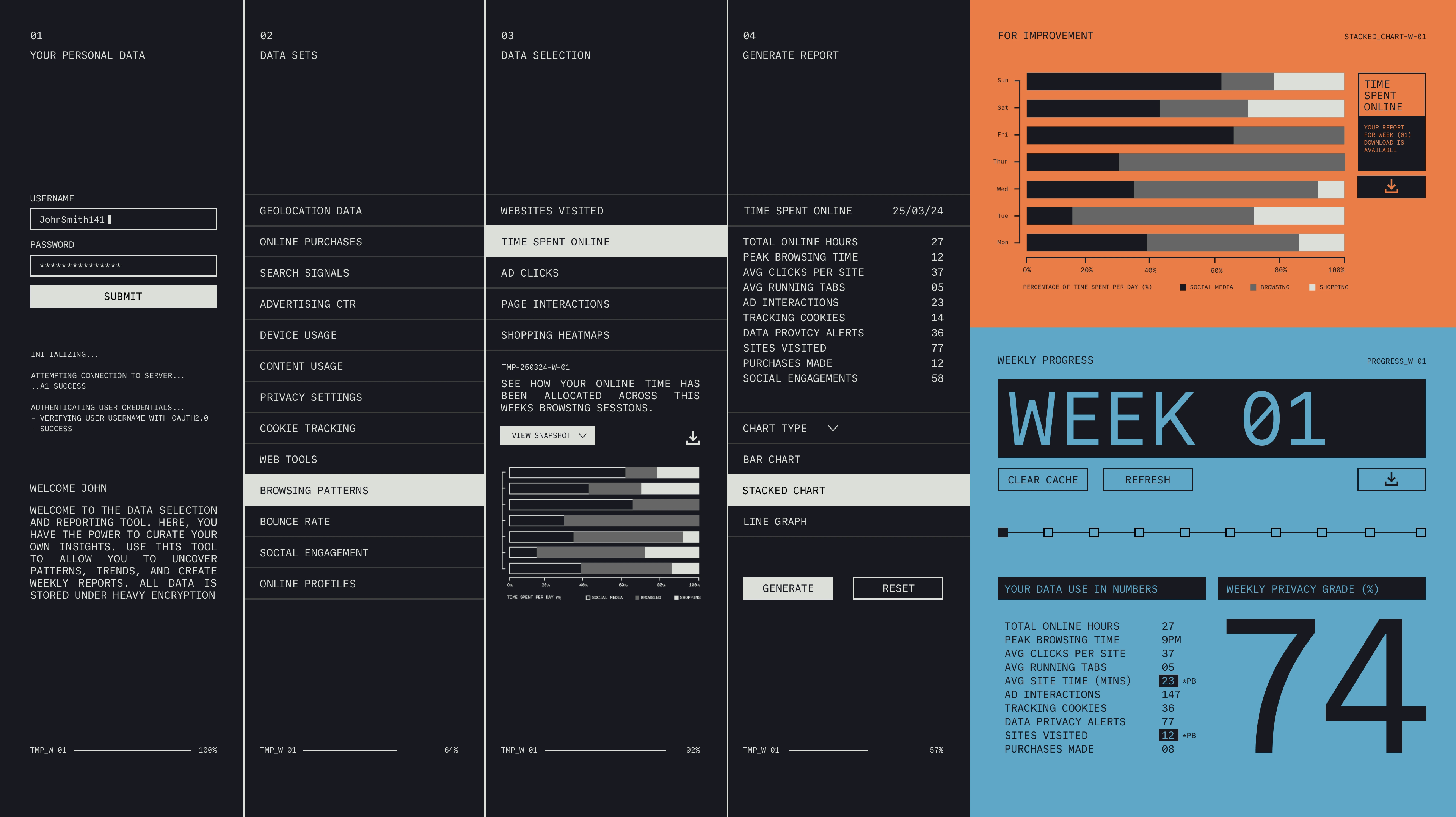
Data Section
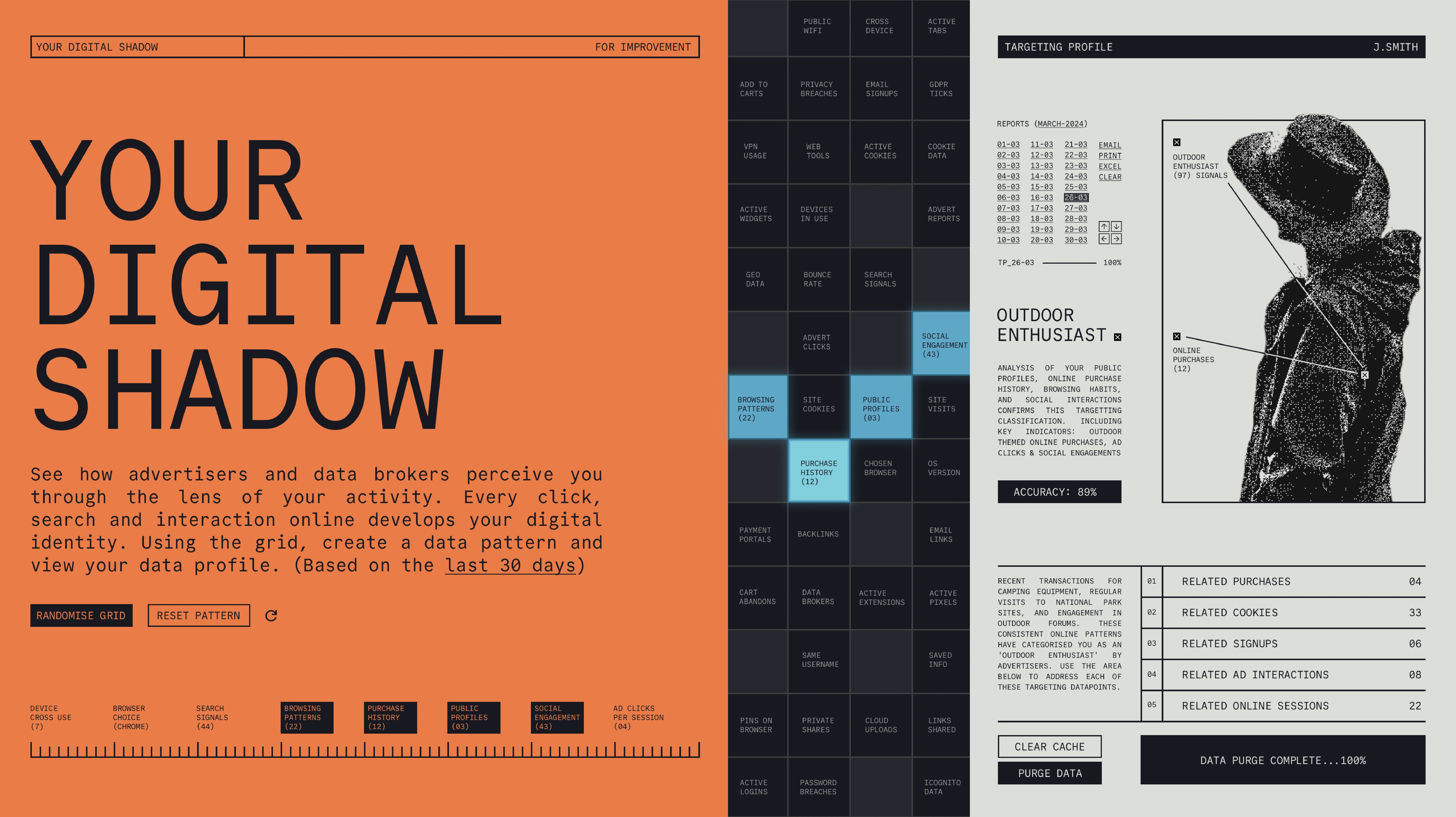
Profile Builder Section
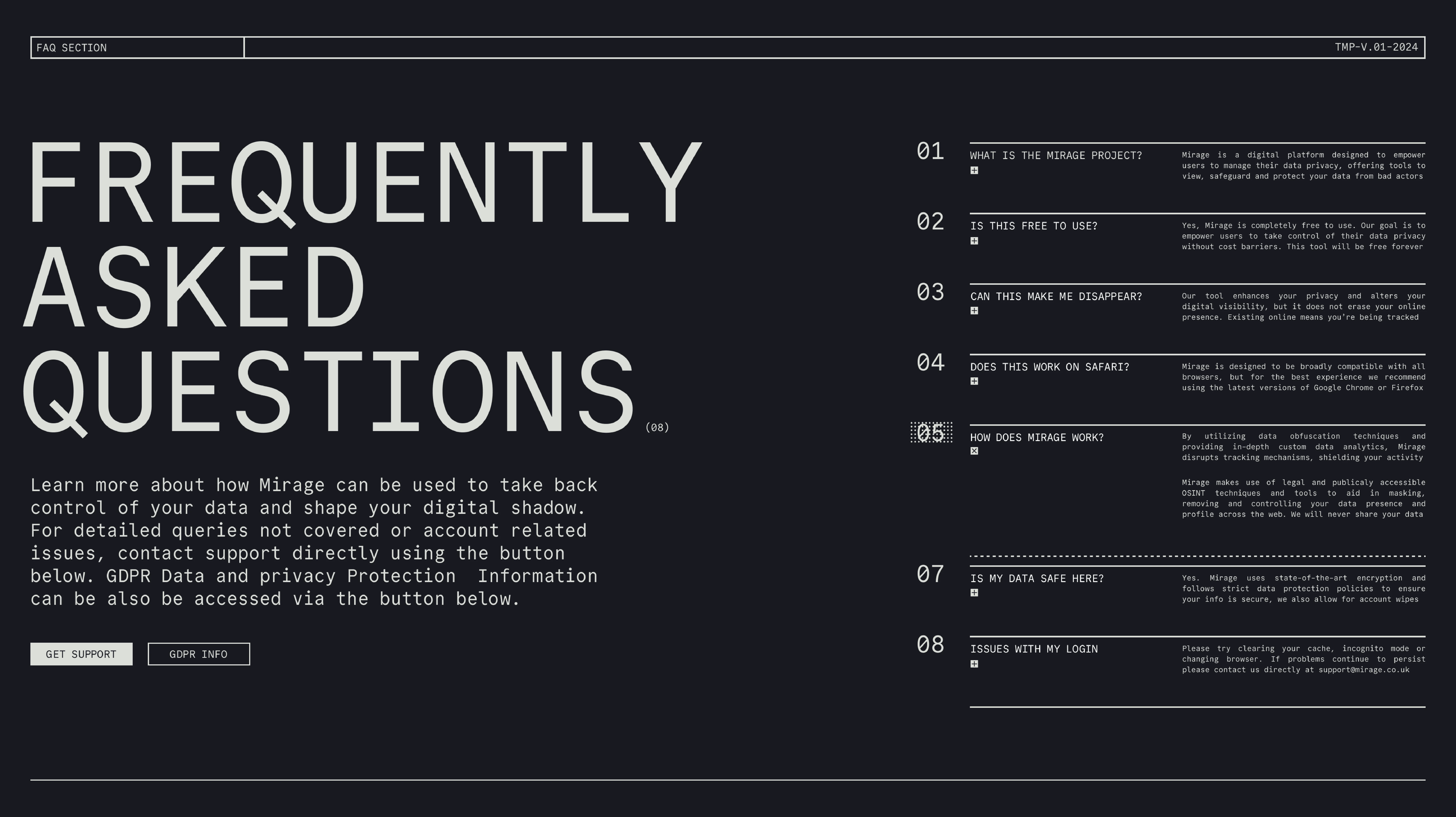
FAQ Section
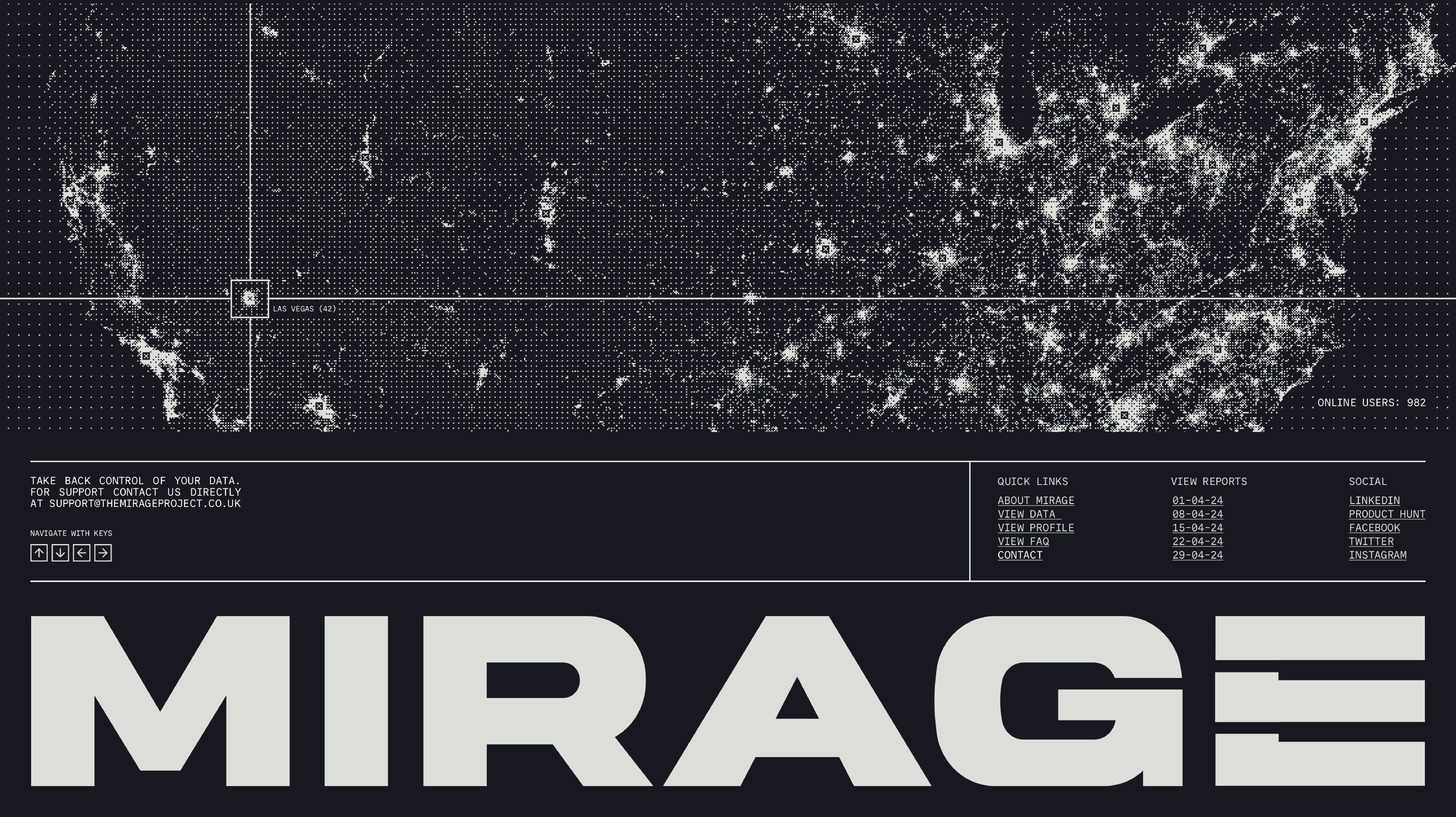
Footer Section
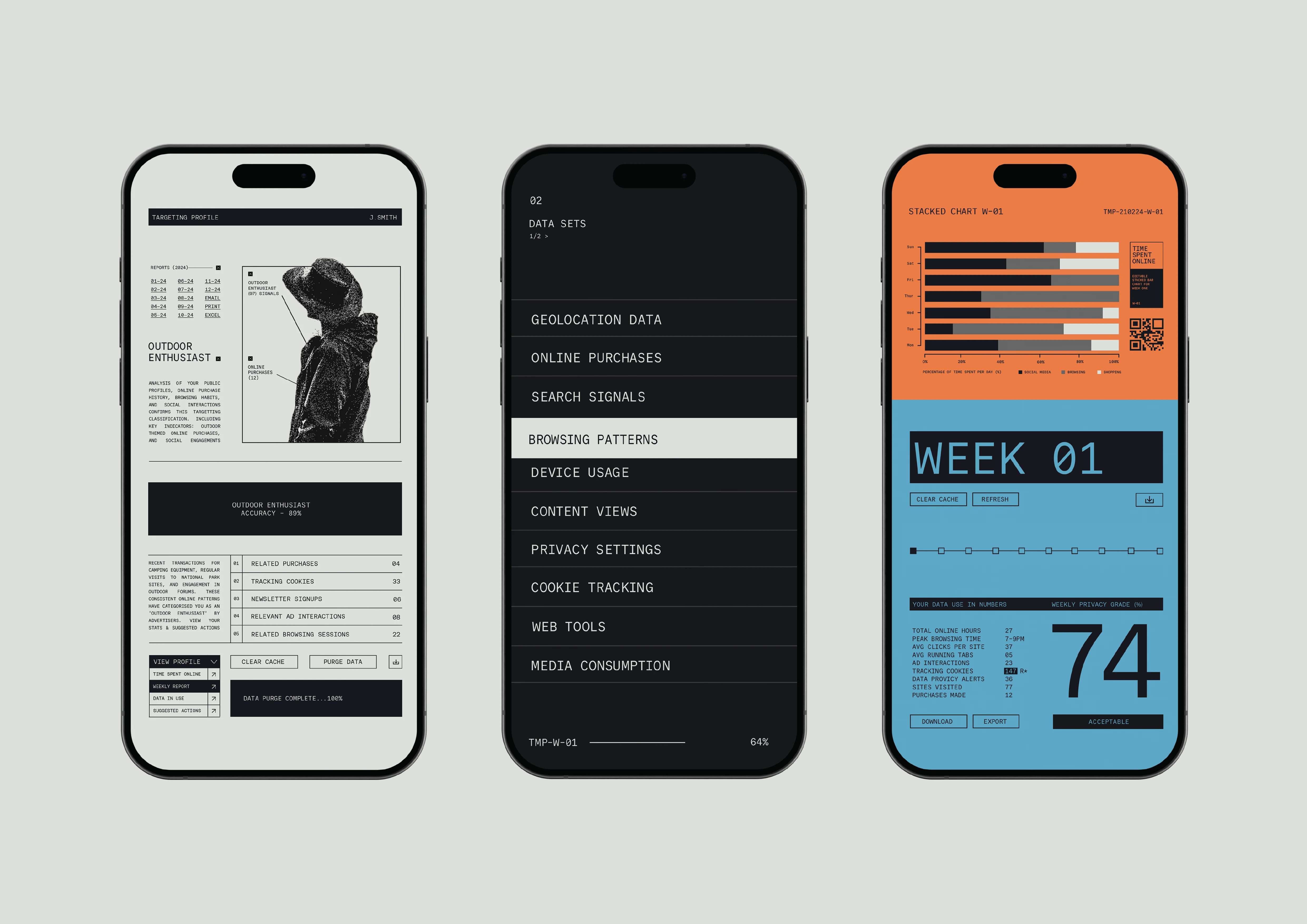
Mobile Previews
Like this project
0
Posted Jul 7, 2024
Website Design for MIRAGE, a tool for managing and controlling data privacy. Visual direction based on old-school interfaces and terminal UI.
Likes
0
Views
1
Tags


Brand Designer
Web Designer
UI Designer

Adobe After Effects

Adobe Photoshop

Figma

