
Branding of Talukder Enterprise
Talukder Enterprise did not begin as a design project. It felt more like a quiet conversation that slowly found its voice.
At first, there was only a name and a purpose. Then came structure. A mark that could carry weight without trying too hard. A logo that feels steady, like something you can trust at a glance. From there, everything followed with intention. The business card became a first impression you would not want to throw away. The letterhead started to speak with clarity instead of formality. Even the envelopes began to feel like they belonged to something thoughtful, not just something functional.
Every piece was shaped to feel connected, not just visually but emotionally. Nothing loud, nothing forced. Just a calm confidence running through it all.
By the end, Talukder Enterprise was no longer just a name on paper. It felt like a presence.
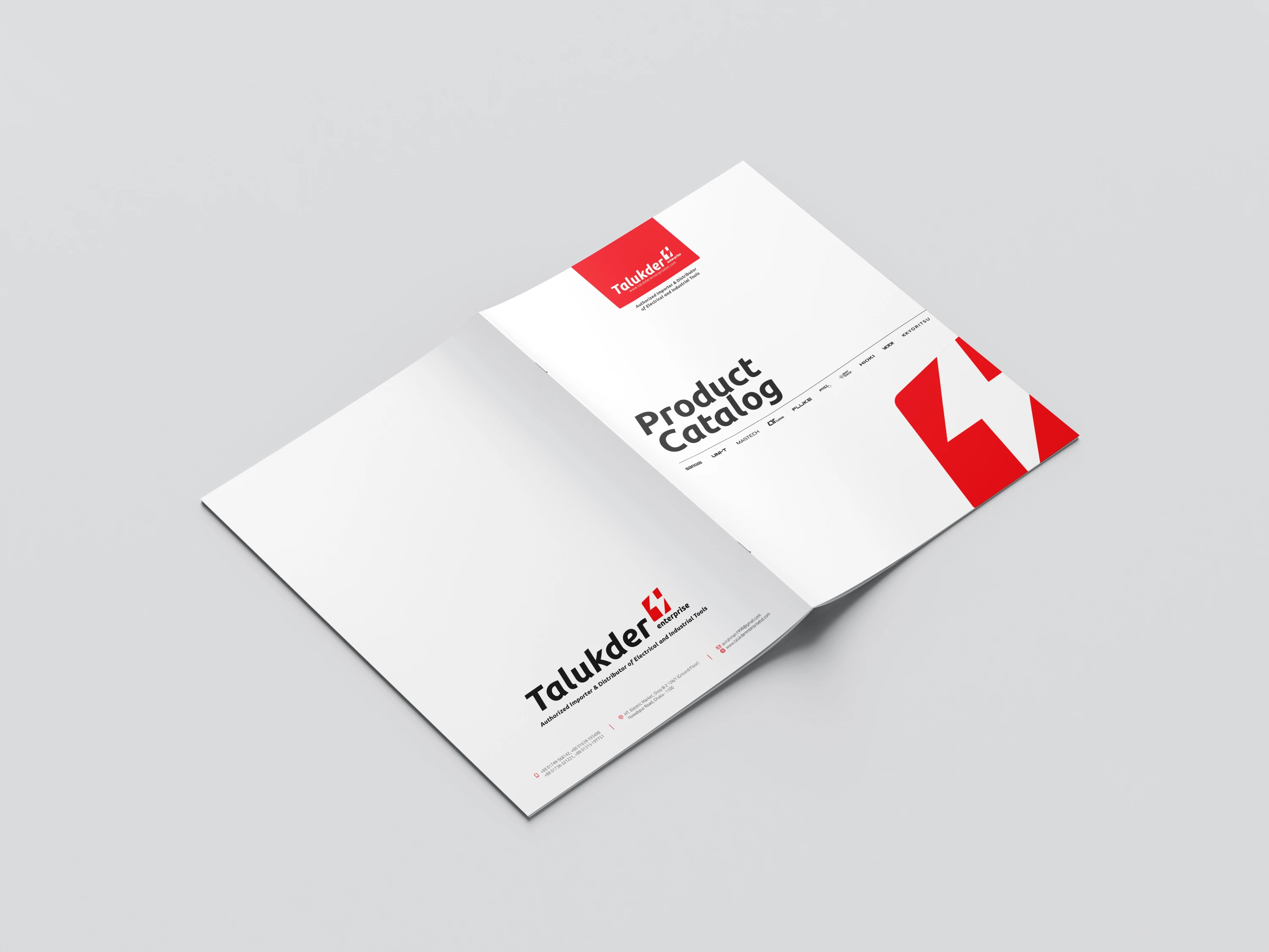
Product Catalog
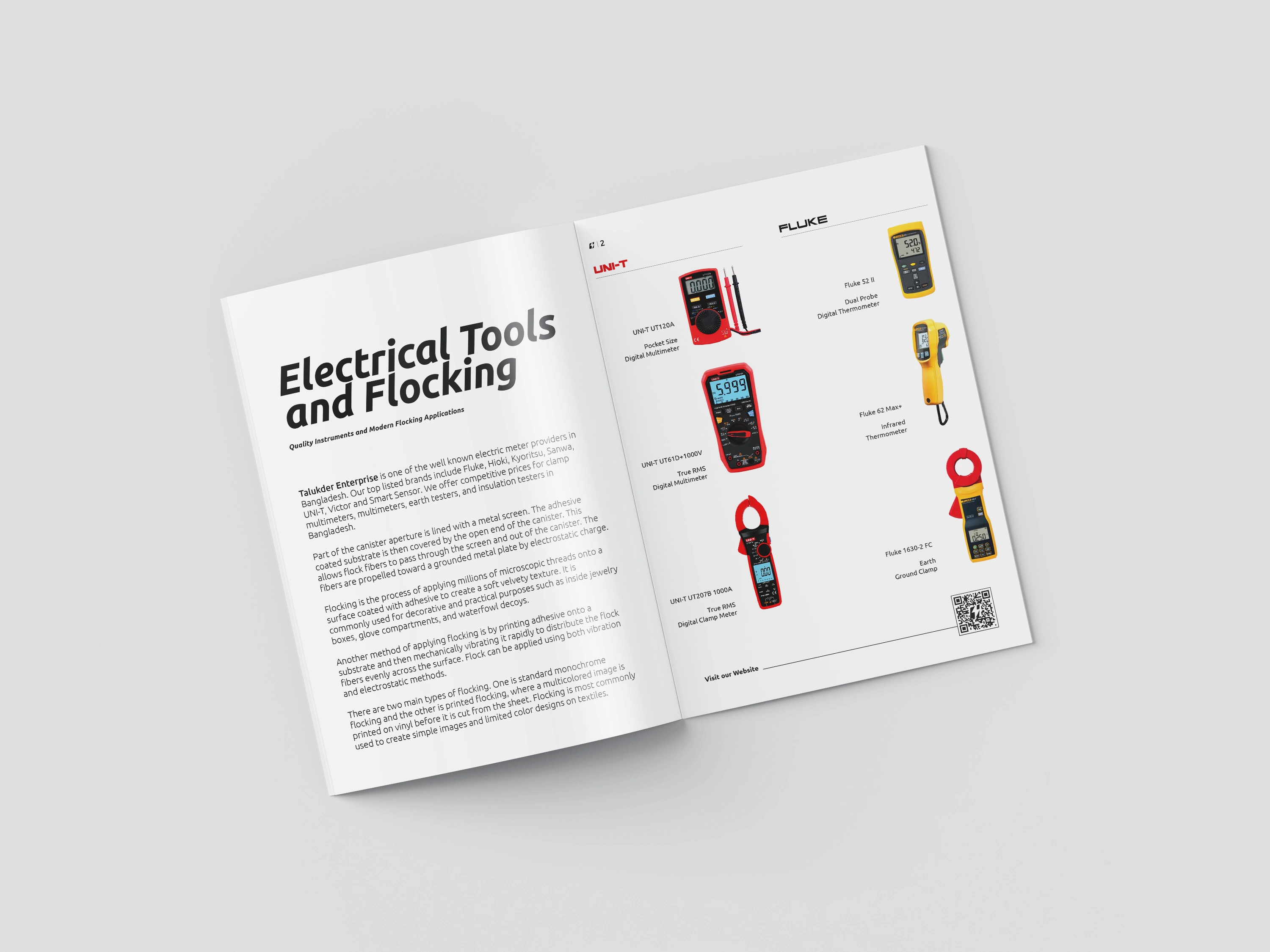
Inside Produce Catalog
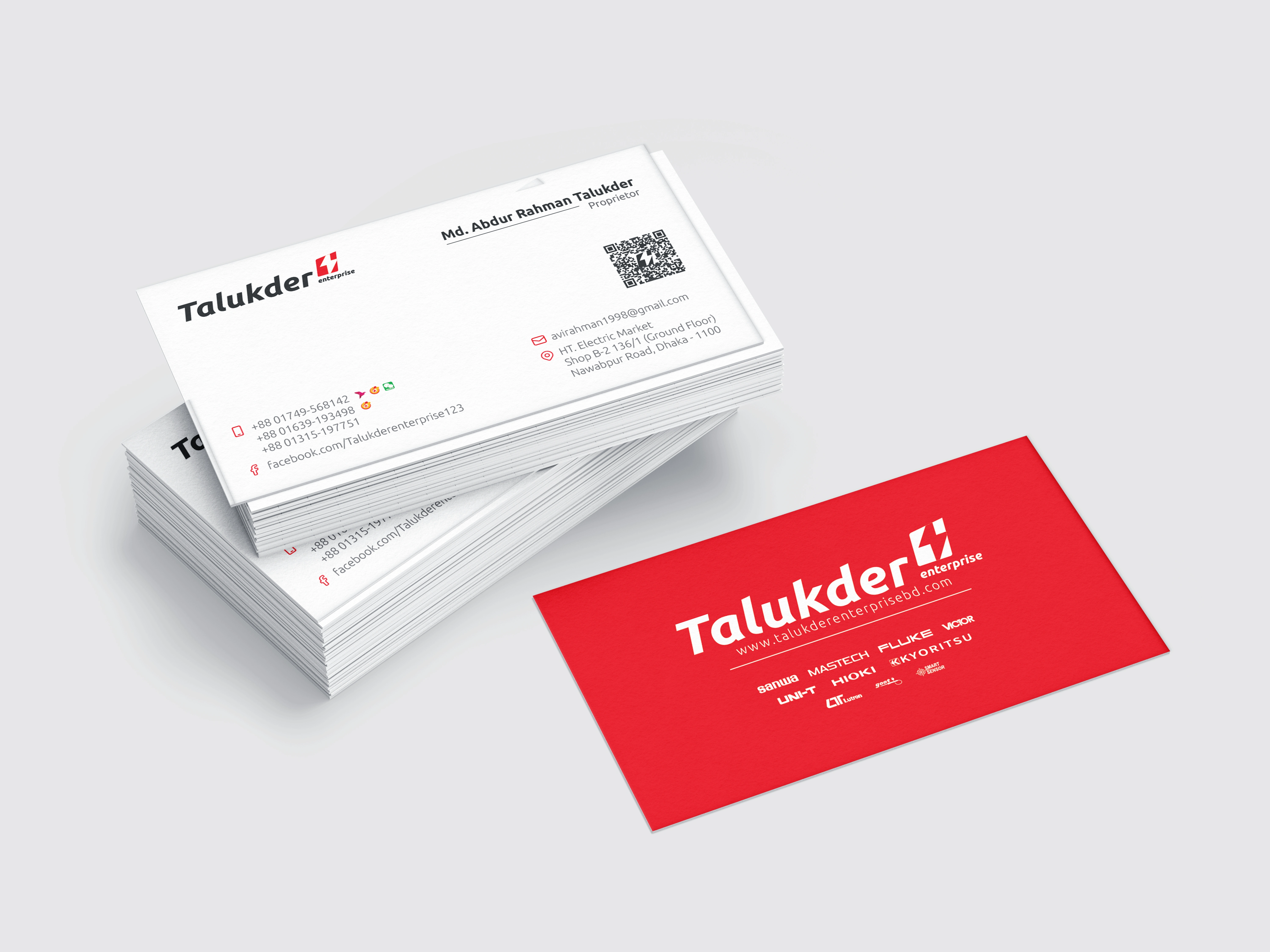
Business card
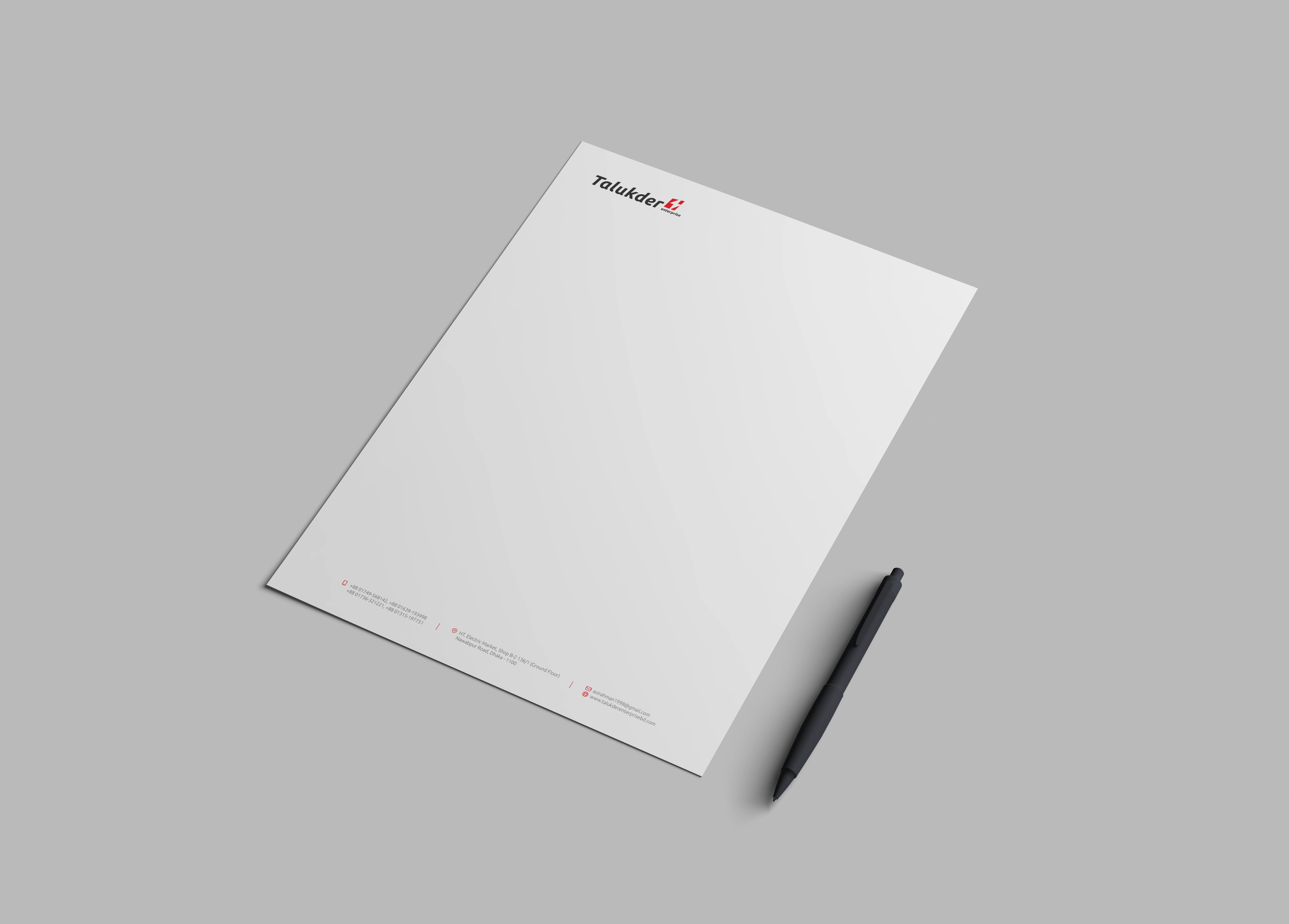
Letterhead
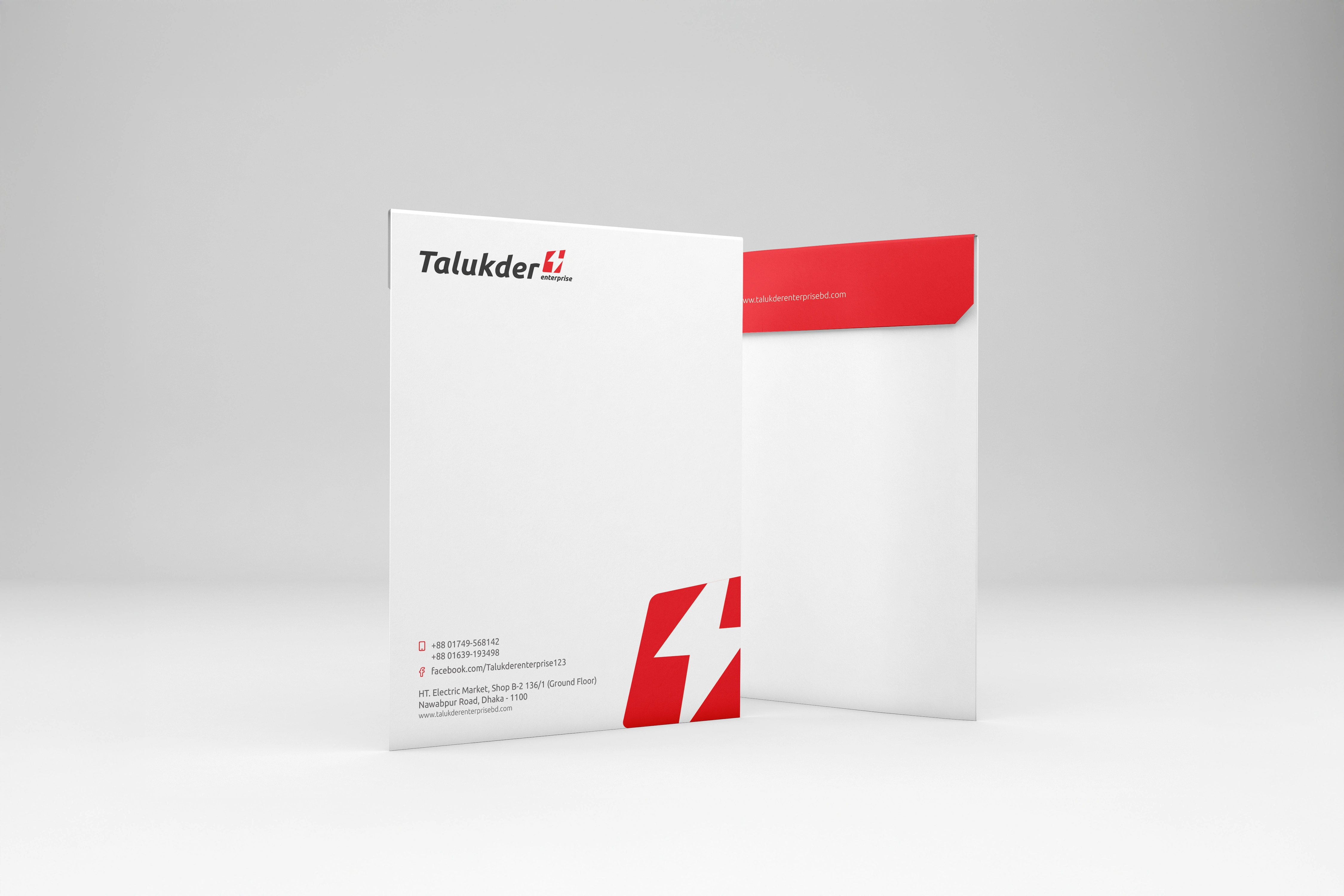
Envelope
0 likes · 5 views · Apr 20, 2026
Created a cohesive brand identity for Talukder Enterprise with a calm, confident design.
Timeline
Feb 7, 2026 - May 10, 2026

