InkJunkeyz / The Tattoo Industry #22

Deryck Vonn Lee


ISSUE #22
The Tattoo Industry Magazine
Ink Junkeyz's The Tattoo Industry came to me with an established publication, a recognizable visual identity, and a growing roster of tattoo artists, models, and personalities. The goal wasn't to reinvent the magazine. It was to evolve it.
The assignment wasn't to replace what existed. It was to make it better.
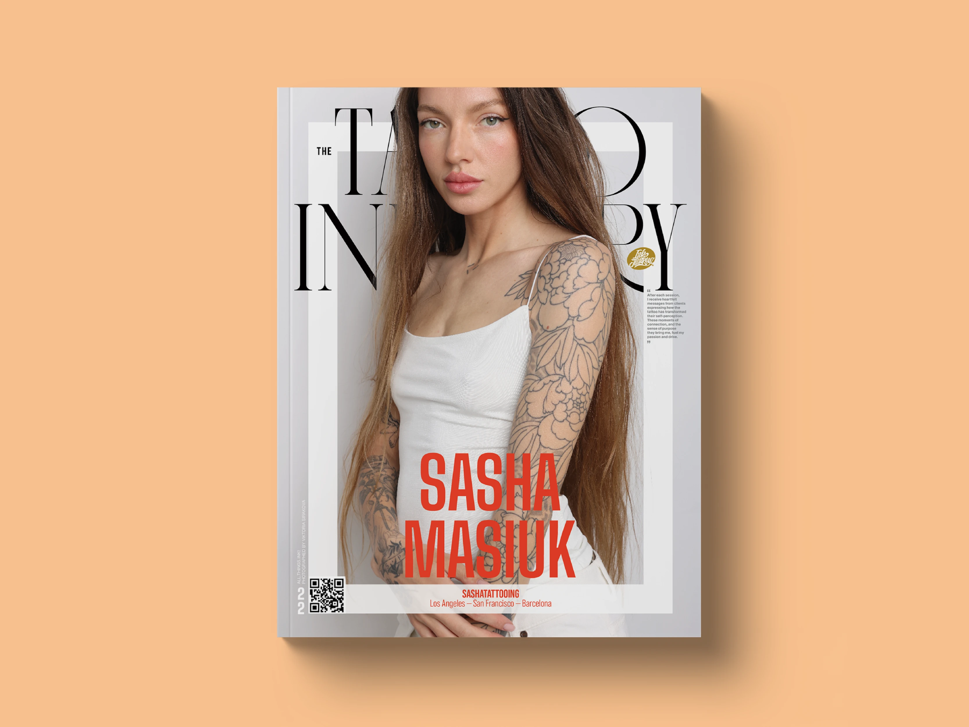
I art directed and redesigned the magazine around a more flexible editorial system, improving readability, strengthening the visual hierarchy, and giving the photography greater impact while retaining enough of the existing identity to keep the publication familiar to its audience.
EVOLUTION, NOT REINVENTION
The publisher wanted the magazine to feel more polished without suddenly looking like a different publication. Maintaining continuity in its core visual identity was important, particularly for contributors who had seen previous issues and wanted to be part of the magazine they already recognized.
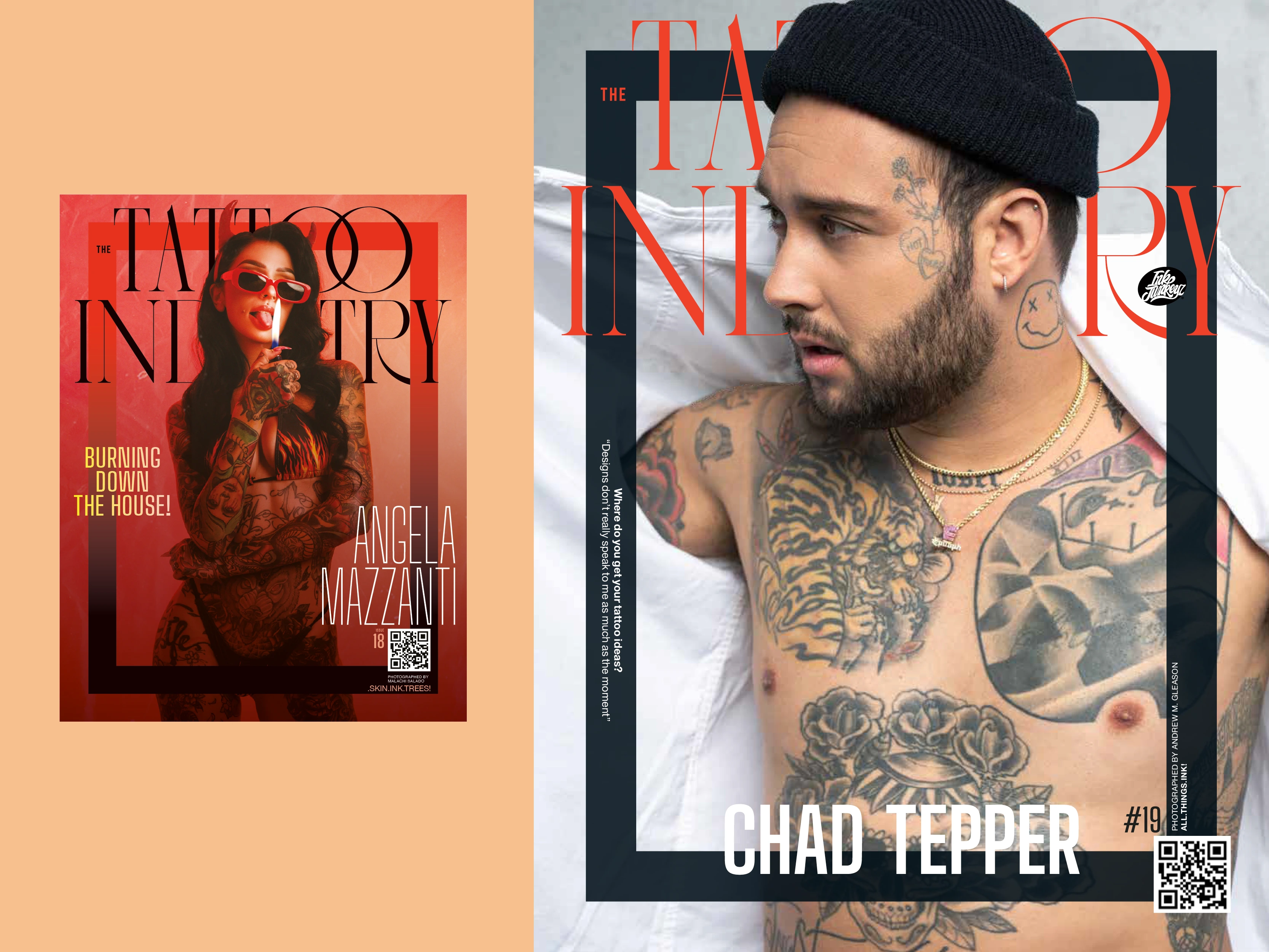
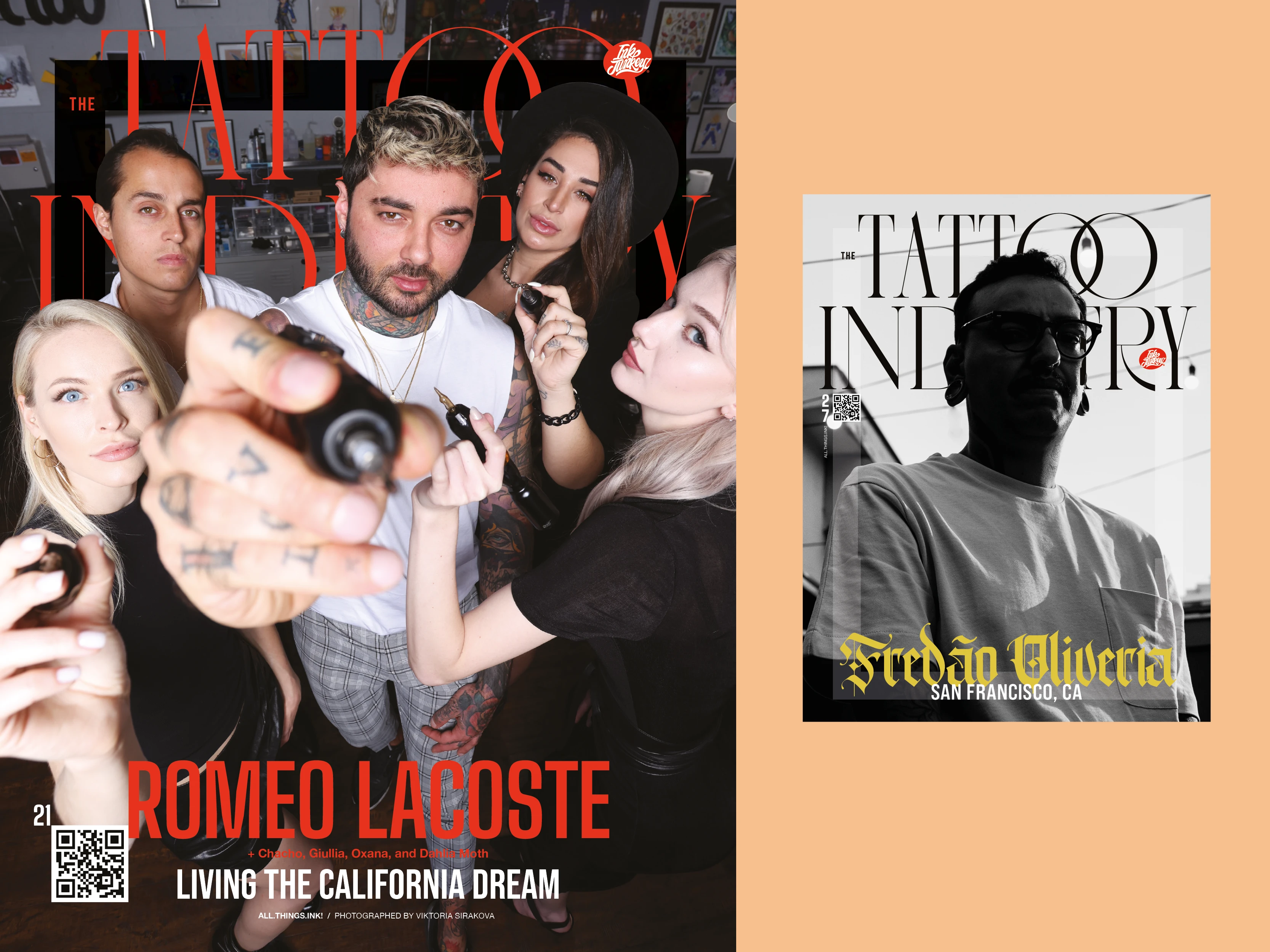
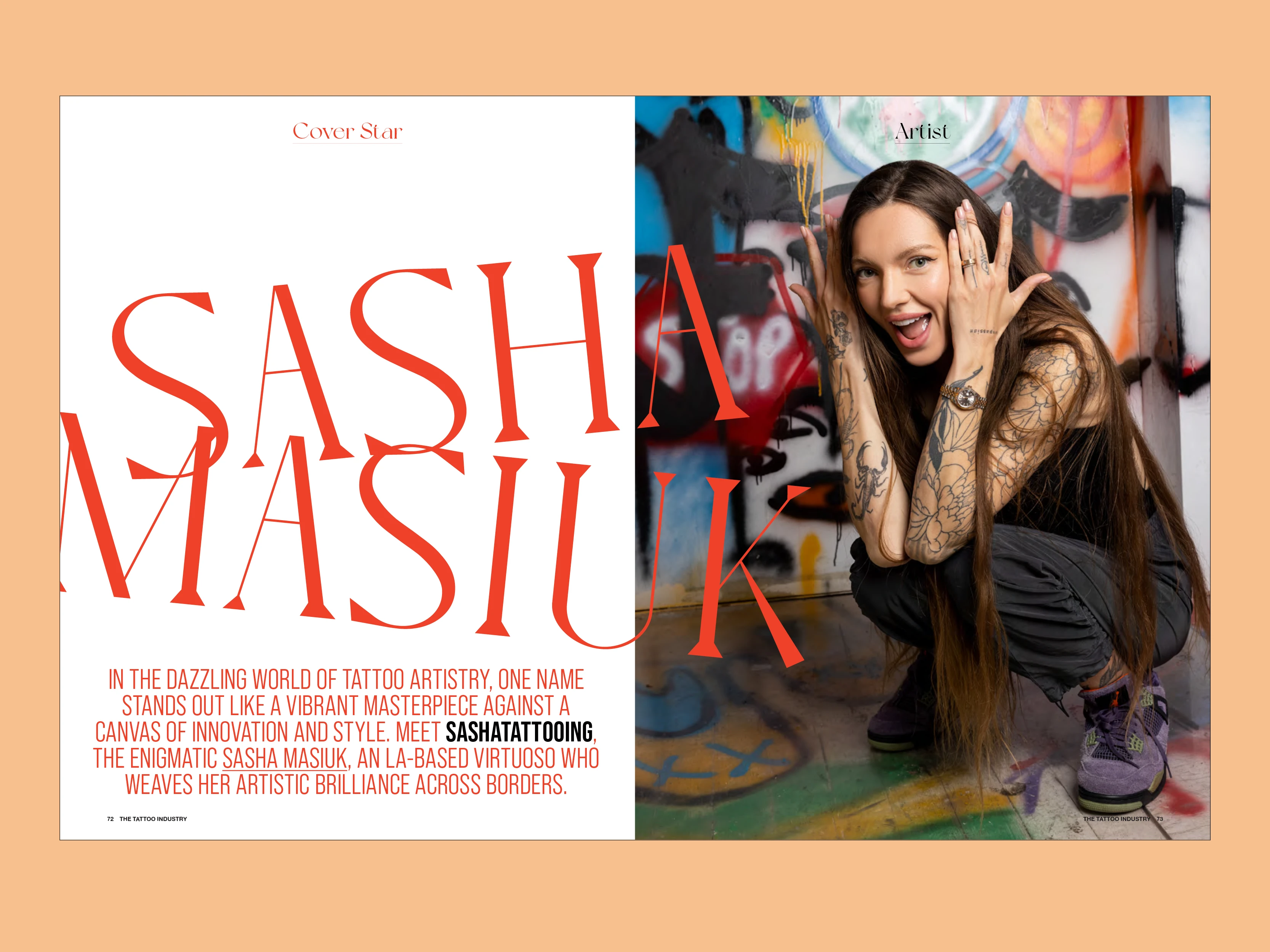
I proposed evolving the existing design rather than starting over, preserving recognizable elements while rethinking typography, pacing, hierarchy, and the relationship between image and text. The goal was to give the magazine a stronger editorial presence without stripping it of its personality.
PROVING THE DIRECTION
Before committing to the redesign, Raymond gave me photography and interview material from a previous issue and asked me to show him how I would approach it.
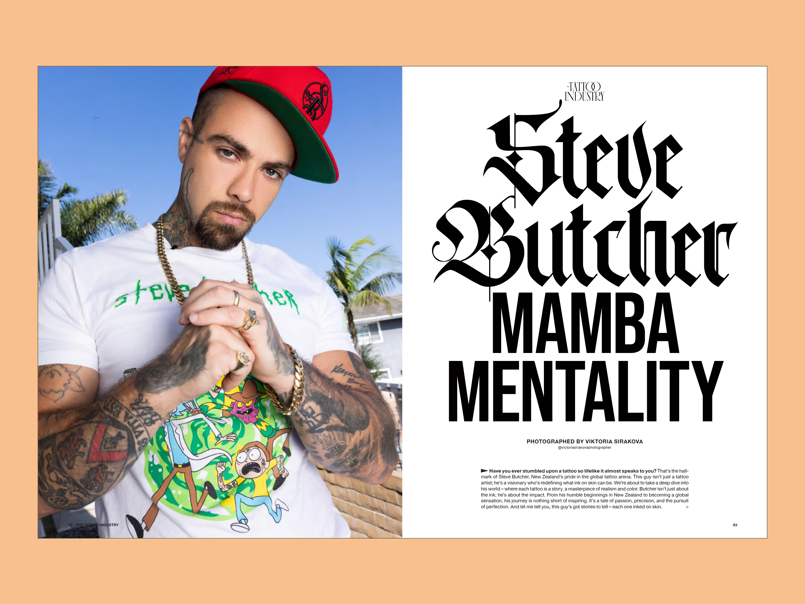
I redesigned an existing interior feature and explored multiple cover directions rather than presenting a single solution. That first round let us test how far the visual language could move while establishing a range broad enough to accommodate very different subjects from issue to issue.
The interior direction was approved immediately. After reviewing the complete cover exploration, Raymond was ready to move forward with the magazine.
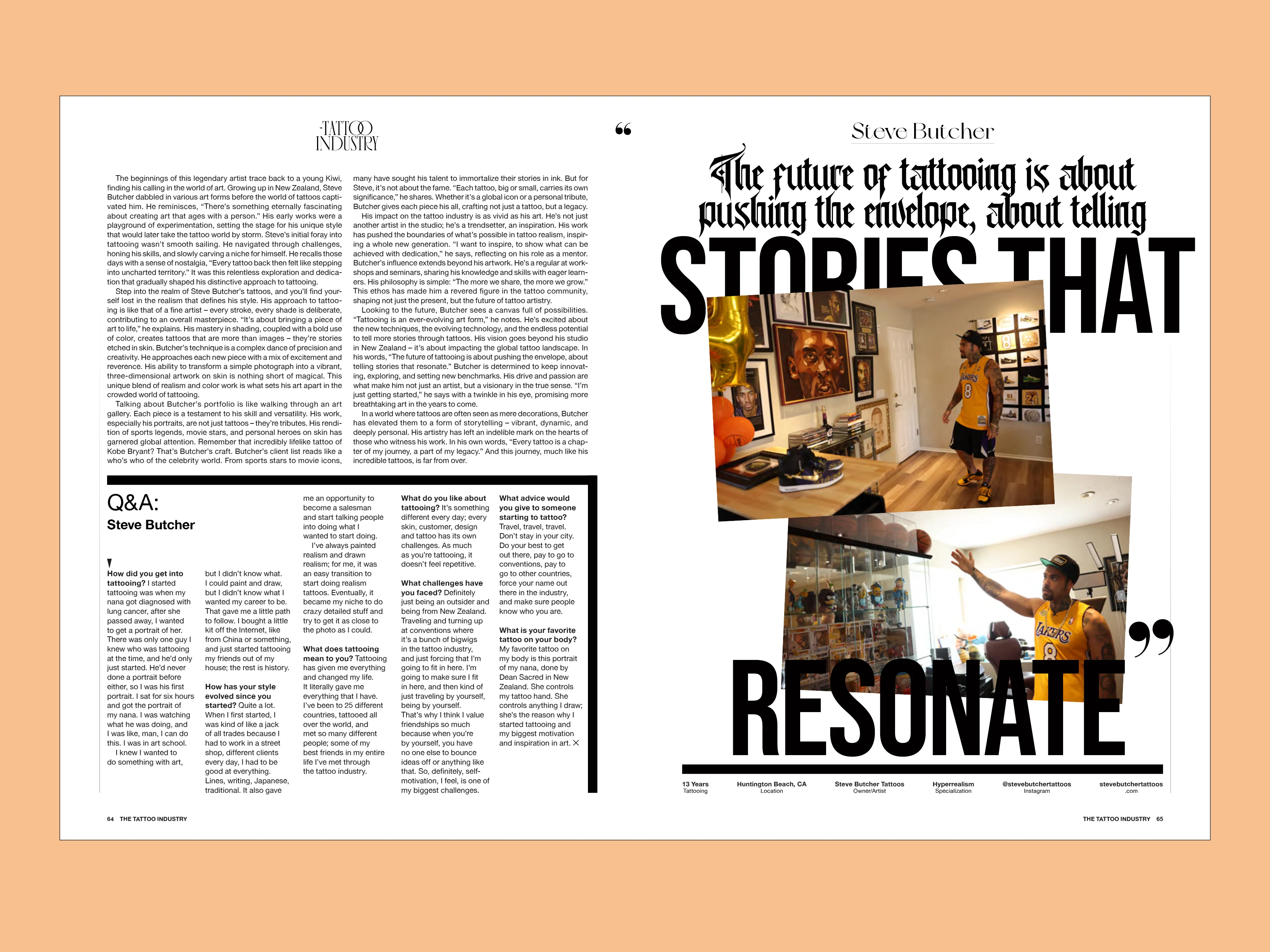
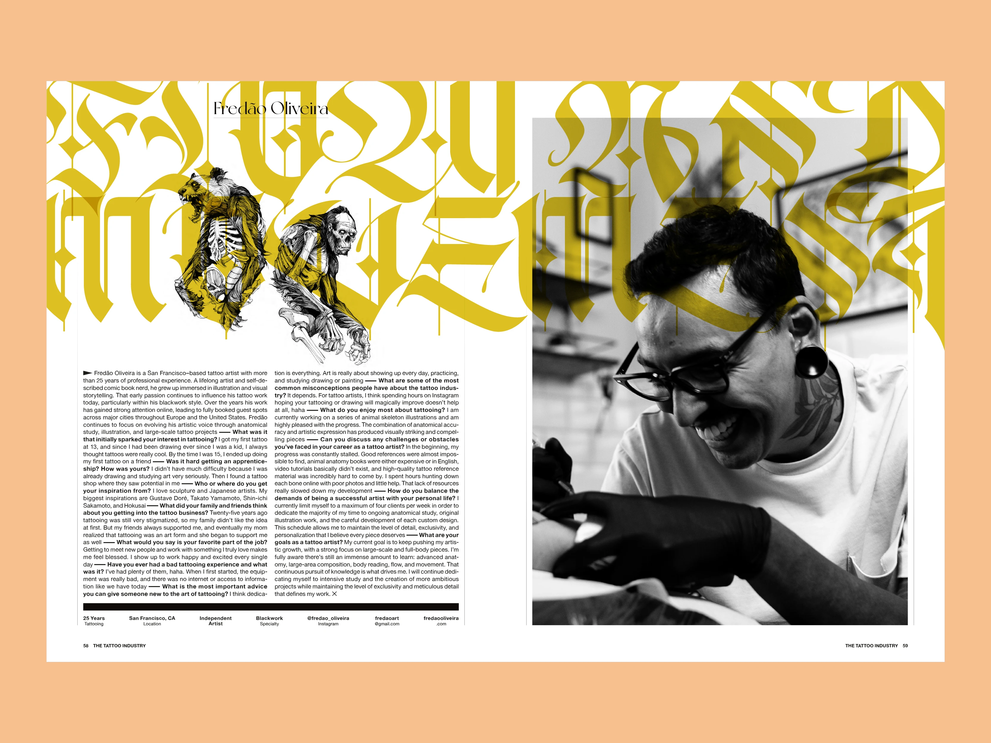
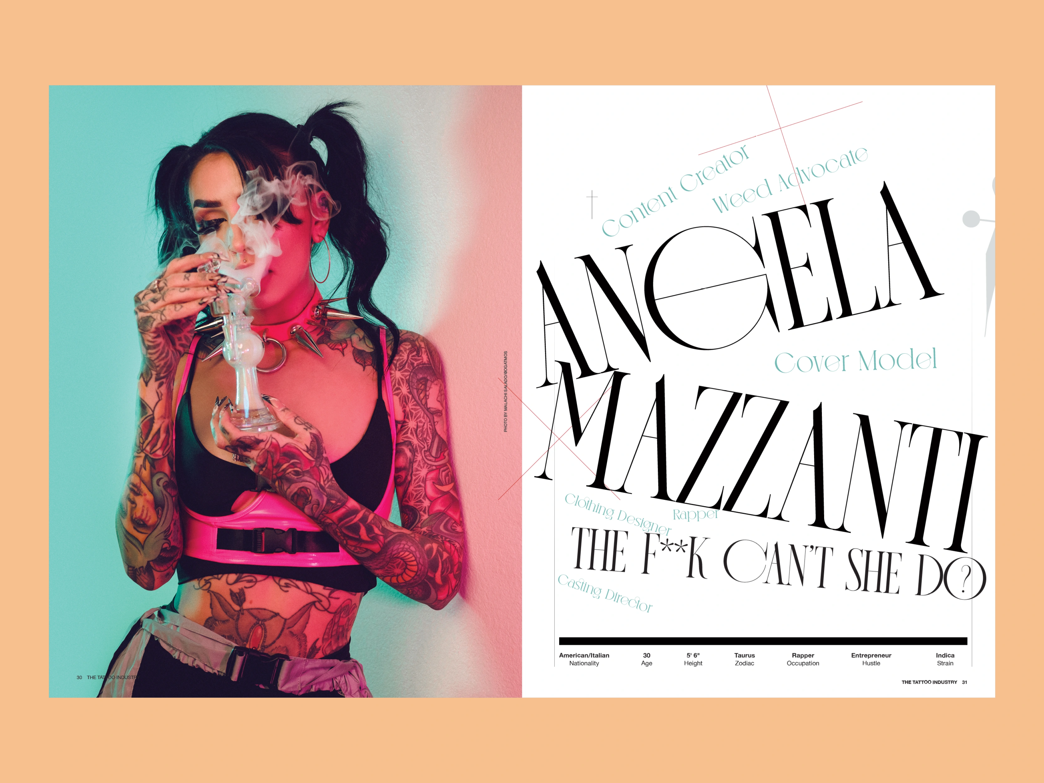
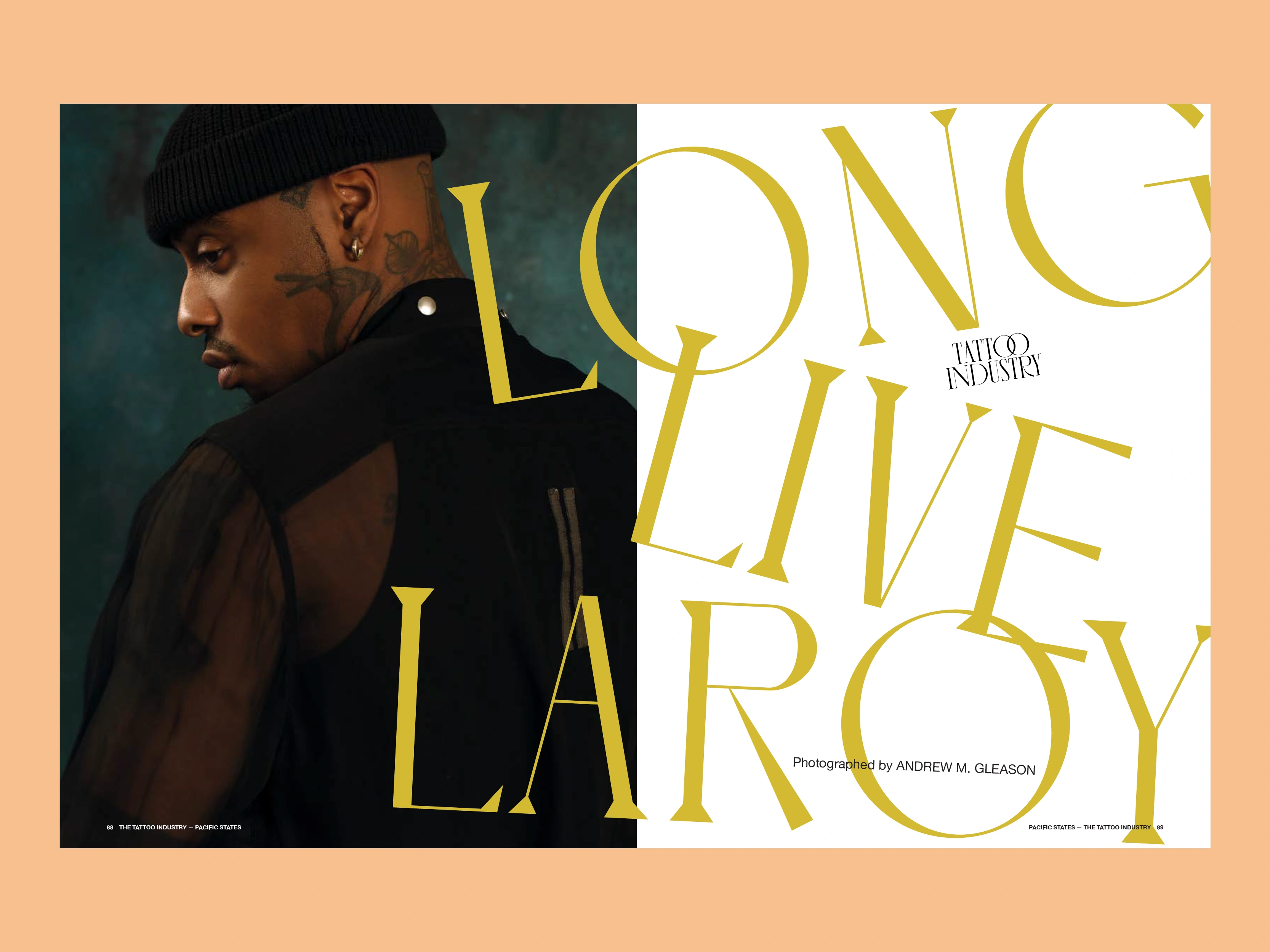
LETTING THE PHOTOGRAPHY LEAD
The magazine had access to strong portraiture, tattoo photography, and contributor imagery. The design needed to support that material rather than compete with it.
I built layouts that could move between large photographic moments and denser interview content, using scale, cropping, typography and negative space to give each subject an individual presence while maintaining a recognizable editorial rhythm across the publication.
That flexibility was particularly important because each feature arrived with different photography. The system couldn't rely on receiving the same kind of image every time.
BUILDING VARIETY INTO THE MAGAZINE
A recurring publication needs consistency, but repeating the same spread structure issue after issue quickly makes that consistency feel like a template.
I developed a visual vocabulary that allowed features to change in composition, scale, and emphasis while retaining common typographic and structural cues. Covers could respond to the personality and photography of each featured subject, while interior stories could move between quieter interview pages and more expressive, image-driven layouts.
The result was a system designed to generate variety rather than eliminate it.
A SYSTEM BUILT FOR THE NEXT ISSUE
What began as a paid design test evolved into an ongoing publication relationship. The redesigned system gave The Tattoo Industry a stronger foundation for producing future issues while leaving enough flexibility for new personalities, photography, and stories to continually shape the magazine's character. The publication was planned on a bimonthly schedule as the engagement progressed.
Like this project
Posted May 26, 2023
Rebranded a bimonthly publication, incorporating a fresh modern design and photographic aesthetic.