Design System for Healthcare
Before we dove into the first project with a healthcare company, we began work on a small design system to help us manage styles and components across projects. The goal was to start in Figma, and then extend to a front-end component library in Vue powered by Storybook.
This healthcare company had no real consumer-facing digital products outside of the barebone apps, so it was time to establish how future products might look and feel going forward. The end-users of the digital products are healthcare providers, lawyers, and clients, so the look and feel of the interface had to look trustworthy and professional. We started with the typography and color palette to complement our branding and marketing style.
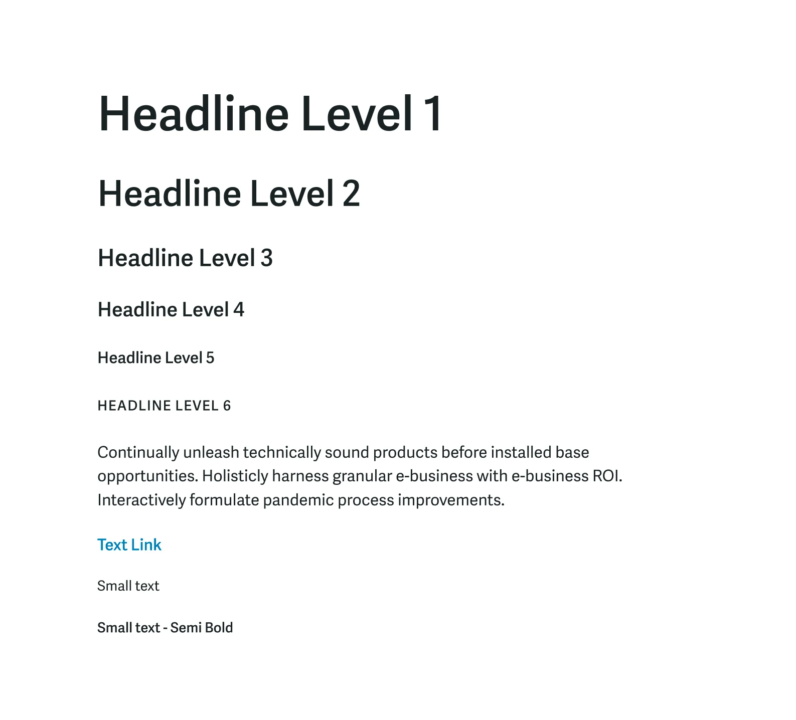
Type scale
We went with Adelle Sans for its great legibility at smaller sizes and its range of weights. It had just the amount of extra personality in a sans serif we wanted, and it complemented the logotype’s Eurostyle font well.
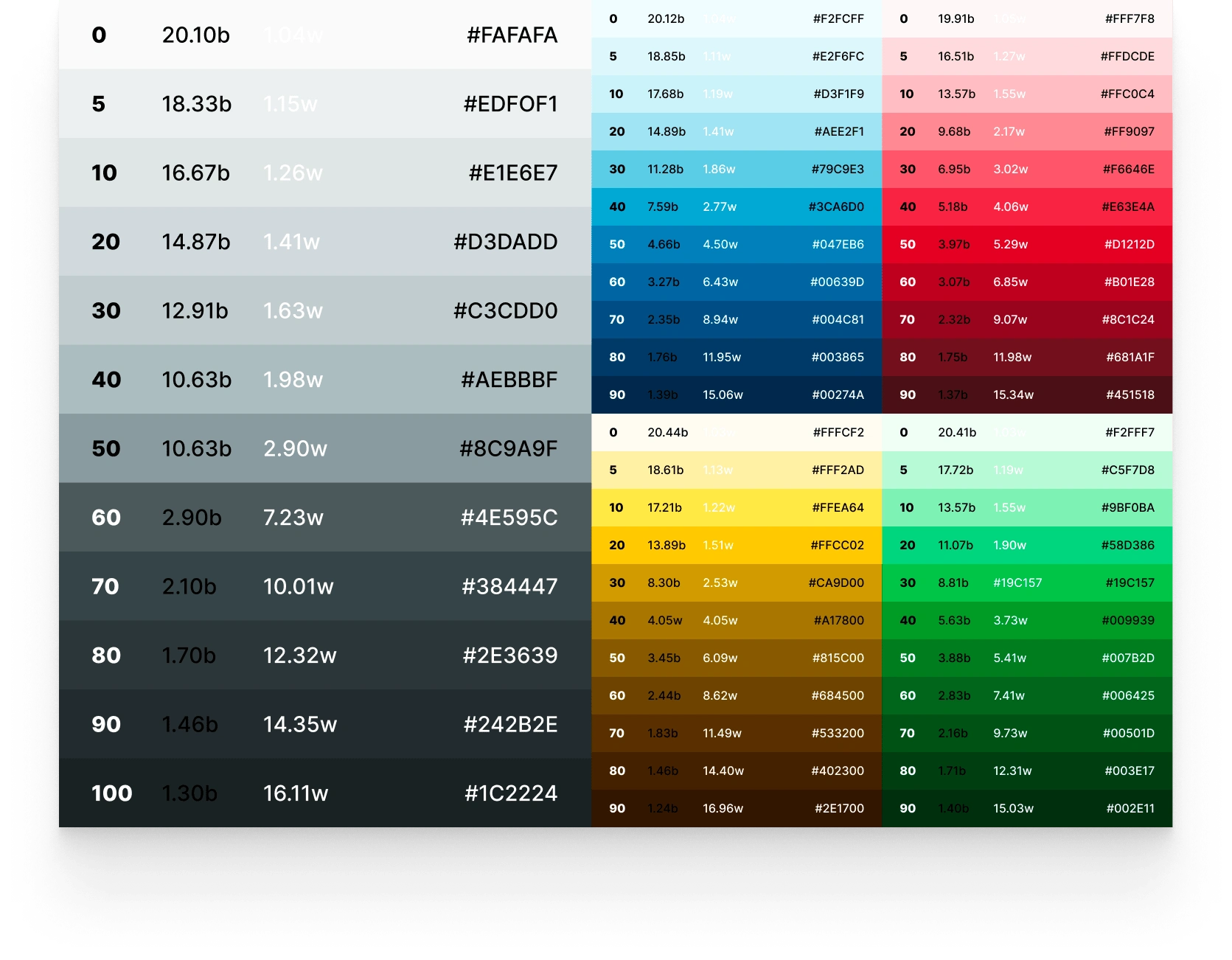
Color scales
For the color system, we started with a base color of
#047EB6, a value close the blue in the existing logo that has a passing AA Large contrast with white text. This is what would become the blue-50 of the pallet. We then leveraged Colorbox to help build out the other hues and values for the system. For the colors outside of the grays, we set the 50 levels to be able to have white text over them with AA Large contrast. That way it was easier to pair font colors with background colors without having to measure contrast every time.For the neutrals, we went with a slightly cooler hue to match our blue accent color. The neutral palette has 1 more shade than the other colors because we often find that we need a larger range of grays for background, border, and text colors. The easing of the neutral shades moves much faster through the middle tones, which gives me smaller steps of the lighter and darker ends to work with for subtle contrast between elements.
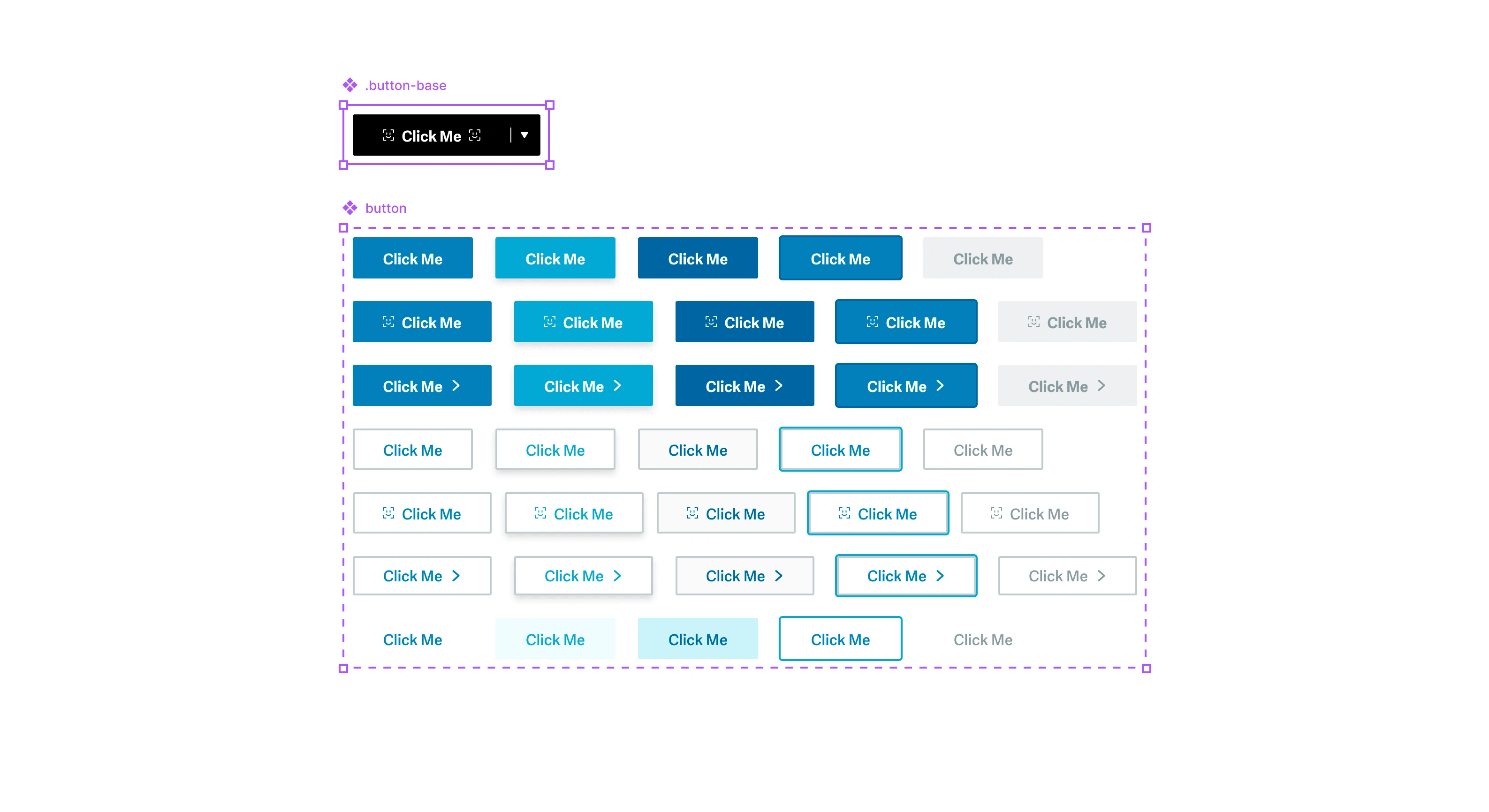
Button component structure in Figma
Since we didn’t know what components we were going to need for the first project, we started with some primitive ones. This established some of the styling upfront and gave us a foundation build from. The plan after that was to expand upon and add to the component library as needed while designing the products. The button component came first, followed by inputs.
For the component structure in Figma, we started with a base component that the rest of the variants were built from. For the button, this meant including icons on both sides and a split button section.
Since the first minimal version, we added modals, alerts, and more as needed while building out the products. Building components “just-in-time” proved to be the right approach. Starting with a very minimal system upfront helped us build the first project quicker and with more consistency, and we didn’t waste time speculating what components we were going to need in the future.
The system in use
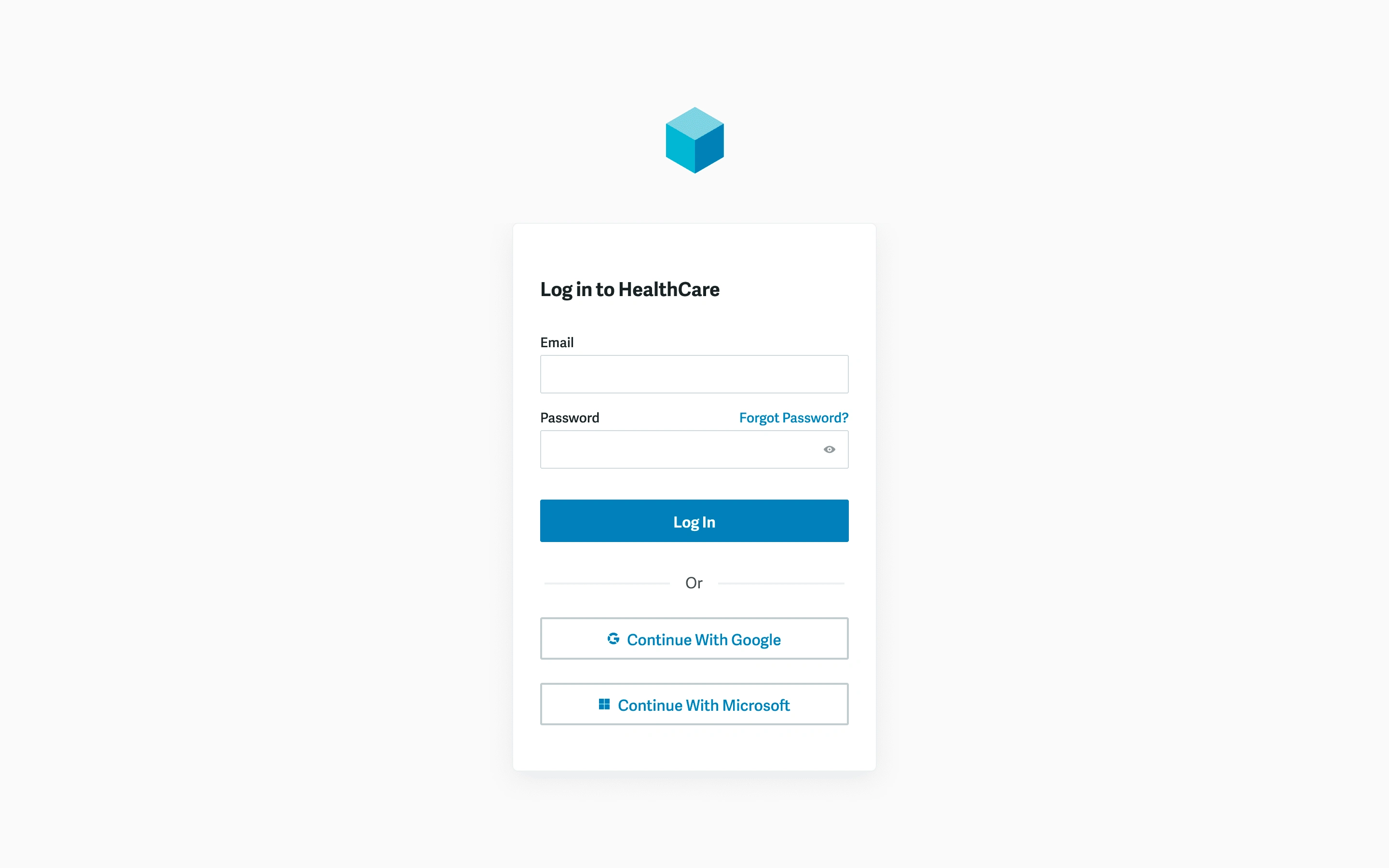
Login screen
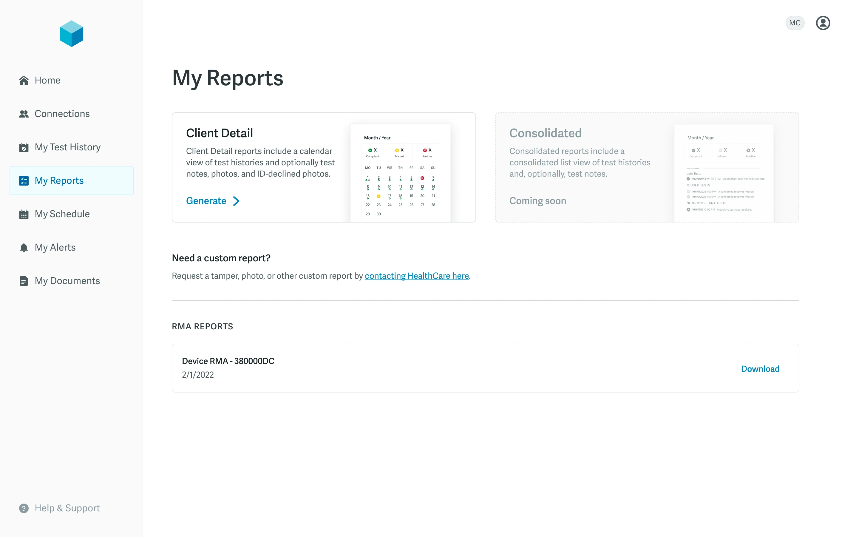
Reports
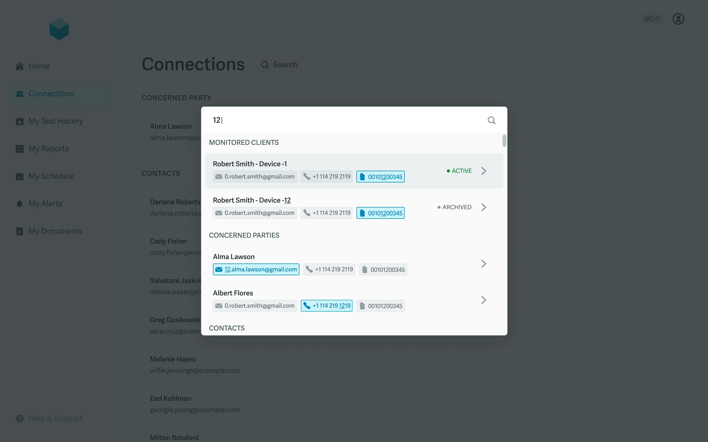
Command center search
Like this project
Posted Nov 29, 2024
A minimal, flexible design system used to accelerate design and development for a healthcare company's first consumer-facing web app.
Likes
0
Views
8
