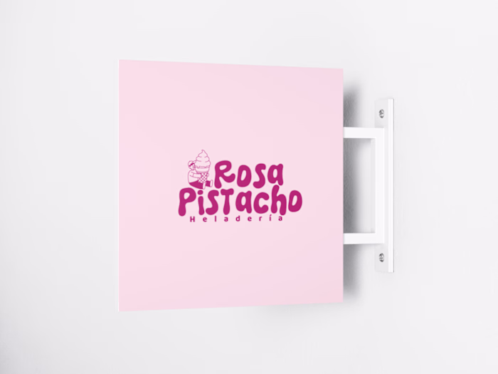
Rosapistacho Heladería
María Díaz
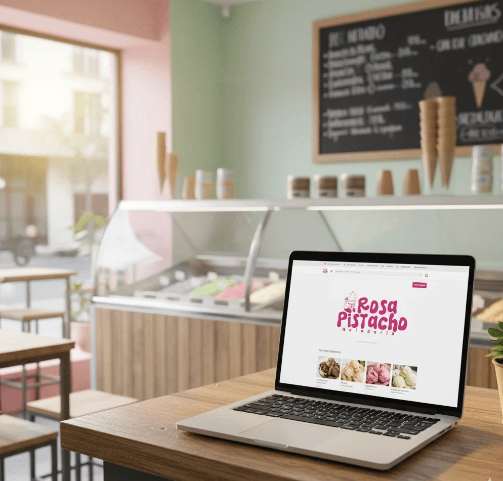
Rosapistacho Heladería
Full brand identity built from scratch for an artisan ice cream shop in Ibagué, Colombia — designed to connect with families, celebrate local flavors, and turn every visit into a memorable experience.
Type
Portfolio Project
Client
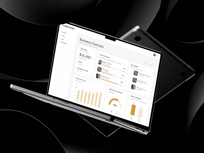
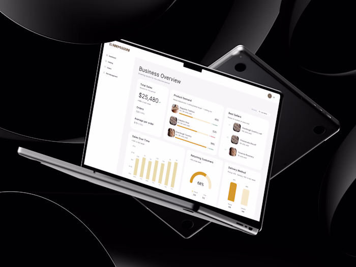
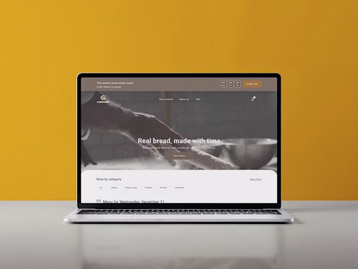
El Hormiguero
Role
Graphic Designer
Tools
Illustration, Notion
Challenge
The client came with a clear vision: open a different kind of ice cream shop in Ibagué. But with no name, no visual identity, and no communication materials whatsoever. The challenge was to build a brand entirely from scratch — one that radiated joy and authenticity, stood out in a competitive local market, and was flexible enough to work both inside the physical store and across social media.
Process
01 Discovery
Client interviews, local competitor analysis, and target audience definition.
02 Strategy
Mission, vision, values, brand personality, tone of voice, and differentiating proposition.
03 Design
Moodboard, typographic exploration, logo development, and color palette.
04 Application
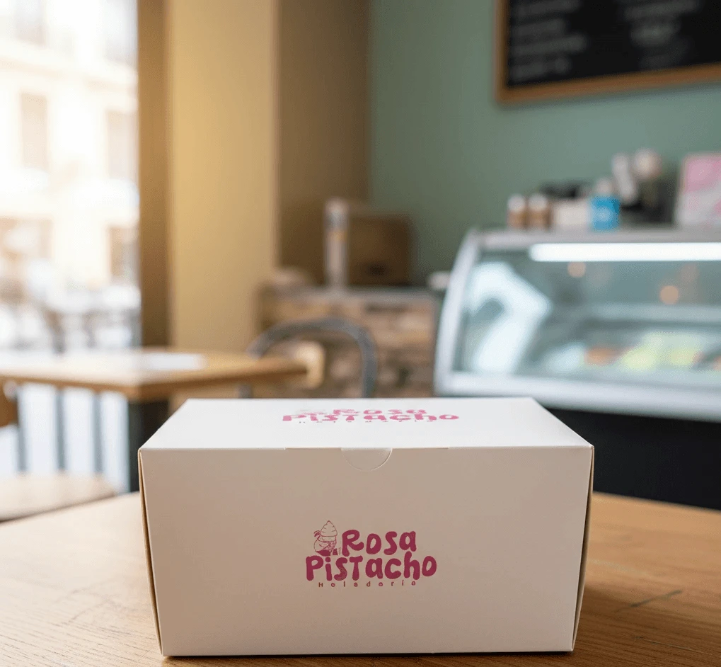
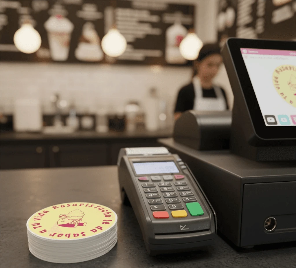
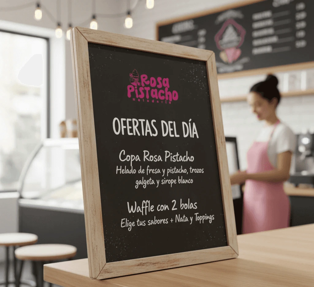
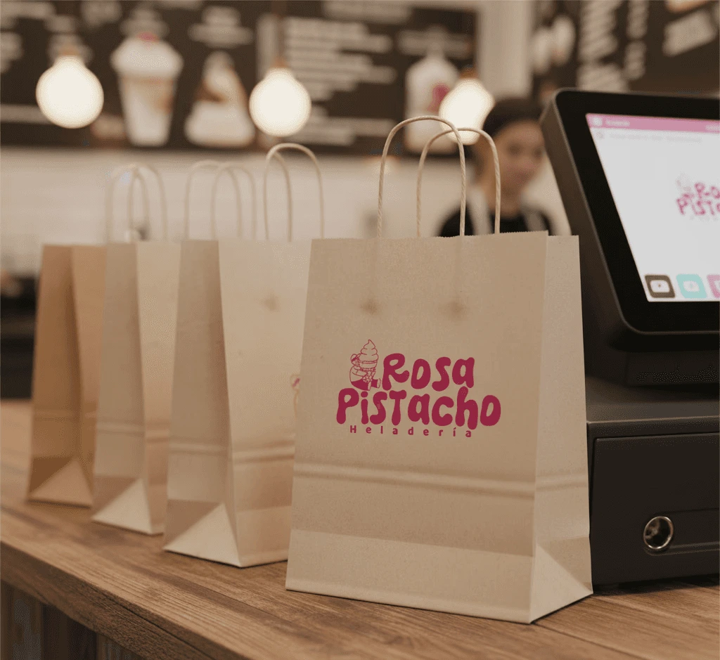
Brandbook, digital assets, packaging, stickers, and correct usage guidelines.
Approach
A playful world built on joy + authenticity
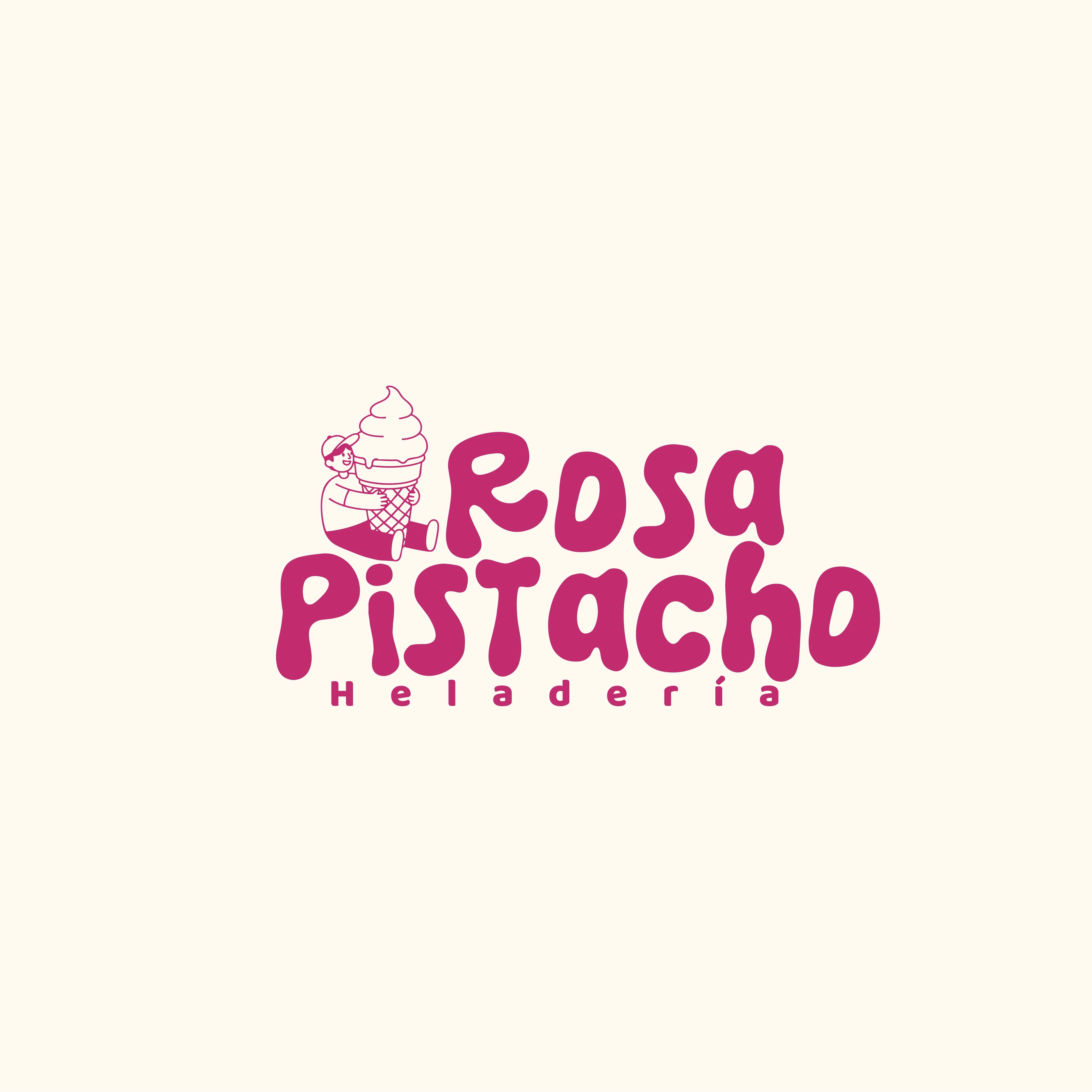
01 Color — warmth balanced by nature
Pink (#C12C6F) was chosen as the primary color for its ability to evoke sweetness and warmth without feeling infantile. Dark green (#1D512B) as the complementary grounds the palette, adding sophistication and a visual nod to fresh, natural ingredients. The secondary pastels — yellow, blue, mint — keep the system playful and adaptable across seasonal content.
02 Typography — friendly, not childish
Quicksand was selected for its rounded terminals and clean geometry. It communicates approachability and playfulness without tipping into the overly cartoonish — critical for a brand that needs to attract both kids and adults. Its legibility at small sizes also makes it practical across packaging and digital formats.
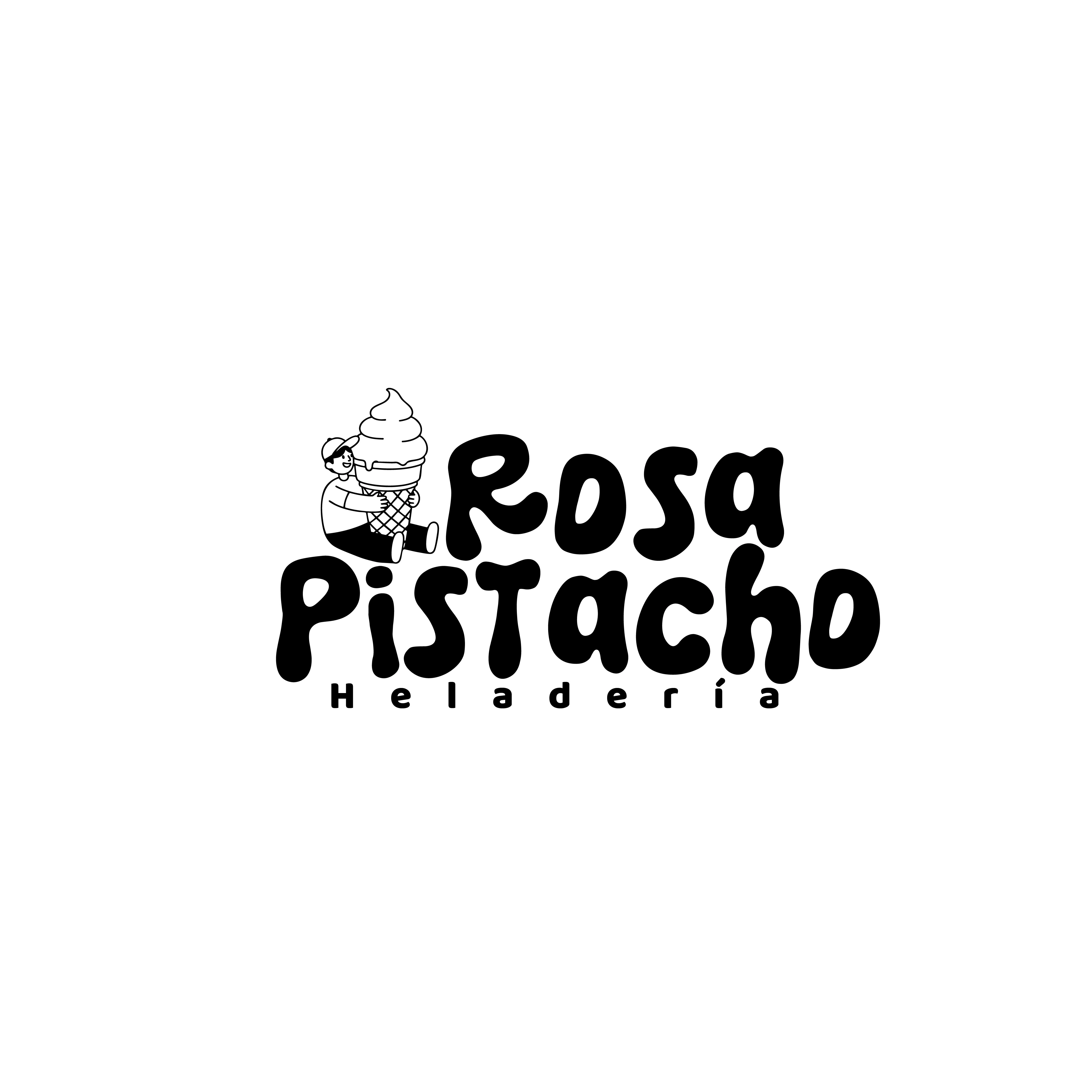
03 The character — a brand asset
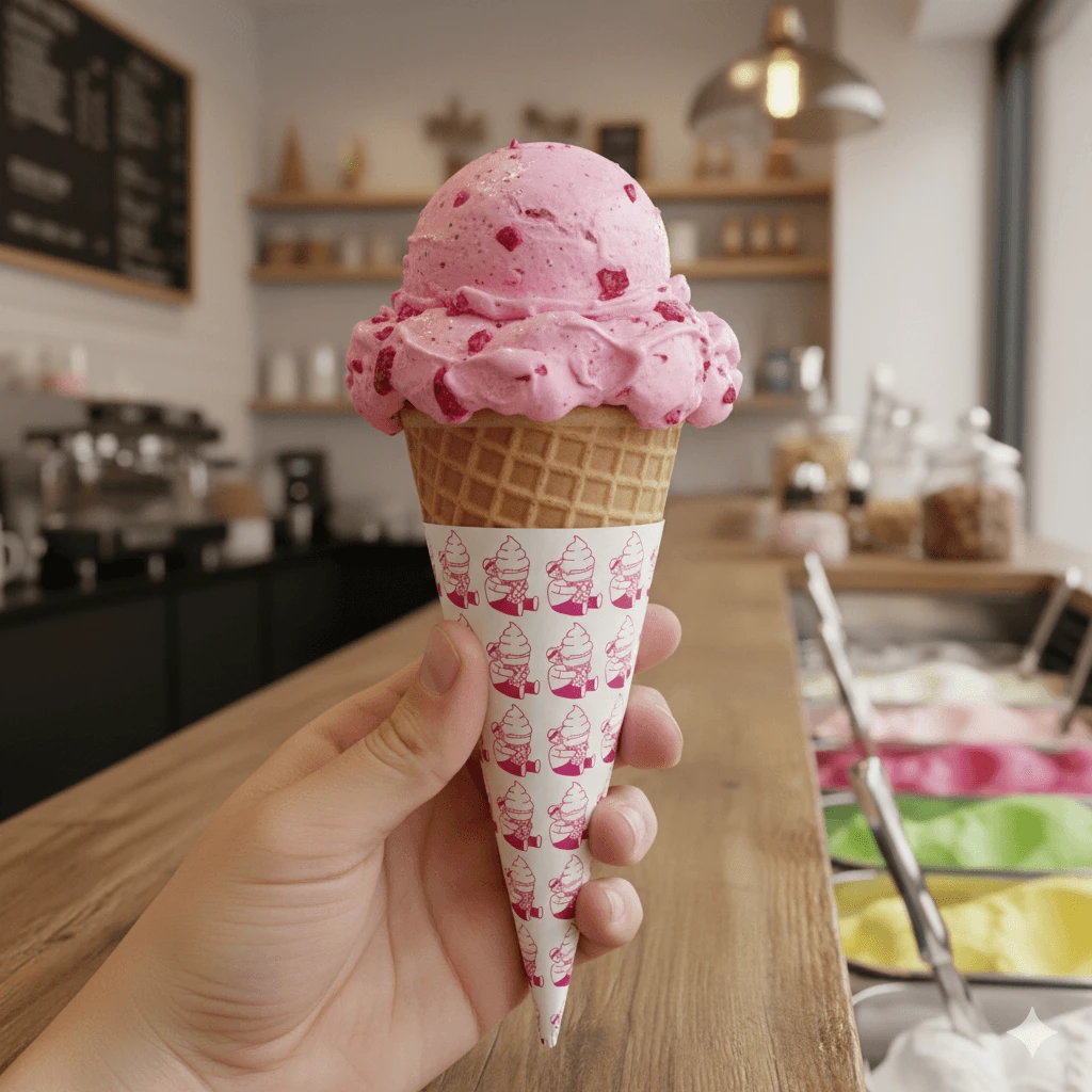
The illustrated boy hugging an oversized ice cream cone was designed to humanize the brand emotionally. Rather than a generic icon, it tells a story — the joy of ice cream as something you hold onto, literally. It travels consistently across the logo, cone wrappers, stickers, and social content, becoming the most recognizable element of the brand system.
04 Logo versatility — built for every surface
Three versions were developed from the start: full color on light backgrounds, a pink version for brand-colored surfaces, and a negative (white) version for dark contexts. This ensures the logo never breaks — whether it's on a paper cup, a dark Instagram story, or an outdoor sign.
Target Audience
Who Rosapistacho is for
Families
A trusted, welcoming space to create memories together.
Young Adults
Aesthetic-driven, looking for experiences worth sharing online.
Local Community
Proud supporters of local brands that celebrate the region.
Competitive Position
Where Rosapistado Stands
Competitor
Generic Visual Identity
Product-first only
No brand consistency
Weak social presence
Rosapistacho
Distinctive identity
Experience first
Consistency everywhere
Social ready from day one
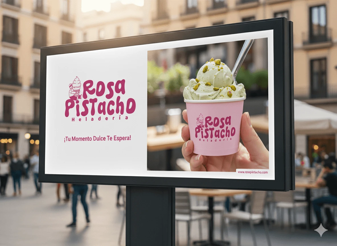
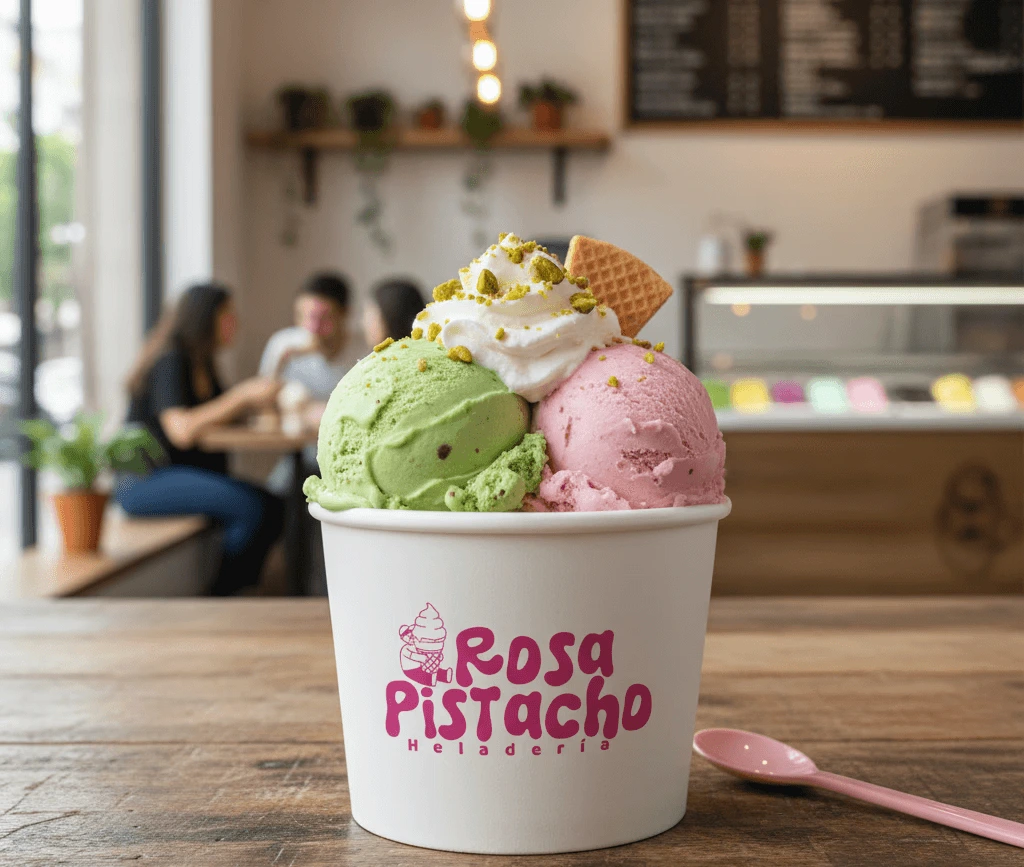
Imagery Direction
How the brand looks in photography
Warm and bright
Natural light, soft shadows. Inviting, never clinical.
People-centered
Candid joy — hands, smiles, shared moments.
Product as hero
Close-ups that make every scoop irresistible.
Visual Identity
The brand system
“Seeing the finished brand was seeing my dream come to life. Rosapistacho had a soul before we even opened our doors.” Sebastian López CEO, Co-founder | Rosapistacho
Like this project
Posted Jun 18, 2026
Brand identity development for an artisan ice cream shop in Colombia.
Likes
0
Views
2