ÜTI - Financial mobile application - Detailed case study ✨
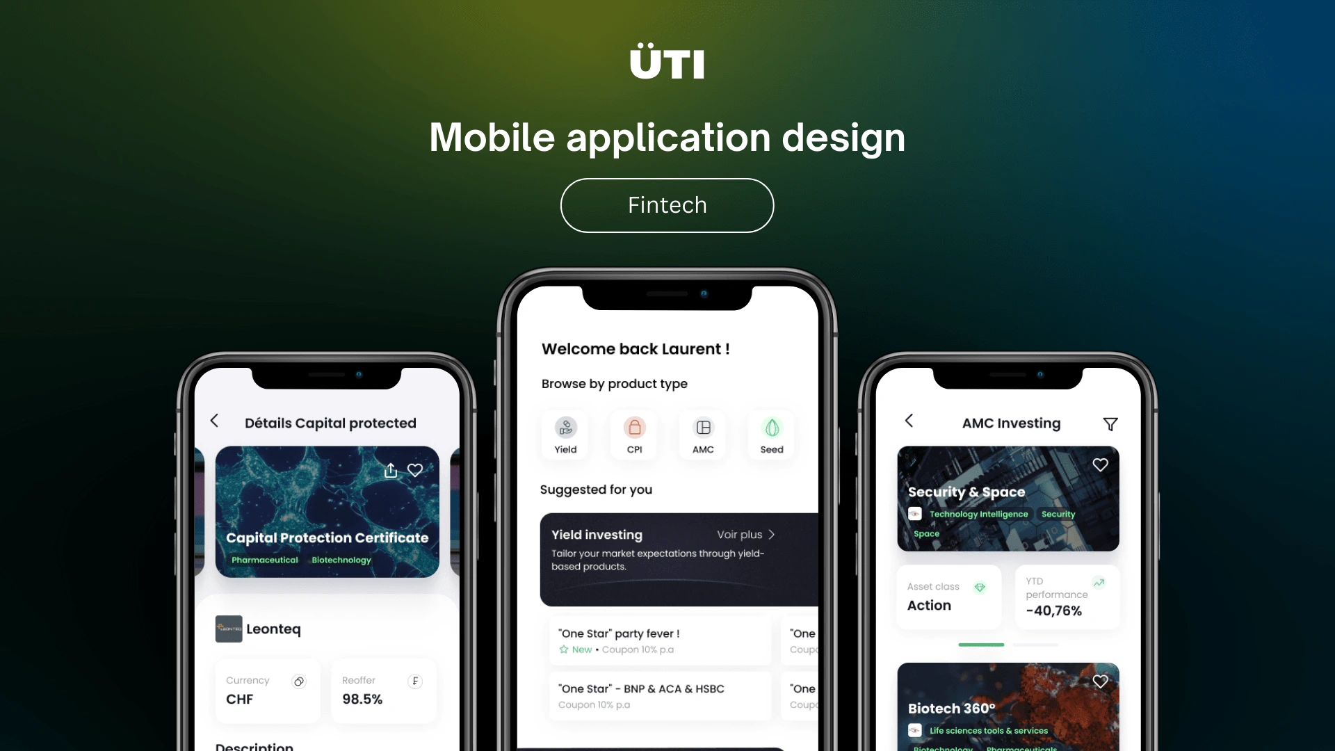
Unveiling ÜTI, an innovative application designed for wealth managers to uncover finely selected investment opportunities in the dynamic landscape of Swiss wealth management.
Content :
Unveiling ÜTI, an innovative application designed for wealth managers to uncover finely selected investment opportunities in the dynamic landscape of Swiss wealth management.Overview 💫Introduction 👋🏼About ÜTIProblem 🚧Overwhelming Volume and Disarray of CommunicationLack of Efficient Sorting Mechanism for Investment IdeasMy Goal 🎯Uncovering the Financial WorldUser-Centric ResearchCollaboration and AlignmentKey Research Insights 🔎User ProficiencyProduct Variety and CohesionImportance of FiltersGraduated Information HierarchySpotlight on the Graduated Information Hierarchy 🔦Level one: DiscoveryLevel two: Product list by category Level three: Product detailsConclusion Final design ✨Some of the final design screensDesign system & UI kitLearnings & what I would do differently 🙋🏽♀️Final thoughts ☁️
Overview 💫
Timeline: December 2022 - March 2023
Role: Product designer
Industry: Fintech
Key deliverable: End-to-end mobile application design
Client: ÜTI
Introduction 👋🏼
About ÜTI
ÜTI is a Swiss startup ambitiously aiming at revolutionizing the wealth management industry by providing an advanced tool to help wealth managers find meticulously selected investment ideas.
Problem 🚧
Problem Summary
Overwhelming Volume and Disarray of Communication
Wealth managers are inundated with a high volume of emails, calls, and messages from various channels. This scattered and unstructured communication makes it difficult to manage and track all the interactions efficiently. They are forced to spend a substantial amount of their time sifting through this information overload, which is not centralized or easily accessible. The time and effort consumed in managing these interactions could be better used in crafting effective investment strategies for their clients.
Lack of Efficient Sorting Mechanism for Investment Ideas
Wealth managers face the complex task of diversifying their clients' portfolios, necessitating the exploration of a multitude of investment opportunities. However, they lack an efficient way to sort through these ideas, as the offers from different providers are not centralized or displayed in a standardized manner. The existing process is inefficient, time-consuming, and often hampers the identification of the most promising investment opportunities. This can lead to missed opportunities and a less optimal portfolio diversification strategy.
My Goal 🎯
Goal Summary
Beginning with a blank slate, I was entrusted with the significant responsibility of shaping ÜTI's digital presence from scratch. My overarching goal was to create an intuitive and efficient platform that seamlessly addresses the unique challenges faced by wealth managers. My focus was on combining advanced functionality with a smooth user experience, resulting in an optimal tool for our target user group that aligns perfectly with the client's vision.
Uncovering the Financial World
My first step was to educate myself about the industry. I dug deep into understanding financial products and how they play a role in wealth management. This provided crucial context and helped me understand the needs and challenges of our users.
Alongside this, I analyzed existing online solutions in wealth management. I looked at their features, usability, and how they met user needs. This gave me a good sense of what works, what doesn't, and where there's room for ÜTI to stand out.
User-Centric Research
To ensure my design truly addressed the needs of our users, a thorough research phase was planned. This was to involve a combination of methods including user interviews, usability tests, and inviting users on weekly demos to have them see and give feedback on the progress and the direction of the app's design. The idea was to gain an in-depth understanding of our users' workflow, their pain points, and their expectations from a wealth management tool. This approach would provide a solid foundation on which to base the subsequent design process.
Collaboration and Alignment
Given the importance of maintaining alignment with the client's vision, I planned for regular weekly meetings with the ÜTI team. This continuous dialogue was to be key in understanding their expectations, gathering their feedback, and iterating on the design. This level of collaboration would ensure that the final product not only serves the users effectively but also closely aligns with ÜTI's mission and goals.
In conclusion, my goal was to embark on this design journey with a deep commitment to user understanding, continuous collaboration with the client, and an iterative design approach. The end aim was to deliver a tool that revolutionizes the wealth management experience for ÜTI's users.
Key Research Insights 🔎
Key Insights Summary
Through the research process, several significant learnings emerged that helped shape the design of the ÜTI platform. Here's a succinct summary of the most crucial insights:
User Proficiency
Our target users, though experts in their field, were not necessarily tech-savvy. They required a platform that was intuitive and user-friendly, reducing the learning curve and allowing them to efficiently utilize the tool from the get-go.
Product Variety and Cohesion
A crucial finding was that there were four main types of products to be featured on the app. Each product type had distinct characteristics that required a specific design approach to effectively communicate the necessary details. However, while each product type necessitated a unique design, it was crucial to maintain a cohesive visual language and user experience across the entire application.
Importance of Filters
Users identified the ability to filter through a multitude of products as a significant value addition. They appreciated ÜTI's promise of streamlining product discovery and delivering exactly what they needed in a timely manner. This affirmed the importance of a robust and flexible filtering system in the application's design.
Graduated Information Hierarchy
A key understanding was the necessity for a clear information hierarchy for each product type. Users needed to quickly identify important details about a product at a glance, without being overwhelmed by excessive information. To achieve this, we planned for a tiered information display. Starting from a broad overview, users could delve deeper into more details as needed, allowing them to make informed decisions without information overload.
These pivotal learnings served as guiding principles throughout the design process, ensuring the development of a tool that truly caters to the needs and preferences of wealth managers.
Spotlight on the Graduated Information Hierarchy 🔦
During the design journey, the emphasis was on crafting potent features to transform ÜTI into a go-to resource for wealth managers. This segment shines a spotlight on the Graduated Information Hierarchy, serving as an illustration of the meticulous thought process and design approach aimed at delivering the optimal user experience.
To ignite interest in a product while simultaneously preventing information overload, a strategically designed Graduated Information Hierarchy was designed. Users can get a quick overview of each product and then delve deeper into more detailed information as needed. This hierarchy allows users to access just the right amount of information at each stage of their decision-making process.
Level one: Discovery
As with many other aspects of the app's design, the current design of the Discovery Page is the culmination of iterative improvements, heavily influenced by insightful user testing. A prime example of these enhancements within the project was the evolution of the Yield products' presentation on this page. In the original design, Yield products were paired with the logo of the provider. However, it became apparent during user testing that the provider's identity did not attract much interest at this initial stage of discovery.
In fact, the users expressed a greater desire to see critical product information that could pique their interest and invite them to investigate further. Responding to this feedback, an important design iteration was made: The provider's logo was replaced with the 'Coupon' descriptor, a vital detail of the Yield products. This design change not only made the Discovery Page more attractive to users but also reinforced the importance of user feedback in refining the user experience. This is a testament to the power of iteration and user testing in the UI/UX design process.
Level two: Product list by category
In this deeper exploration stage, crucial information is gradually unveiled, echoing the user's growing interest. Drawing inspiration from traditional marketplace catalogs, users can swipe on a product within the list to reveal additional valuable details. This feature allows users to fan the flames of their interest in a product or, conversely, to save time if the unveiled information does not meet their expectations.
Level three: Product details
In this concluding exploration stage, users are equipped with all the necessary information to make optimal decisions. However, to ensure ease of navigation and readability, only the primary pieces of information are initially displayed for each group of characteristics. By utilizing "See more" buttons, users can access additional details within pop-up windows, allowing them to delve deeper into specific characteristic groups.
Moreover, the standardized format of information presentation further simplifies the comparison of different products. This standardized approach enables wealth managers to confidently make informed decisions by easily assessing and contrasting key features across the product range.
Conclusion
In conclusion, the Graduated Information Hierarchy illustrates the power of a user-centric design approach. Evolved through user feedback, this hierarchy strategically presents information based on user interest levels, facilitating easier product exploration and comparison. This process, from initial discovery to in-depth product details, underscores the crucial role of responsiveness and iterative improvements in delivering an optimized user experience.
Final design ✨
Some of the final design screens
Design system & UI kit
Design continuation and documentation are crucial aspects of my work, serving as the foundation for sustained growth and evolution of the projects I undertake. Recognizing this, I always provide a UI kit and a design system along with my designs.
The design system serves as the atomic structure of the design, encompassing foundational elements like typography, colors, and more, ensuring visual coherence throughout the project. Meanwhile, the UI kit acts as the molecular structure, comprising compound components like buttons, form elements, and others, maintaining functional consistency. This approach fosters smooth transitions and paves the way for design continuity.
Learnings & what I would do differently 🙋🏽♀️
Research-Based Platform Selection:
In hindsight, a more rigorous initial assessment regarding the type of platform would have been beneficial. The client approached me with the request for a mobile app, which I accepted without questioning its suitability for the final user.
However, it would have been more effective to delve deeper into understanding the technological aptitude and preferences of the target users at the very outset. This would involve conducting user research or surveys to gauge the target audience's comfort level with different technologies, their daily digital habits, and their preferred platforms for similar tasks.
Upon reflection, I realize that for our target user group, who are not particularly tech-savvy, a web platform might have been a more suitable choice. It could have offered an easier transition, given its closer resemblance to traditional computer-based workflows they might be accustomed to. A web platform could also offer a more comprehensive and expansive interface, potentially accommodating a wealth of information in a more accessible manner.
In future projects, I will prioritize understanding the user's technological preferences and the platform's alignment with the product's purpose before committing to a specific platform. This approach would ensure a more user-centric design and ultimately, a more successful product.
Final thoughts ☁️
Embarking on the ÜTI project was an incredibly enriching journey that expanded my horizons into the world of wealth management. The process was filled with learning opportunities, revealing the power of user-centric design and effective feedback loops in creating a useful, innovative product. Despite some challenges, the joy of crafting a solution that truly serves wealth managers was immensely rewarding. Ultimately, the ÜTI project was more than just design work; it was a journey of continuous learning, growth, and affirmation of design's transformative potential.
Like this project
Posted Jun 14, 2023
Financial products marketplace - mobile application design.
