Tally Branding
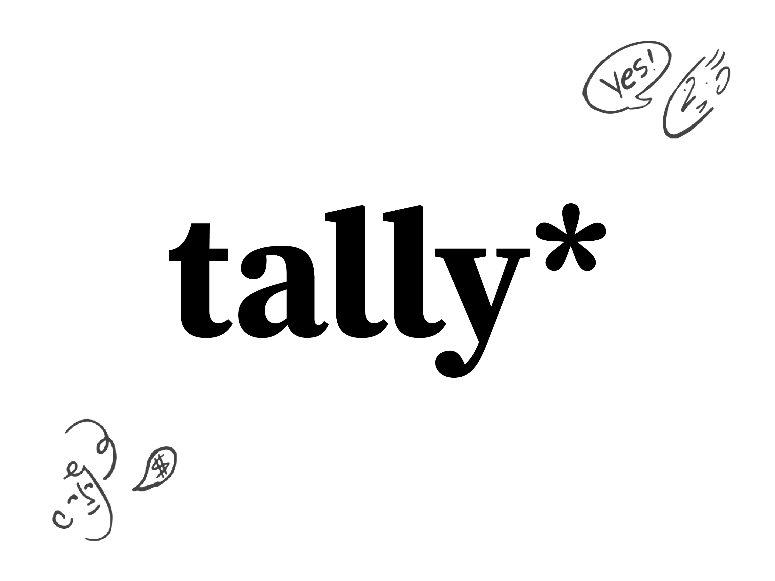
The new Tally logo.
Tally is the simplest way to create forms, for free. I had the pleasure of working with them on a new and simplified logo and branding.
Illustrations, doodles, and UI are ©️ Tally.
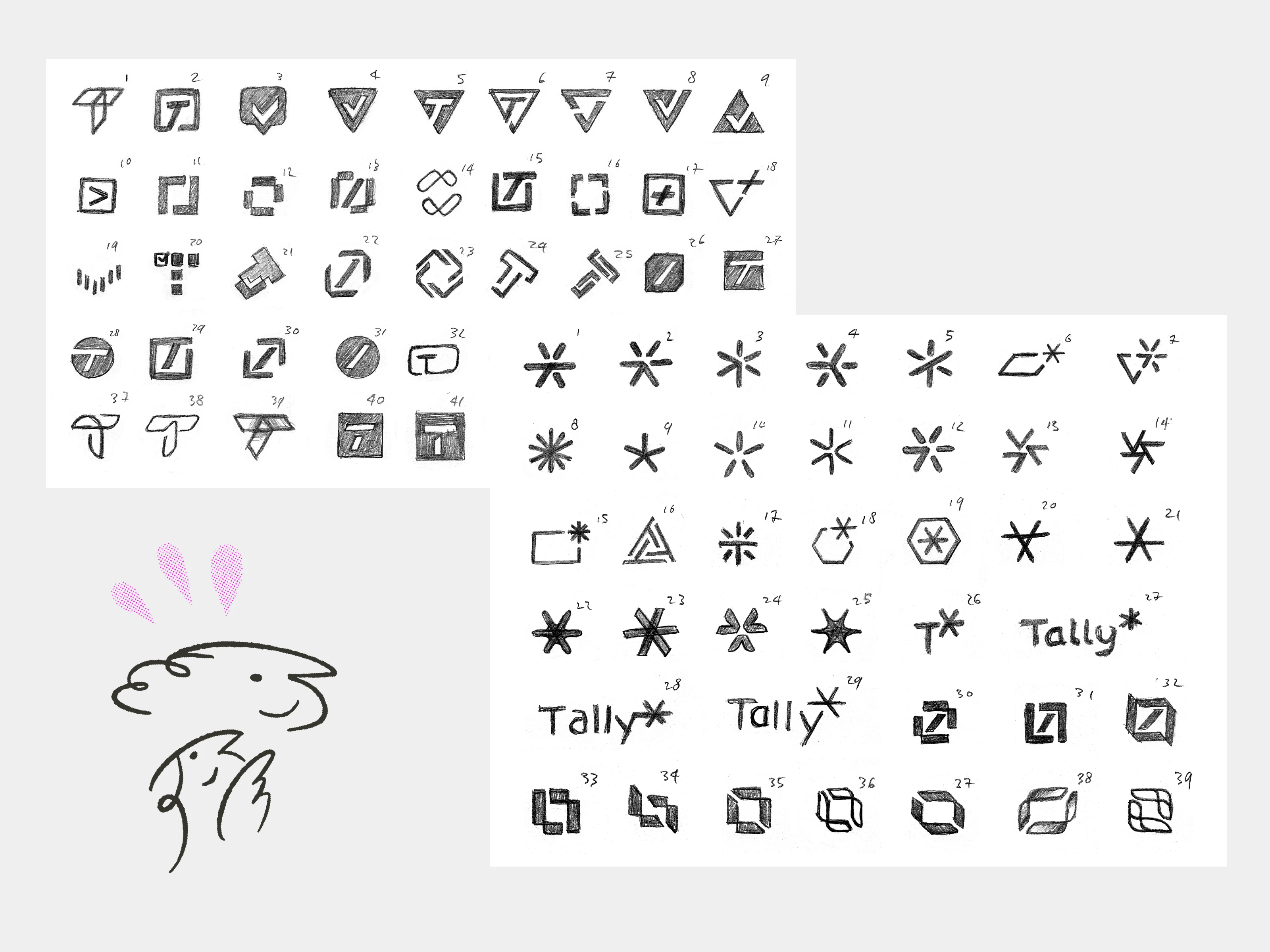
A few of the sketches I made.
We went through a process of sketching around 80 rough logo concepts. We digitized around 10 of them and created another 40 variations and further concepts. In the end we landed on using an existing typeface and asterisk. This symbol represents the ‘required’ icon shown when you answer a mandatory question in a Tally form.
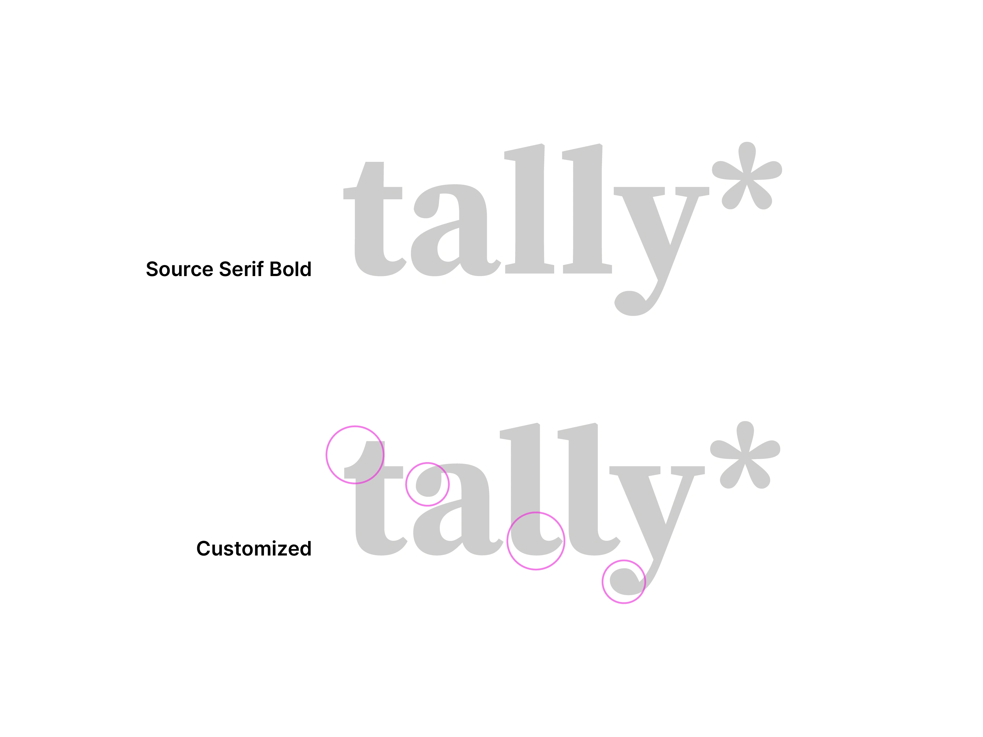
Tweaks to the typeface for a more unique look.
Source Serif is an amazing typeface, but a few small details were bothering me and I wanted the wordmark to be unique. I made the top of the t more stylish, increased the roundness on the ends of the a and the y and changed the bottom of the l's.
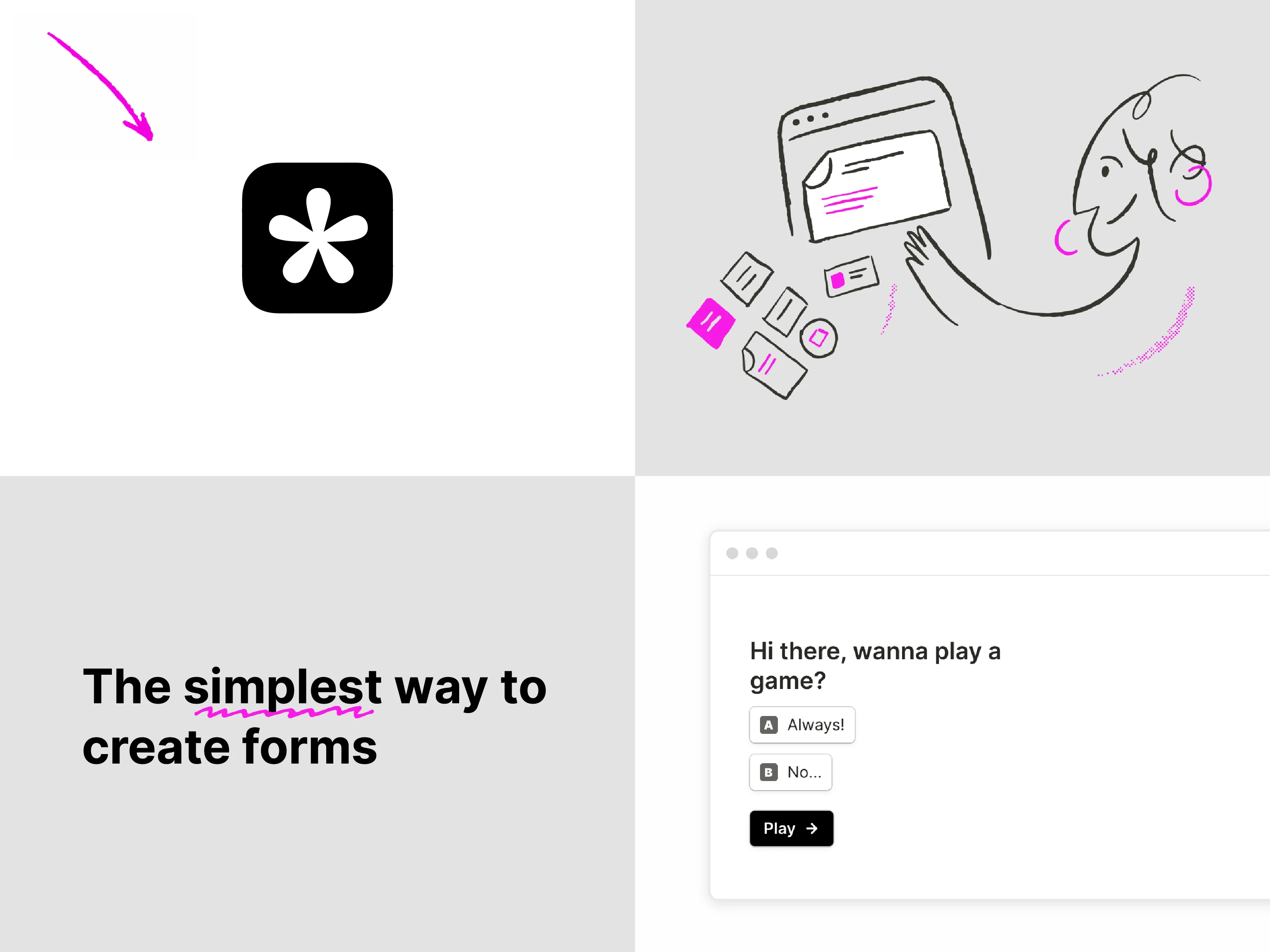
The new app icon.
Tally already worked with a talented illustrator who did some awesome illustrations. Tally recently launched their 2.0 and I think they did a great job, you can read more about the rebrand and new version on their blog.
Like this project
Posted May 31, 2024
I created a new logo for Tally. In this post I cover the full process, from logo sketches to typeface design and more.
Likes
0
Views
4

