Framer Website | Happy Ramen
Project description
Case Study: Happy Ramen's Branding and Website Journey
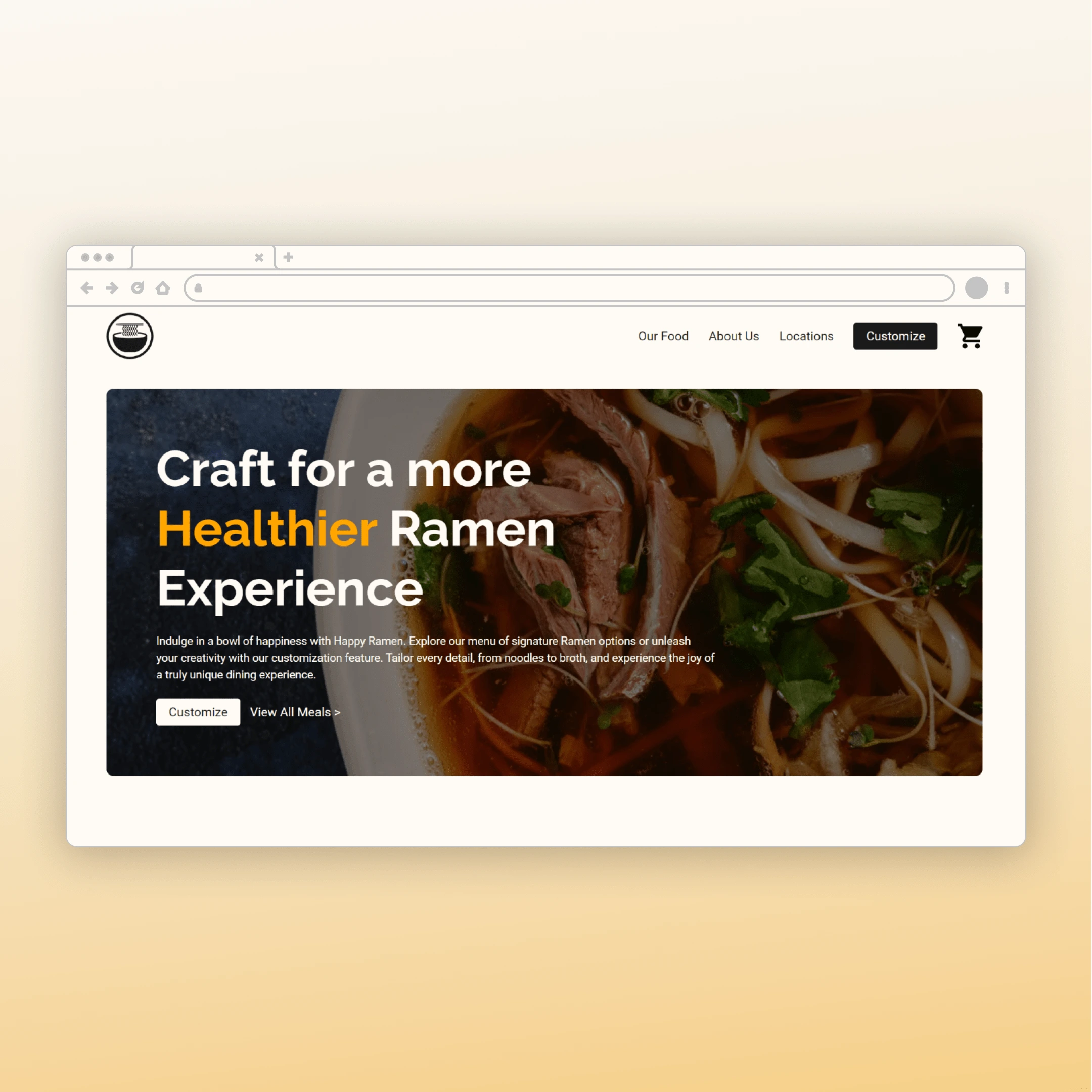
Project Overview: Happy Ramen, a beloved food delivery service renowned for its customizable Ramen dishes, reached out to us for a complete branding and website makeover. They wanted to improve their online presence, emphasizing their commitment to quality, health, and personalized dining experiences.
My Approach:
1. Exploration and Brainstorming: I dug deep into Happy Ramen's core to brew up a design strategy that suits their style. After some serious brainstorming, I landed on a concept that's fresh, modern, and most importantly Happy Ramen.
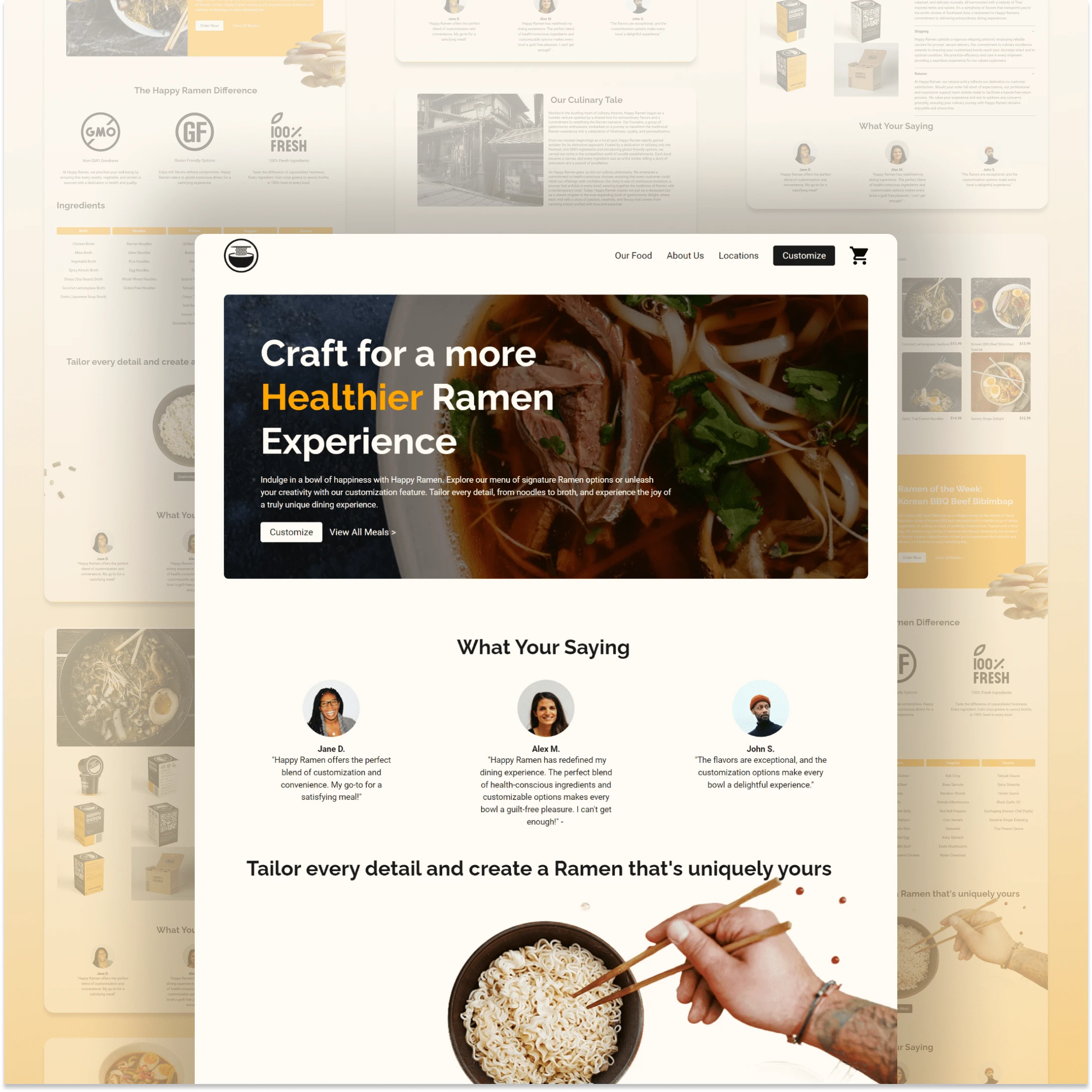
2. User-Friendly Design: I wanted navigating the site to be as easy as slurping noodles! So, I cooked up an interface that's intuitive and visually popping. I organized things neatly so customers can glide from browsing to ordering with little resistance.
3. Branding Harmony: I sprinkled Happy Ramen's brand elements all over the site—logo, colors, images—to keep things consistent and give it that unmistakable Happy Ramen flavor. It's like branding magic!
4. Mobile Responsiveness: I didn't forget about the phone addicts! The mobile site is indistinguishable from it desktop and tablet form, changing colors to fit any screen.
5. Call to Action: I sprinkled call-to-action buttons like diced chives all over the site. They're like little nudges saying, "Hey, why not customize your Ramen?" It's all about making ordering a breeze.
Project Outcome: The result? A website that's as tasty as Happy Ramen's dishes! It's vibrant, easy to use, and screams "Happy Ramen" from every pixel. I've cooked up a design that's not just a website but a whole experience, bringing Happy Ramen's vibe straight to your screen.
Like this project
Posted Mar 19, 2024
Happy Ramen wanted a web redesign to emphasize quality, health, and personalization. Using Framer, I revamped their site for a fresh online presence.
Likes
0
Views
5

