Enhancing Advantage Card Digital Offers for Boots UK Mobile App
Project Overview
Role: Product UX/UI Designer
Duration: 1 Year 1 Month
Team: Collaborated with 1x UX Manager, 1x Project Manager, 1x Business Analyst, 1x User Researcher, Engineers
Client Overview
Boots, a leading UK pharmacy and beauty retailer, wanted to take their customer engagement to the next level by enhancing the Advantage Card Digital Offers on their mobile app.
Outcome & Impact
While the solution is still in the works, our journey has already sparked some significant improvements:
We've created a smoother, more cohesive design for the digital offers section, making it easier and more enjoyable for users to interact with.
By improving navigation and visibility, we've made it simpler for users to find and take advantage of the offers and benefits that come with their Advantage Card.
We've ensured our design aligns with the latest app updates, keeping the brand consistent and familiar for users.
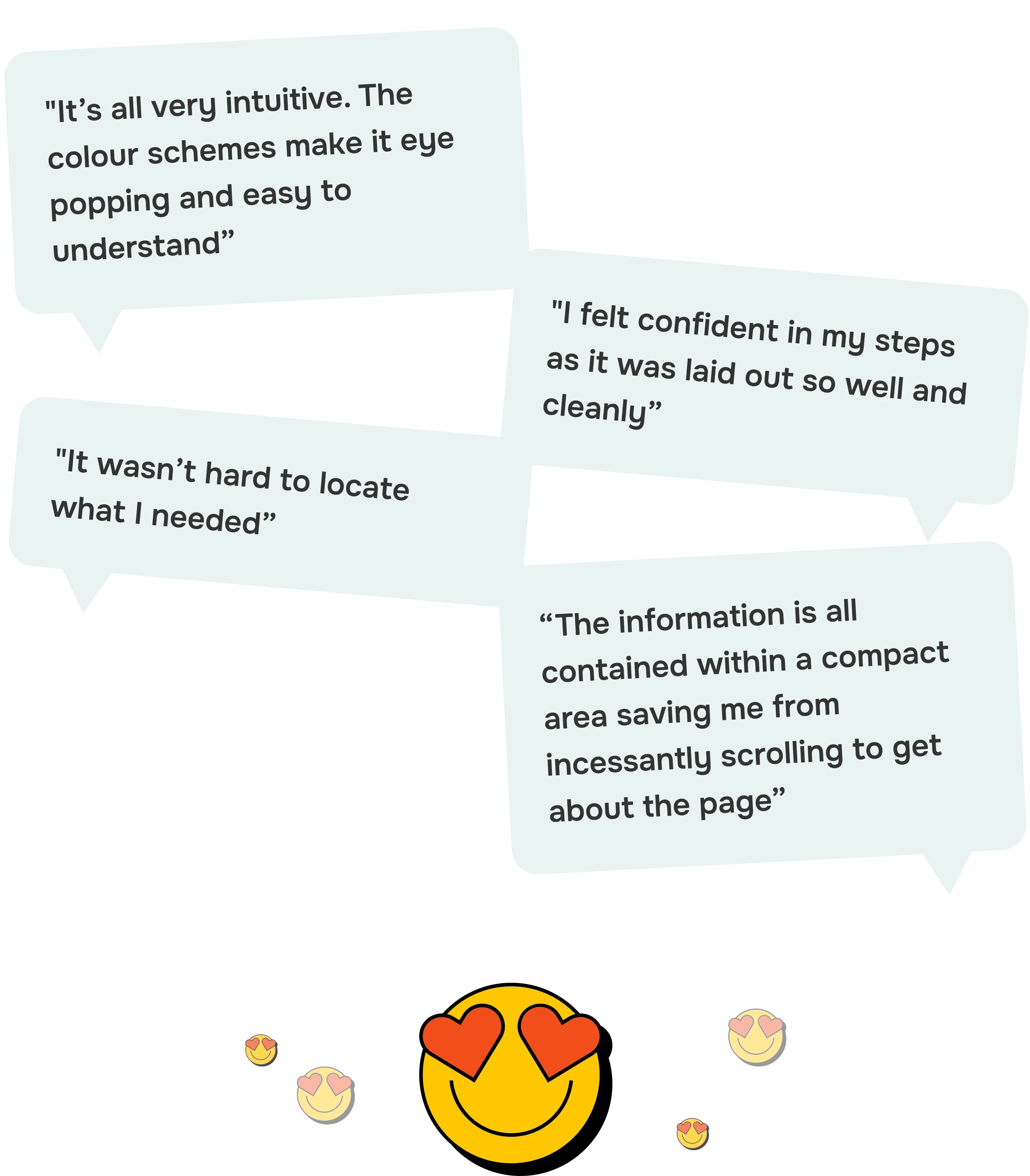
A few User feedback insights on new designs
Problem
Even though the Boots Advantage Card is incredibly popular, users were hitting a few bumps when using the mobile app. They faced:
Generic offers that didn’t feel personalised
A disjointed design that wasn’t easy on the eyes
Frustrating navigation that made finding offers a chore
These issues were dragging down customer engagement and satisfaction.
Objective
Our team's mission was clear: to research, strategise, and design a more personalised and user-friendly digital offers experience on the Boots mobile app. We aimed to boost customer engagement and satisfaction by making the app’s features more intuitive and enjoyable to use.
Solution & Process
I’ve broken down the project into three main phases: Empathise, Conceptualise, and Design.
1. Empathise
Goals
We needed to get into the shoes of our customers by understanding their pain points, needs, and expectations.
Actions
We kicked things off with usability testing on the current app experience. Here’s what we found:
Conducted a competitor and market analysis to see what others were doing right (or wrong).
Facilitated workshops with stakeholders to dig deep into their assumptions, desires, and essential needs.
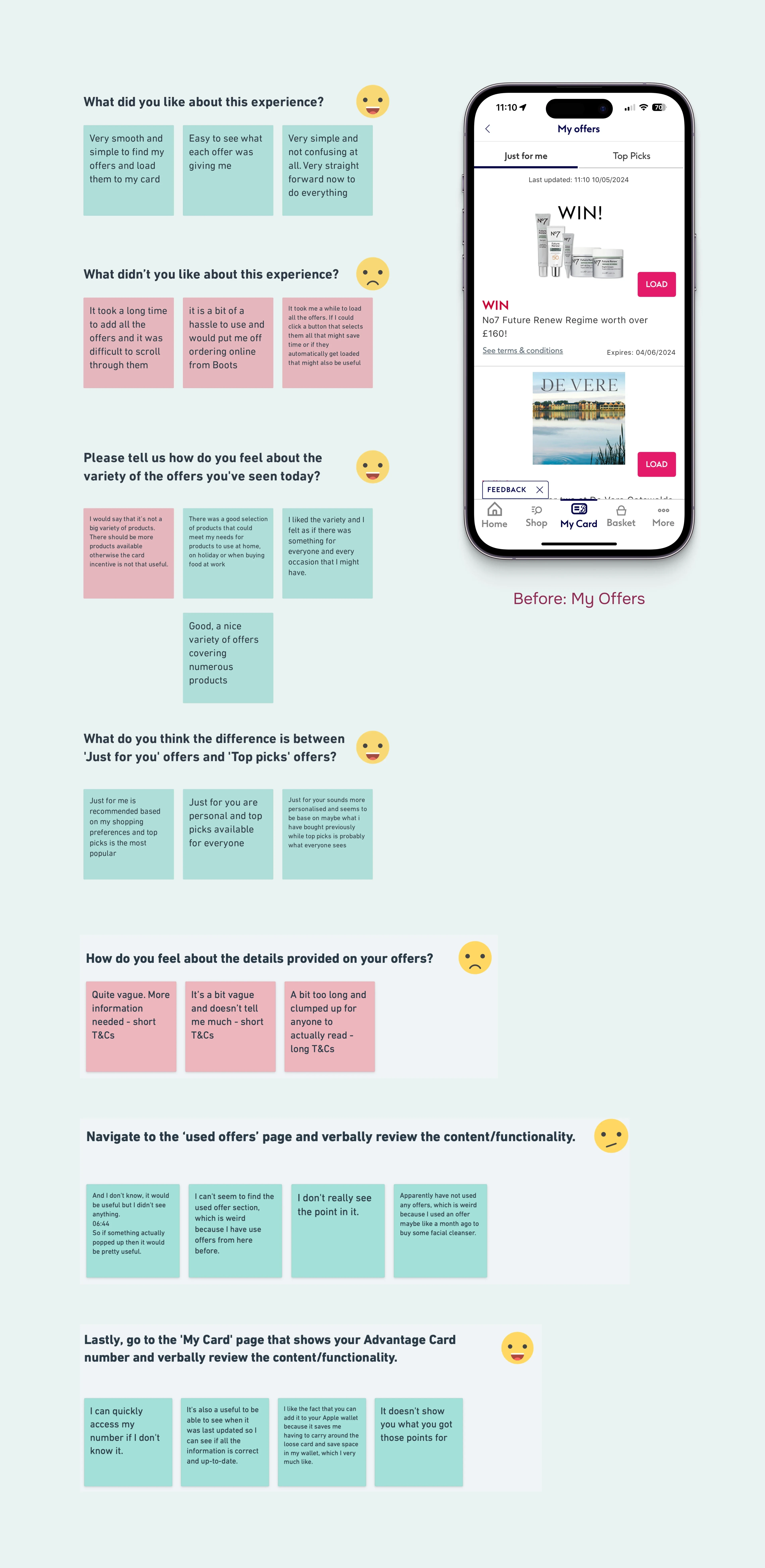
User Feedback from Usability Testing Carried Out on Existing Experience.
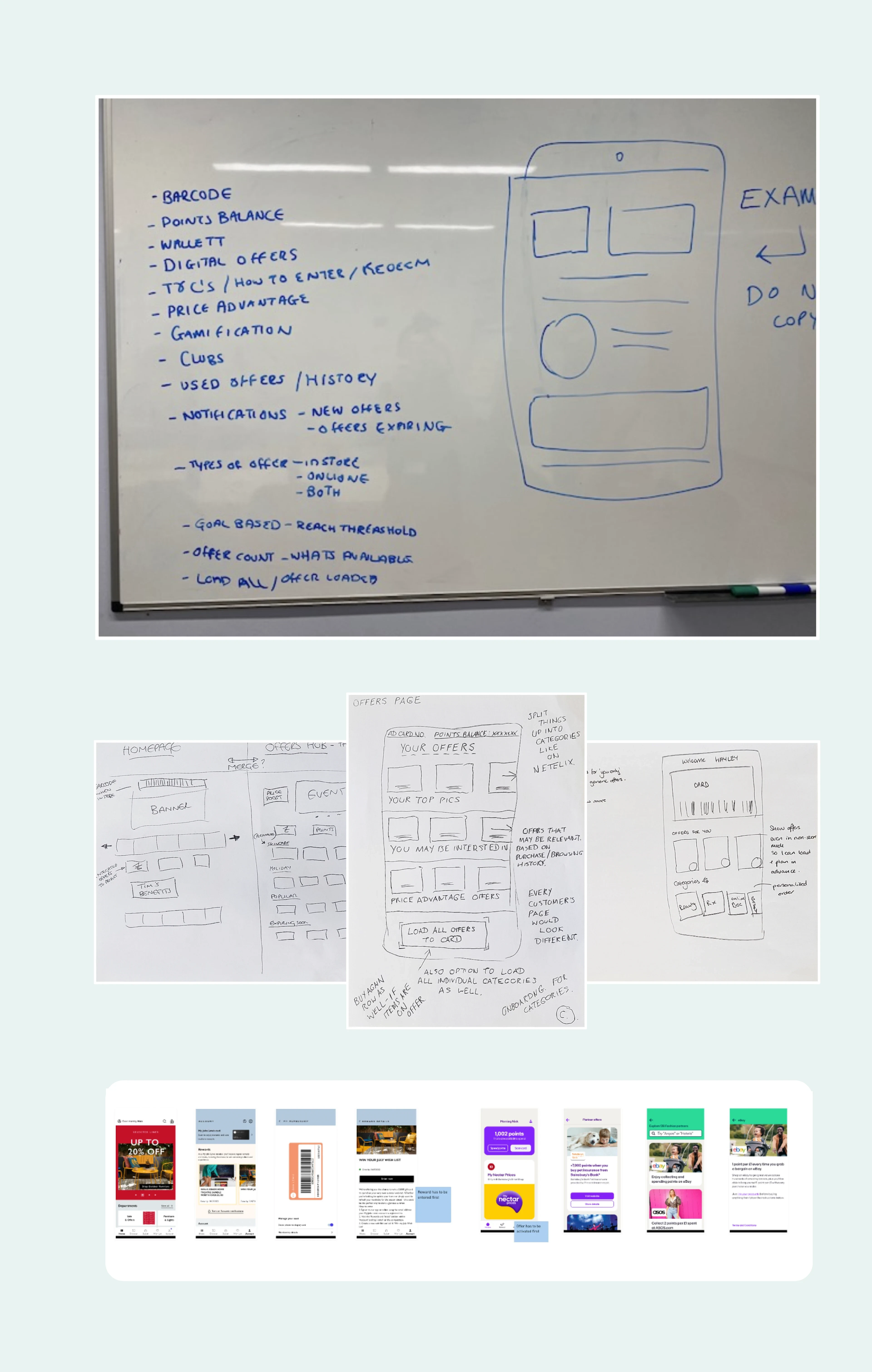
Brainstorm of MVP Features, Sketching Exercise with Stakeholders, and Competitor and Market Analysis.
2. Conceptualise
Goals
With a clear understanding of our users, it was time to shape a strategy to improve their experience.
Actions
Gathered and prioritised insights from our research to guide the development of our MVP.
Created affinity maps to get a holistic view of our audience.
Presented our synthesised insights to stakeholders to ensure their buy-in.
Developed three UI concepts inspired by our findings: ‘Netflix’, ‘Tinder’, and ‘Traditional List’ styles.
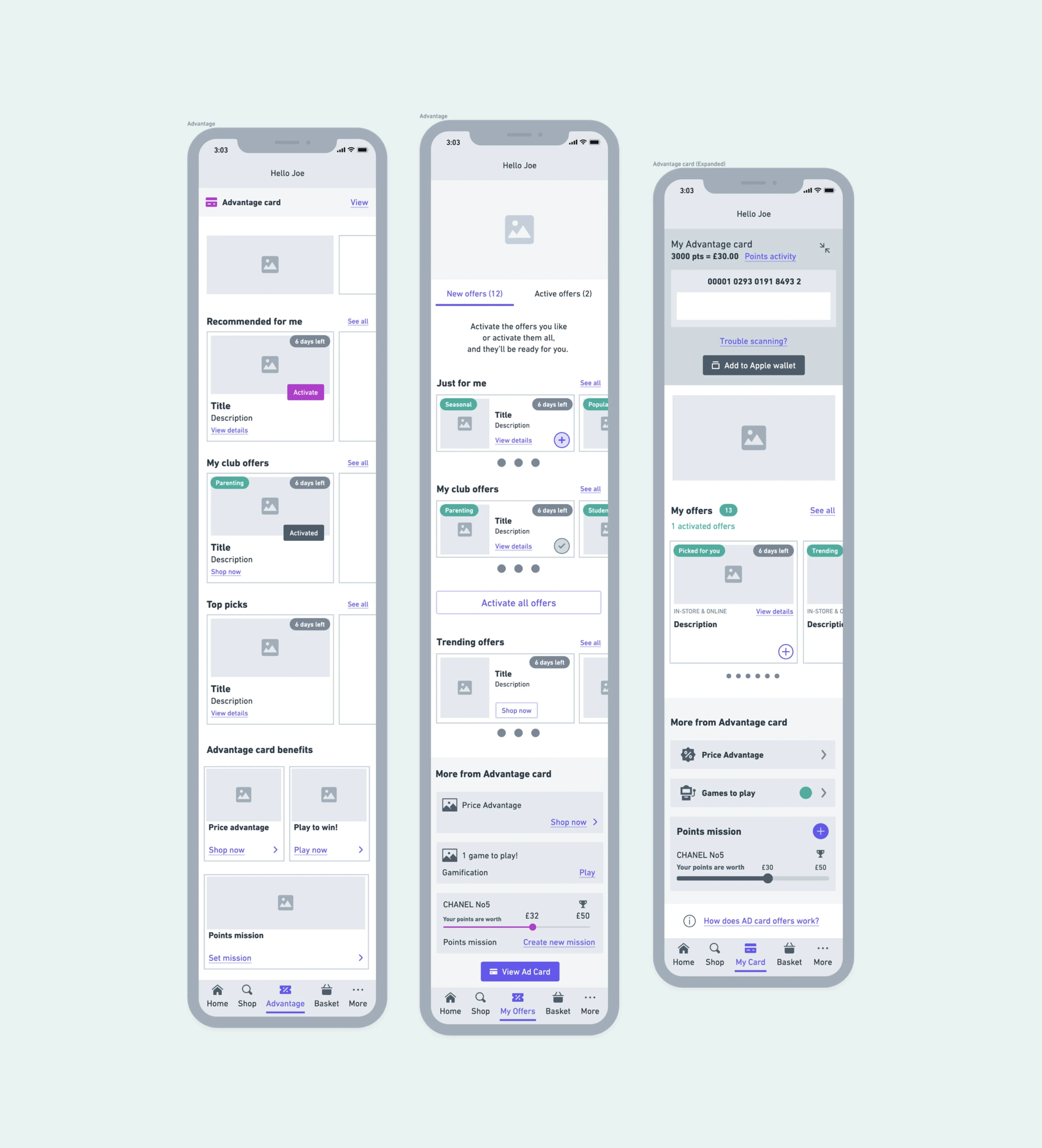
Mid-Fidelity Whimsical Wireframes
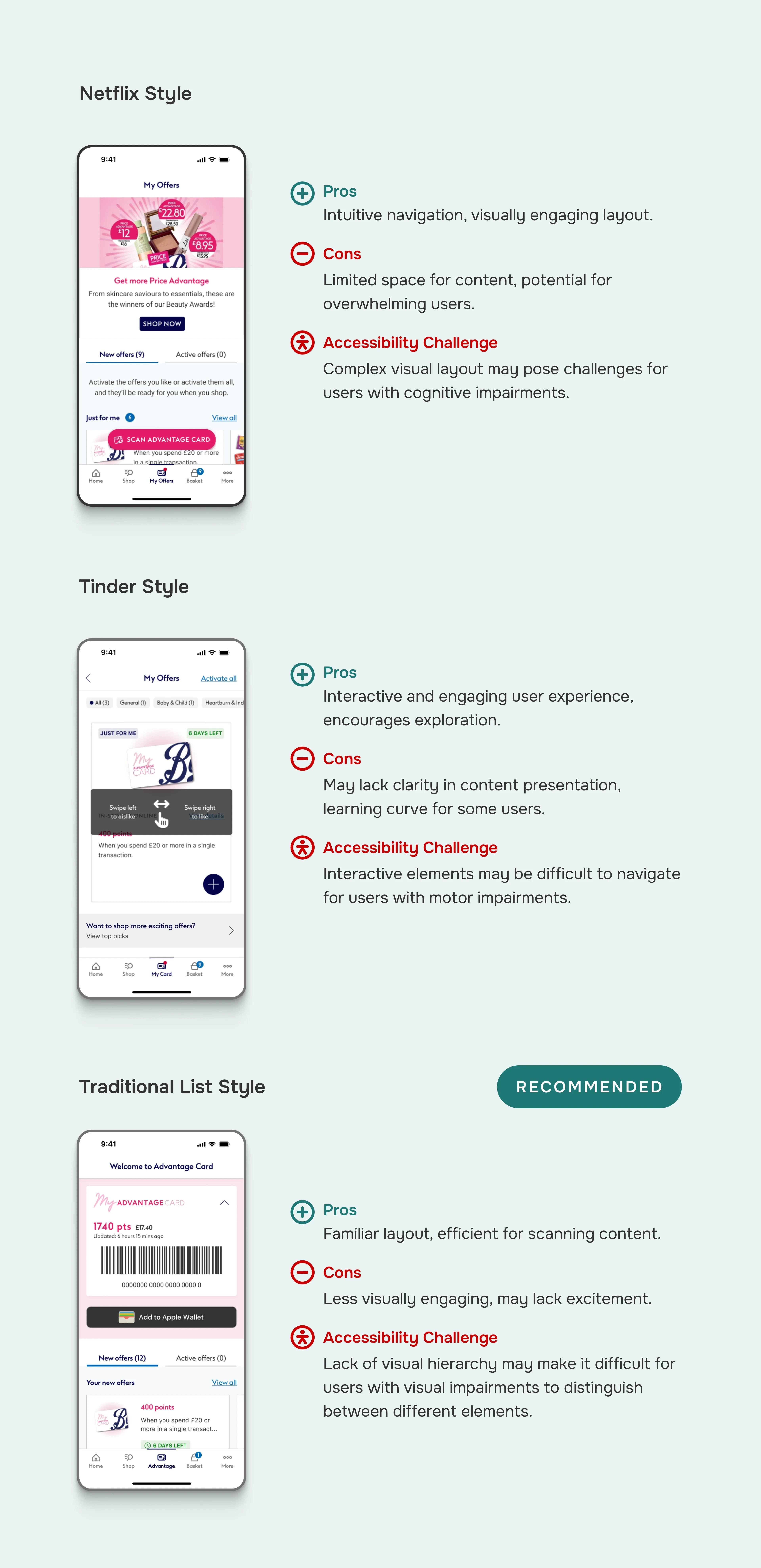
Evaluation on Different Design Variations of the Advantage Card Offers Screen.
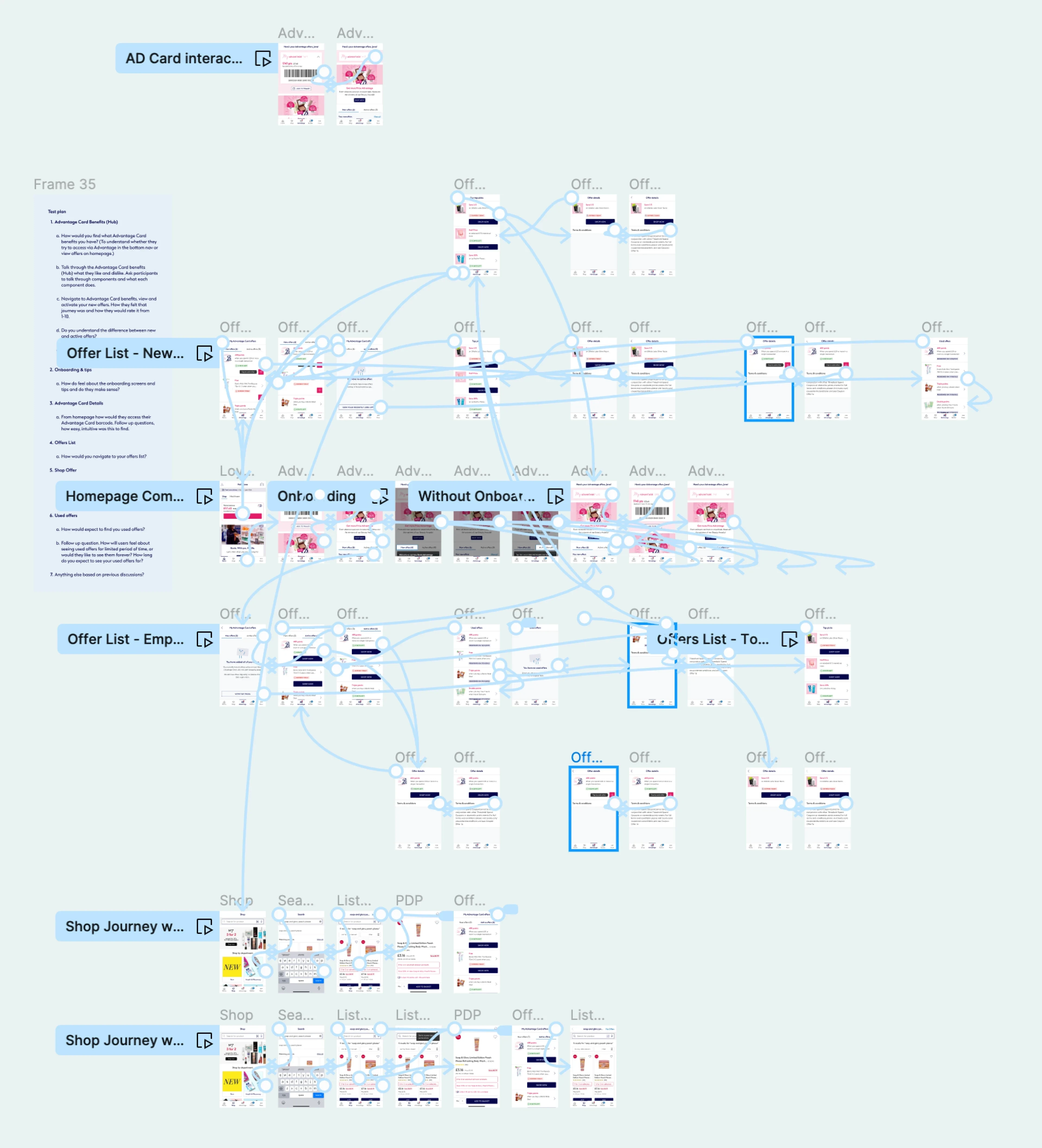
Figma Prototype for User Testing
3. Design
Goals
Test our three UI concepts through high-fidelity wireframes and prototypes.
Actions
Translated all the user feedback and insights into visually appealing and functional interfaces.
Conducted user testing on the three concepts to refine usability and overall user experience.
Documented comprehensive user flows, including empty and error states.
Iterated improvements to the Boots Design System by:
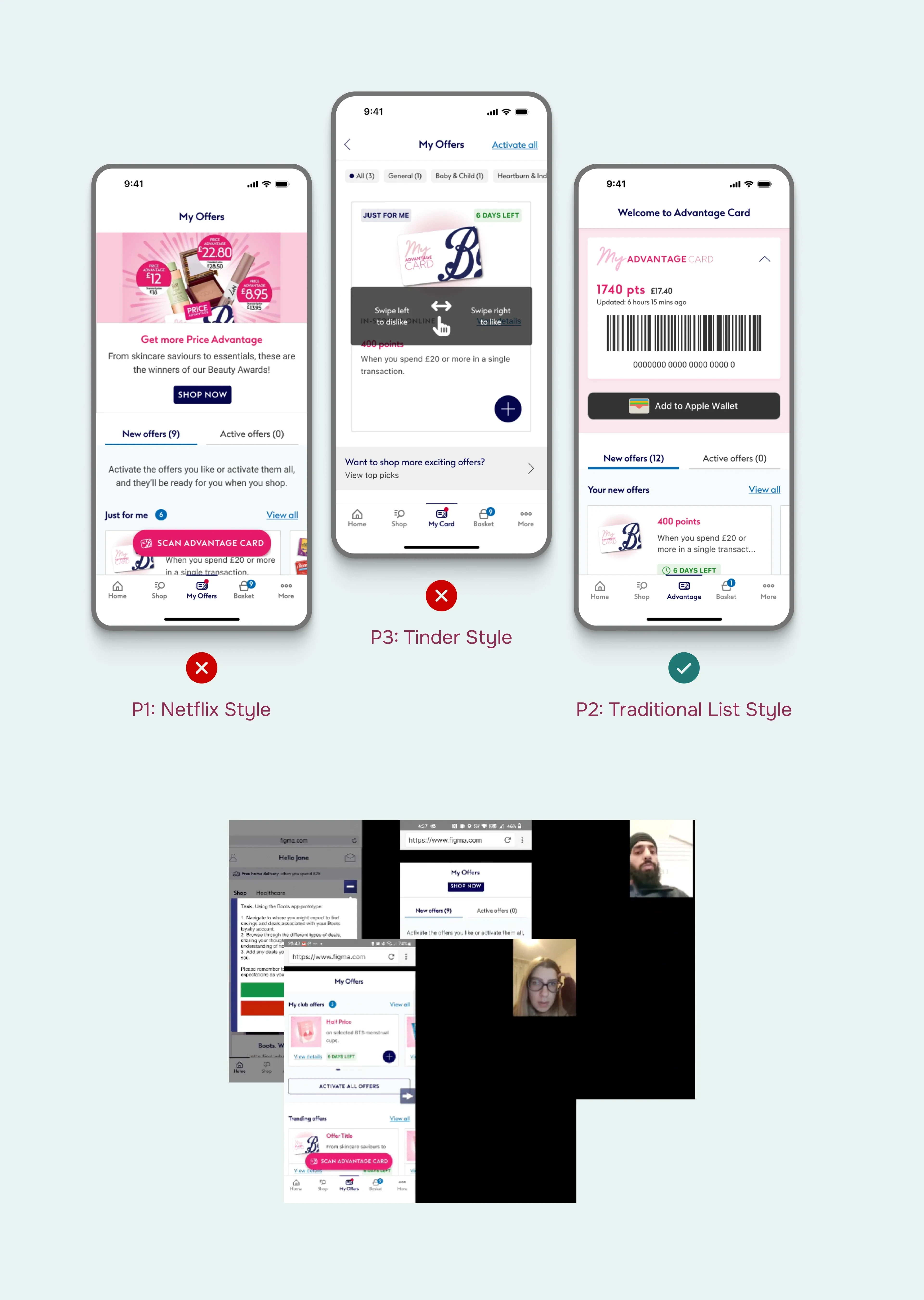
Unmoderated User Testing with 6 Participants to Measure Behavioural / Attitudinal
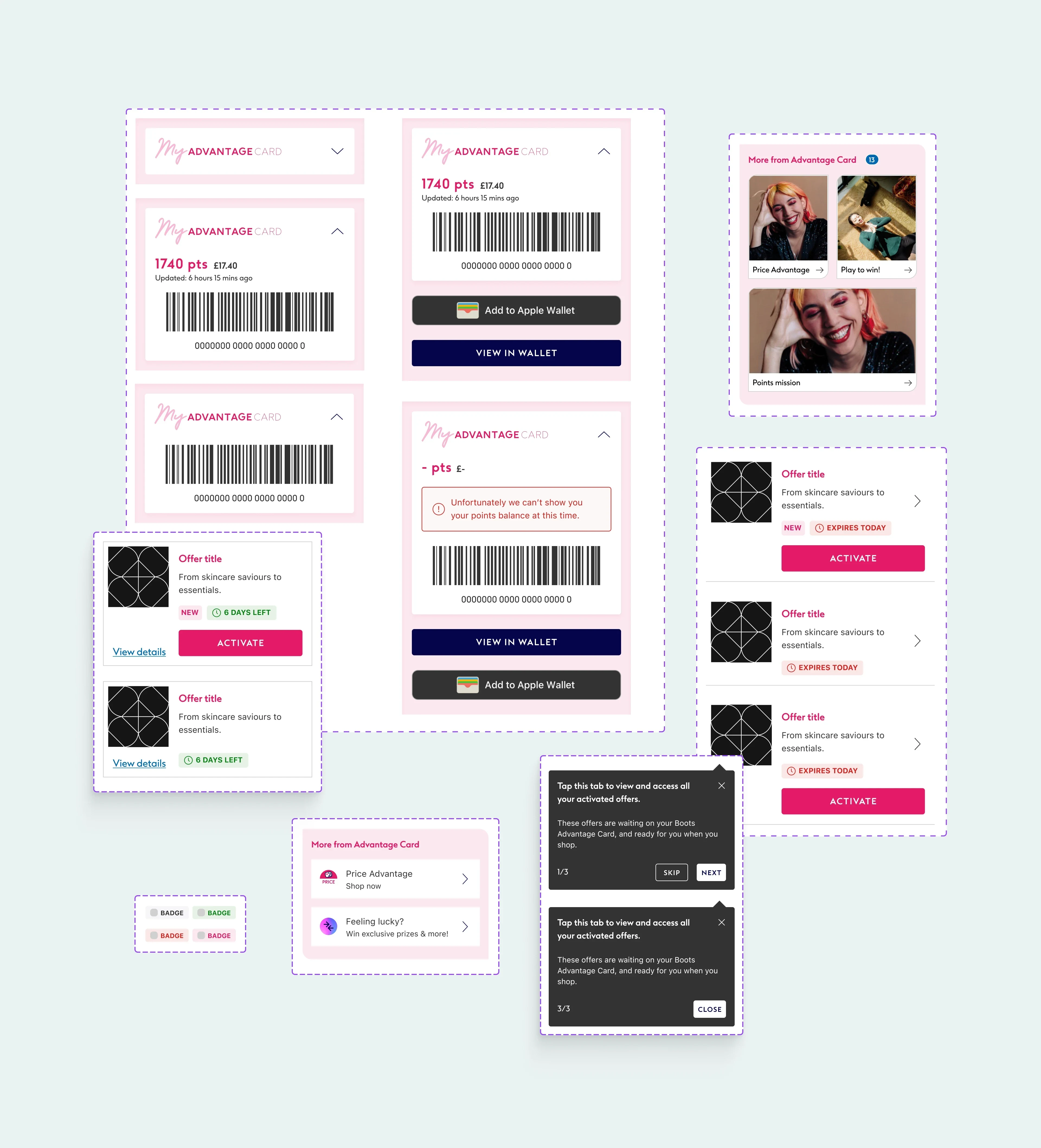
New UI Components Created for Boots Design System.
Tools and Techniques
Used Figma, Mural, Whimsical, and UserZoom to bring our ideas to life.
Project Takeaways & Challenges
Engaging stakeholders throughout the process ensured alignment and buy-in, making the project smoother.
Focusing on user feedback and needs led to a more intuitive and satisfying experience.
Regular testing and iteration improved the design’s effectiveness and usability, highlighting the importance of adaptability in UX design.
The project elevated the level of UX maturity within Boots, fostering a culture of user-centred thinking and design.
UI Designs
Advantage Card Offers Home
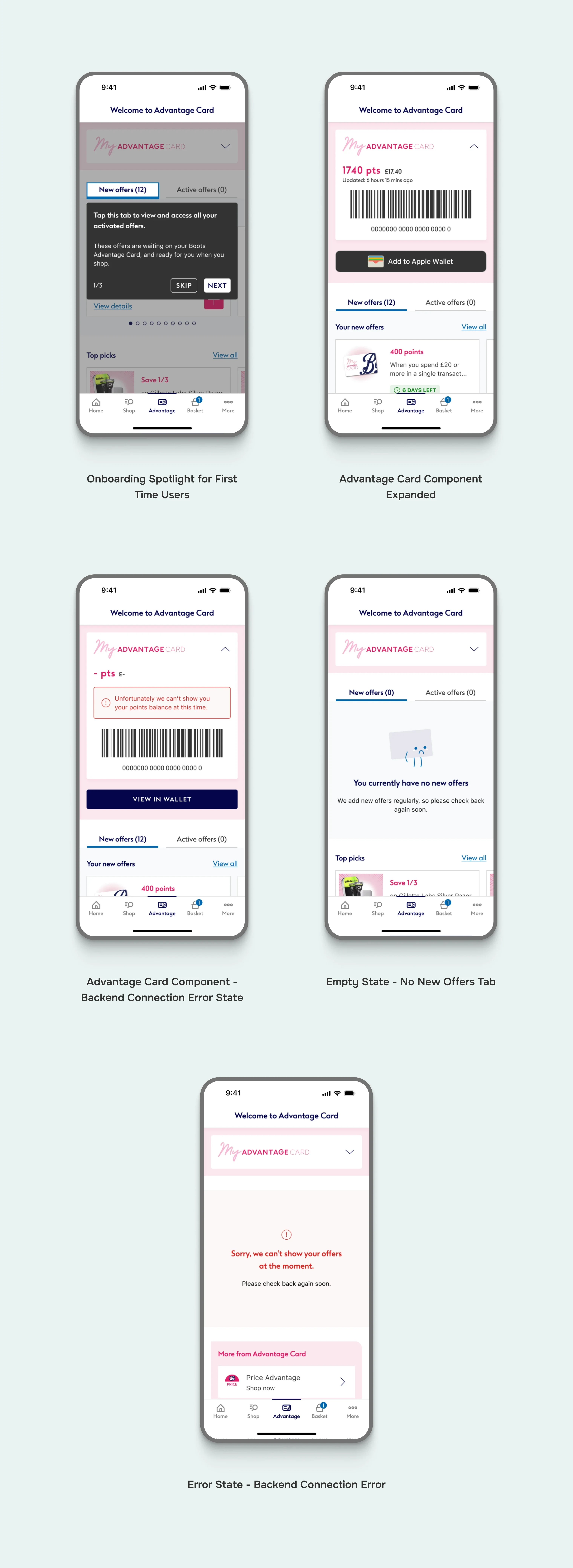
Advantage Card Offers Home
Offers List
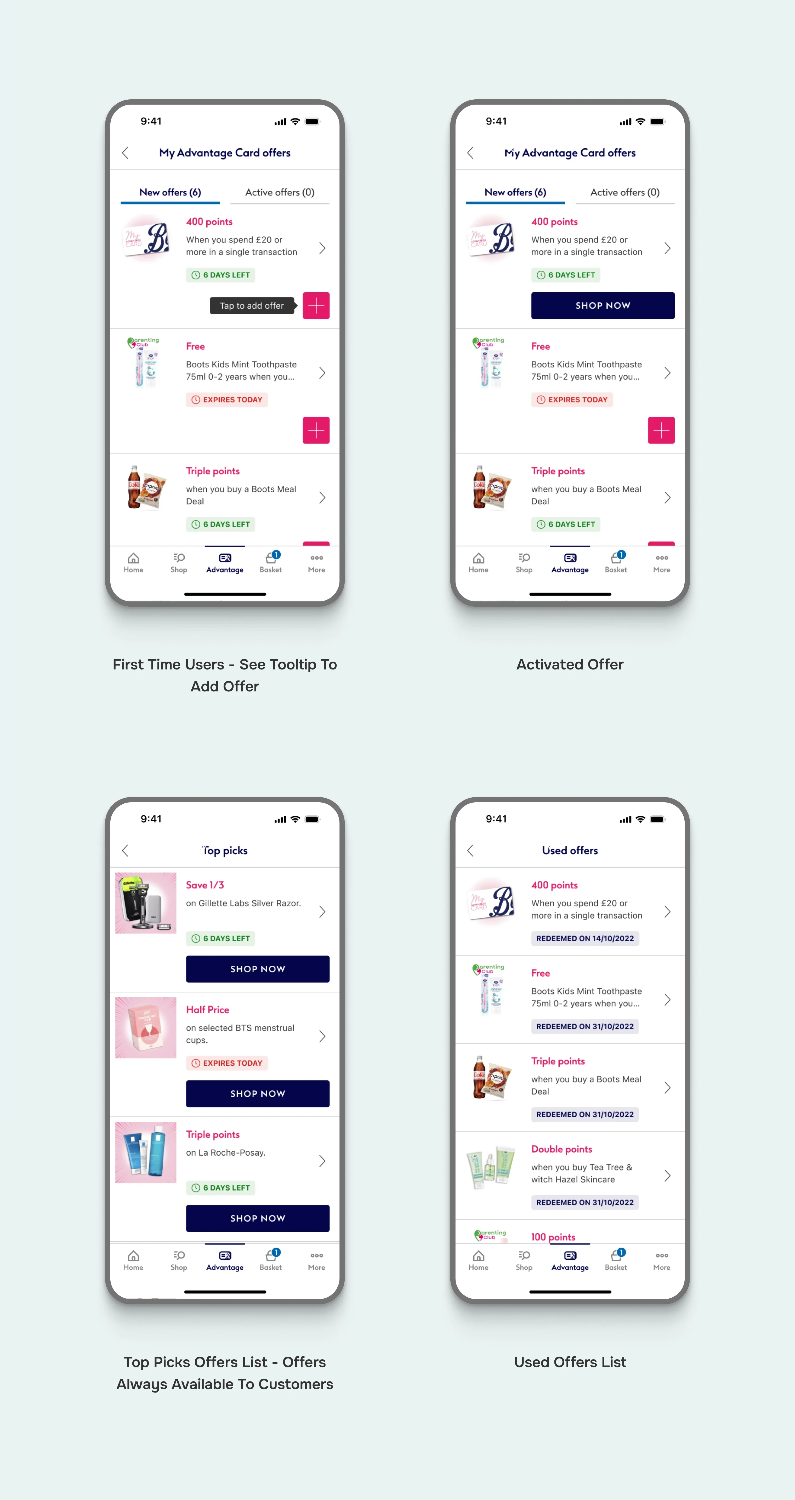
Offers List
Offer Details
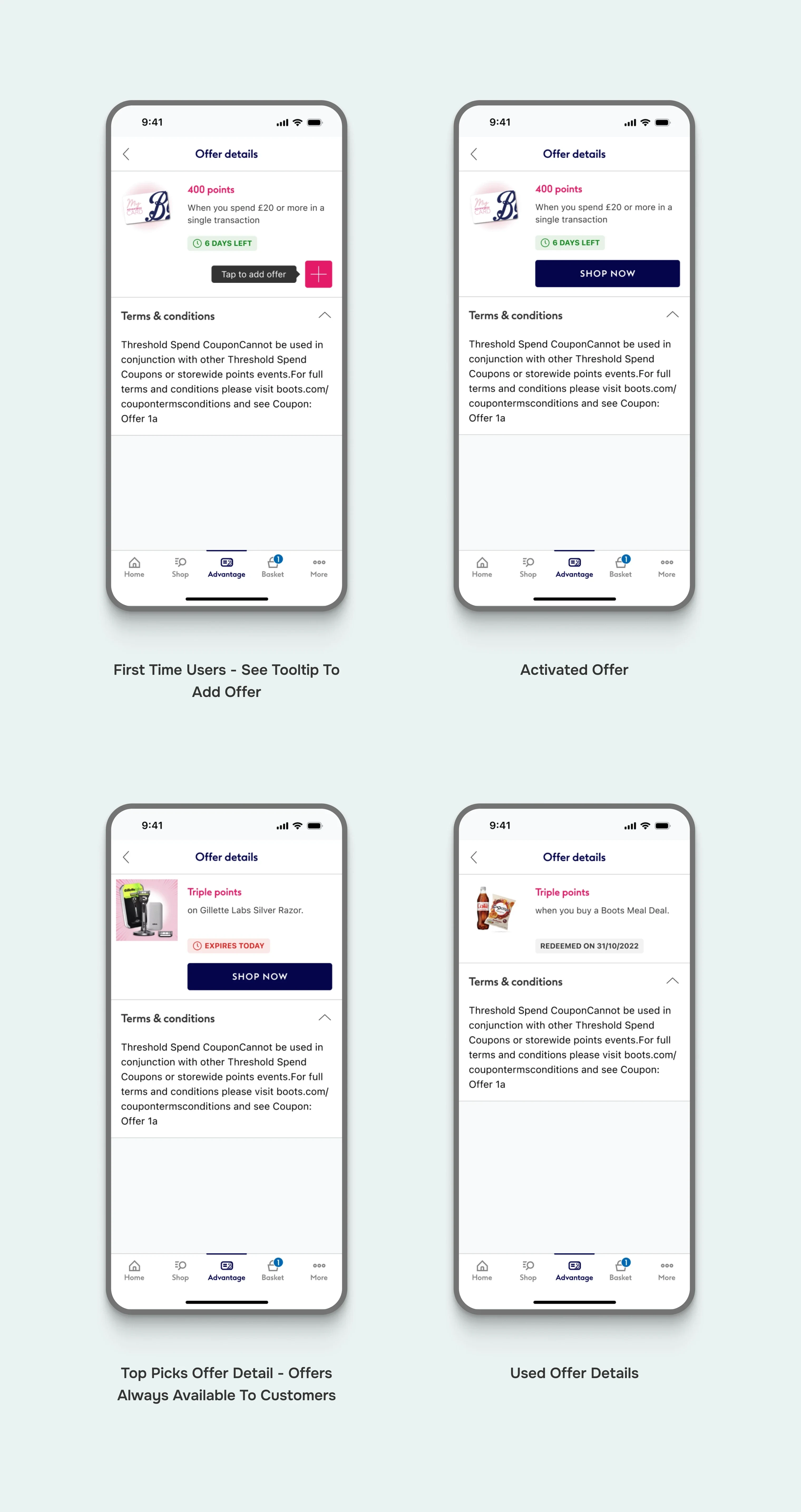
Offer Details
Supporting Screens
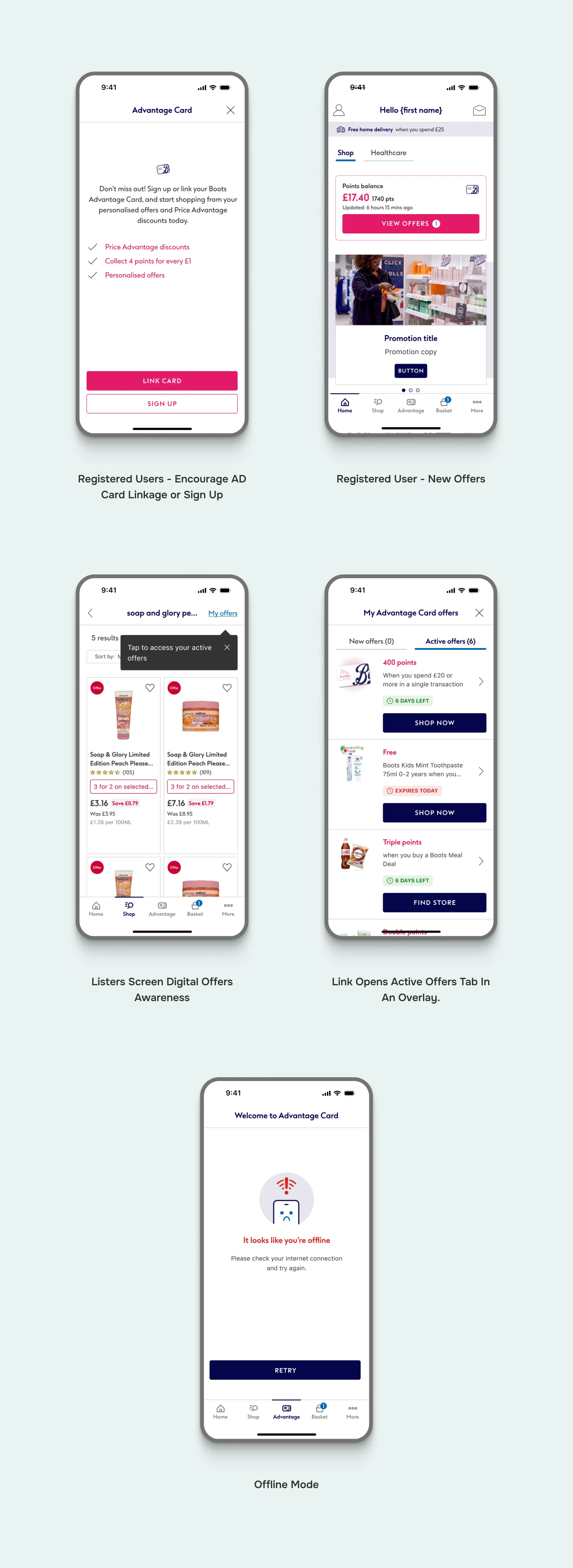
Supporting Screens
Like this project
Posted Jun 18, 2024
UK's household health and beauty brand, Boots sought our expertise to increase user engagement and streamline customer journeys on their iOS and Android apps.
Likes
0
Views
35
Clients

Boots UK


