WASHIT App Interface Design
Ram Prakash
The Challenge
Modern urban consumers need convenient laundry solutions that fit their busy lifestyles. The challenge was designing an app that makes booking laundry services feel effortless—reducing the typical 8-10 tap booking process to just 3 steps while maintaining clarity around pricing and service options.
Key Design Goals:
Simplify booking flow to minimize friction
Create trust through transparent pricing
Design for quick repeat orders
Maintain premium brand aesthetic
App ordering screens
The Solution
I designed WASHIT's mobile interface with a focus on clarity, speed, and trust—three critical elements for on-demand service apps.
Design Decisions:
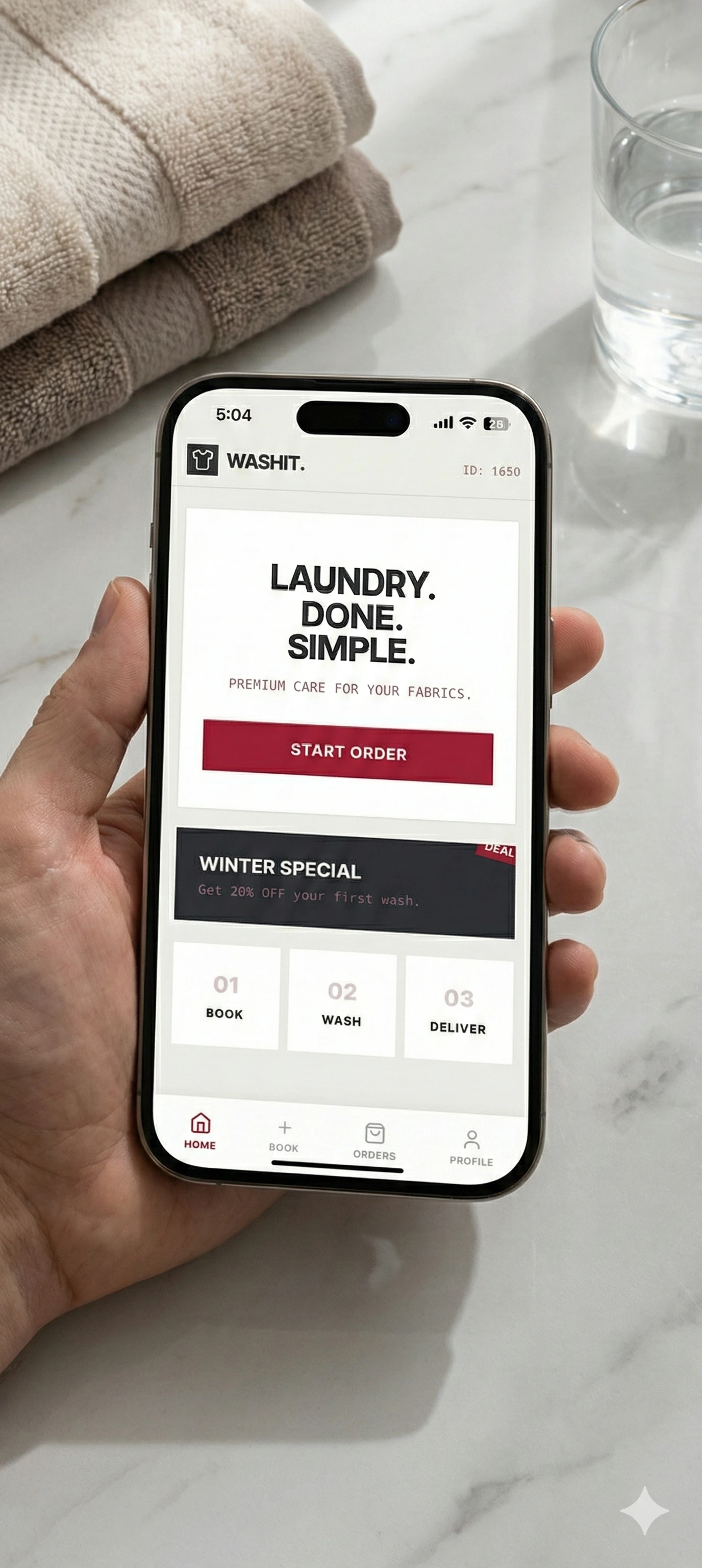
1. Bold, Benefit-Driven Home Screen
Hero message "LAUNDRY. DONE. SIMPLE." immediately communicates value
Single prominent CTA ("START ORDER") reduces decision fatigue
Winter promotion banner creates urgency without cluttering interface
Three-step visual process (Book → Wash → Deliver) sets expectations upfront
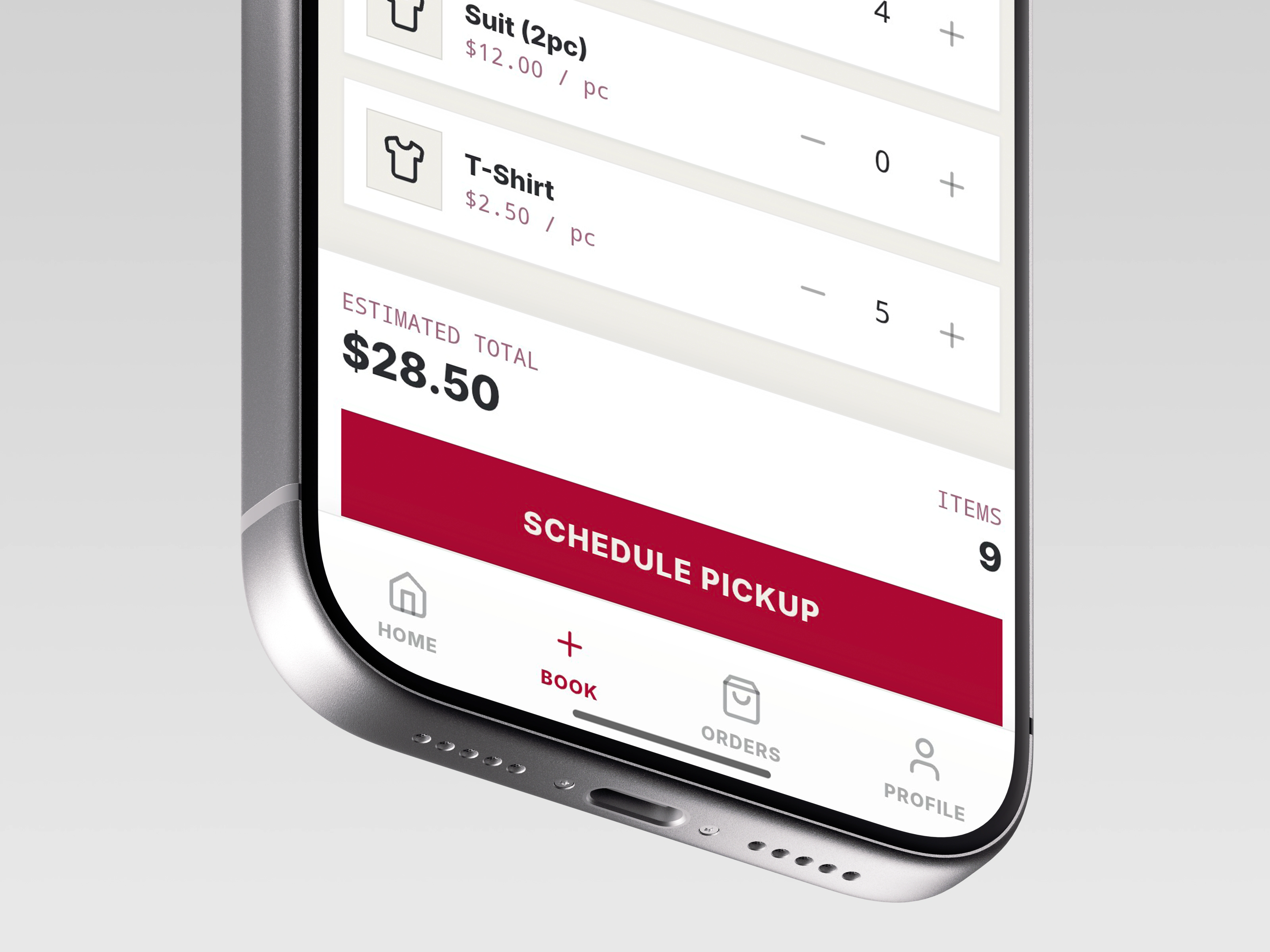
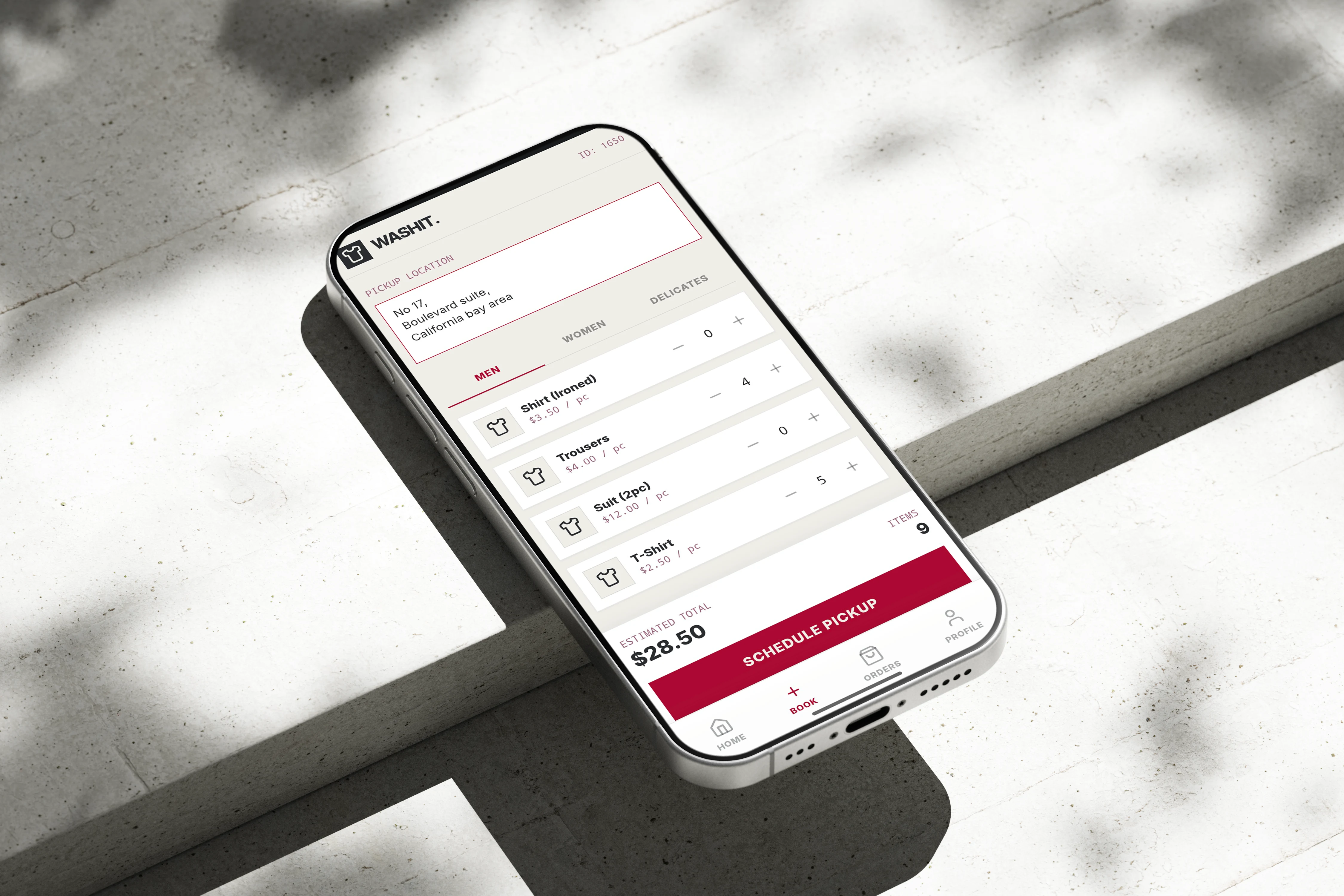
2. Transparent Pricing Structure
Item-by-item pricing displayed before booking ($2.50-$12.00 range)
Real-time total calculation builds trust
Category tabs (Men/Women/Delicates) organize selections logically
Quantity controls allow precise orders
3. Streamlined Order Management
Status-first design (Pending Pickup/Delivered immediately visible)
Payment CTA only on pending orders (reduces confusion)
Estimated pickup dates set expectations
Order history provides reference for repeat bookings
Visual Design Approach:
Minimal color palette (black, white, burgundy red for CTAs)
Sans-serif typography for modern, clean aesthetic
Generous white space reduces cognitive load
Consistent iconography across screens
Design Process
1. User Flow Mapping Identified critical path: Home → Service Selection → Order Confirmation → Order Tracking
2. Wireframing Focused on reducing steps while maintaining clarity on:
Service pricing
Pickup location
Order contents
3. Visual Design Applied minimal aesthetic that signals premium service quality while remaining approachable
4. Interaction Design
Quantity steppers for precise item selection
Tab navigation for service categories
Bottom navigation for primary app functions
Results & Impact
User Experience Improvements:
3-step booking process (vs. industry average of 8-10 taps)
Transparent pricing reduces pre-booking hesitation
Order management interface enables quick repeat orders
Design Outcomes:
Clean, professional interface that positions WASHIT as premium service
Scalable design system ready for additional features (subscriptions, service upgrades)
Mobile-first approach optimized for on-the-go booking
Key Learnings
1. Transparency Builds Trust Showing per-item pricing upfront (even when higher than competitors) reduces cart abandonment because users feel in control.
2. Simplicity ≠ Less Information The booking screen provides detailed pricing while remaining visually clean through smart categorization and spacing.
3. Status Visibility is Critical For service apps, order status must be immediately visible—not buried in menus—to reduce customer anxiety.
Technical Specifications
Screens Designed: 3 core flows (Home, Booking, Orders)
Design Tool: [Figma/Adobe XD - whichever you used]
Color Palette:
Primary:
#1A1A1A (Black)Accent:
#B71C3E (Burgundy Red)Background:
#F5F5F5 (Off-white)Text:
#1A1A1A / #999999Typography: [Your font choice - appears to be a clean sans-serif]
Expandable Features (Future Roadmap)
Based on this initial design, the app could expand to include:
Subscription/membership tiers
Real-time delivery tracking
Stain treatment add-ons
Eco-friendly service options
Referral program integration
Like this project
Posted Dec 6, 2025
Designed mobile UI/UX for on-demand laundry app. Simplified booking flow to 3 steps, transparent pricing structure, and premium minimal aesthetic.