Throwback to an e-commerce app
Throwback to an e-commerce app I designed some time ago
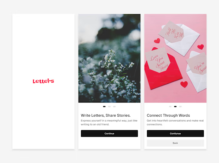
Revisiting these screens reminded me how much impact the basics still have:
Clean UI for clarity
Typography doing real UX work
Color used sparingly and with intent
What I liked most about this project:
Icon selection
Minimal black-and-white palette
Distinction between the website brand and the actual product
Font choice and hierarchy
I'm still proud of how this came together.
Like this project
Posted Jan 7, 2026
Throwback to an e-commerce app I designed some time ago Revisiting these screens reminded me how much impact the basics still have: Clean UI for clarity Typ...
Likes
0
Views
0


