the sustainable institution Visual Identity
In collaboration with Lorenz Klingebiel
The conceptualization of the visual identity for the sustainable institution was an intricate project aimed at unifying a series of symposia, residency programs and events hosted by Rupert, Vilnius (Earth Bounds), LUMA Arles (Every Building is a Prediction, and Every Prediction is Wrong), and E-WERK Luckenwalde (Burn Out). The goal was to create a cohesive visual narrative that encapsulated the essence of sustainability and growth, which are central themes of the event series.
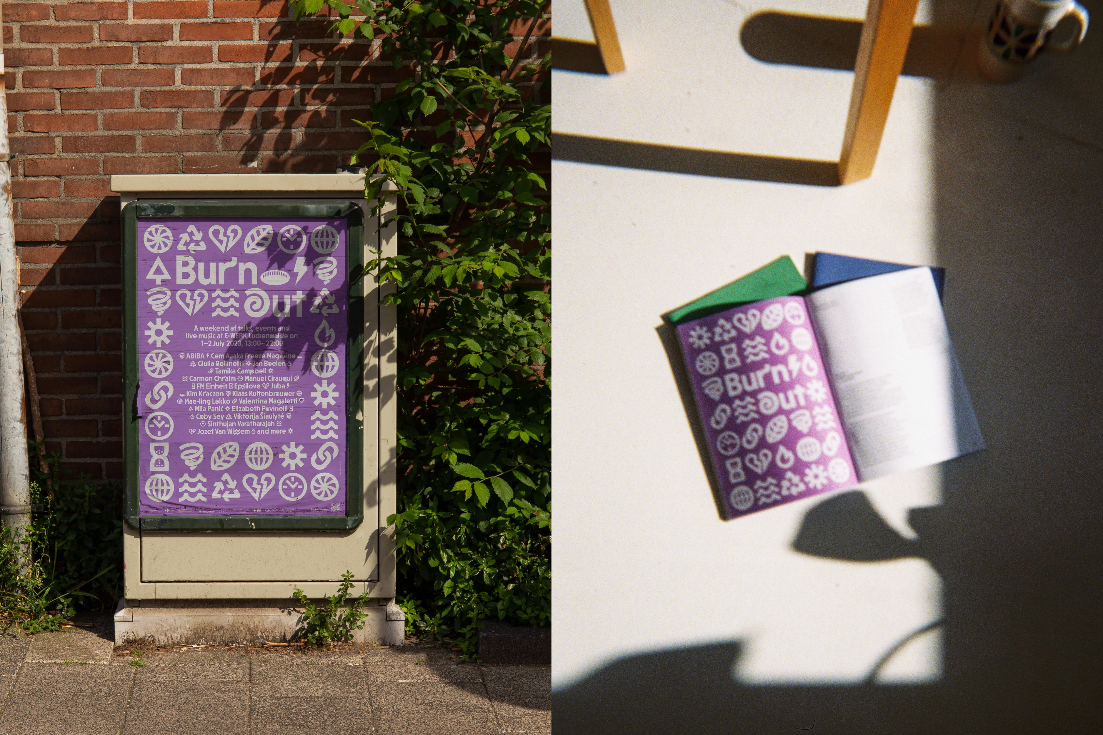
Left: Poster Design for 'Burn Out', the first event hosted by E-WERK Luckenwalde. Right: Brochure spread of 'Burn Out'
Concept and Symbolism
The starting point for this visual identity was the symbol of the spiral. The spiral was chosen for its rich symbolism; it represents growth, development, and the cyclical nature of sustainability, which directly links to the subjects and content of the events. This symbol served as a unifying thread throughout the visual identity, creating a consistent and recognizable motif.
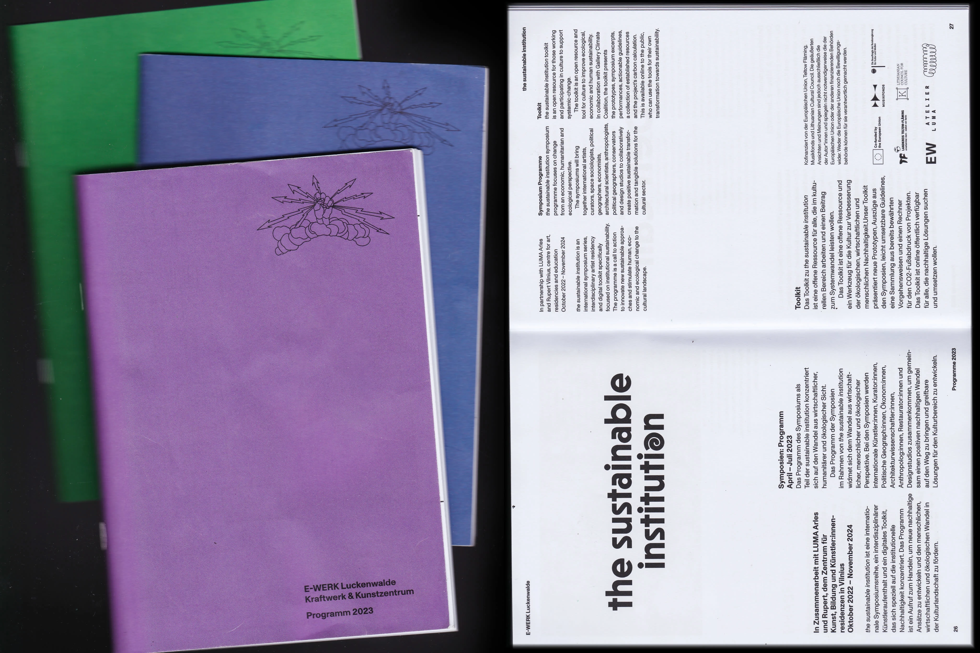
Brochures and 'the sustainable institution' word mark
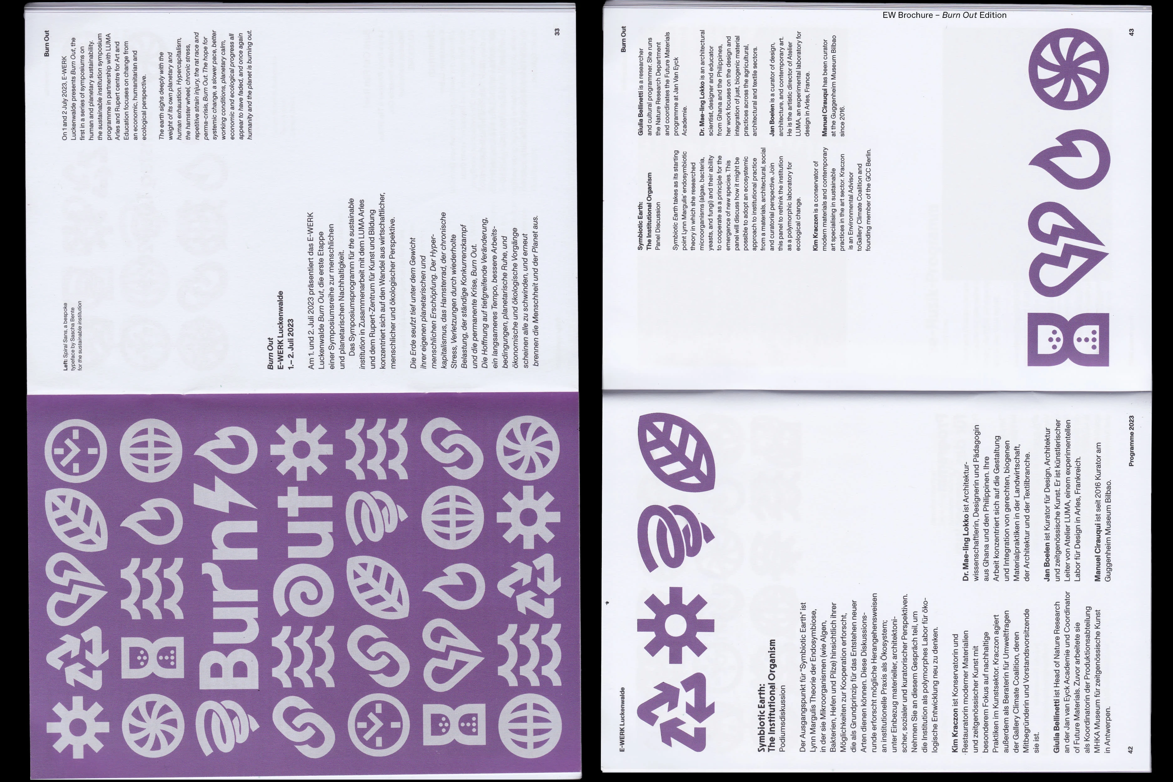
'Burn Out' Visual identity and a closer look to the elements of the 'TSI Spiral' typeface
Typography Development
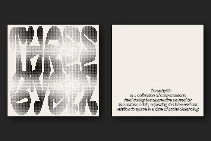
Collaborating with type designer Sascha Bente, we developed a bespoke typeface that integrated the spiral motif. This custom typeface featured unique glyphs, with the spiral incorporated as a central design element. The typeface was not only a visual anchor but also a functional tool that enhanced the thematic coherence across various platforms and materials.
Implementation Across Events
The visual identity was rolled out in phases, starting with the announcement of the open call for residency applications. The website, designed as the primary communication hub, showcased the new identity and set the tone for the upcoming events. The visual elements, including the bespoke typeface and spiral motif, were seamlessly integrated into the website design, providing an engaging and informative user experience.
As the series progressed, the three symposia each featured the visual identity in different contexts, with the E-WERK Luckenwalde event receiving particular design focus. The visual elements were adapted to suit the unique atmosphere and thematic concerns of each symposium, ensuring a flexible yet consistent brand presence.
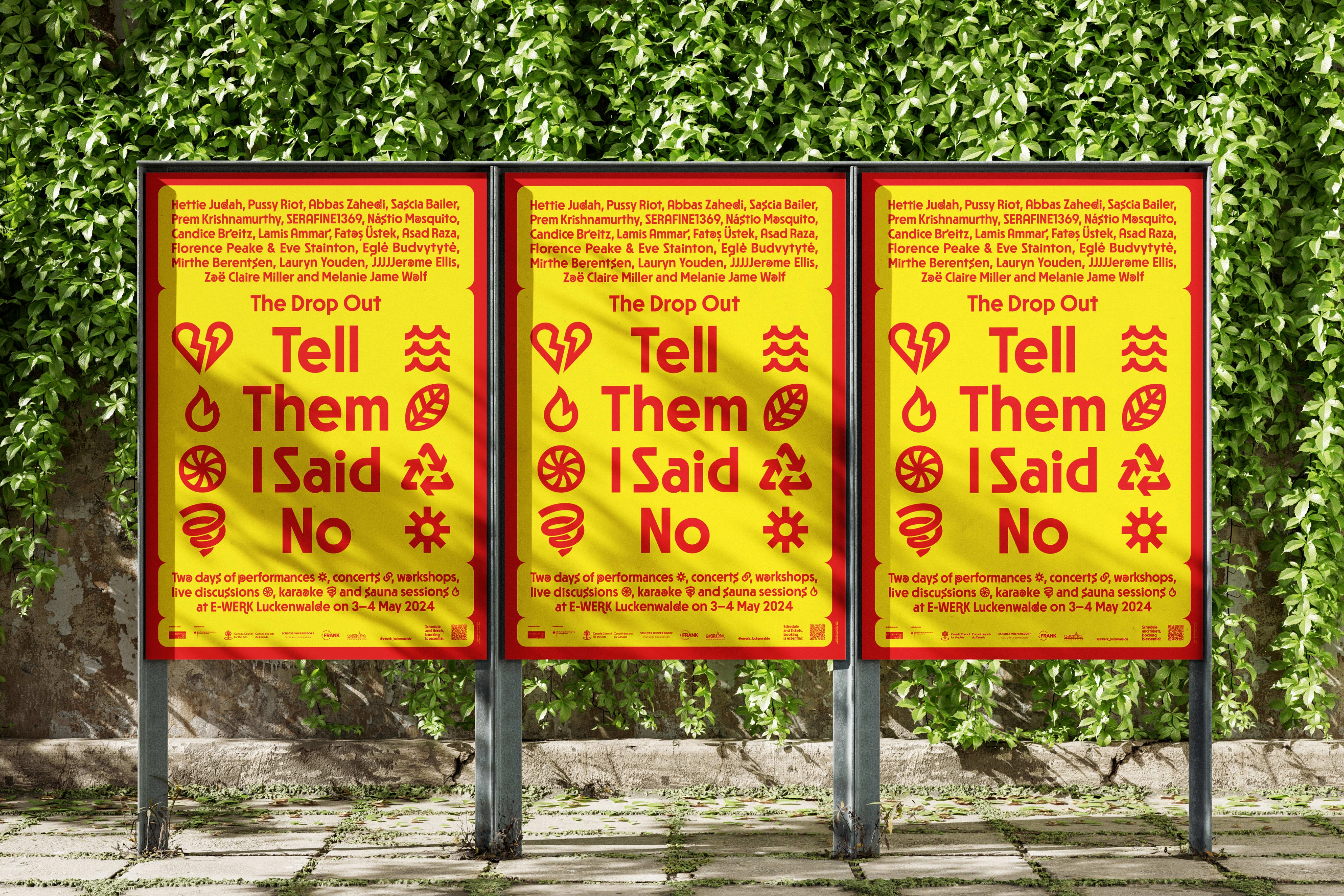
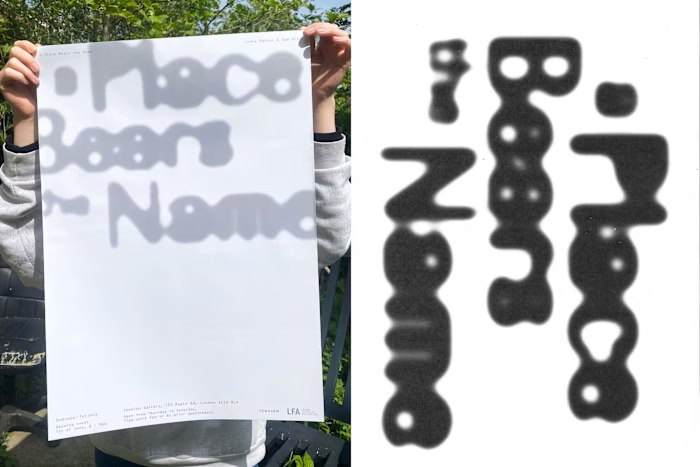
Poster design for 'The Drop Out: Tell Them I Said No', the second event hosted by E-WERK Luckenwalde
E-WERK Luckenwalde Events
The first weekend of May 2024 marked a significant milestone with E-WERK Luckenwalde hosting a second event titled "The Drop Out: Tell Them I Said No." For this event, the visual identity was further refined and expanded to create a compelling narrative that resonated with the audience. The bespoke typeface and spiral motif were prominently featured in promotional materials, event signage, and digital content, reinforcing the thematic continuity and visual appeal.
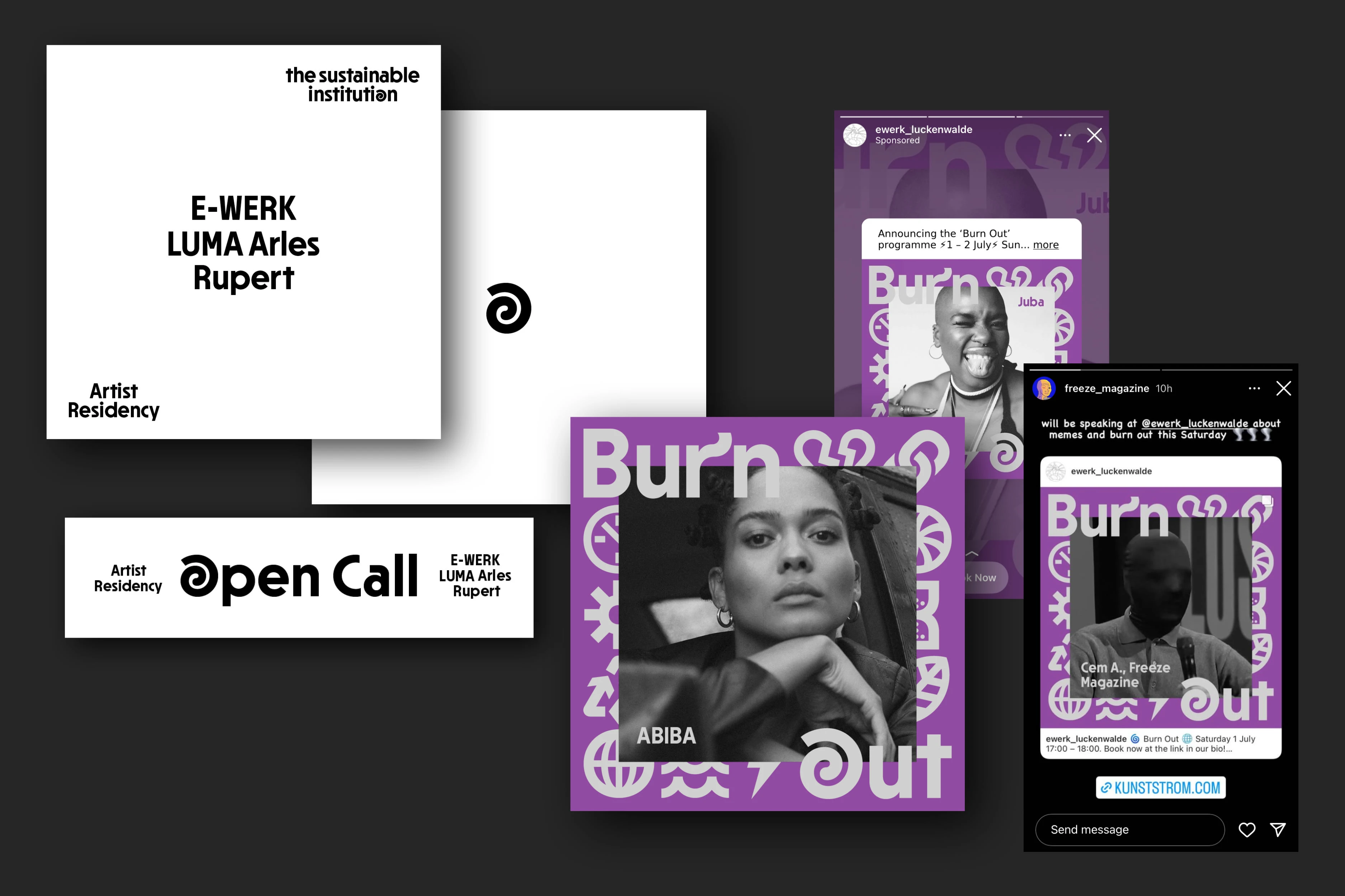
Online assets for the 'Residency Open Call' and 'Burn Out'
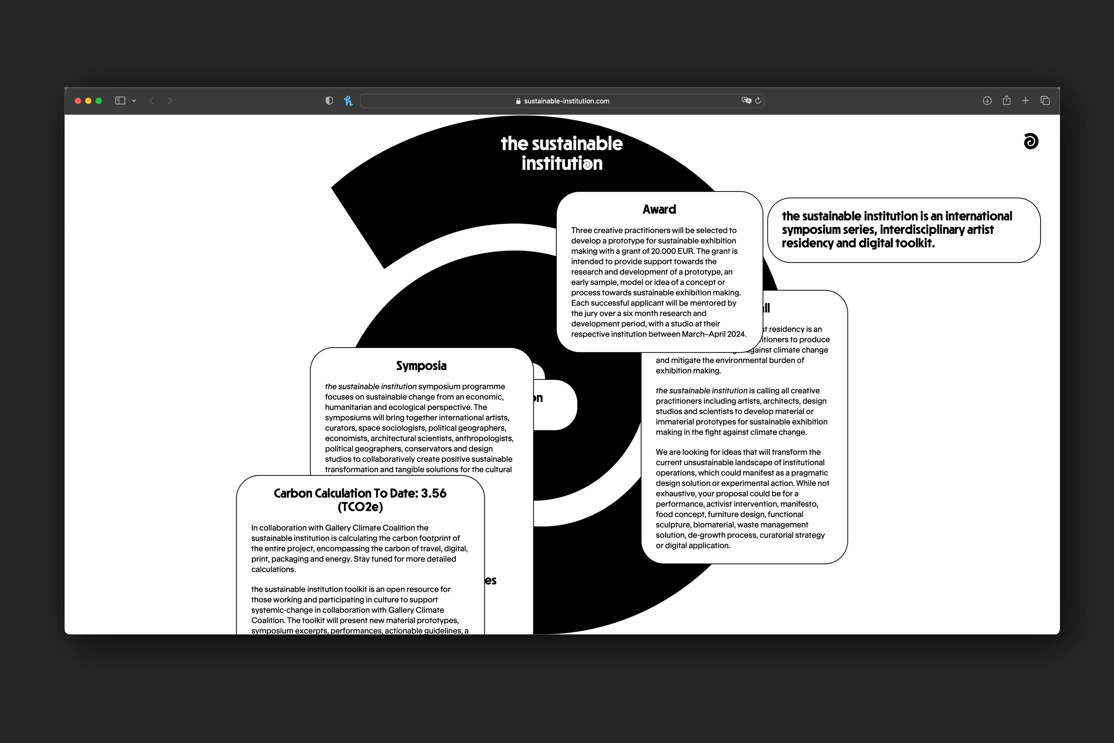
Website design with the spiral key visual
Future Plans and Website Relaunch
Looking ahead, the website is set to relaunch in Summer 2024, updated with an archive and an overview of past events. This relaunch aims to create a lasting digital legacy for the Sustainable Institution series, providing an accessible resource for attendees and the wider community. The updated site will feature detailed documentation of each event, including images, videos, and written summaries, all designed within the established visual framework.
In conclusion, the visual identity for the Sustainable Institution was a carefully crafted project that successfully linked multiple events through a consistent and meaningful design language. By using the spiral symbol and a bespoke typeface, we were able to create a unified visual identity that not only captured the essence of the series but also provided a versatile and engaging platform for future events.
Like this project
Posted May 27, 2024
Visual Identity for Symposium and Residency Program series 'the sustainable institution'
Likes
0
Views
16
