Design Concept: a Place Bears the Name Exhibition
In the heart of contemporary Britain, where the echoes of the past reverberate through empty spaces and lingering shadows, "A Place Bears the Name" emerges as a poignant exploration of memory, melancholy, and the enigmatic allure of what once was.

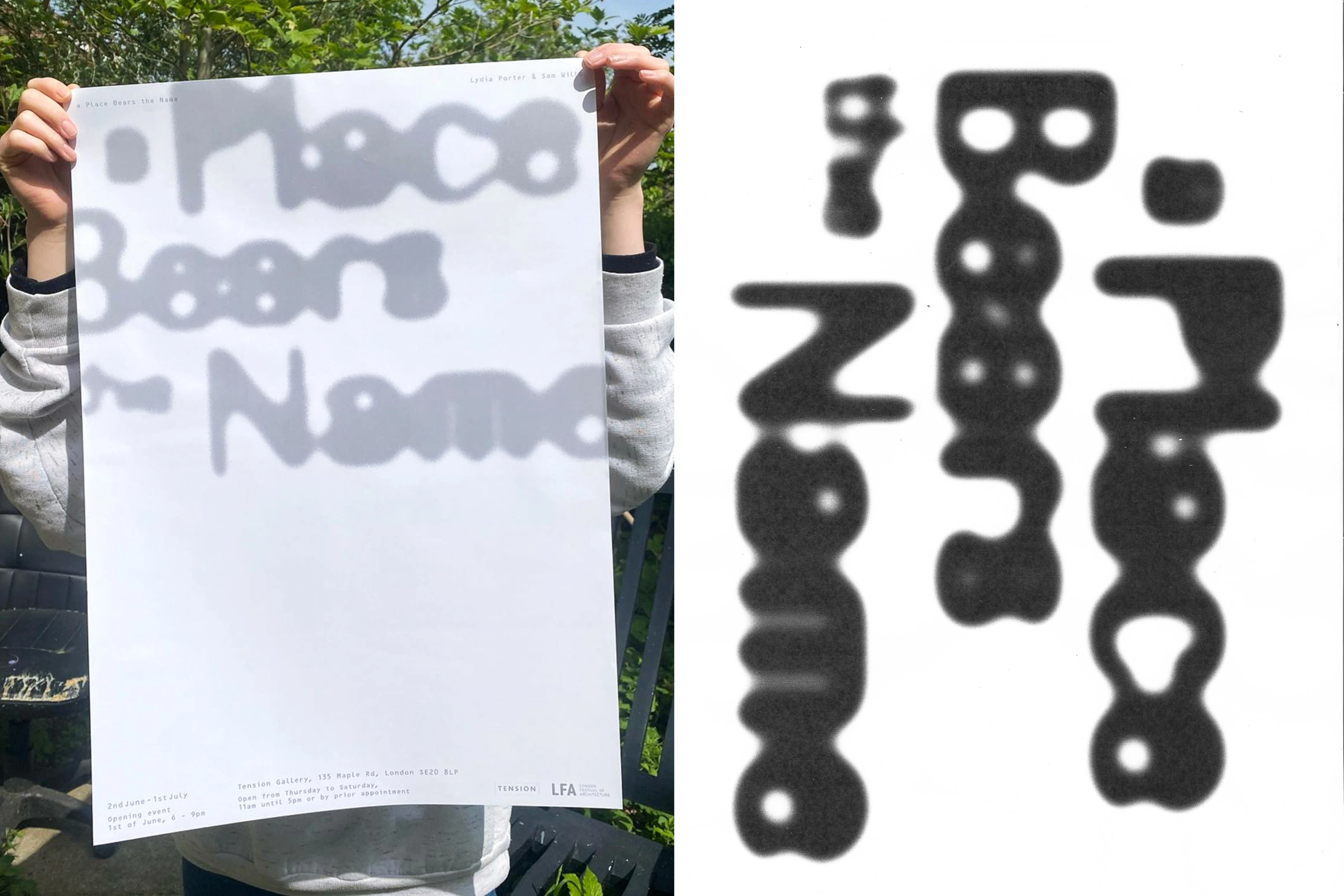
Poster and a close up of the work in progress
Bespoke Lettering
At the forefront of the exhibition's visual identity lies bespoke lettering, meticulously crafted to embody the exhibition's thematic essence. This lettering serves as a visual representation of the exhibition's main point of departure: the shadows of an empty past and the haunting melancholy that permeates contemporary Britain. Evoking a sense of nostalgia and introspection, the lettering casts a shadow on the pages or background, blurring the lines between presence and absence, just like the memories and stories that linger from the past.
Key Visual Element
The title, rendered in this shadow font, stands as a key visual element that unifies all formats of the exhibition's promotional materials. Whether it's posters adorning city walls, flyers distributed in bustling neighborhoods, or social media posts captivating virtual audiences, the title emerges as a symbol of intrigue, inviting viewers to delve into the nuanced layers of meaning hidden within the shadows.
Like this project
Posted May 27, 2024
Visual Identity and Bespoke Lettering for the exhibition 'a Place Bears the Name'
Likes
0
Views
3


