Built with Webflow
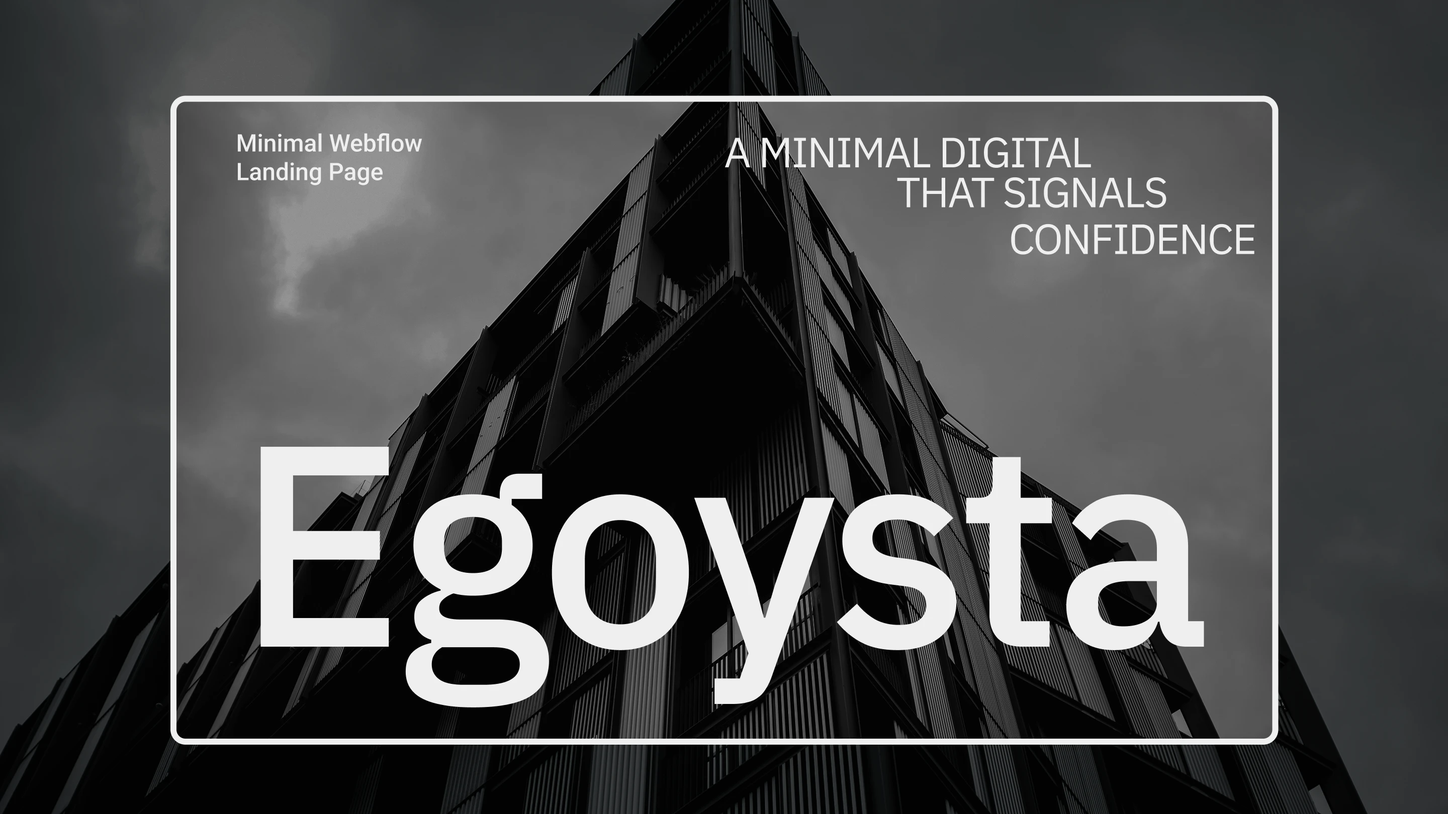
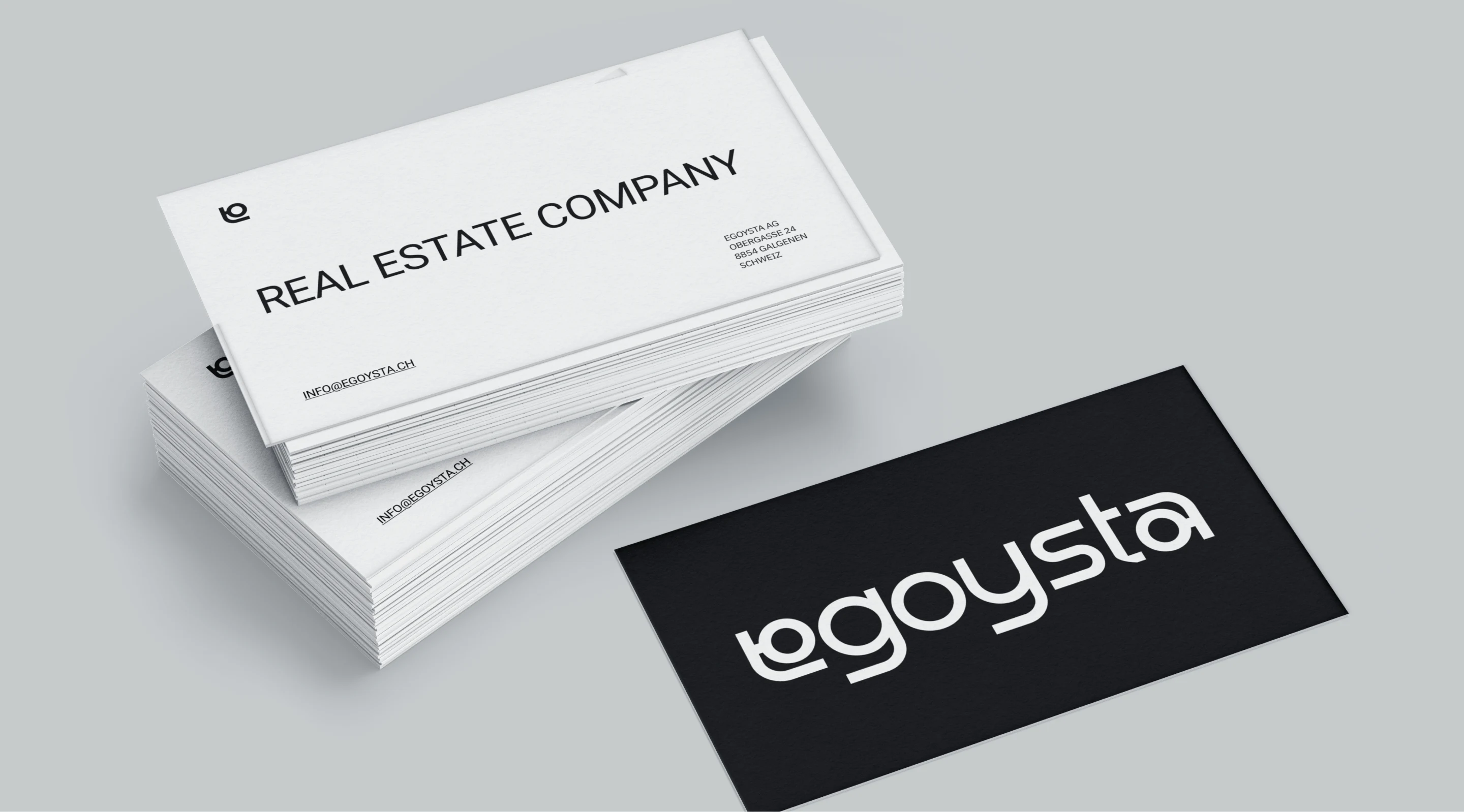
Egoysta Webflow Landing Page Design
Klimt Creations
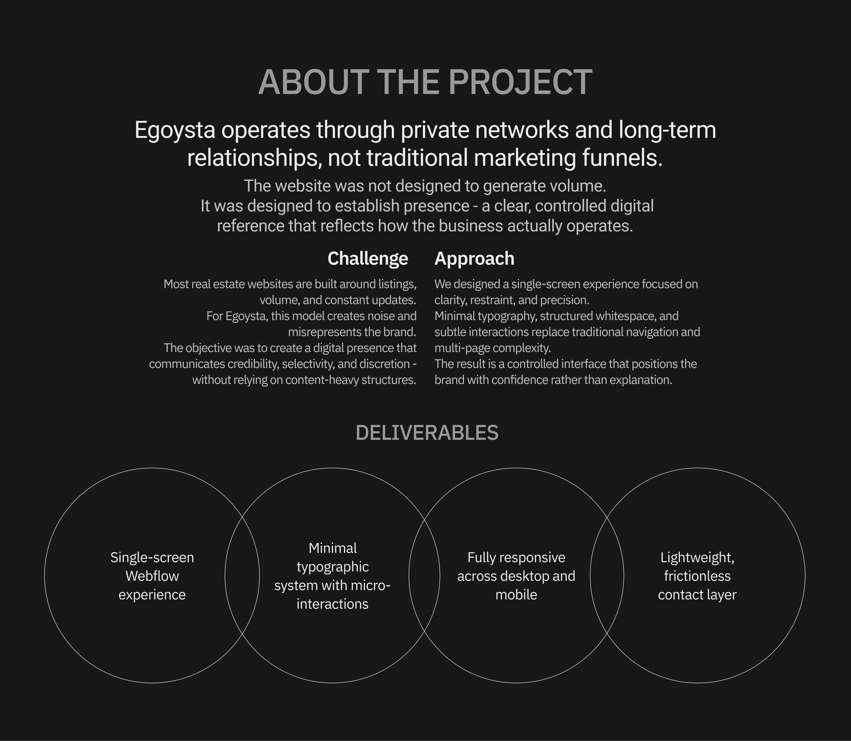
Challenge
Traditional real estate websites are built around listings, marketing copy, and multi-page structures.
For Egoysta, this approach created misalignment.
Key challenges included:
• The website was not a primary acquisition channel
• Standard real estate layouts felt unnecessary and overly complex
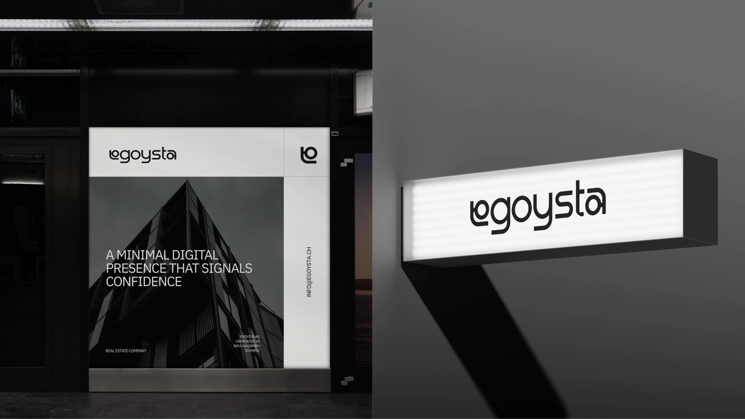
• The brand required a more deliberate, understated digital presence
• The experience needed to be memorable while remaining minimal
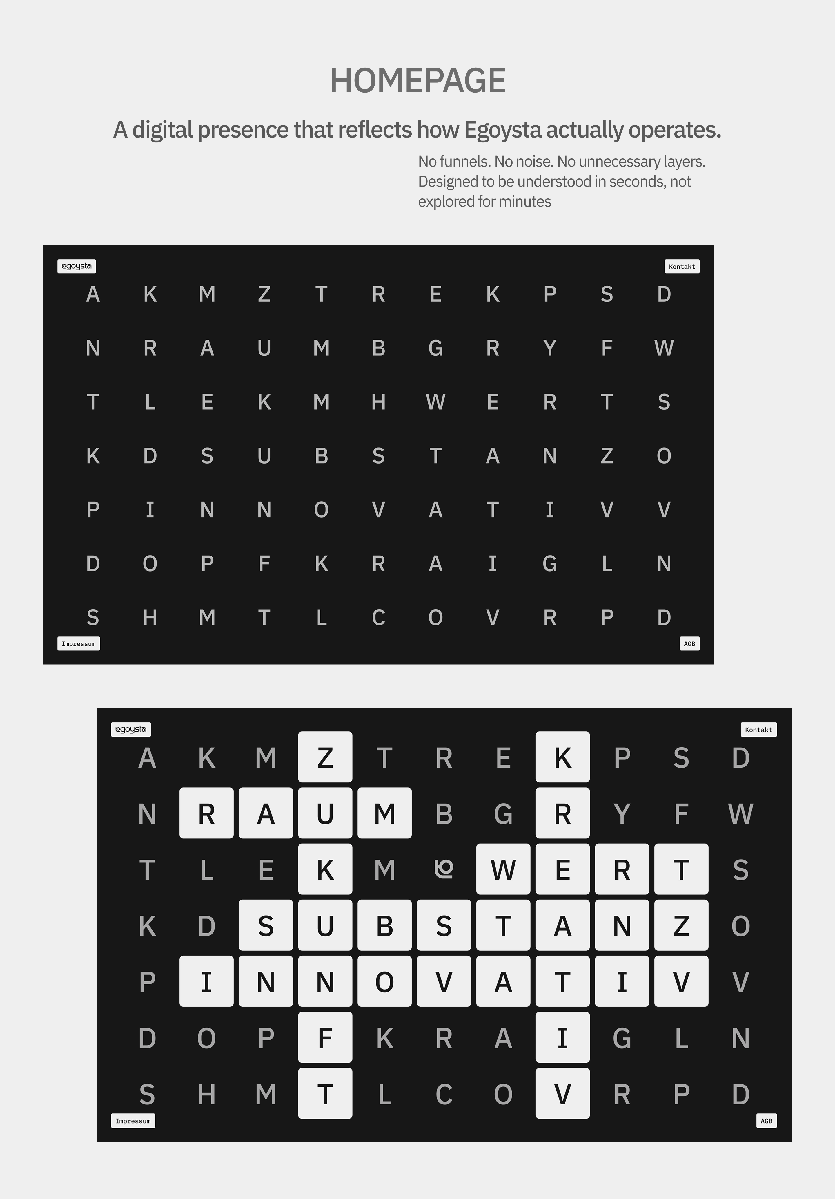
Solution
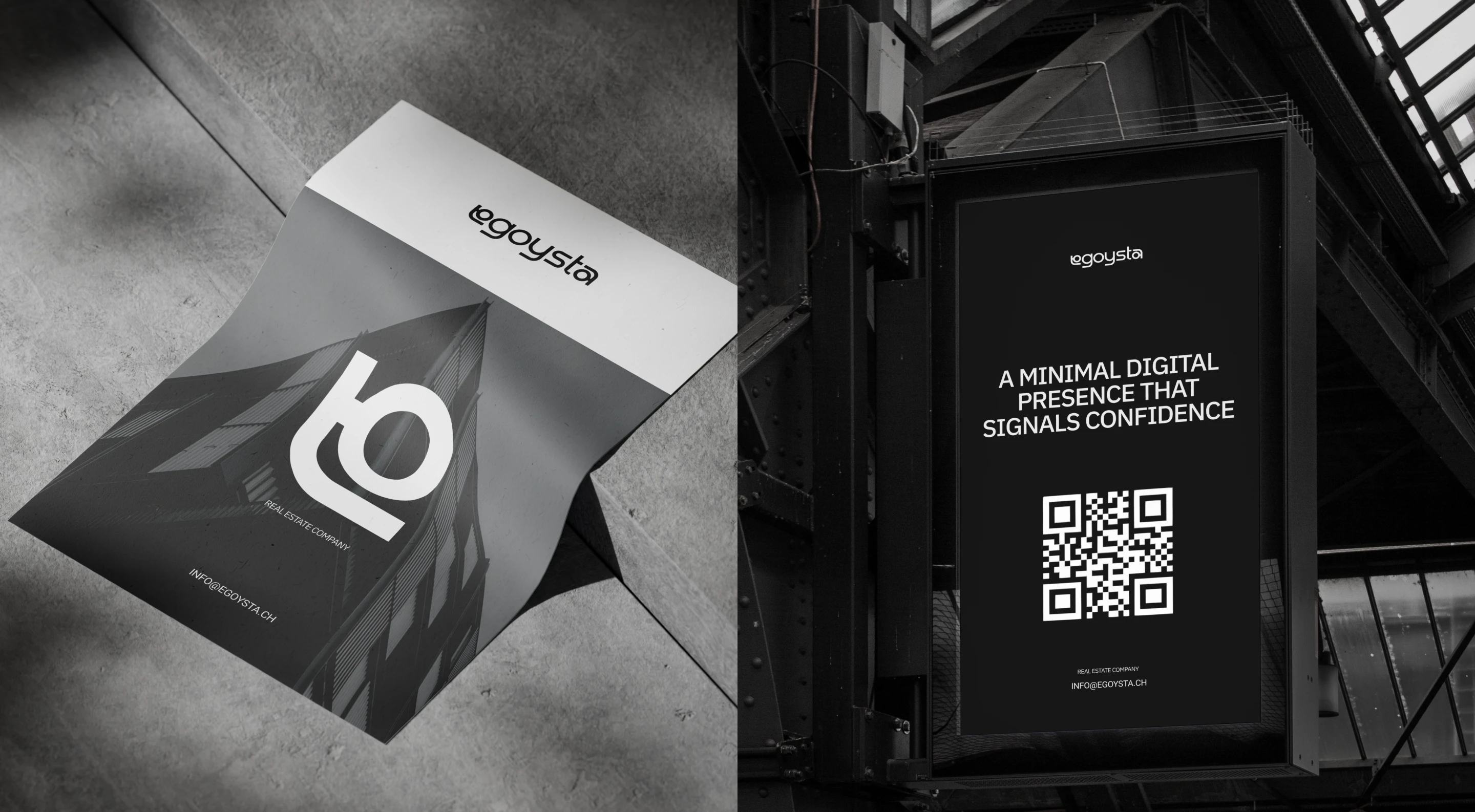
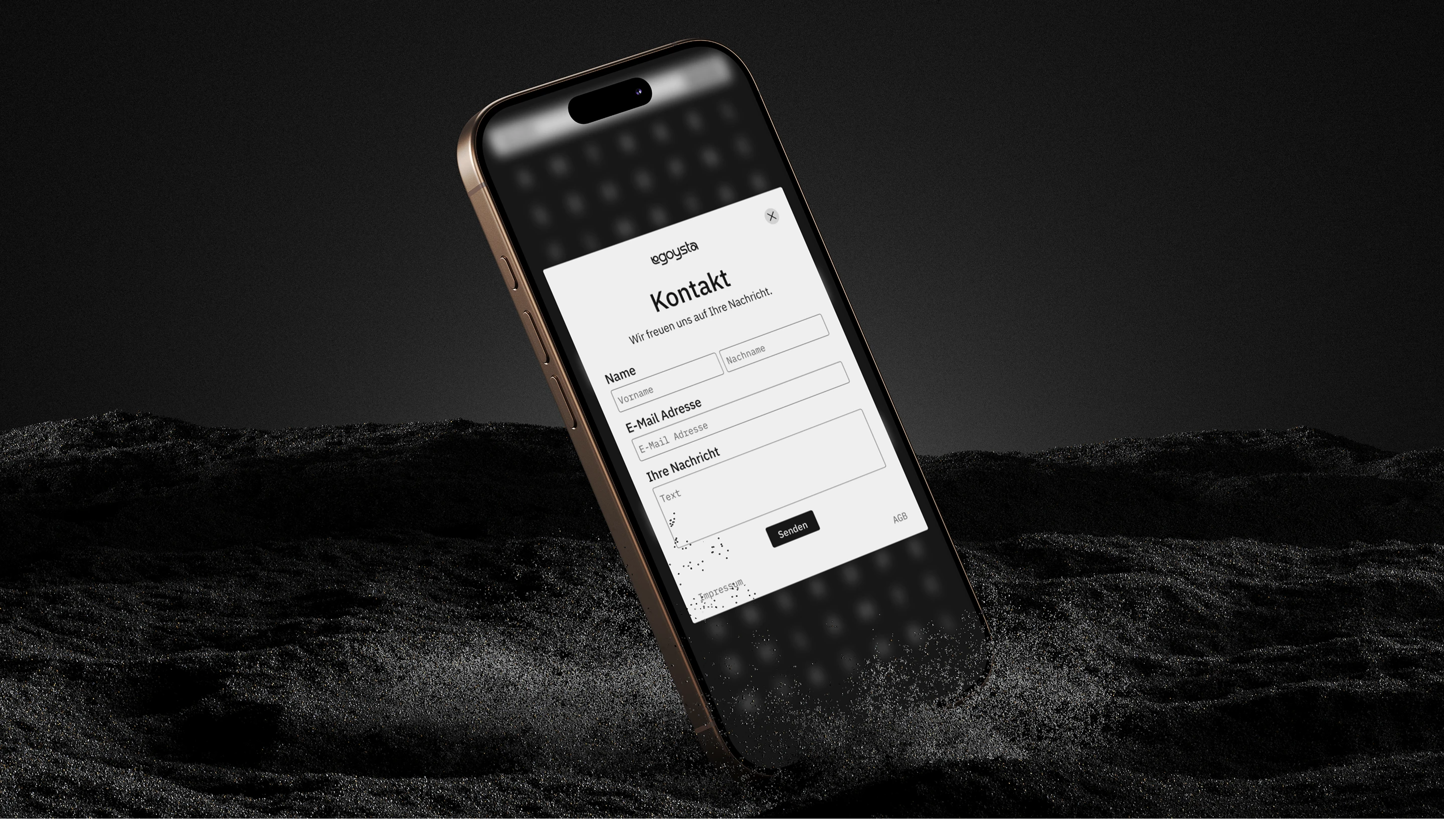
We designed a single-screen Webflow landing page built around clarity, restraint, and intention.
Instead of adding more content, we focused on reducing everything to what matters:
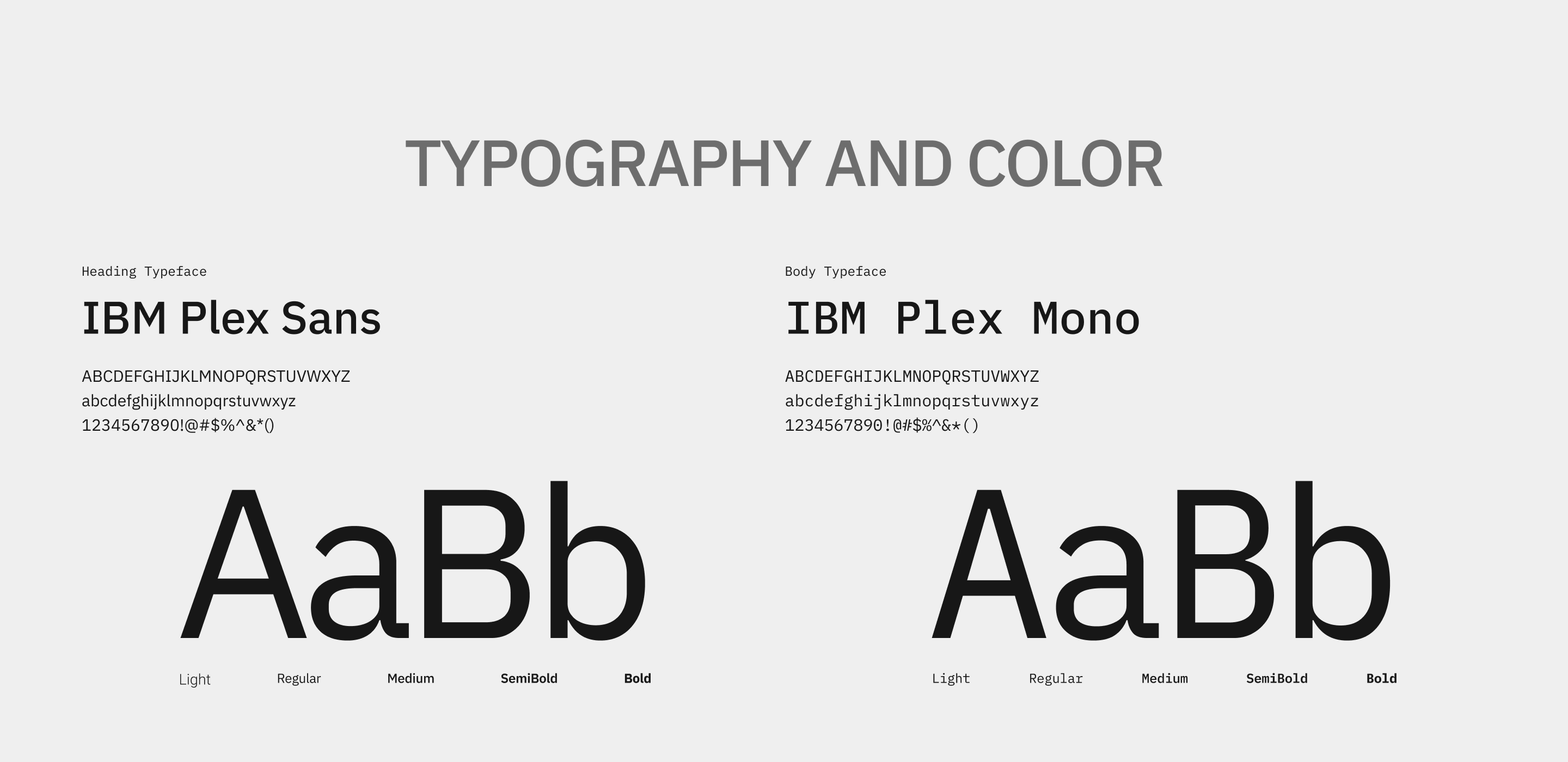
• Minimal typographic composition
• Generous whitespace and balance
• Subtle motion and hover interactions
• A simple, unobtrusive contact interaction
The result is a digital experience that communicates through tone and structure, not volume.


Results
Egoysta now has a digital presence that reflects its positioning and philosophy.
The new website provides:
• A distinctive, minimal online identity
• A modern, high-quality Webflow implementation
• A design-led experience aligned with the brand’s values
• A memorable reference point for clients and partners
Like this project
Posted Mar 25, 2026
Designed a minimal Webflow landing page for Egoysta focusing on clarity and brand alignment.
Likes
0
Views
2