Most “production company” websites look
Mike Samovarov
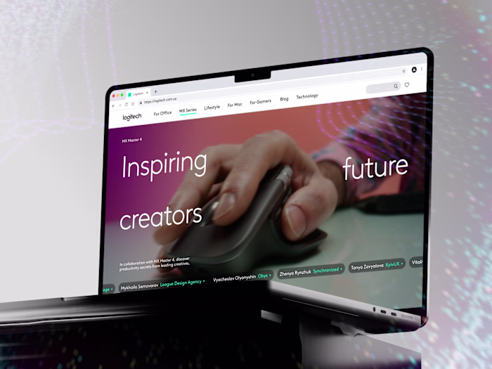
Most “production company” websites look the same - dark, heavy, and honestly… forgettable.
We decided to go in the opposite direction 👉 Just wrapped a website design for a team that builds and operates video systems for concerts, events, and films - basically, the people behind the visuals you actually remember.
Instead of playing it safe, we leaned into bold. Bright colors, sharp contrasts, a bit more energy in every interaction.
The kind of interface that catches your eye in a few seconds - just like their work does on stage and on screen.
Really enjoyed working on this one ☺️✨
If your website doesn’t quite match the level of what you do yet - happy to take a look 📩
Like this project
Posted May 28, 2026
Most “production company” websites look the same - dark, heavy, and honestly… forgettable. We decided to go in the opposite direction 👉 Just wrapped a websi...
Likes
0
Views
1