
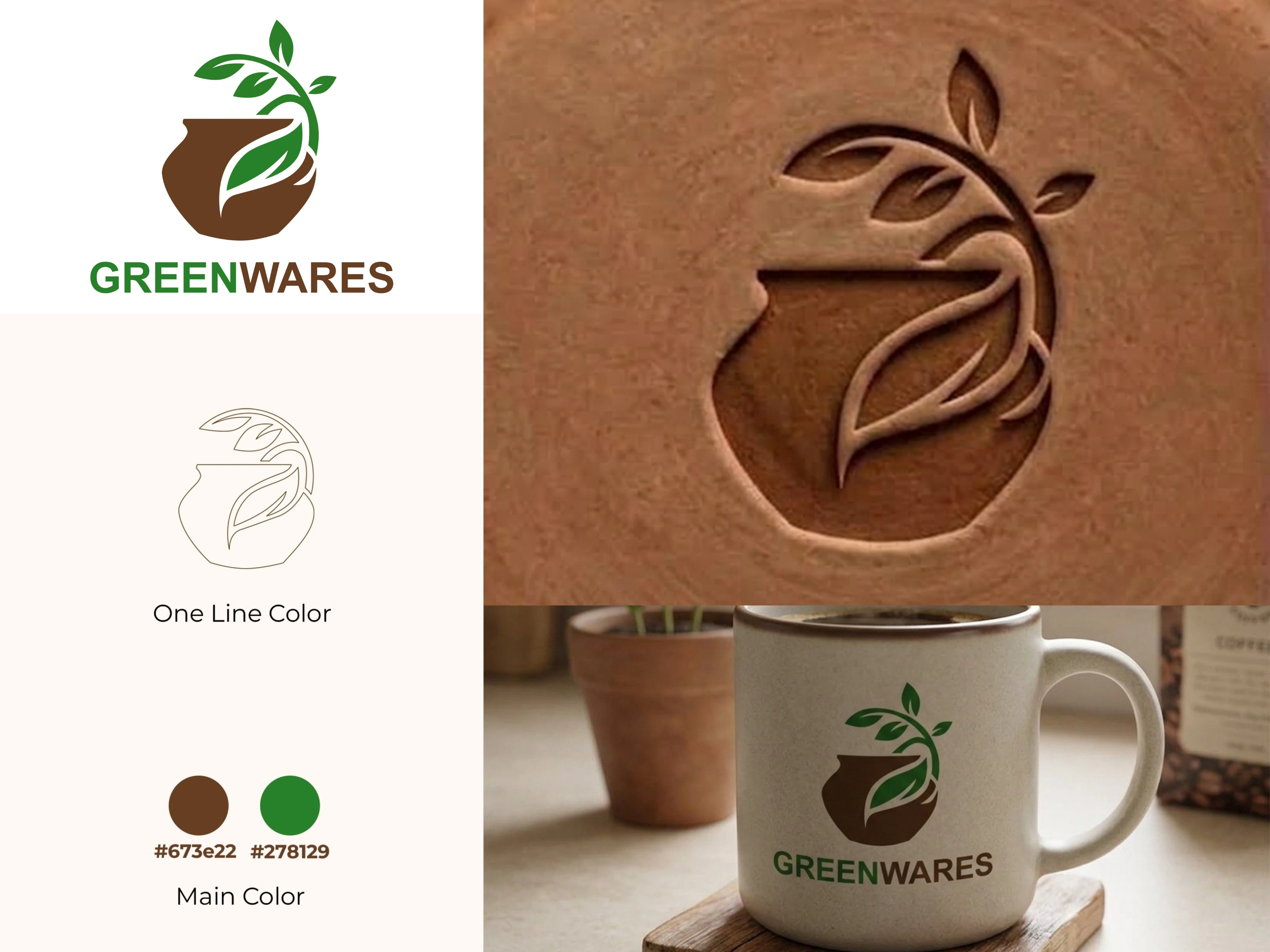
Latest logo concept: Greenwares, a pottery studio mark built around a hand-thrown pot with a leaf and branch curling into a circular form.
Kept it minimal on purpose, no ornate details, just enough to read as pottery at a glance. Also designed a one-line stamp version that holds up at 15mm and stays legible even on a partial clay impression, so it can double as a maker's mark pressed straight into the piece.
Earth-brown and muted green for warmth, one clean stroke for the stamp.
#logodesign #minimalistlogo #potterybranding #brandidentity #graphicdesign
0 likes · 0 views · Sep 15, 2026
Latest logo concept: Greenwares, a pottery studio mark built around a hand-thrown pot with a leaf and branch curling into a circular form. Kept it minimal on...

