DOPO DI NOI (After Us)
Maurizio Piacenza
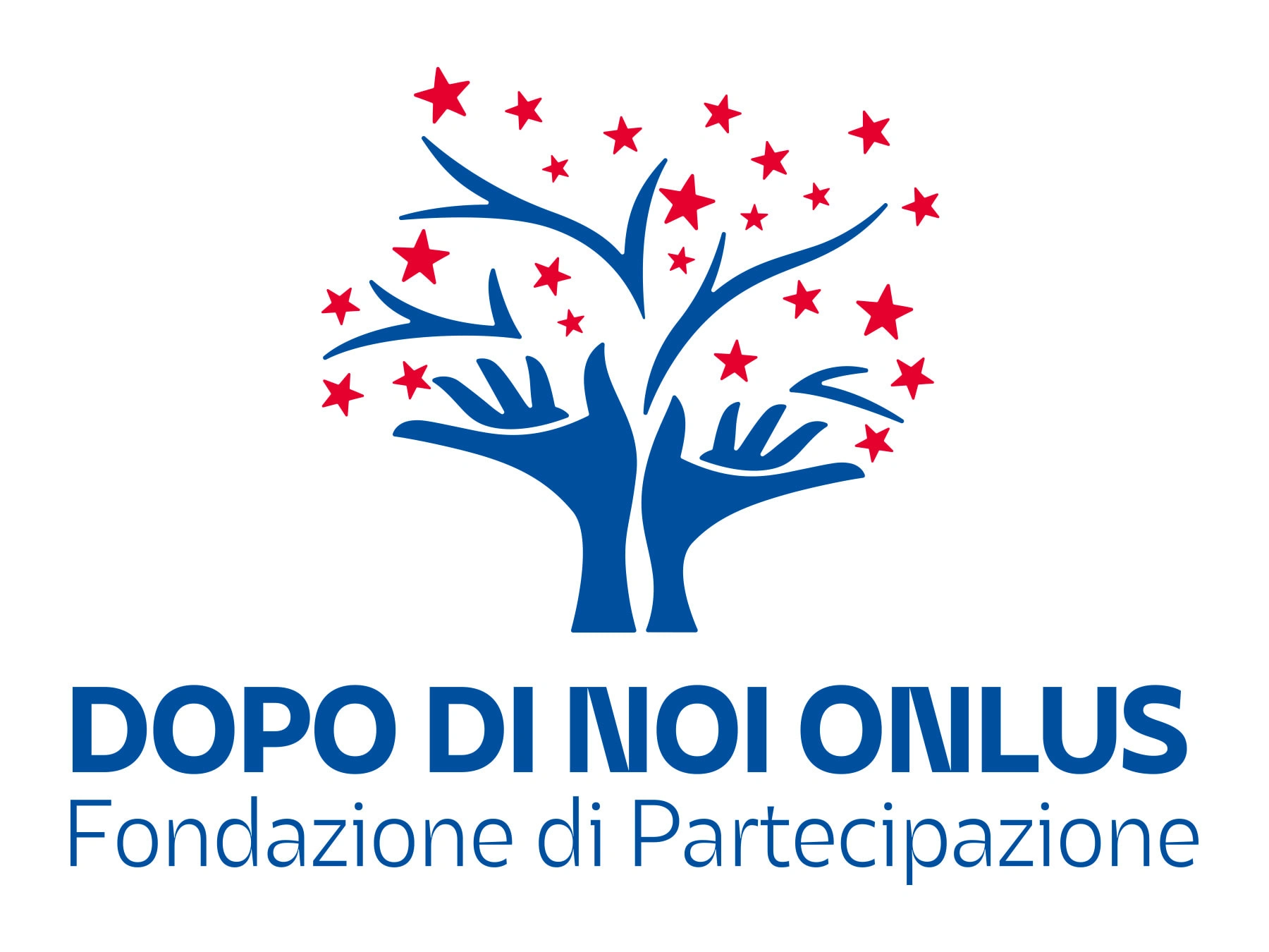
LOGO RESTYLING
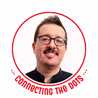
Logo restyling for tnot-for-profit organisation "Dopo di Noi Fondazione di Partecipazione" that works with and for disabled people.
Not a revolution, more a rationalisation to improve:
shapes of the pictogram, now more harmonious;
colours which, although visually not so much changed, now have a more rigorous CMYK composition;
last but not least, typography. They needed a more defined identity, and Asgard by Zetafonts has a lot of character — pardon the pun :) An entire type family that ensures consistency in different use cases and, at the same time, provides the right tools to meet the most diverse needs.
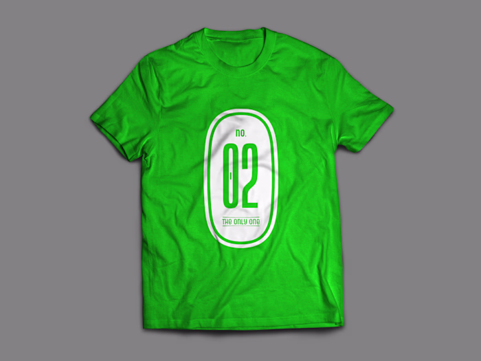
This is the first step. We're already working on what's next (t-shirt & more).
Like this project
Posted Oct 4, 2022
Logo restyling for not-for-profit organisation "Dopo di Noi Fondazione di Partecipazione" that work with disabled people. Now working on their t-shirts & more.