Teamwork Commerce
New Logo and brand identity to emphasize continuity, harmony and commerce
Revision Round 1
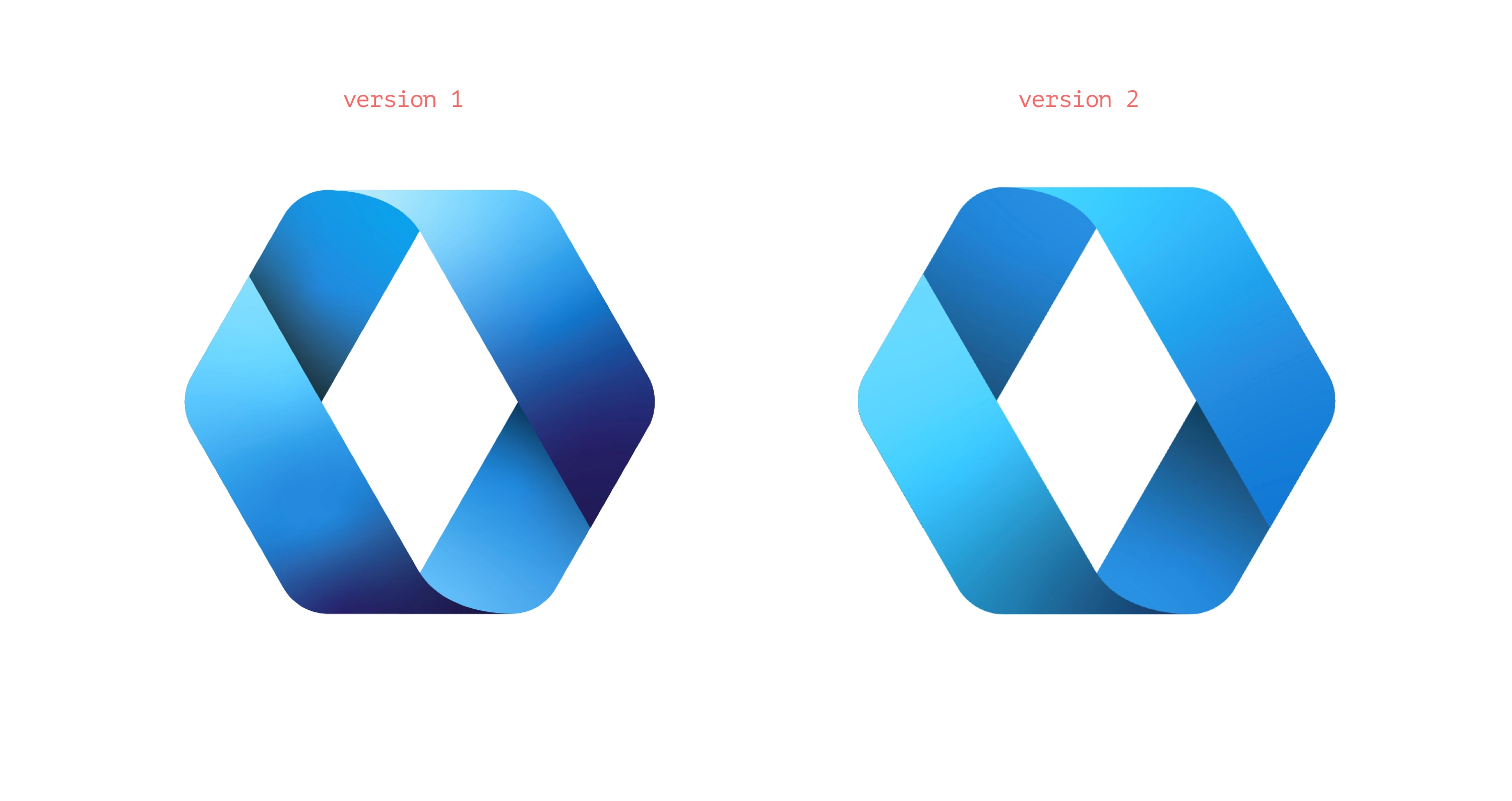
Textured gradient has been toned down and simplified in version 2
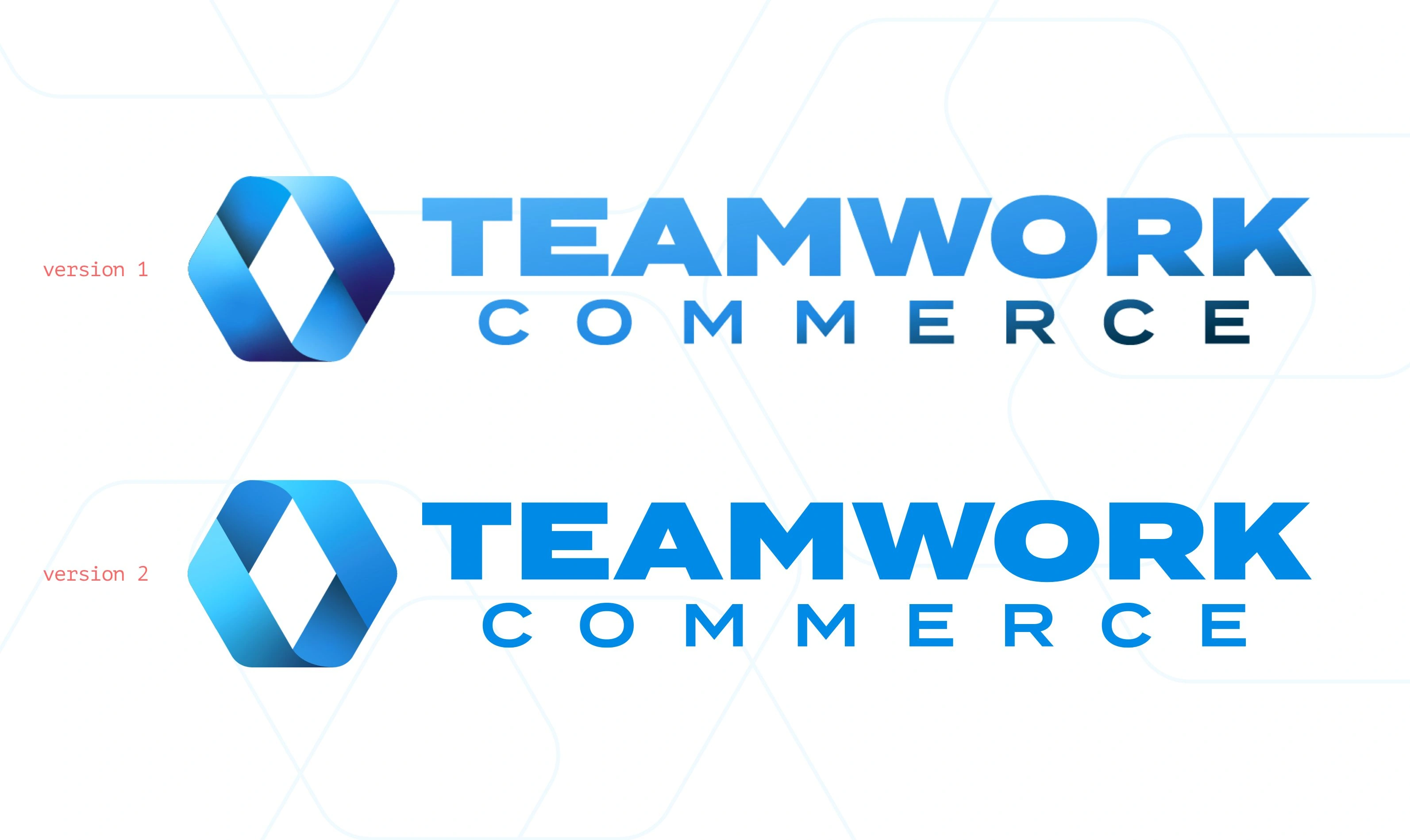
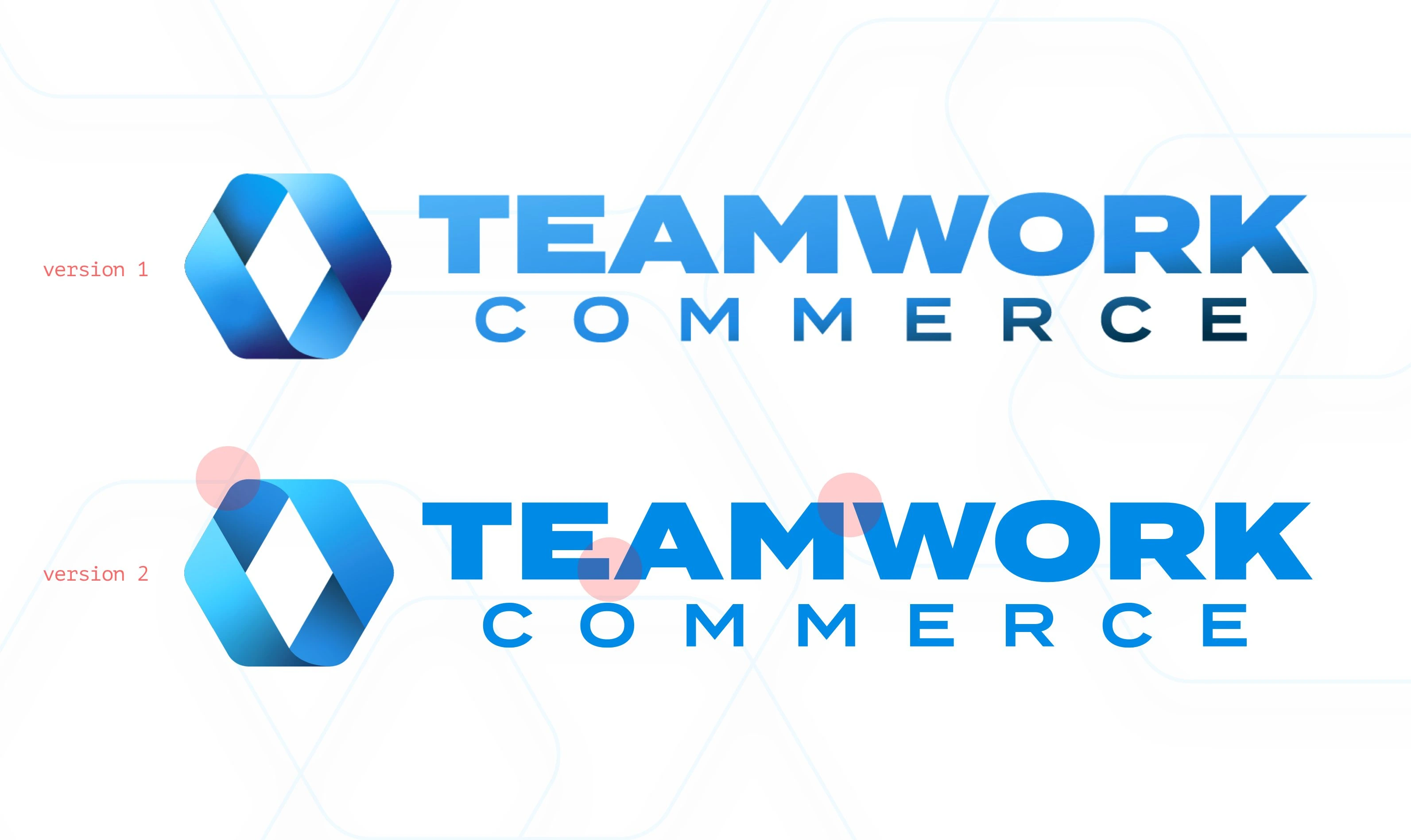
Gradient has been removed on the monograph and a slight increase in the kerning to help with the spacing between the "E" and "A"
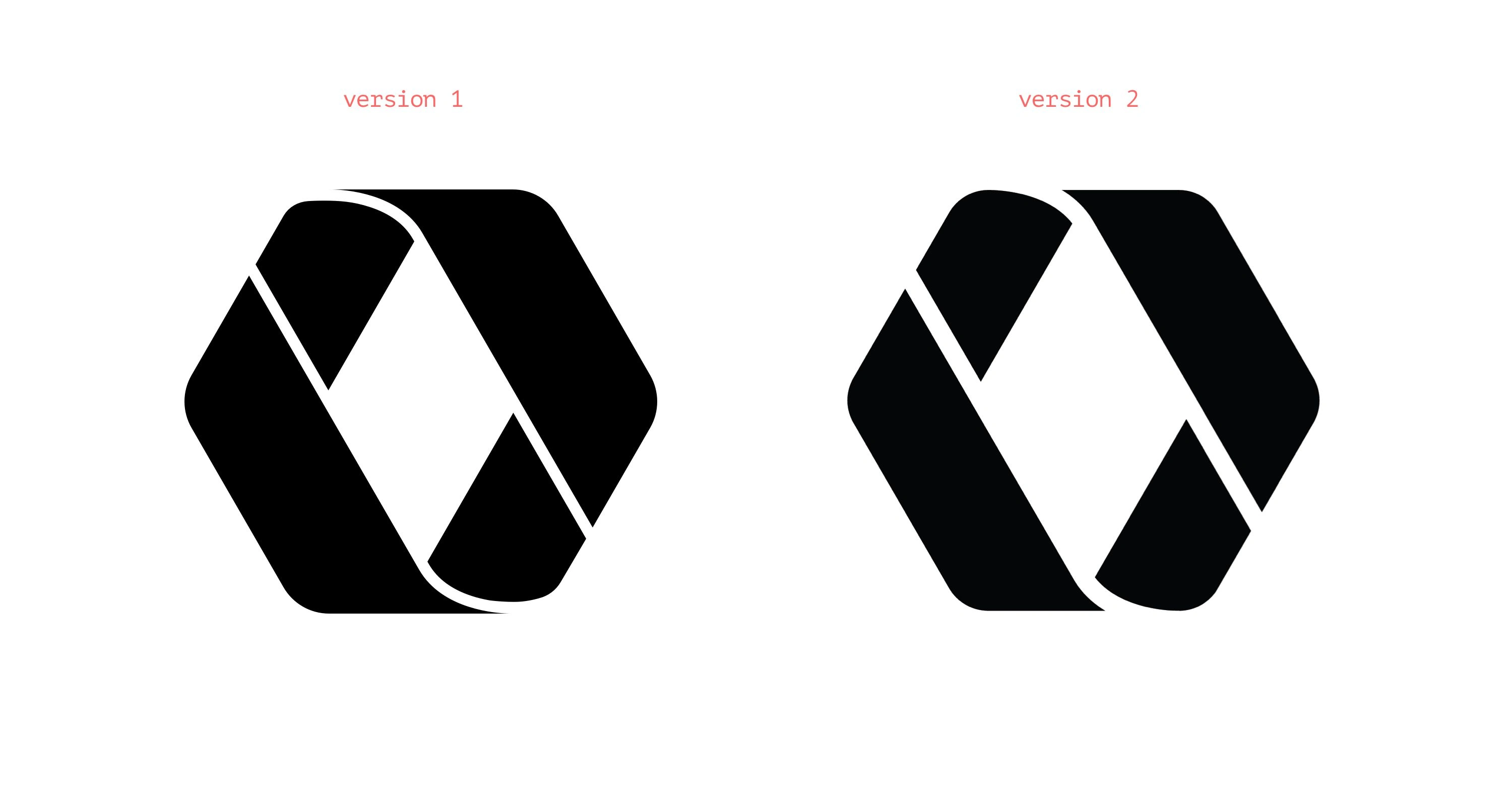
Version 2 monotone version features larger space between shapes, more natural curves, and less sharp edges to help for small versions
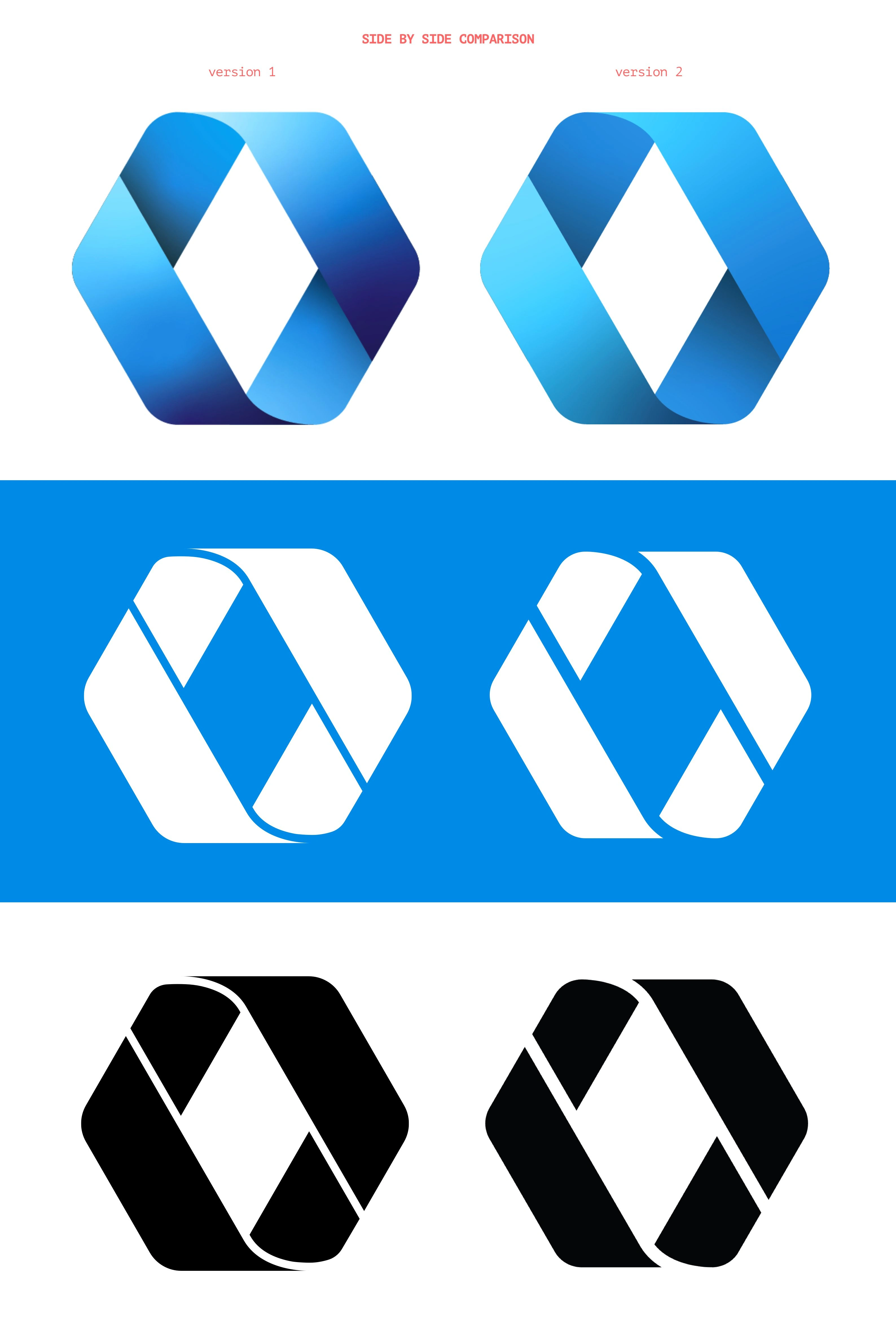
Monogram variation


Version 2 variant features a less bold typeface that more closely resonates with the original monogram
Less bold monogram paired with the new logo
Original Presentation
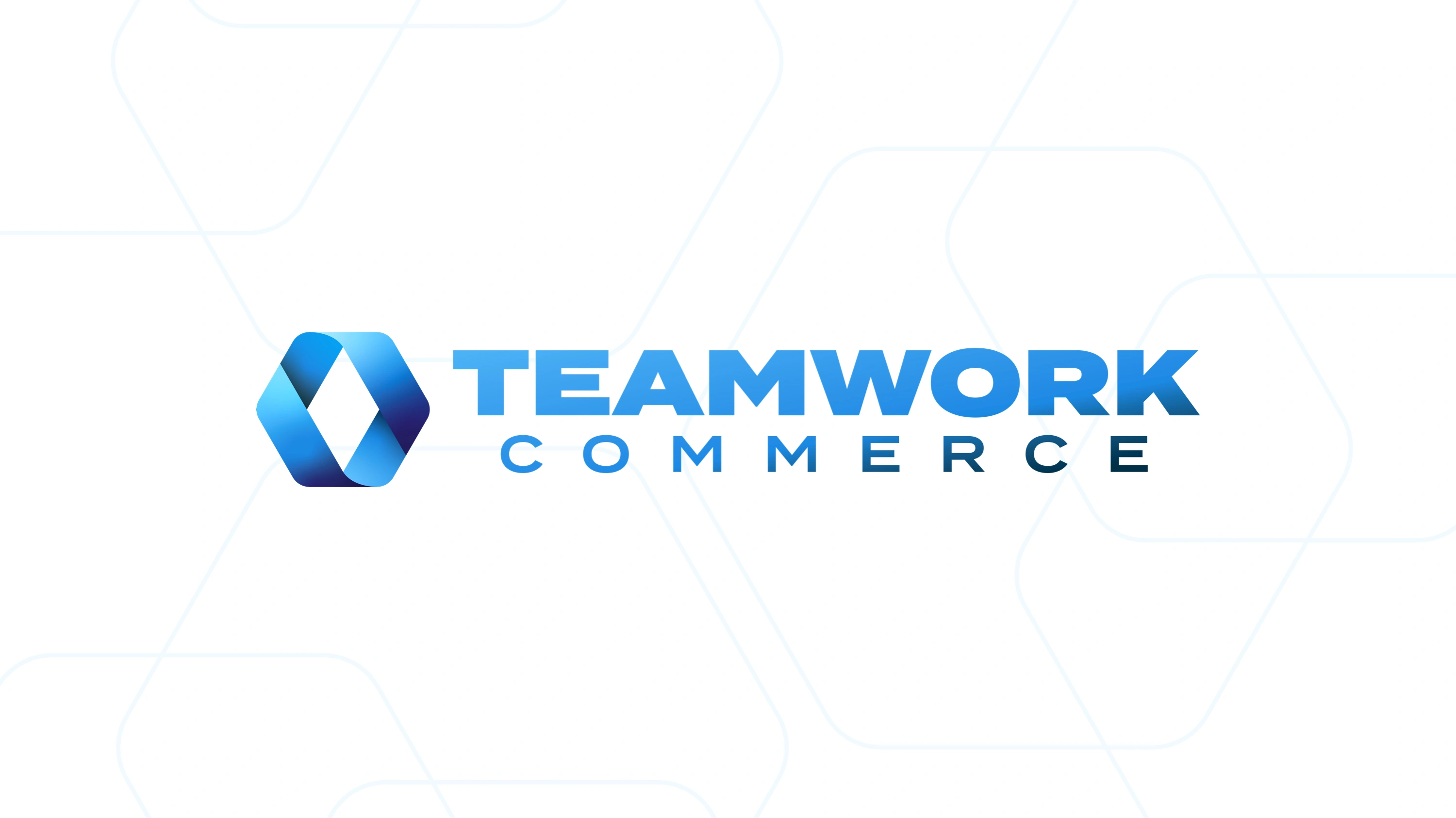
The new full color mark
The new monotone mark
The new brand identity honors the Teamwork Retail legacy by paying homage to familiar styles while pointing to the future with an updated, modern logo and wordmark.
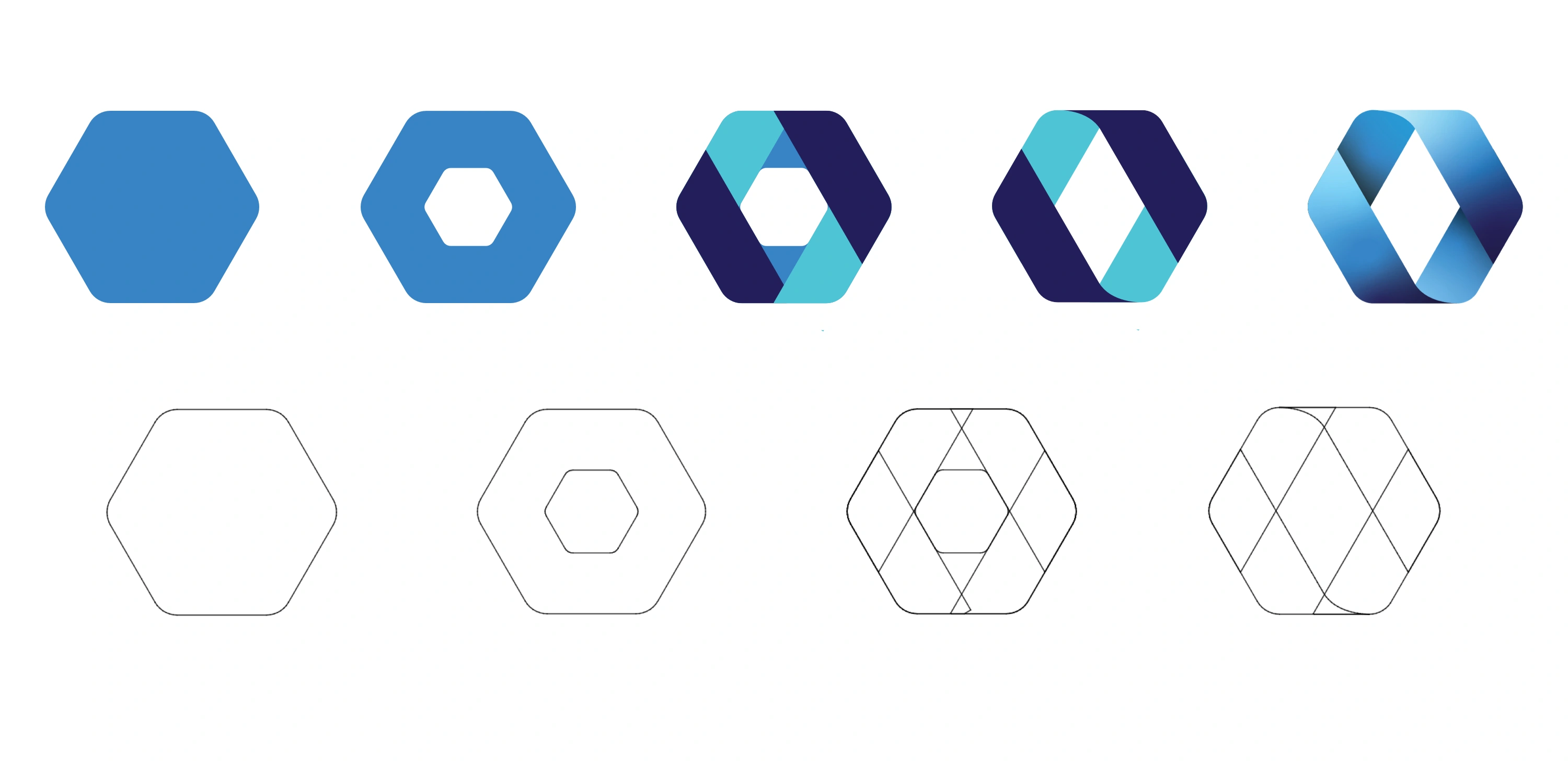
The design process of Teamwork Commerce's new logo mark
The hexagon has long symbolized unity and balance. It is one of the only shapes in which each side supports each other mutually. Therefore, the new hexagon shaped logo intentionally translates itself into Teamwork Commerce's unified suite of applications and features.
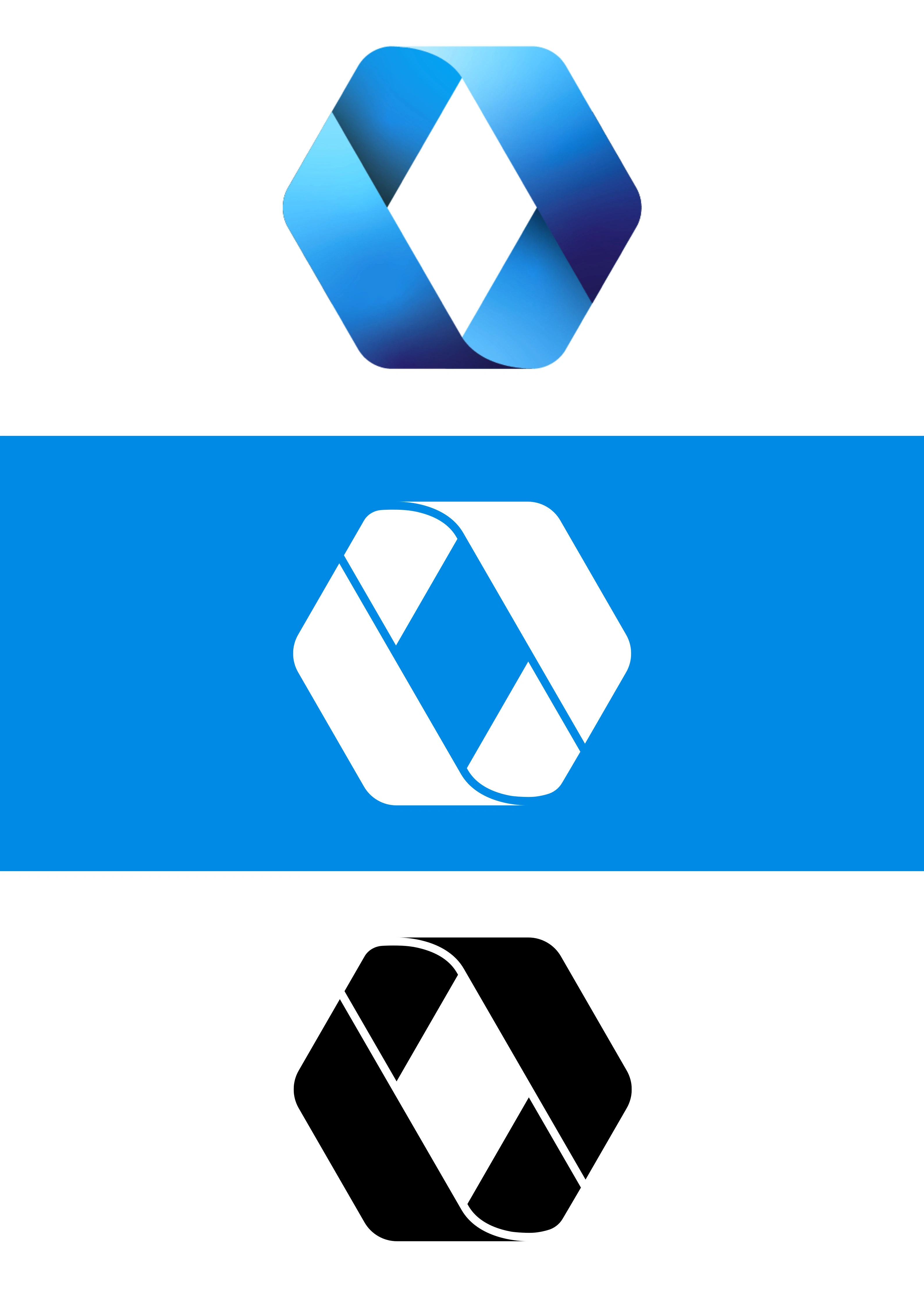
The new logo mark also features an intentional ongoing loop (a simplified variation of Solomon's knot) and a diamond shape cut out, both of which have long represented wealth, prosperity and commerce.

The evolution of the brand over the years.

The new wordmark has been carefully designed with the new name and new typeface.
The new brand identity carefully honors the history of Teamwork Retail.
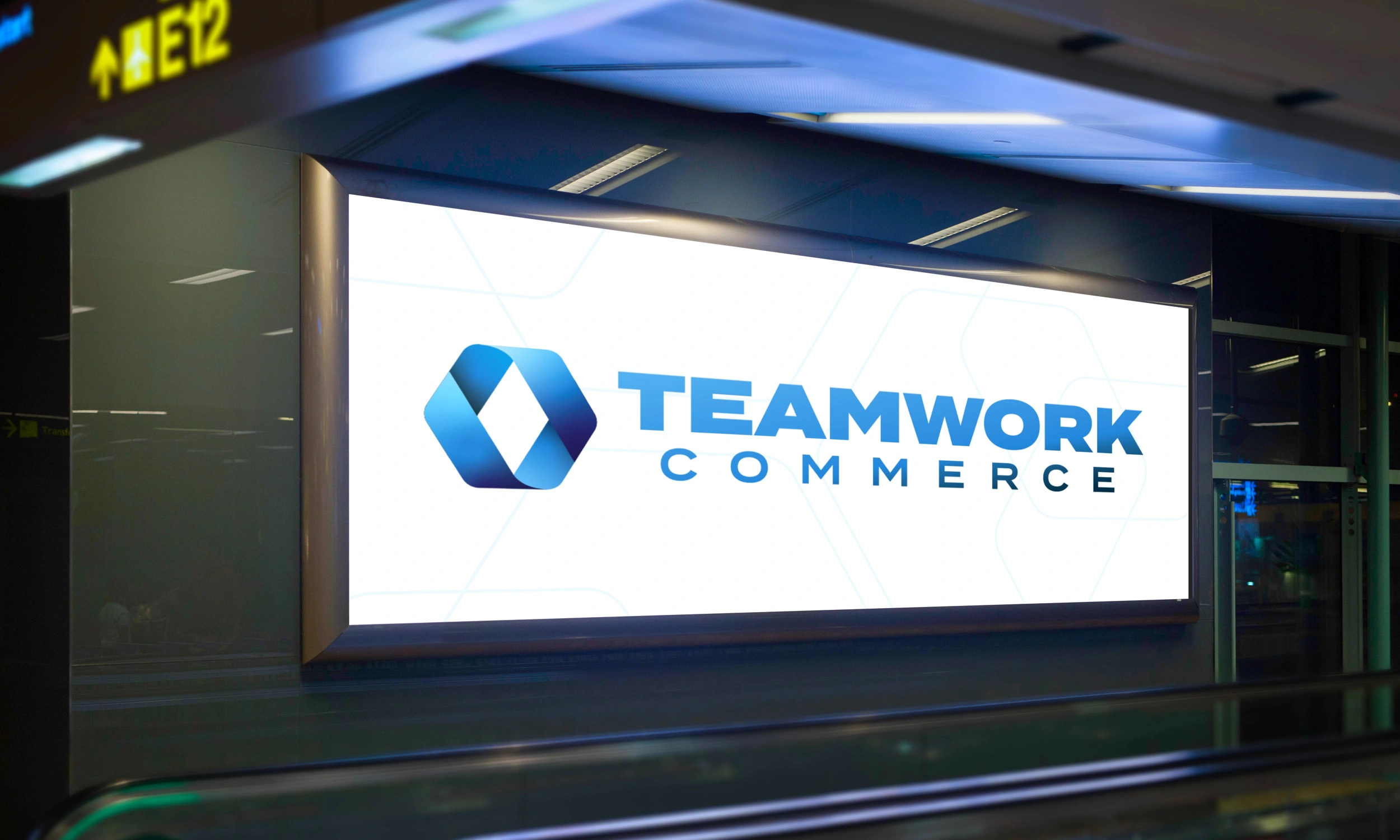
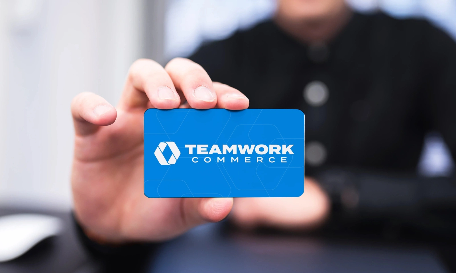
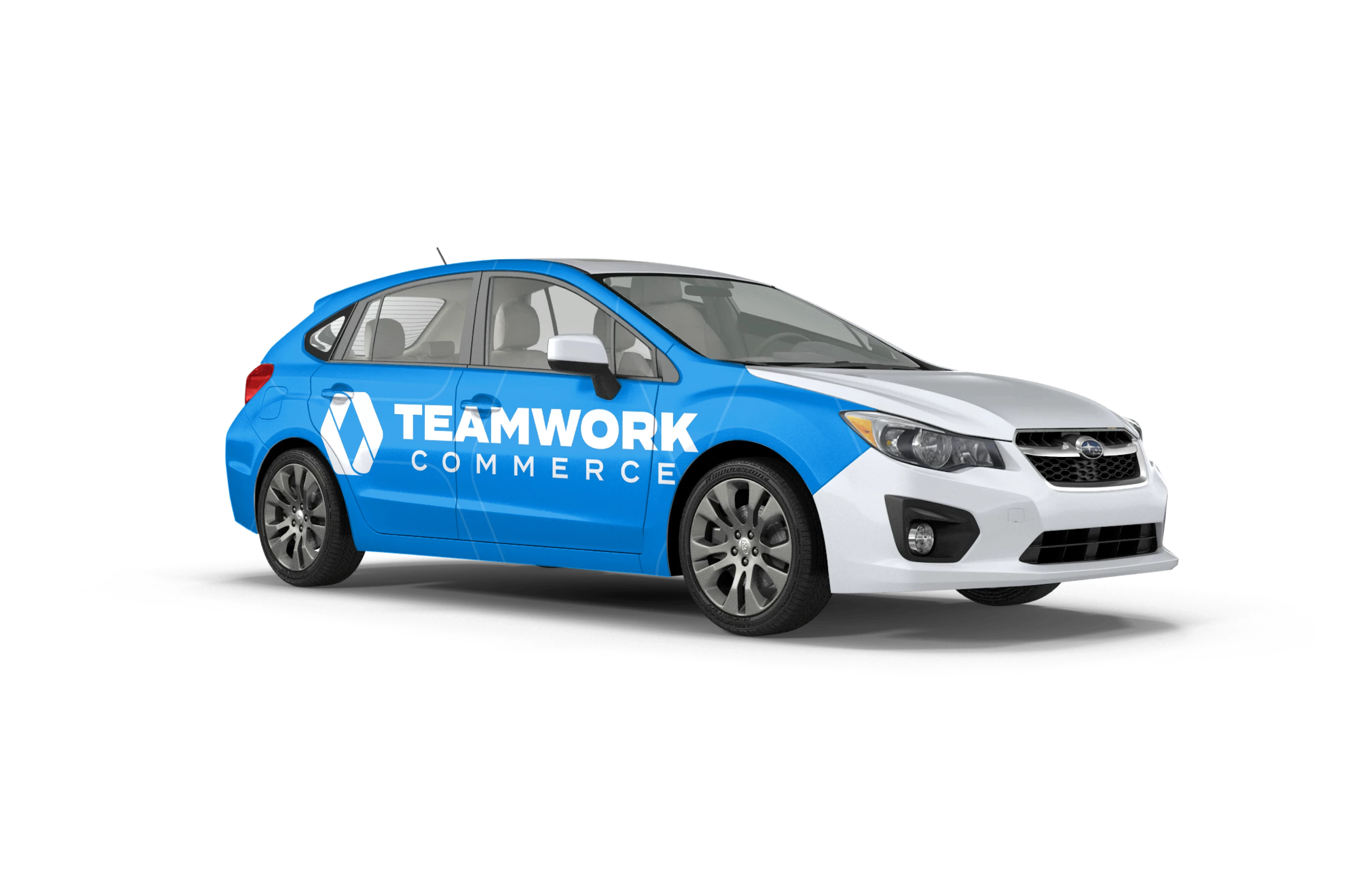
The new logo mark looks great in full color and monotone in physical contexts.
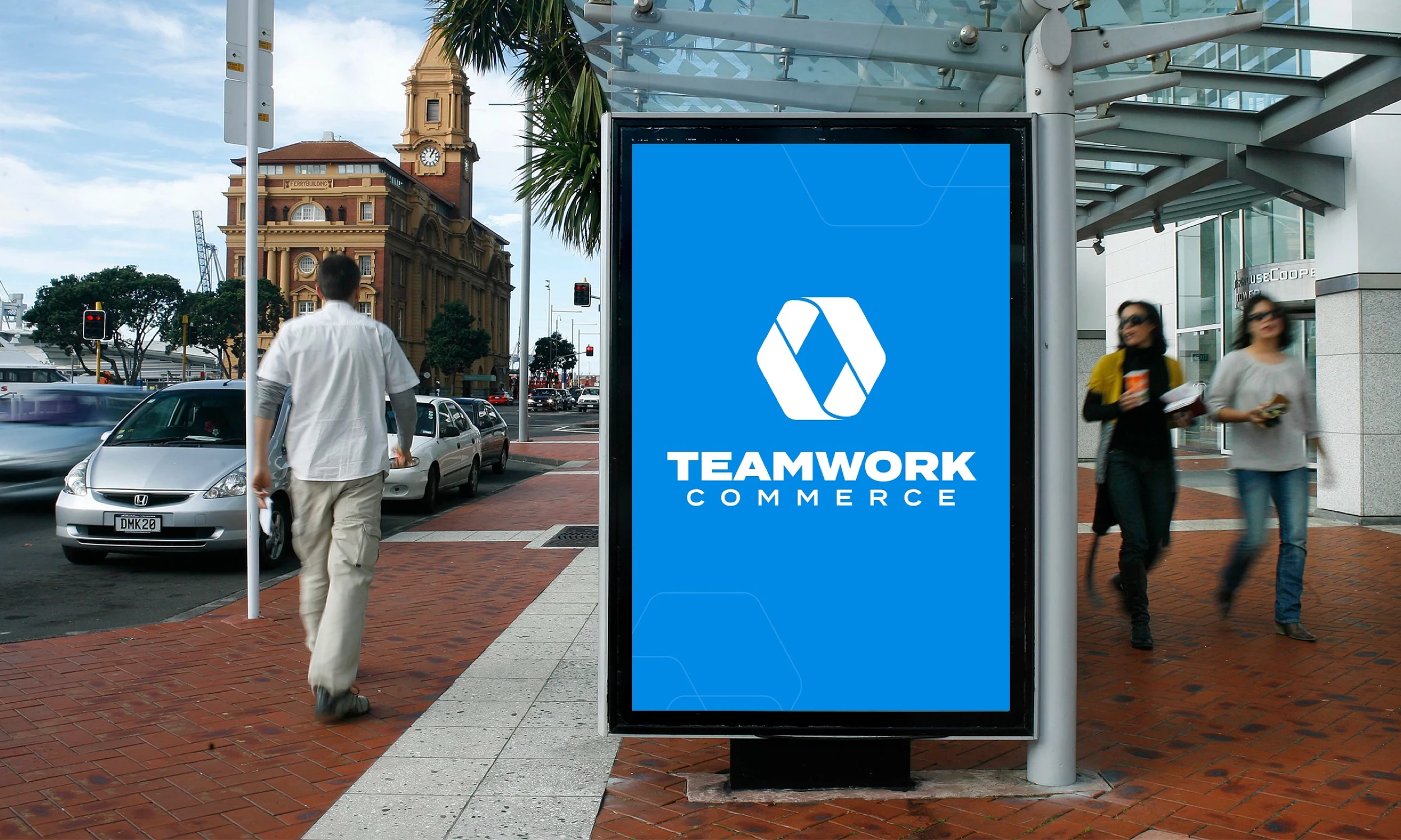
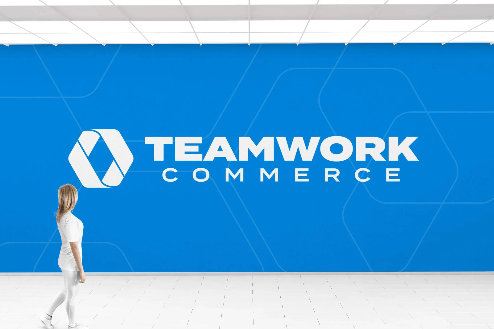
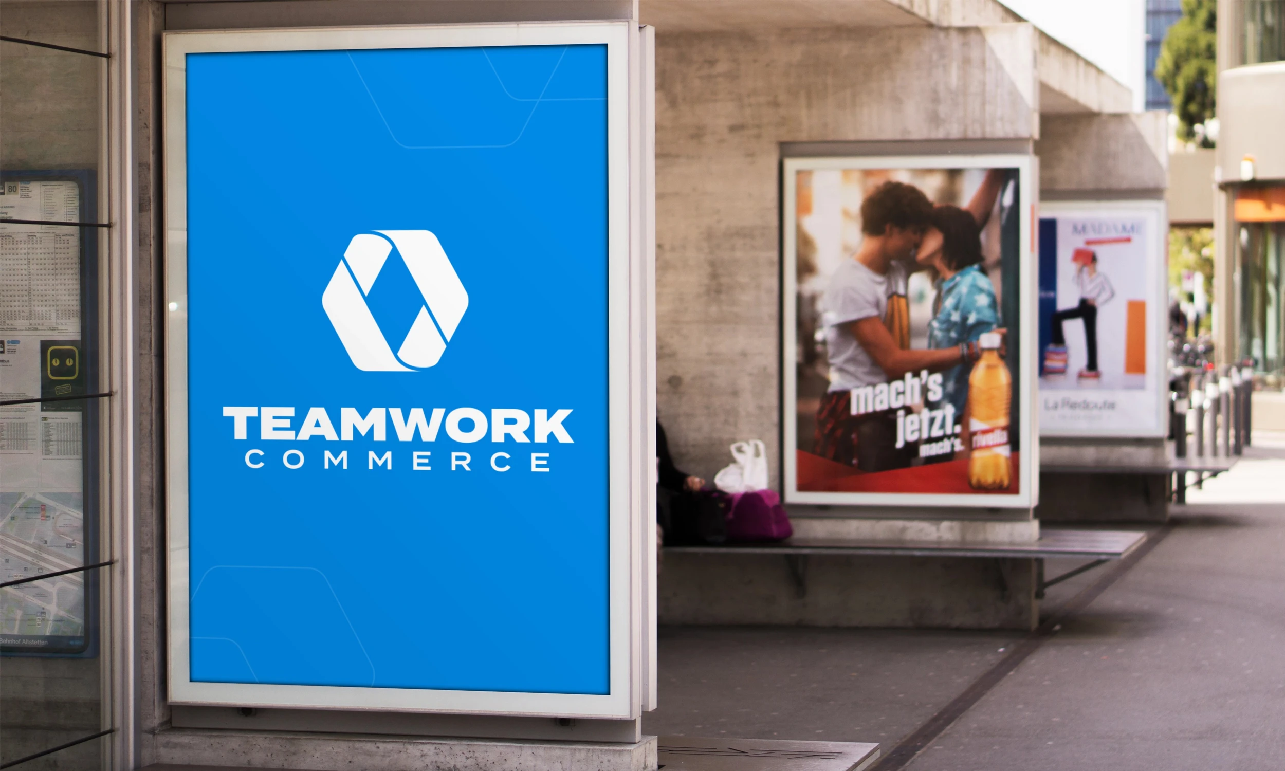
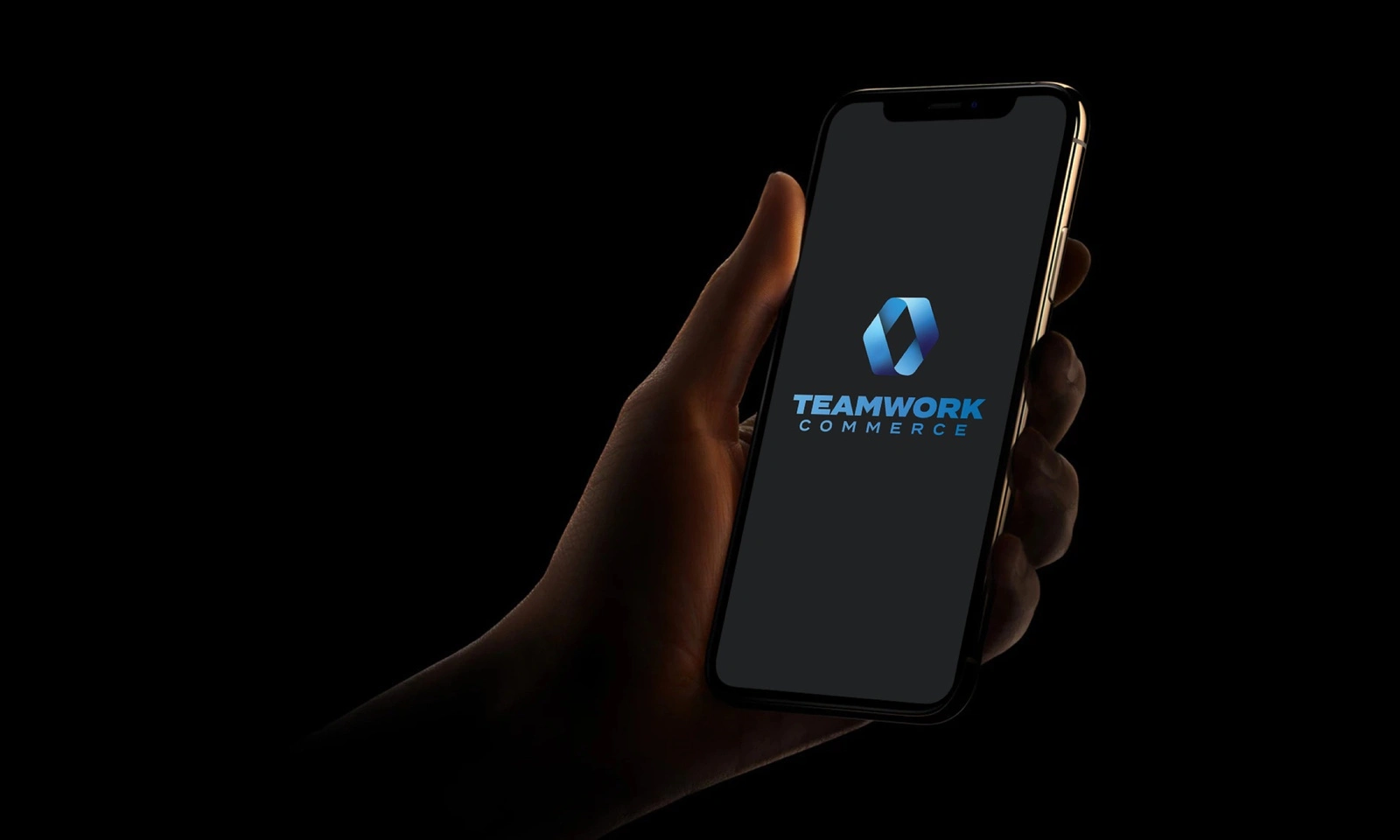
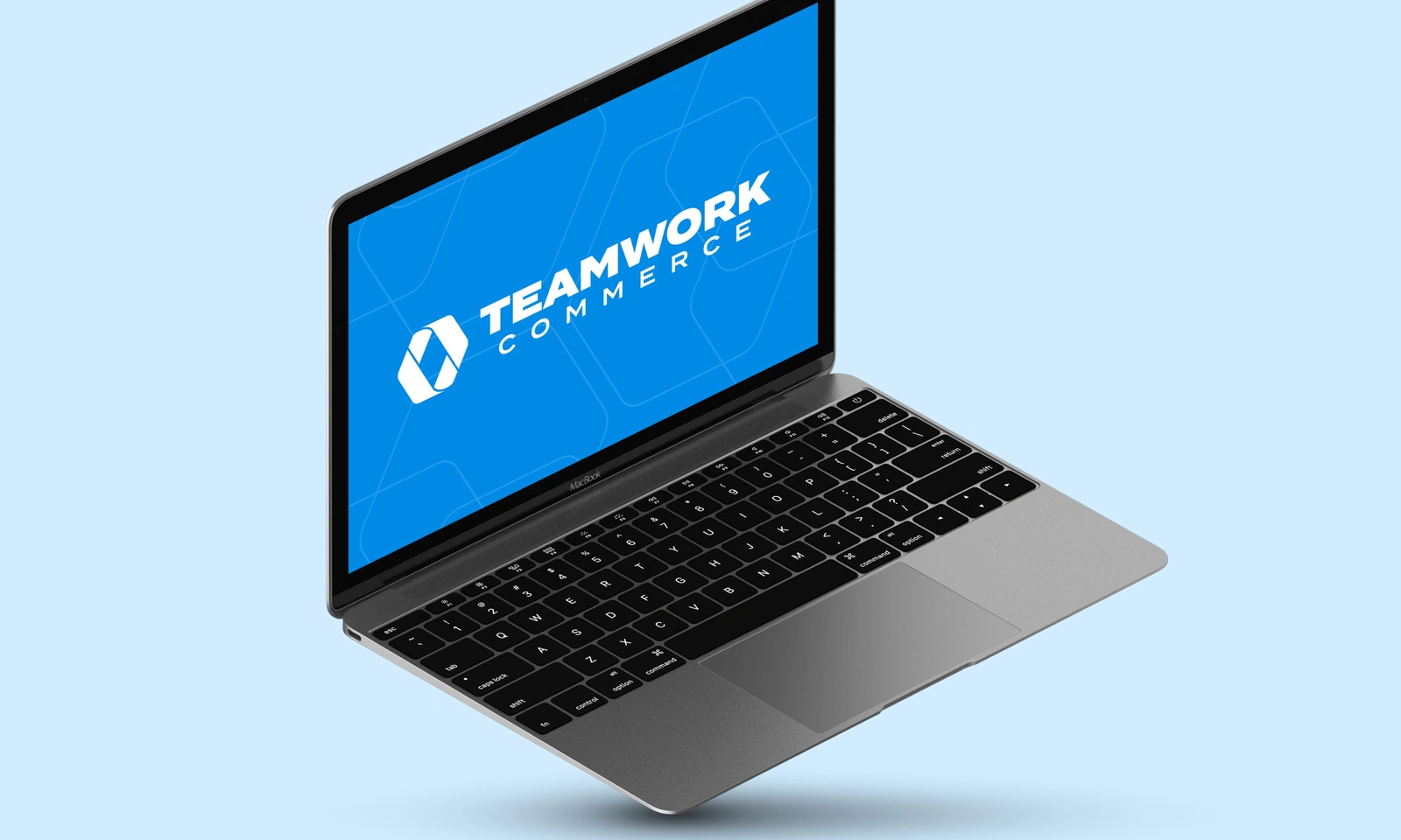
The new mark in digital contexts
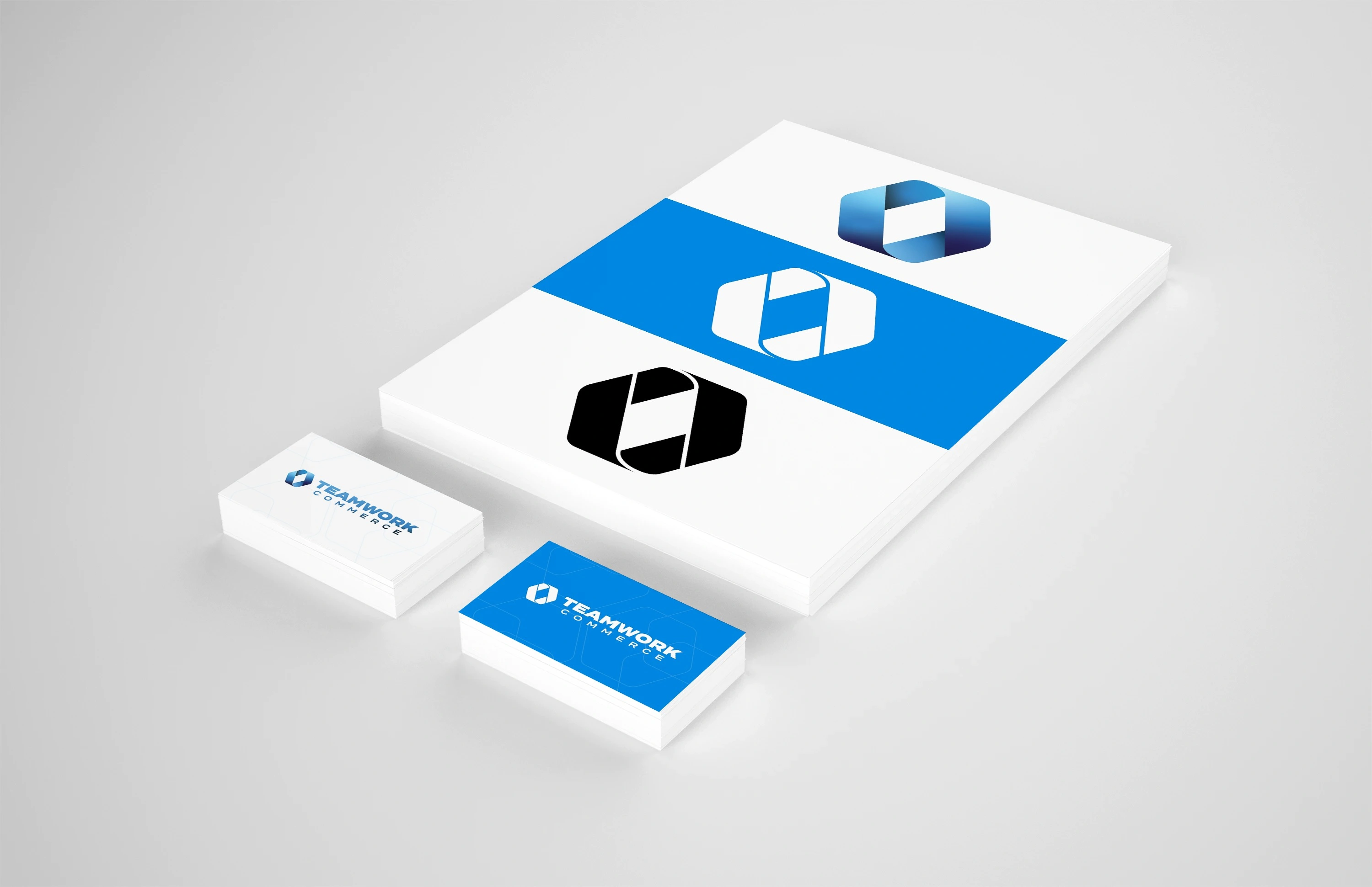
The new mark across branded assets
Like this project
Posted Oct 28, 2023
ChampKid Design transformed Teamwork Commerce's brand identity with a modern logo that reflects continuity, harmony, and commerce, paying homage to the future.

