UX/UI writing
Learn how to use fonts properly.
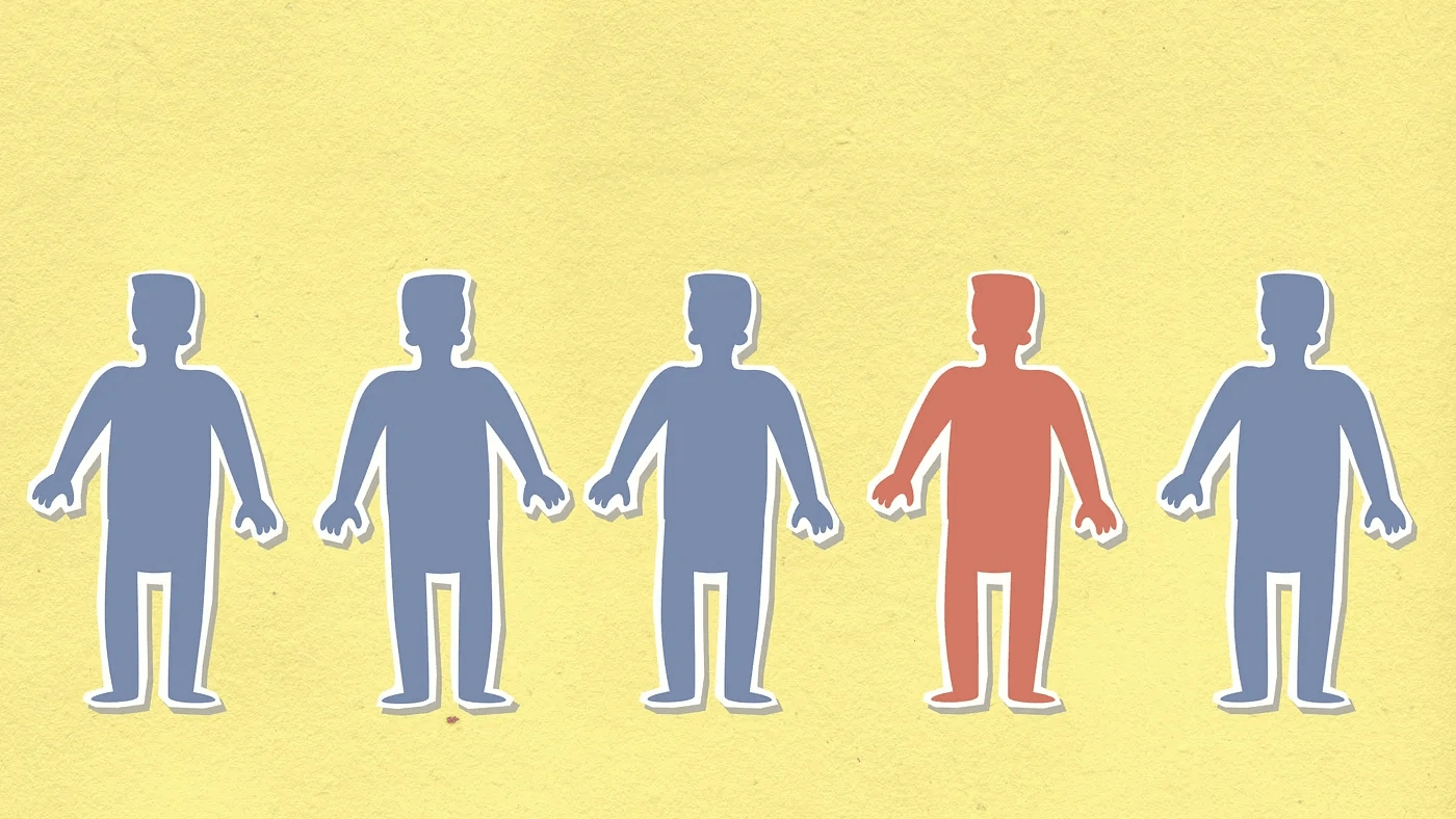
Fonts have unique personalities, similar to humans
Introduction
When designing a webpage, the first step is to consider how to make the page more visually appealing and efficient. Many people are unaware that fonts have unique personalities, similar to humans.
To have a stronger impact on your audience, the designer must understand the subject of the page. With this understanding, the designer can proceed to the next step. Although it may sound easy, it can sometimes be challenging. However, we can overcome this challenge together.
In this article, I will briefly discuss learning about typefaces and the concept of personality.
What is the Typeface?
You might be wondering, “What exactly is a typeface?” It’s a valid question. In simple terms, a typeface refers to the design and appearance of characters, including letters, numbers, and symbols. Essentially, it’s the “face” or style of the text you see.
To align with the page’s goal, the typeface should be chosen carefully. The most common typefaces are usually under two categories, Serif and Sans Serif. Besides these two, there are two more categories called Display and Script. However, there might be more typefaces, but we’ll go through these common categories.
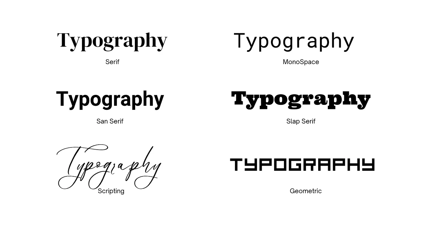
Some examples of different Typefaces
What is the difference between Serif and Sans Serif?
The word “Sans” means “without” in Latin, and “Serif” is a decorated stroke at the end of a letter. With this knowledge, it is easy to understand the personality of the letters.
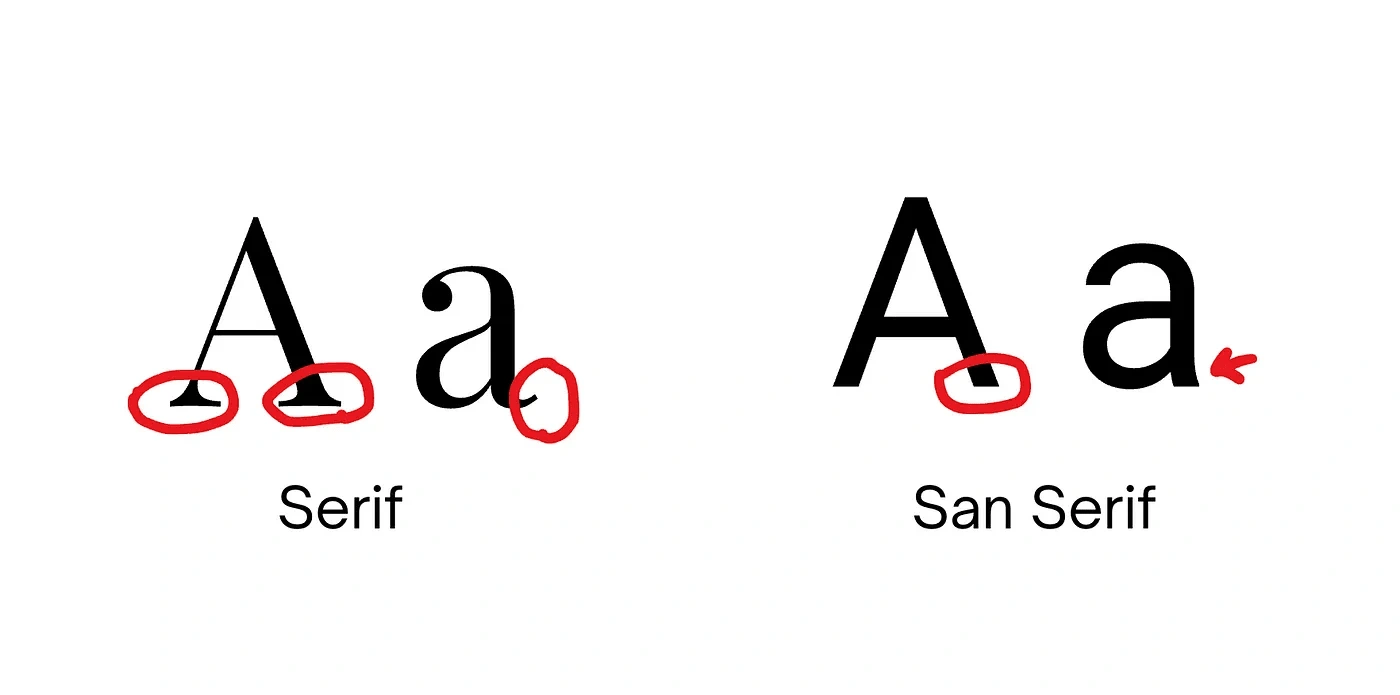
Difference between Serif and San Serif
Serif and Personality:
The Serif typeface is one of the oldest typefaces. There are three types of Serif styles, Old, Modern and Slab.
Old Serif is a classic, elegant, and readable typeface commonly used in magazines and upscale restaurants. If you want to convey a sharp and luxurious look, this is the typeface to use.
Modern Serif is similar to Old Serif; however, they have slight differences. Modern serif has a less sharp decorative stroke, and each letter has a contrast of thickness and thinness, making it more visually appealing compared to the old style. This style is commonly used in modern magazines such as Vogue and New York Times.
Slab Serif does not have a thick and thin contrast compared two others. It looks more mechanical and has a large size, therefore it is not suitable for body text.
Personality: Classic, Neat, Traditional, Readable
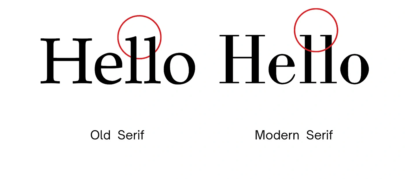
Comparison between Old and Modern Serif. In Modern Serif, O and E letters have more thin and thick contrast
Sans Serif and Personality:
The Sans Serif typeface is more casual and modern than a serif typeface. Sans serif is commonly used because it is readable and suitable for any kind of passage, whether short or long. It has three main styles: Grotesque, Geometric, and Humanist. If the designer wants to convey modernity and neutrality, Sans Serif can be a good choice.
Personality: Modern, Friendly, Clean, Readable
Display and Personality:
It looks very casual and is not recommended for professional purposes. It should be chosen carefully, especially due to its large size; it looks appealing in headlines only. Display fonts are not commonly used in designs.
Personality: Fun, Friendly, Artistic
Script and Personality:
Sometimes called handwriting, similar to display, it is uncommon to be used unless the designer wants to convey human handwriting to create a fun and uplifting atmosphere.
Personality: Fun, Creative, Handwriting
Conclusion:
In conclusion, If the designer is looking for a classic, neat, and readable typeface, then they should use Serif. It’s clear that these magazines exude professionalism. Therefore, the Serif illustrates professionalism and cleanliness.
If the designer wants to convey professionalism with a less formal and more friendly and fun approach, they can use Sans Serif. If they want to convey fun, unserious, childish, and casual vibes, the designer can use Display or Script fonts.
sources:
Like this project
Posted Oct 30, 2024
I created an in-depth article that guides you through the process of selecting the perfect typeface for web design
Likes
0
Views
10

