

The brief
People look for a lawyer at the worst moment of their lives. The site has to feel calm, serious and experienced within seconds, then make the free consultation the obvious next step. Most law firm sites look the same: a gavel photo, a wall of text and a phone number.
Sterling & Reeve is a concept site I designed and built to show what a trial law firm gets from a 72-hour WebsiteIn72 build.
What I built
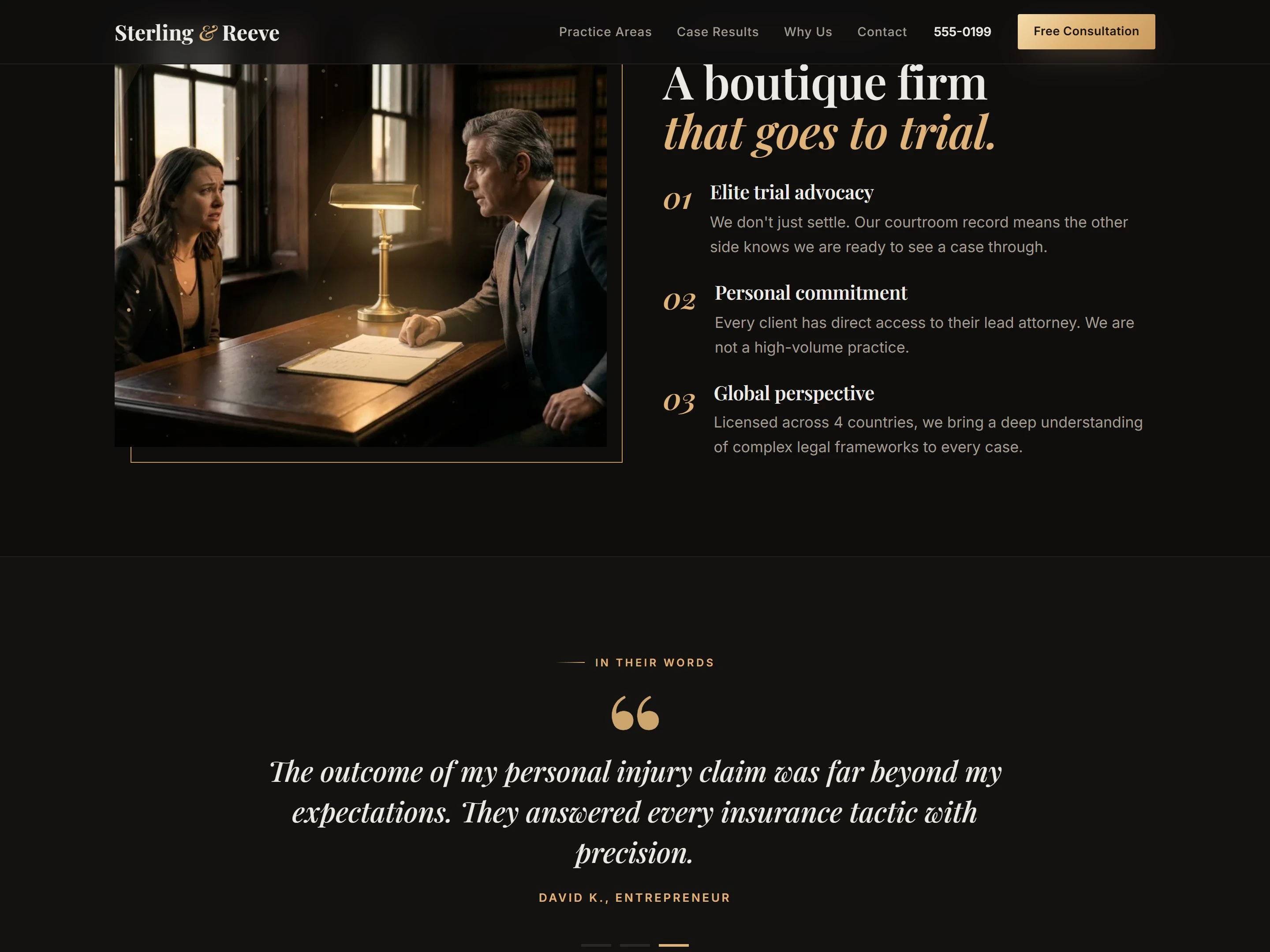
A dark, cinematic hero with a "living" consultation photo: a slow push-in, a flickering desk lamp and drifting dust in the light.
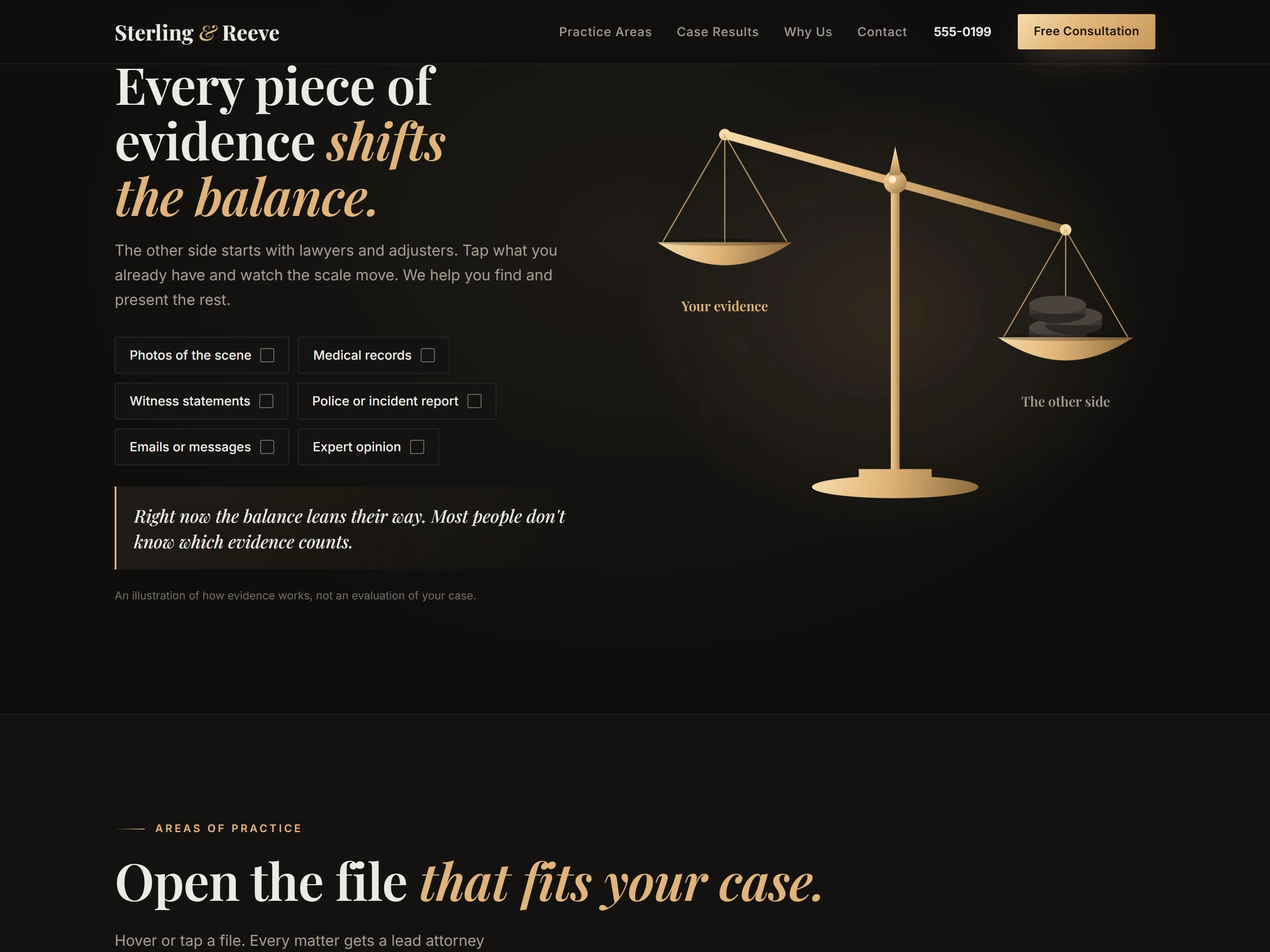
"Every piece of evidence shifts the balance": a gold balance scale that tips as visitors move through the section.
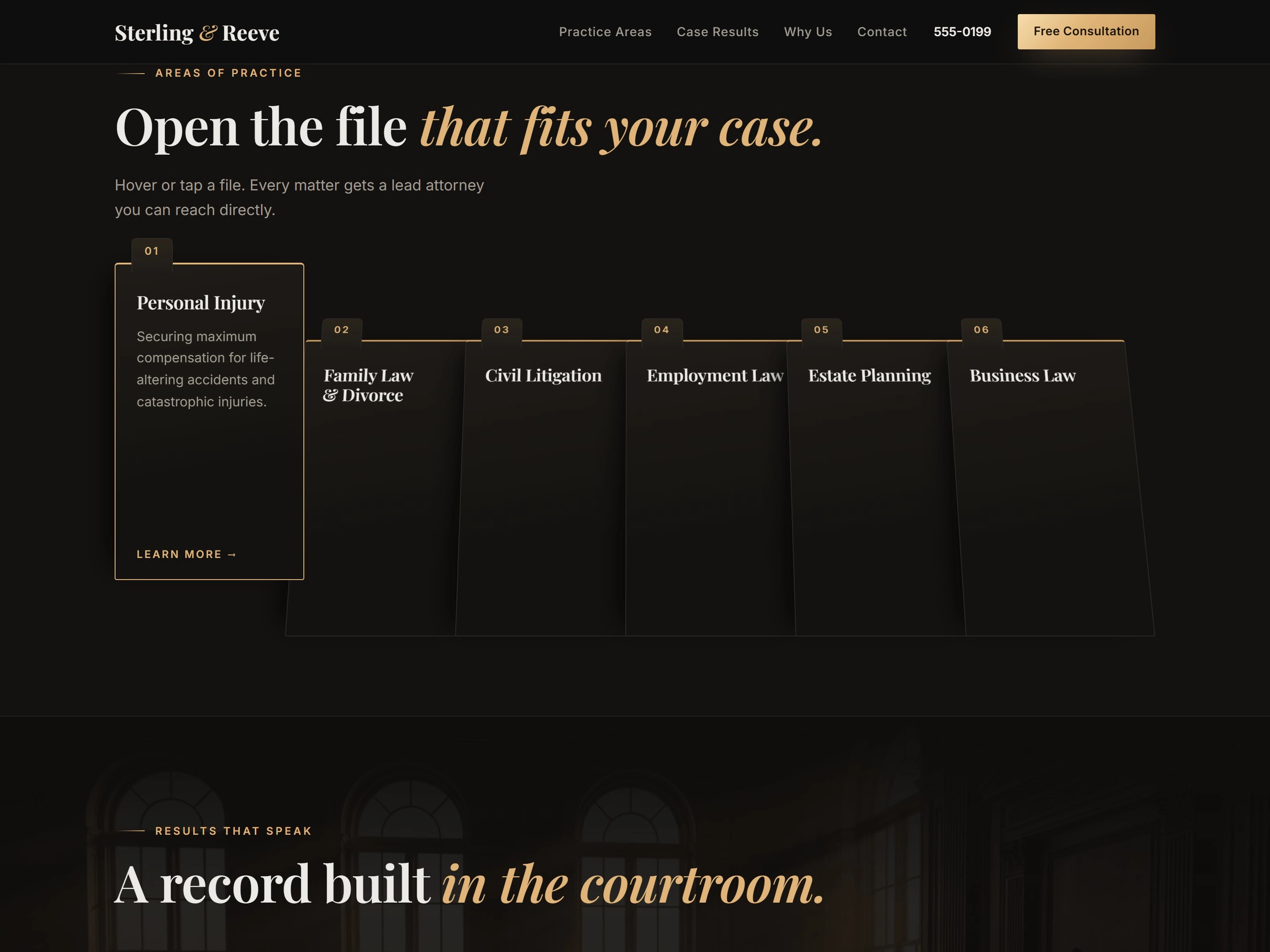
"Open the file that fits your case": a 3D file drawer for six practice areas, from personal injury to business law.
A courtroom record section where case results are stamped with wax seals.
A boutique-firm section on trial advocacy and personal commitment, and a gavel-strike call to action for the free consultation.
Its own brand system: near-black and warm gold with Playfair Display and Inter.
Built to bring in consultations
Every section points to one action: book the free case review. On a client build, consultation forms go straight to the firm's inbox, and the site ships with SEO basics, Google Analytics and SSL.
Tools
WordPress, custom HTML, CSS and JavaScript animation.
Want one for your law firm?
I build sites like this in 72 hours. You see a live draft first and pay $499 only if you love it. Message me here on Contra.
0 likes · 0 views · Nov 12, 2026
Law firm concept site: a balance scale that tips as evidence shifts, a 3D case-file drawer and wax-seal case results. A 72-hour WordPress build.


