Painless insurance quotes
Chris Annetts
Holiday Extras wanted the experience of buying travel insurance online to match that of their award-winning cell-centre.
The challenge
Having worked together previously, Holiday Extras asked us to help them improve their travel insurance booking flow.We were tasked with creating an experience comparable to their award-winning call centre. Their staff are friendly, helpful, and able to shield the customer from the inherent complexity of insurance, and they wanted an online booking flow that was equally unintimidating.
WHAT WE DID
Content writing
Data analysis
Form design
Journey mapping
Prototypes
Stakeholder interviews
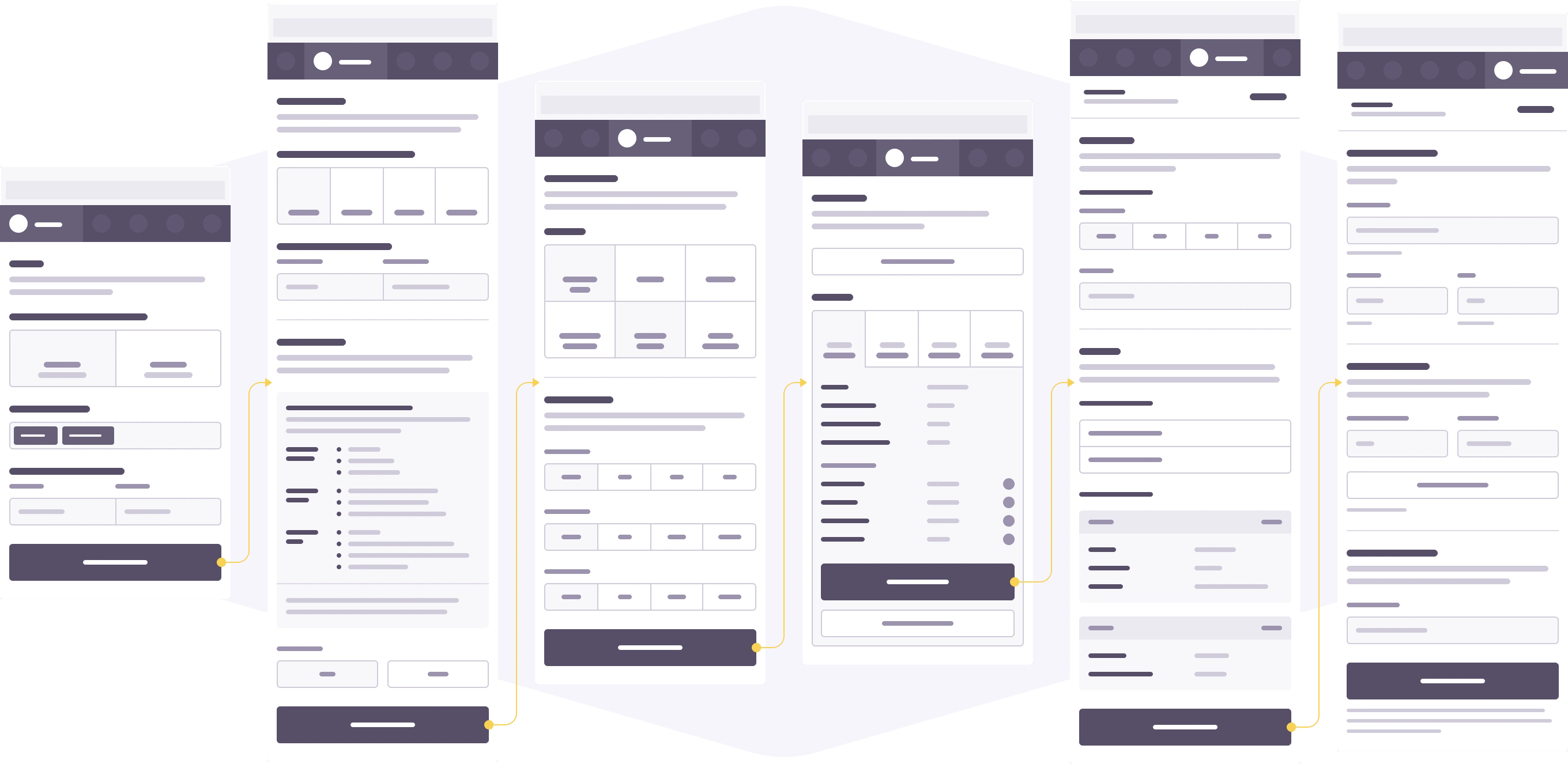
Wireframes
Our approach
Improve iteratively
Although this was a "reimagination", changes would be made iteratively by building on the existing online booking process.Any recommendations we made would need to work both in isolation and as part of the current system. Where possible, we reused existing elements, minimising the friction as sections of our work were introduced.
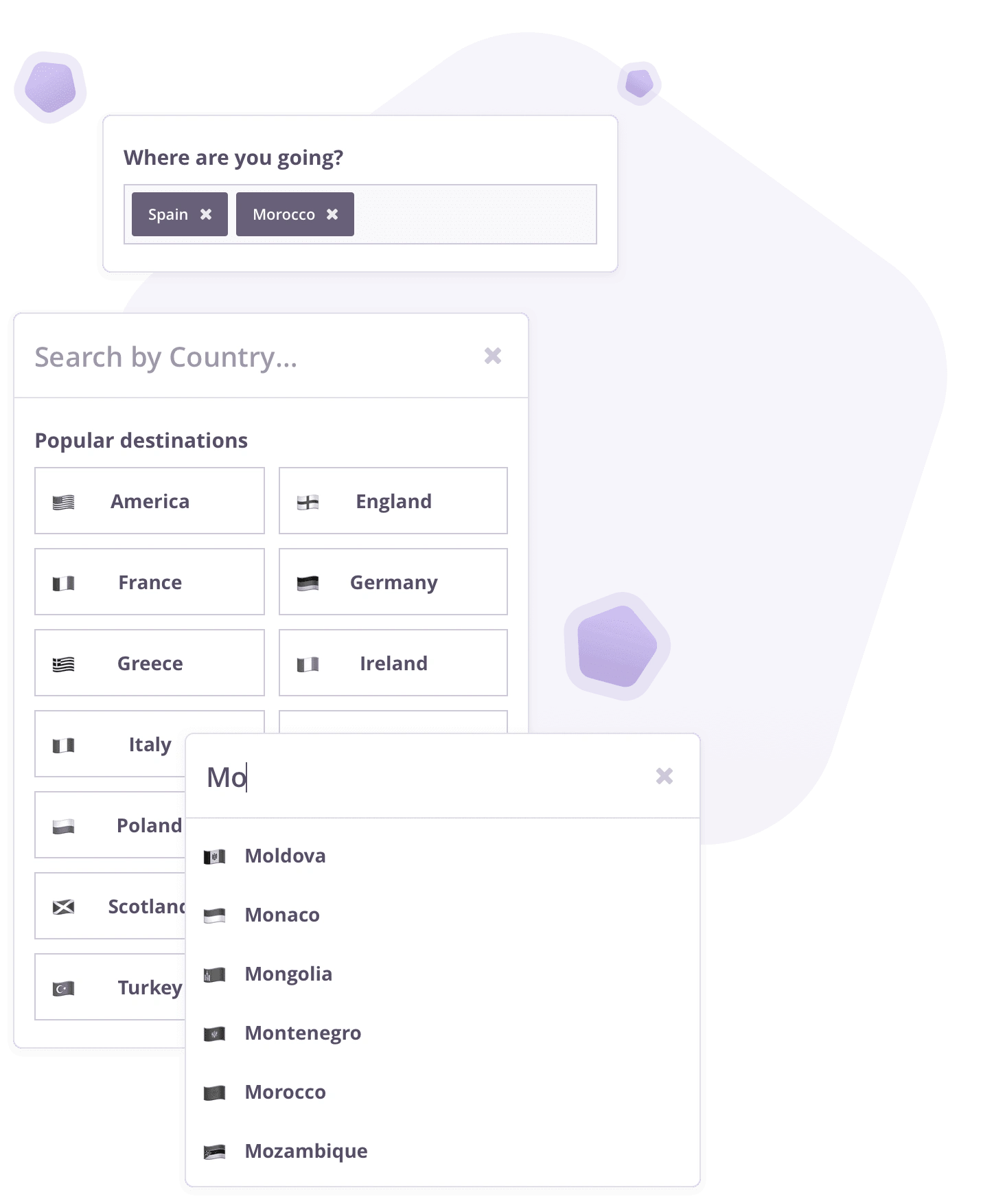
Be guided by the numbers
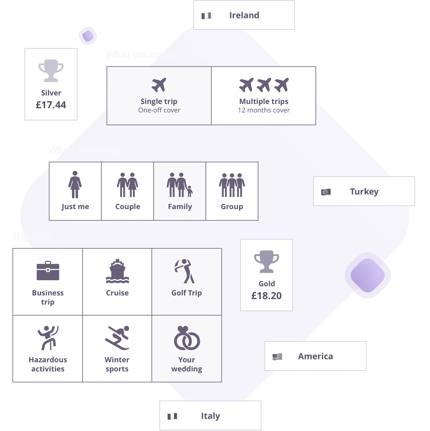
While reviewing the previous 12 months of policies, we found that most people were going to the same handful of places.By suggesting these popular destinations, 4 out of 5 travellers would be able to select a location in a single interaction, with the remaining destinations available through an autocompleting search field.
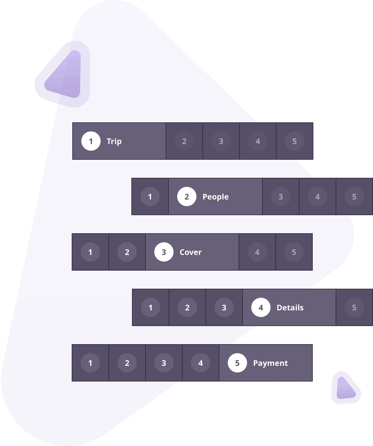
Be clear about effort and progress
People are more likely to give up on a task when they’re unsure how far away they are from completing it.We intoduced a progress tracker to help set expections, showing users how much effort is needed as they move through the process. The tracker also makes it simple to navigate between sections, removing an existing pain-point for those who need to go back to a previous step.
Help people progress quickly
Truly great online experiences accommodate inherent human behaviours, rather than forcing new ones.We used iconography throughout the process to help users to more easily distinguish between various choices. People tend to scan Web pages rather than read them word-for-word, and can interpret images much faster than words, making icons the ideal visual parter to a text description.
Show a price as early as possible
With so many insurance providers to choose from, you’d better make sure you give your users a reason to hang about.In the very first step, a range of personal information was previously being asked for each traveller, even though date-of-births were the only details needed to calculate a price. Other than first-names, which made it easier to gather the remaining details later, we deferred the remaining questions until later on, radically reducing the time required to see a price.
Personalise the experience
It’s no longer enough to create one-size fits all products, and the entire experience should be tailored for each individual.
We were able to offer users highly relevant upgrades by allowing them to tell us more about their trip. By making this step optional, the majority can continue without interacting at all, and those that do have additional requirements will only see upgrades that meet their needs.
When a couple are travelling, and both have Mr and Mrs selected as their titles, the second traveller will be asked whether they share a surname (we apply the same logic to families too). By asking the user if this is the case, rather than assuming it to be so, the action feels useful and thoughtful rather than rude and presumptuous.

Not everybody needs to see everythingYour booking flow shouldn't feel intimidating to all of your customers to meet the needs of a small minority.Previously, every customer was offered every upgrade, although our research showed that just four of the options were commonly asked about through the Call Centre. We radically simplified the comparison of available tiers by including only these four benefits, but made the full breakdown available for those who wanted to see more.
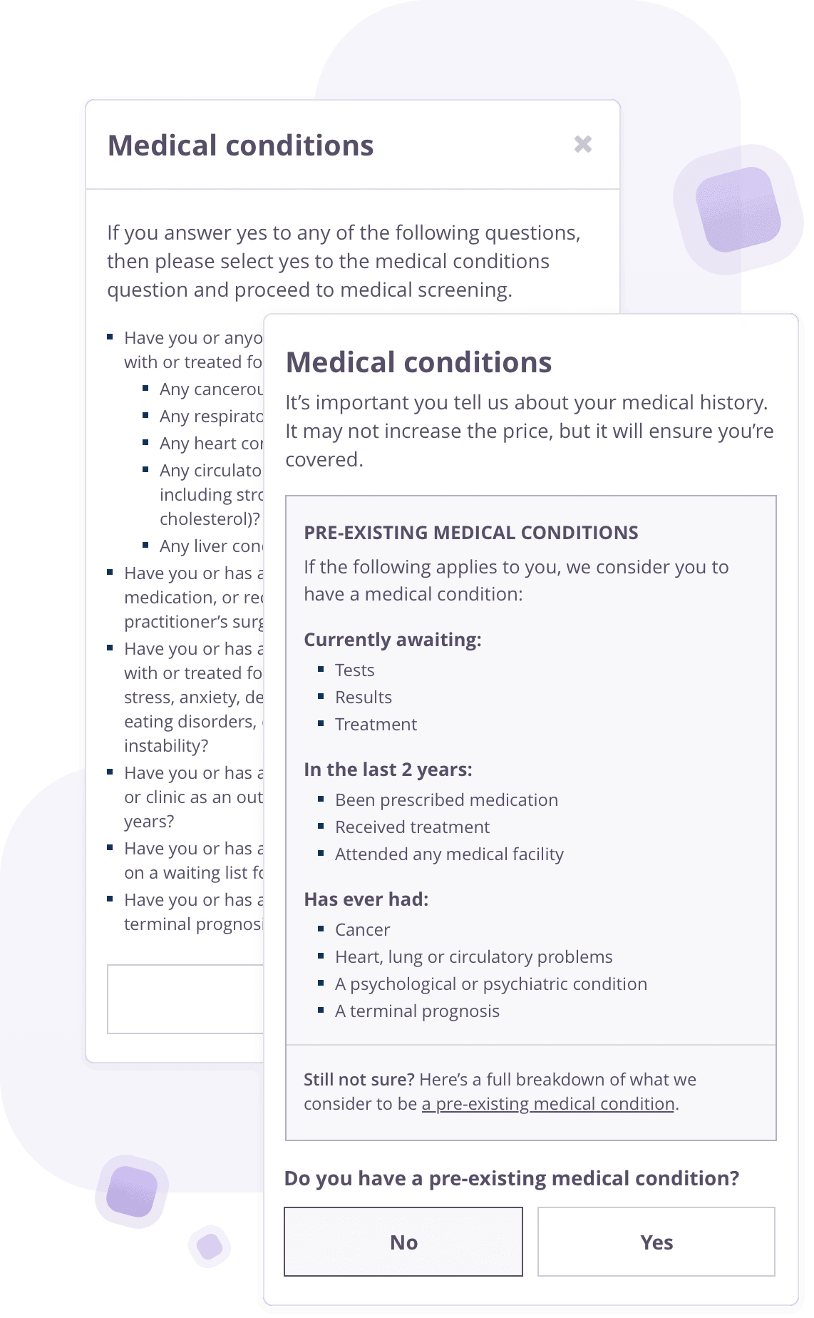
Write inclusively by cutting the jargonIt shouldn’t take a law degree for your potential customers to understand whether or not the policy is a good fit for them.We worked closely with the Holiday Extras compliance team to simplify their explanation of a pre-existing medical condition, while still meeting their legal requirements. A full description remained available, but the majority benefitted from a jargon-free list of illnesses and ailments.
The outcome
Radically faster quotes
The changes made meant we were able to provide an insurance quote in a fraction of time it had taken previously.
Changes to how a pre-existing medical condition was described meant test users were able to understand and answer whether or not they had one more than a minute quicker than had been the case before.
USER TESTING
233%: quicker to see a price
It took users an average of 1 min and 24 secs to see their price, compared to 3 mins and 16 secs in the previous version.
74: fewer interactions to see a price
Users tapped their screen an average of 68 times before they saw their price, compared to 142 times in the previous version.
Small and continuous improvements
As was the intention, the new content and structure of the process will gradually be integrated into the booking flow.
The engineering team at Holiday Extras have started introducing a number of elements of our prototype into the live booking flow, and we look forward to seeing further progress over the coming months.
Leaf were a pleasure to work with – always available and willing to offer advice or to put forward constructive suggestions. The decision to work with them is one we haven’t regretted, and I’d gladly recommend them to anyone looking to improve their own booking flow.
Carl Burdett, Digital Marketing Manager — Holiday Extras
Like this project
Posted Aug 18, 2023
Holiday Extras wanted the experience of buying travel insurance online to match that of their award-winning cell-centre.