Clorox Packaging Redesign
Kevin Fenton
The internal perception at Clorox was that their packaging had become stale and was jokingly referred to as the powerpoint presentation of the cleaning aisle.
I worked in tandem with Clorox’s in-house design team to solve one big task: reimagine our packaging in a way that will scare our brand team! The only non-negotiable piece of this project was that we could not change the shape of any of the packaging. Everything else was fair game.
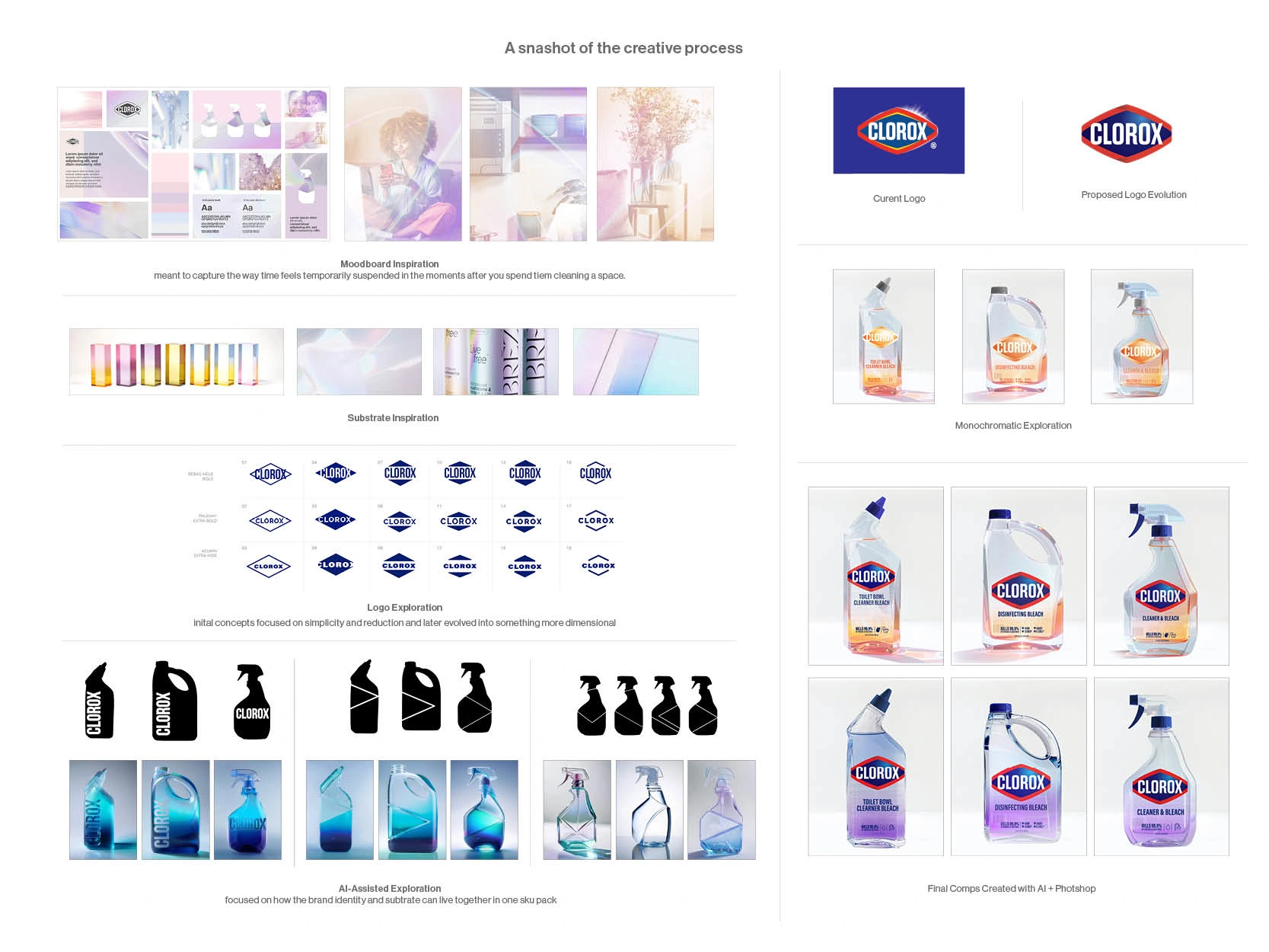
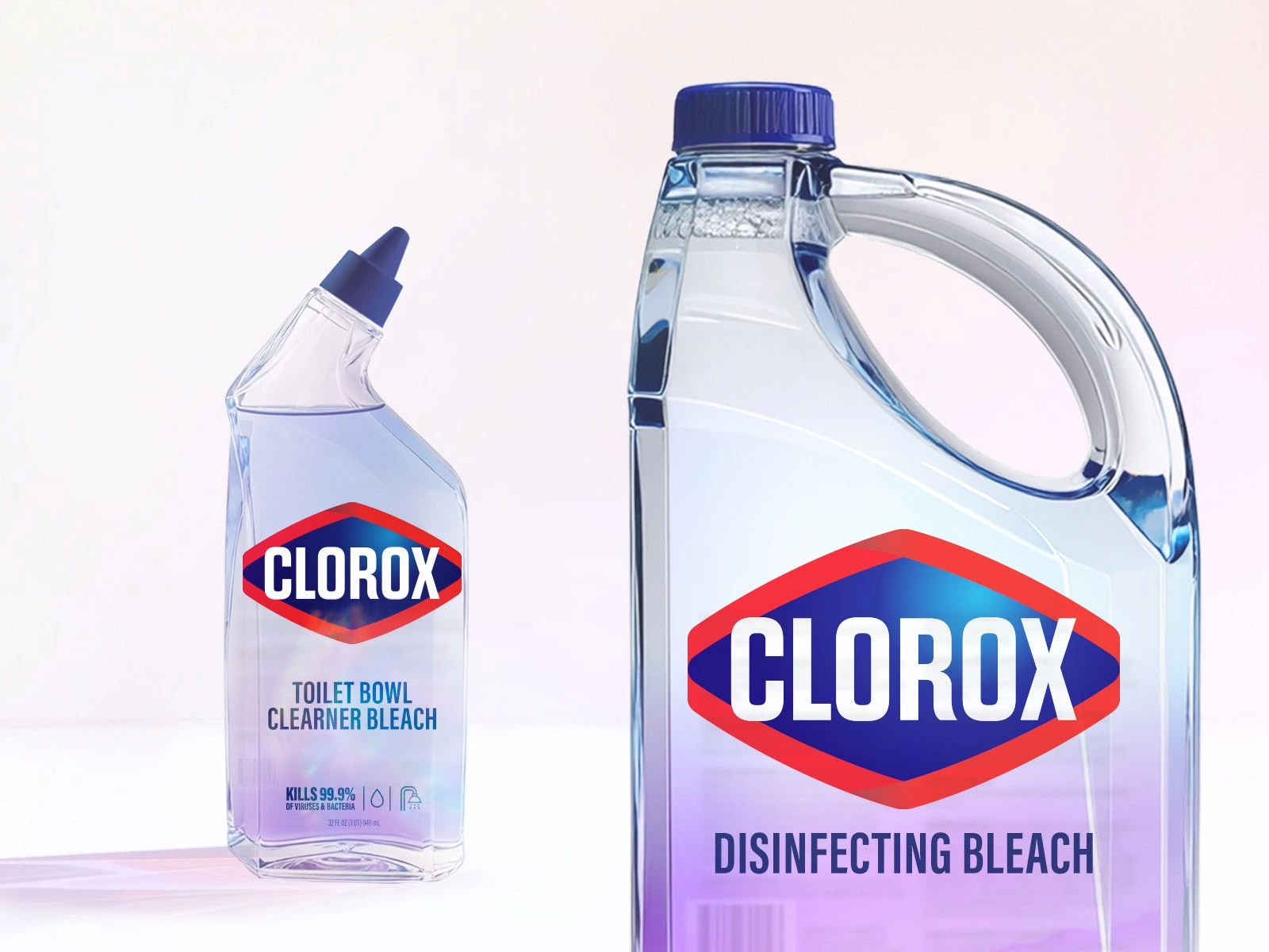
From a process standpoint, the work began with moodboarding around suspended light, iridescence, polished surfaces, and quiet domestic stillness. I then explored ways the Clorox logo could be gently refined to better support the elevated direction without losing its core recognizability. From there, I used AI-assisted 3D renderings and image generation as a conceptual tool to quickly visualize how form, light, transparency, and substrate could come together across multiple SKUs. These renderings allowed me to communicate a more immersive packaging idea before translating the direction into high-fidelity presentation comps.
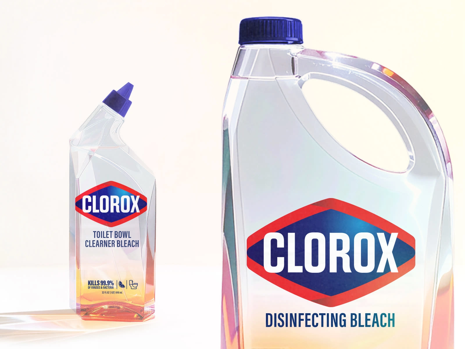
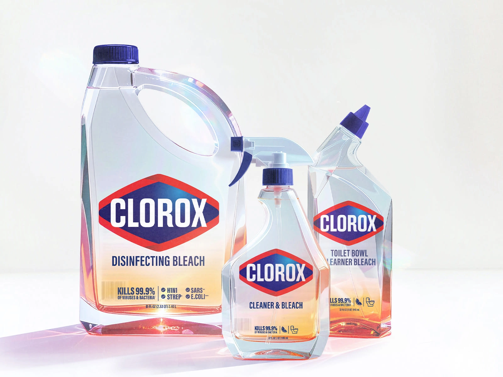
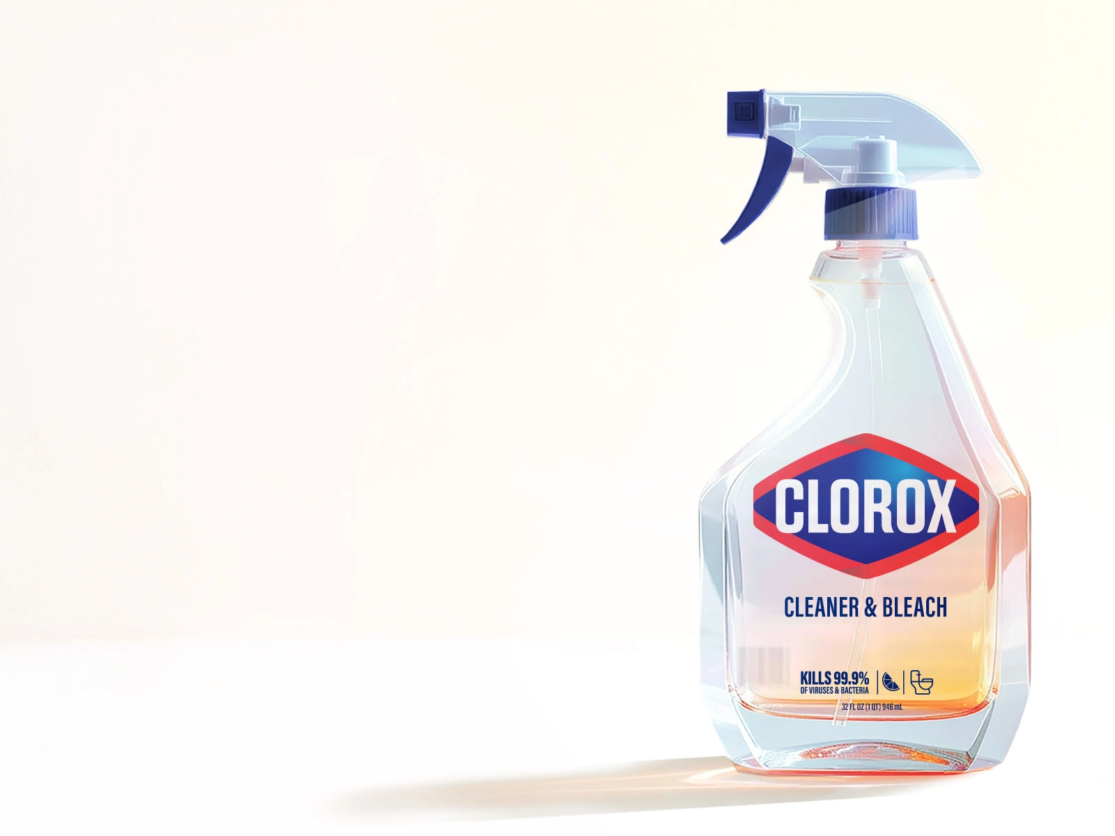
Working within the fixed structural forms of the existing bottles, I developed a new design direction inspired by the emotional reset that happens after a space has been cleaned: that rare moment when everything feels still, fresh, and briefly perfect. Rather than treating cleaning as purely functional, I wanted the concept to capture the almost atmospheric shift that Clorox creates in a space.
That idea led me to explore refracted light, translucency, and surface interaction as the core visual language for the system. I was interested in expressing the feeling of transformation not only through brand elements, but through the packaging substrate itself. The concept proposed a harder, acrylic-like materiality paired with soft gradients and light-driven color effects, allowing the liquid, surface, and graphics to work together to create an object that felt more dimensional, premium, and sensorial in the hand.
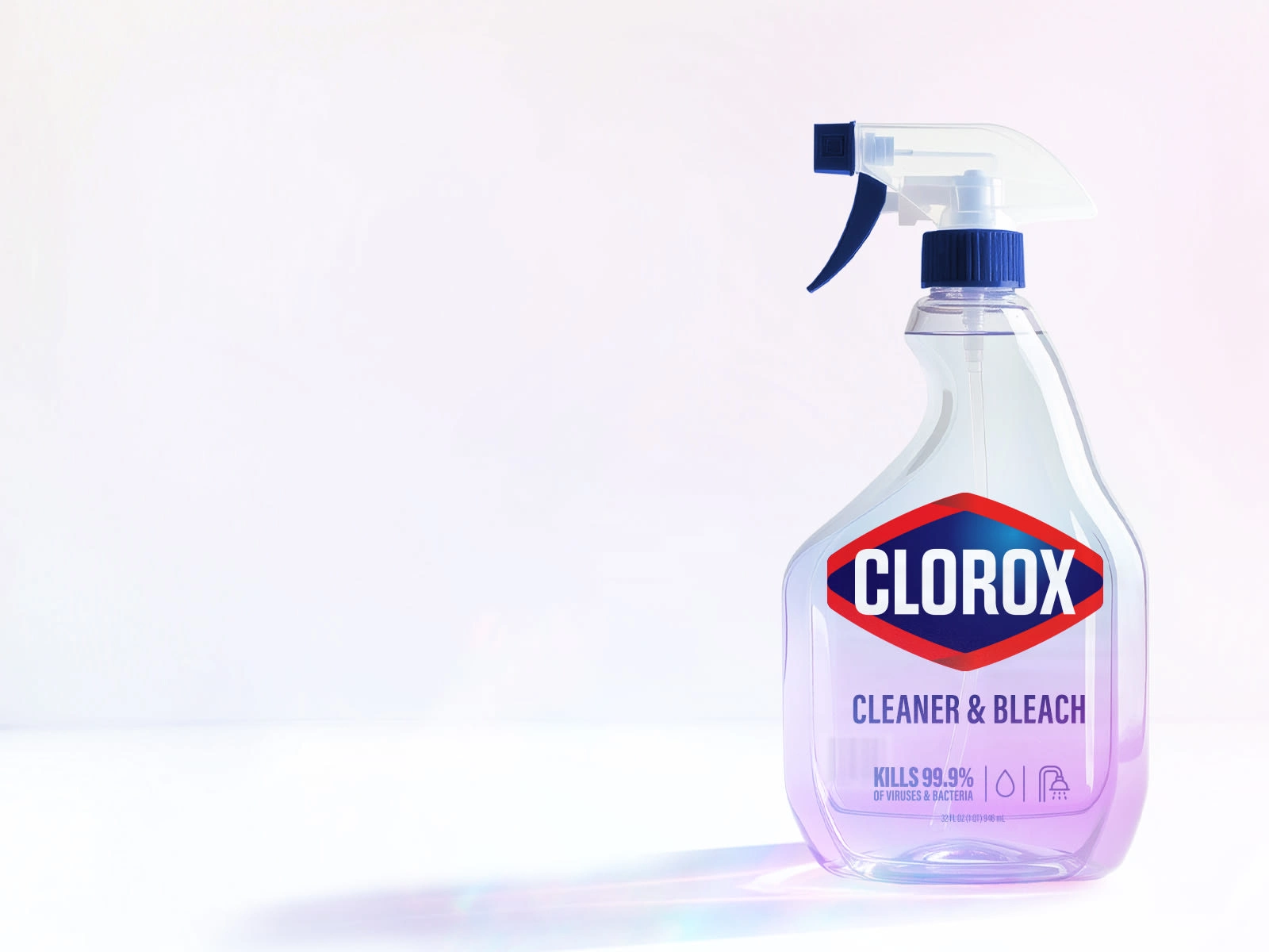
The final concept reframed Clorox not just as a product that cleans, but as a product that transforms the feeling of a space. By combining subtle logo refinement, refracted-light inspiration, and AI-assisted packaging visualization, I was able to present a more elevated and emotionally resonant vision for how the brand could show up in the aisle.
Like this project
Posted Mar 11, 2026
Reimagined Clorox packaging with a design inspired by cleanliness and transformation.
Likes
0
Views
12
Clients
Clorox