Wallet Overview: iPhone Duo UI

Imran Khan


Finance App for iPhone Duo
Wallet Overview Screen 💳

Posted Oct 25, 2026
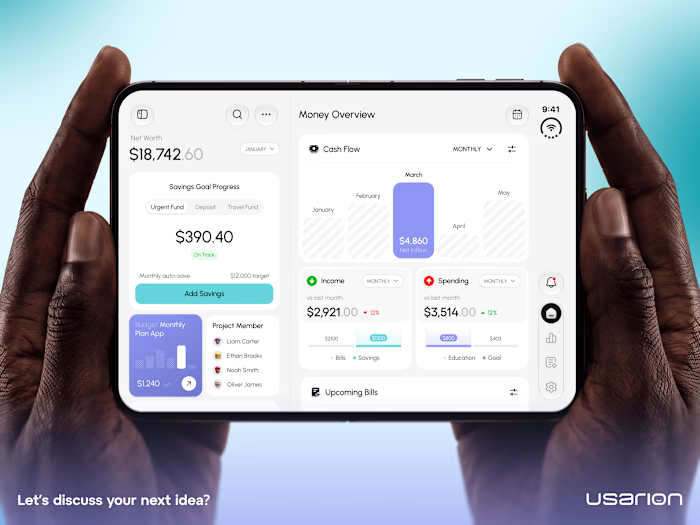
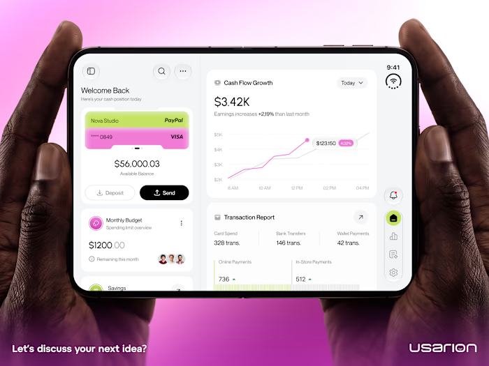
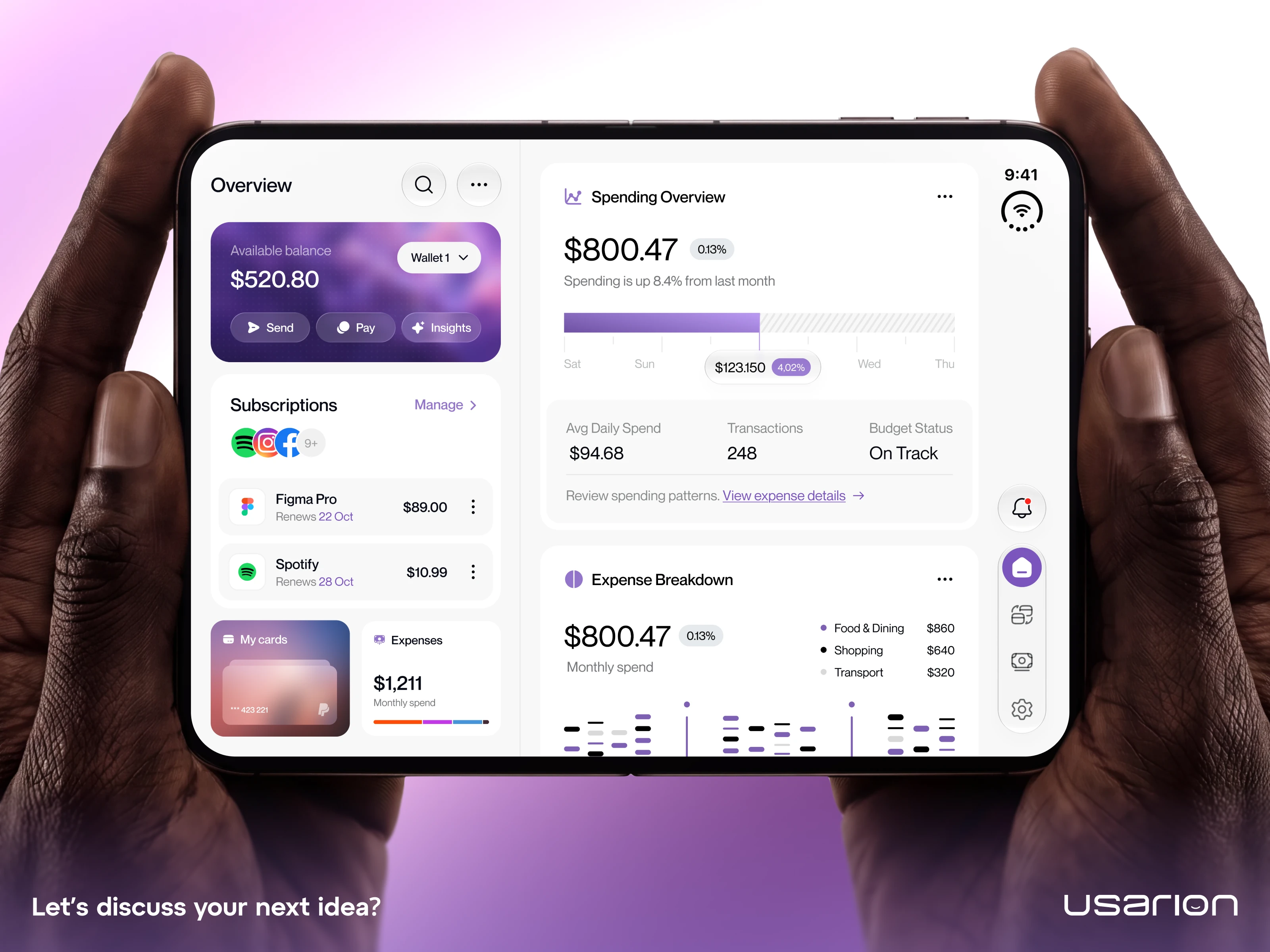
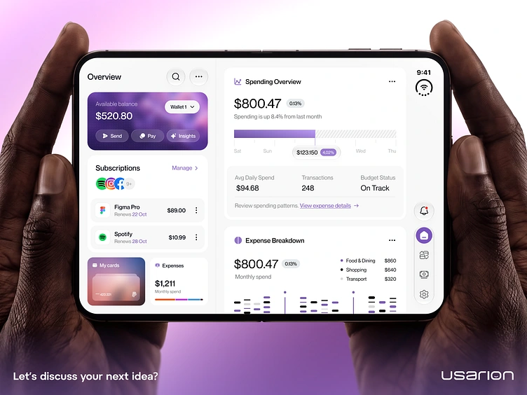
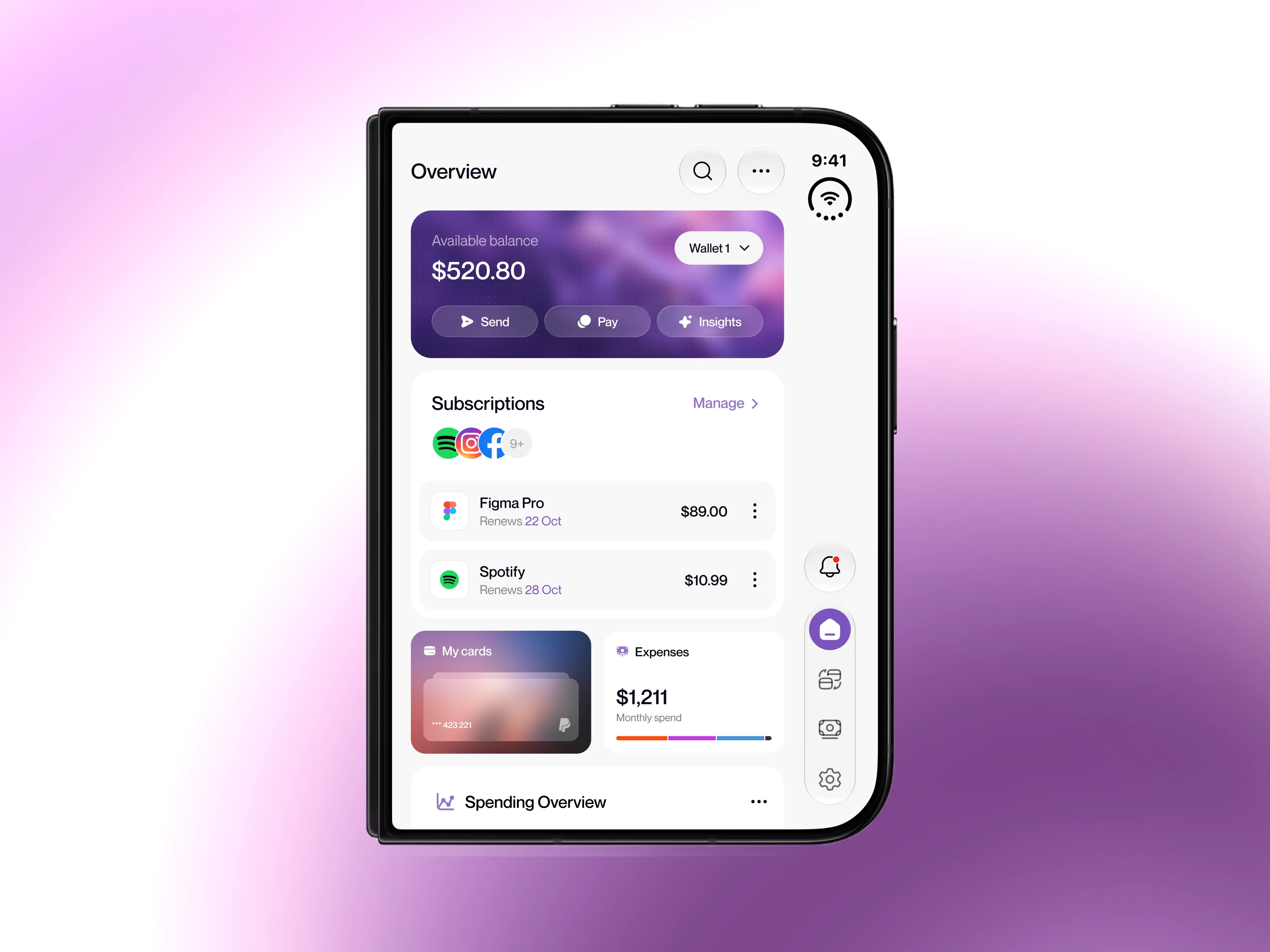
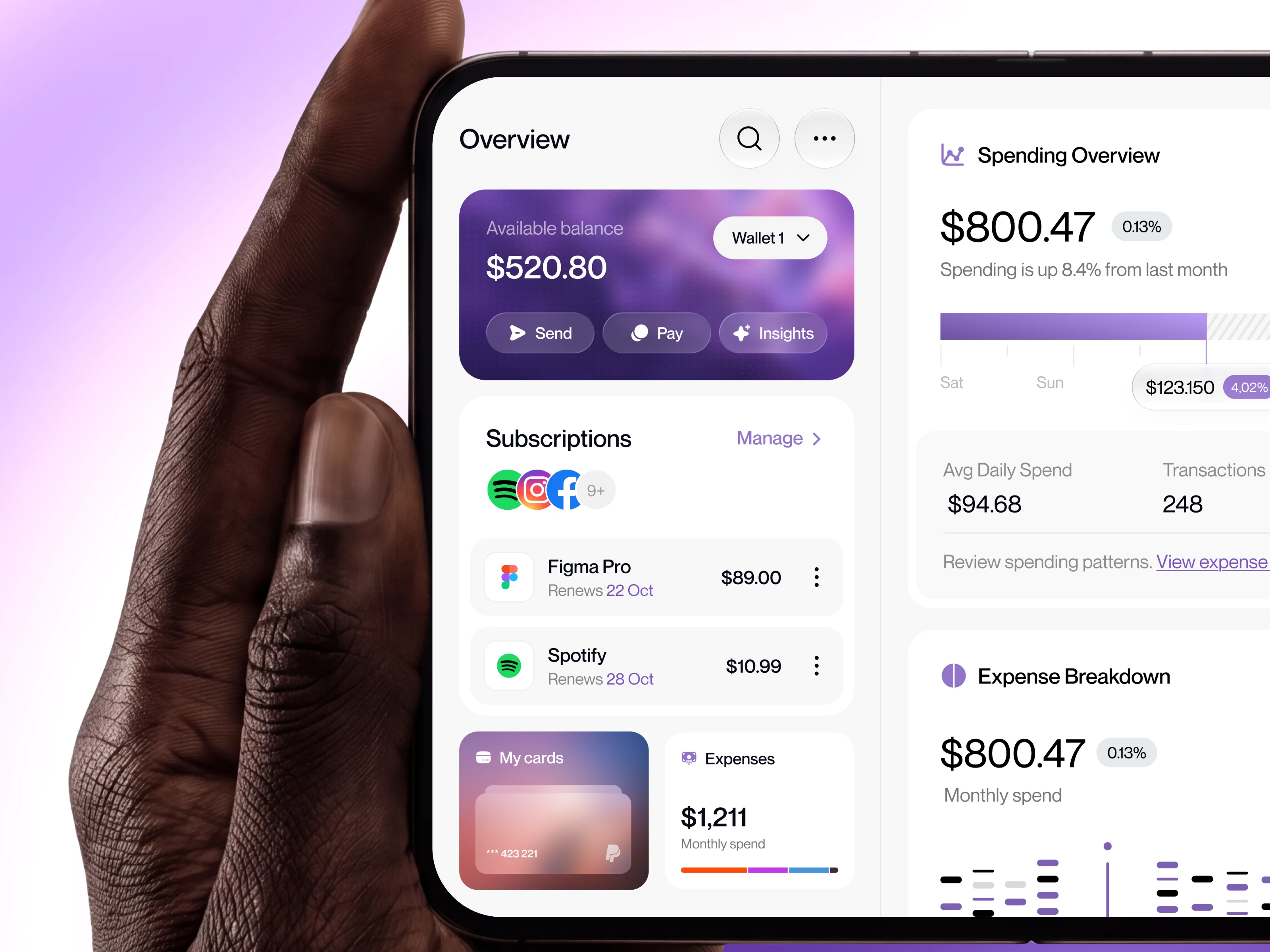
Finance App for iPhone Duo Wallet Overview Screen 💳 A foldable screen can be used fully open or half folded, so we designed the Wallet Overview to work well both ways. Full screen: everything side by side. Your available balance with quick Send, Pay and Insights actions, active subscriptions with upcoming renewals, and card and expense snapshots on the left. Spending trends, budget status and a category breakdown on the right. Half screen: the essentials first. Balance, subscriptions and cards stay up top, while spending analytics move below so nothing gets lost when space gets tight. The visual language leans rich but calm. A deep purple wallet card anchors the screen, while soft grey cards and one accent color keep the numbers easy to read. A floating side rail keeps navigation in the same spot across both modes. Would you rather see your balance or your spending first? Let us know in the comments 👇 Have a product idea? Let’s build it together. 🌐 Usarion: Product Design & UX for startups worldwide Press “L” if you like it ❤️
0
0