Parkway App Concept for Simplified Parking
Shreya Shah
2024 · Research · UX/UI Design · Interaction Design
Parkway: Made finding and booking a parking spot 35% faster through a lower cognitive load
Overview
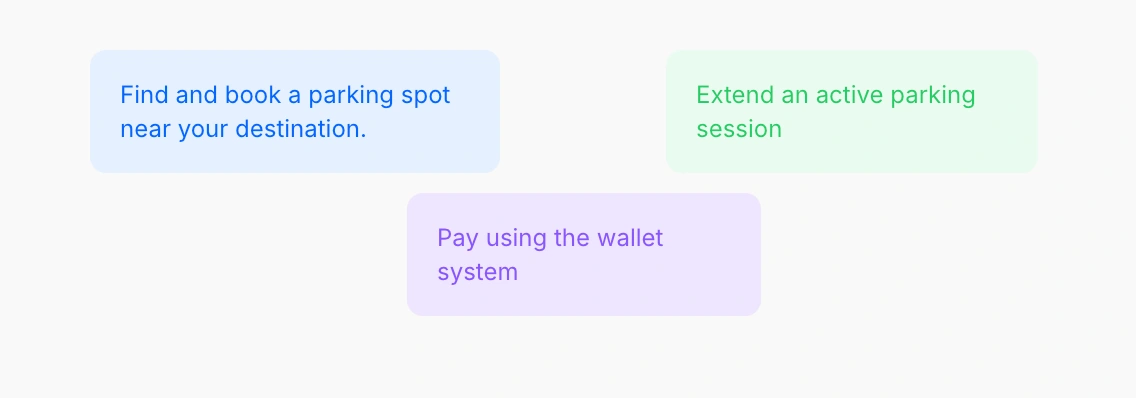
Parkway is a mobile app concept that takes the stress out of parking by replacing today’s fragmented, complex experiences with one intuitive flow to find, reserve, and book a spot in just a few taps.
During the project, I interviewed drivers, mapped the pain points, created flow models, personas, and user stories, built a high-fidelity prototype in light and dark modes, and conducted user testing.
Tools Used: Figma, Figjam
Type: Academic
Role in a team of 4: User Interviews, User Research, UI/UX Design, Interaction Design
Impact
35% faster booking
2.6 cognitive load on a scale of 7
Usability Audit of popular apps in Rochester
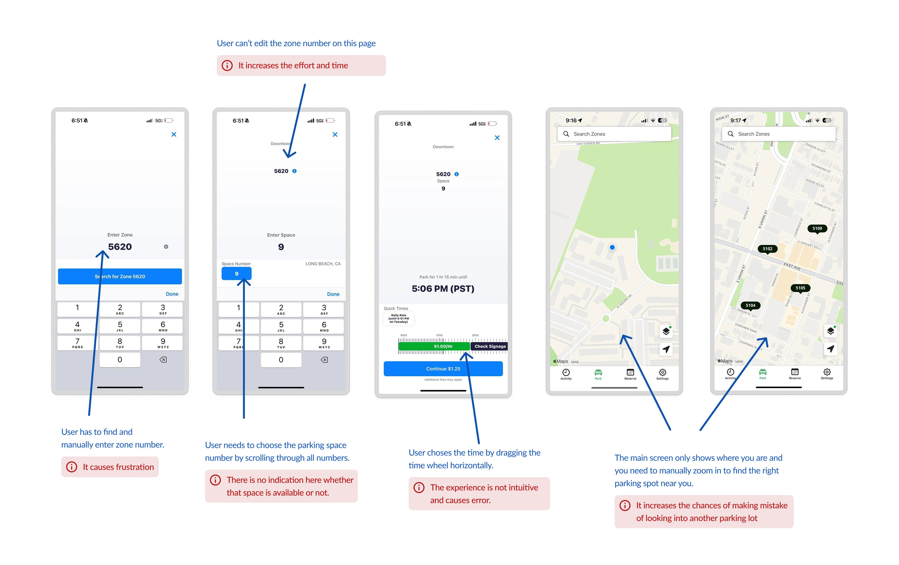
ParkMobile (From left - 1, 2, 3) and Passport Parking (4, 5)
Initial Goal
How might we improve parking apps to enhance user experience?
Challenge faced in the initial steps
We wanted to conduct a contextual inquiry, but we couldn't ask strangers to let us in their car, drive to a destination, and observe them book a parking spot!
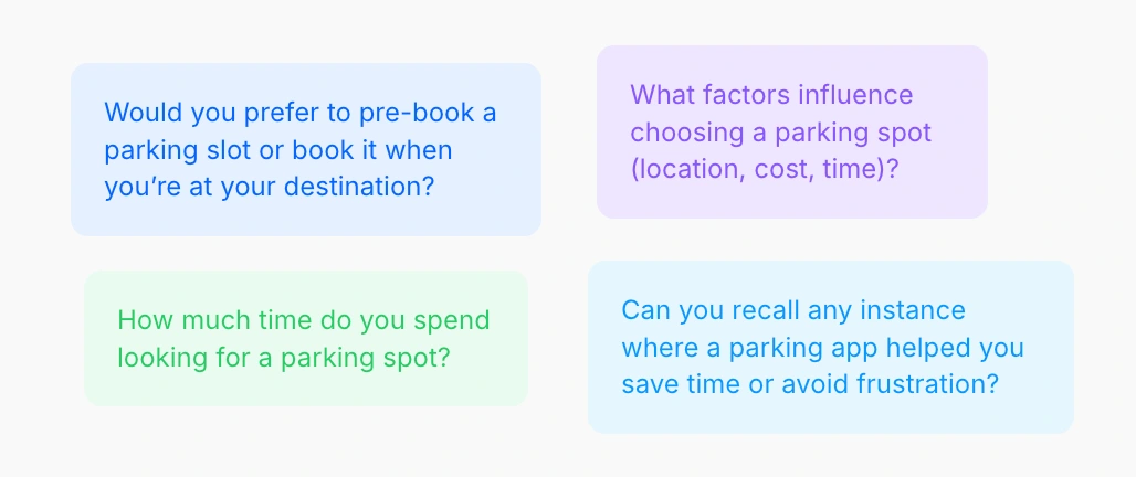
Sample questions asked in Contextual Inquiry
Solution: We designed interviews with hypothetical scenarios where users acted out booking a spot and shared insights about their past experiences.
Contextual Inquiry
The contextual inquiry was conducted with 8 drivers (ages 20–26) who regularly or occasionally use ParkMobile or Passport Parking. During that, people pointed out that the current process of booking and paying through parking apps is annoying. Some of the comments that stood out -
They all suck in general and are annoying to use, especially when parking is free. Like they want you to accidentally pay.
I've legit decided not to park somewhere because the app was so bad.
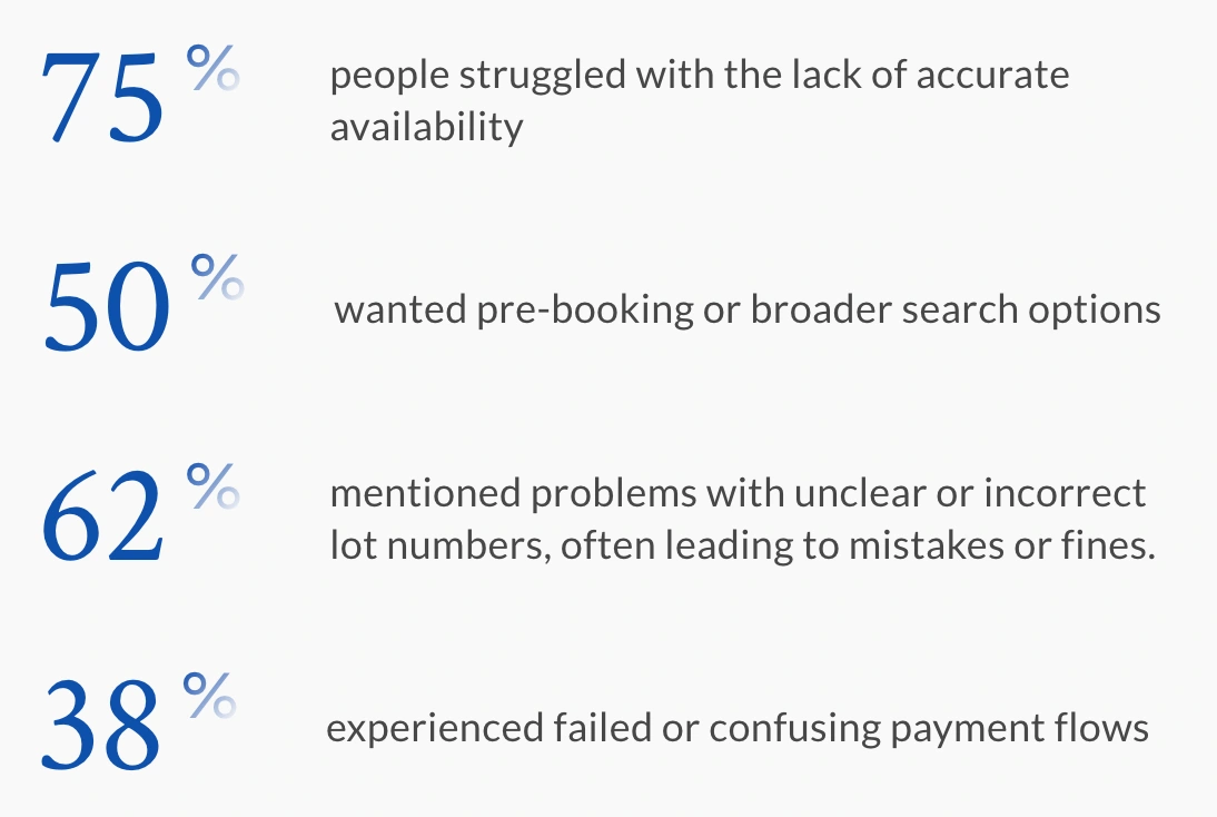
Findings from Contextual Inquiry
Moreover, the average time to book a parking spot varied between 70-90s. 1 participant also noted that they have even spent more than 20 minutes to find a parking spot.
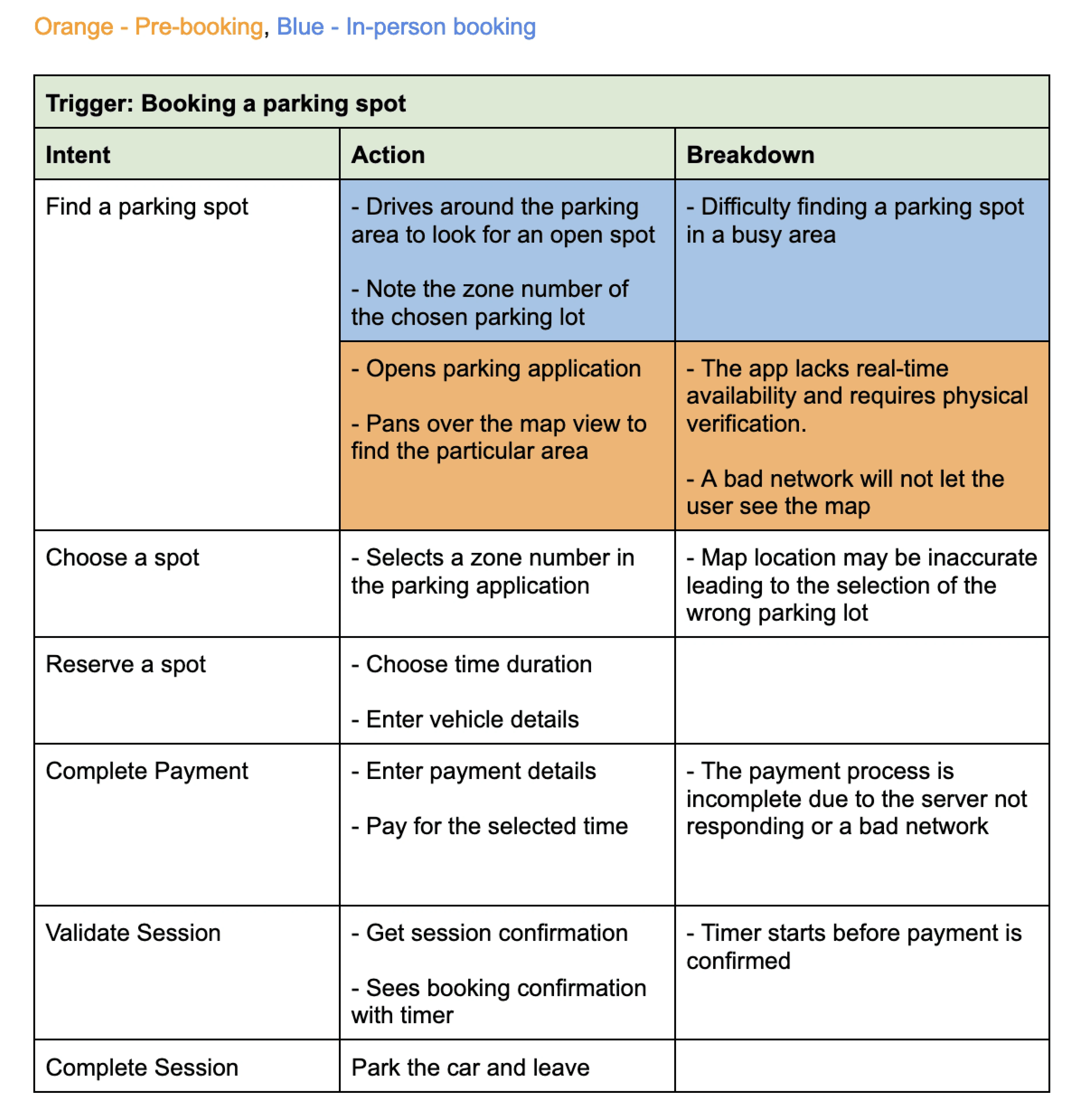
Where in the parking journey do users encounter breakdowns?
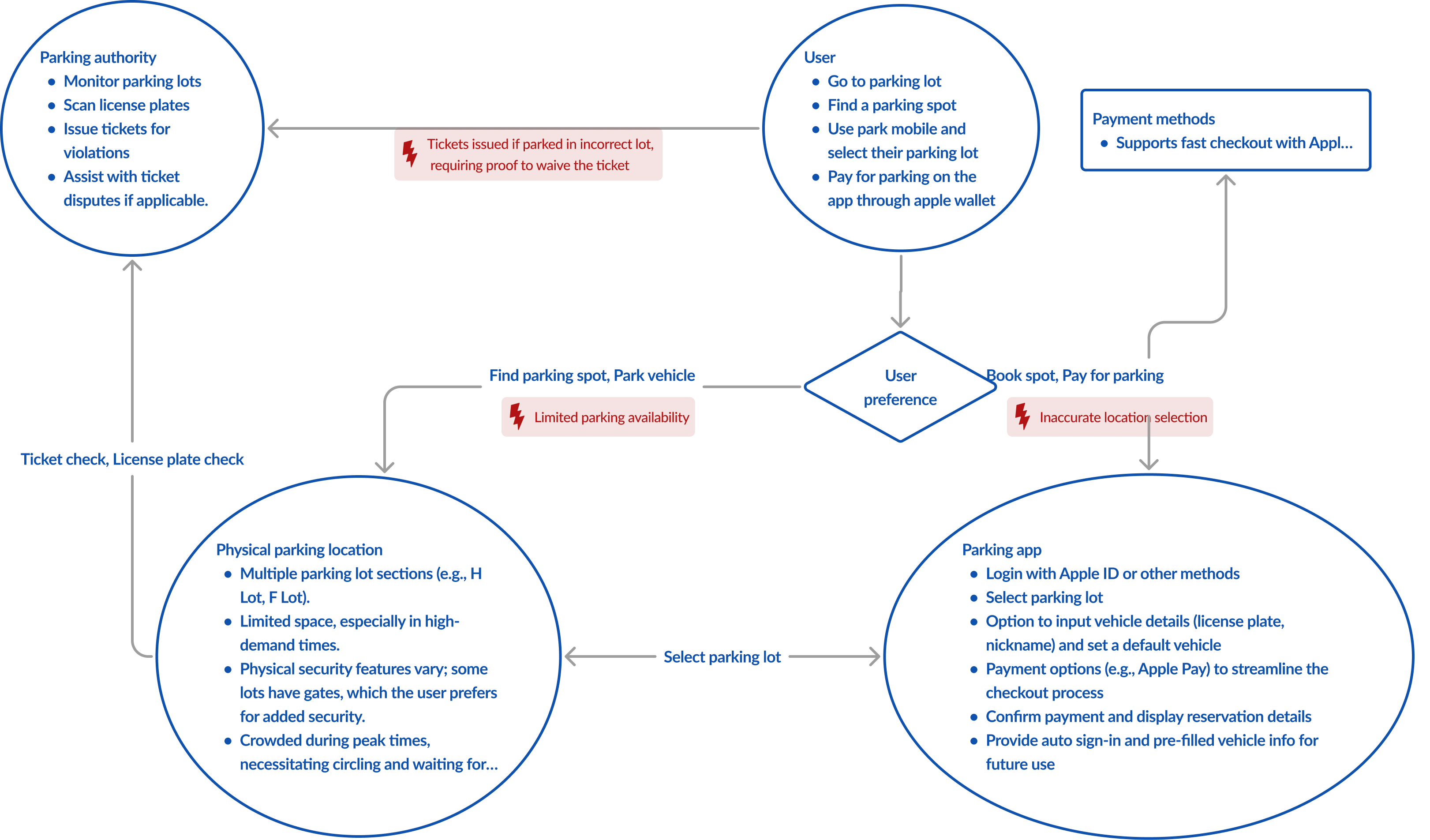
We mapped out flows to capture the direct and indirect factors that shape the parking experience. This helped us break down the journey step by step and pinpoint exactly where users run into friction.
Flow Diagram for participant 1's journey
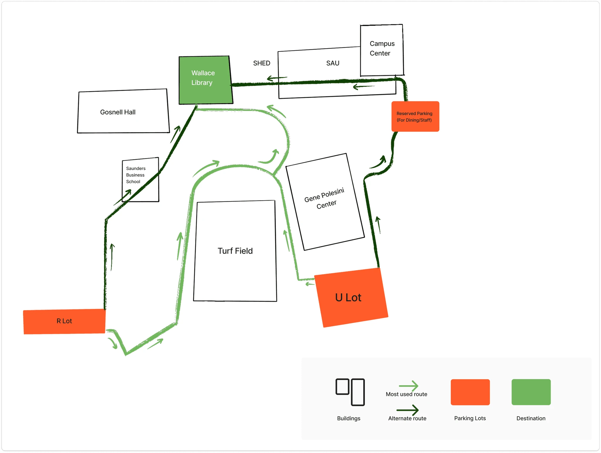
Physical Diagram of Participant 3's journey
Consolidated Sequence Diagram
Key pain points included: unreliable networks, booked spots turning out unavailable, failed payments, confusing or inaccurate zone labels, unexpected ticketing, and time wasted searching for spaces.
Personas
Initially, we created one persona for pre-booking parking spots, but revisiting the pain points led us to create two personas.
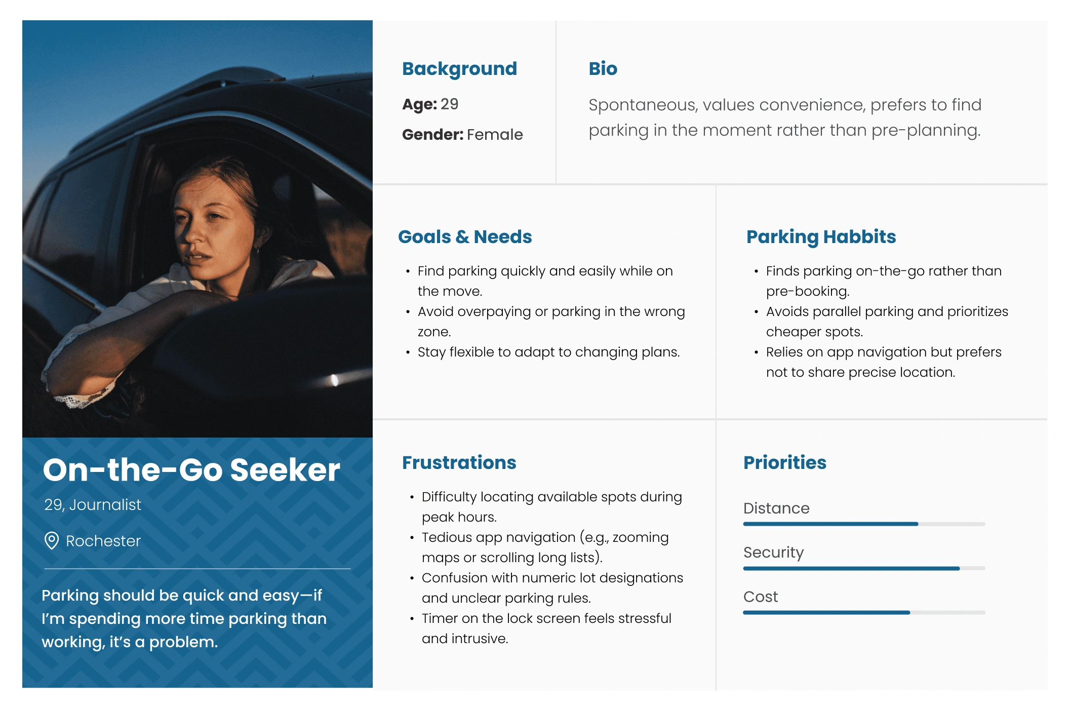
On-the go seeker: Values flexibility and convenience, opting to find parking in real-time
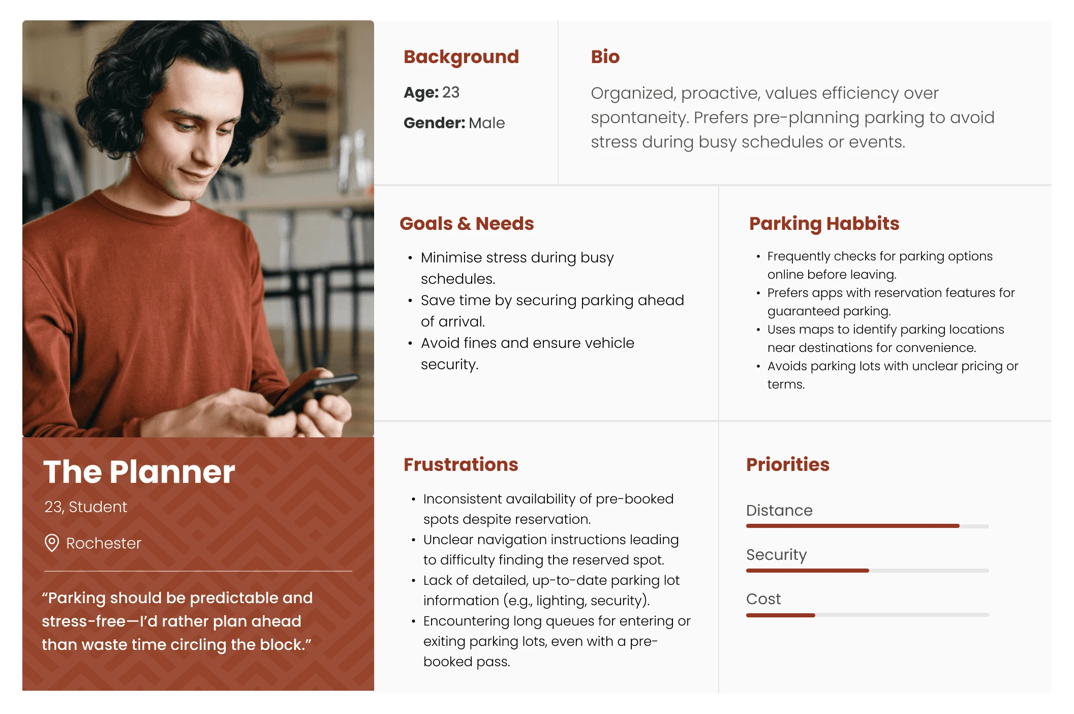
The planner: Avoids last-minute stress by planning ahead and often pre-book parking spots to save time.
The initial goal was based on the perception that users just hate parking apps. But with research, we realized the main friction point was the complexity of parking apps.
Revised Goal
How might we simplify parking apps to reduce cognitive load and make booking faster?
Challenge - Technical limitation
We thought "why not just show real-time availability?" That would make the process so much easier. However, due to lack of CCTV cameras, it wasn't feasible.
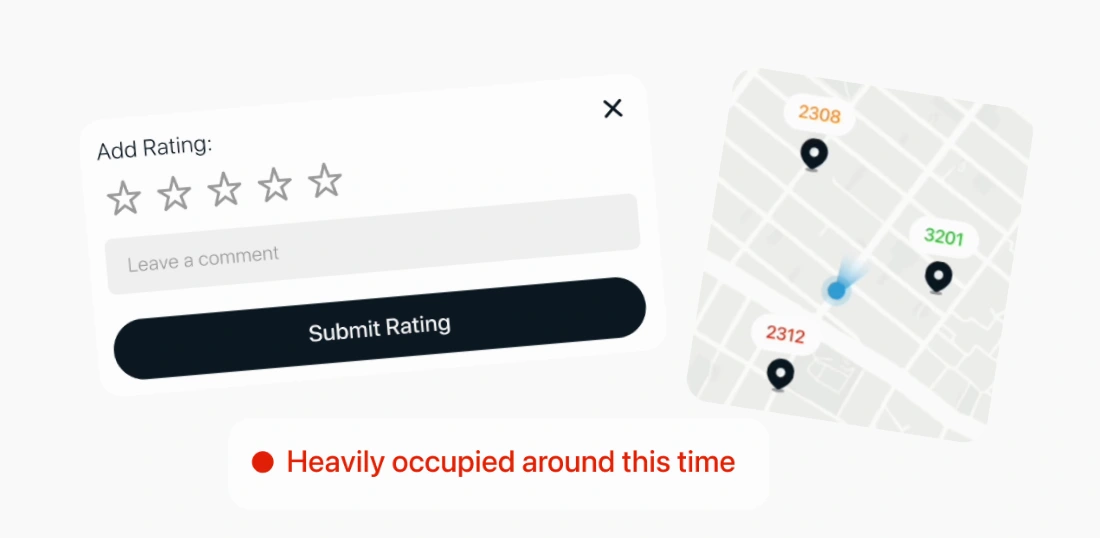
Feedback System, Color coded indicators, Suggested toast messages
Solution: We came up with creative solutions like color-coded indicators, suggested spots, and a user feedback system to help others find available parking zones based on shared experiences.
What does the ideal user journey look like?
We developed a solution storyboard to assess the usefulness of the chosen features for users, which guided us in designing the screens for Parkway.
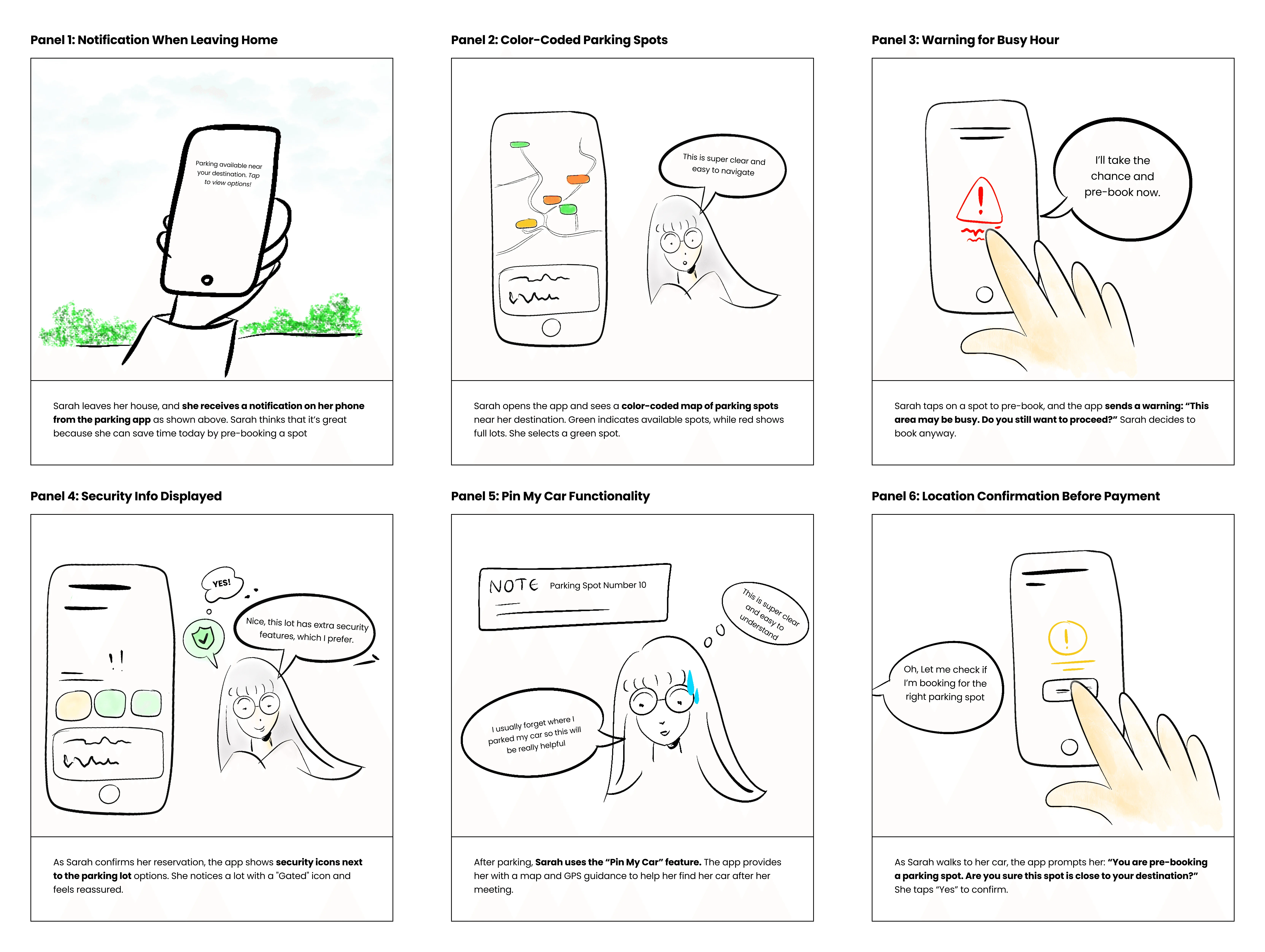
Solution Storyboard
Visual Identity
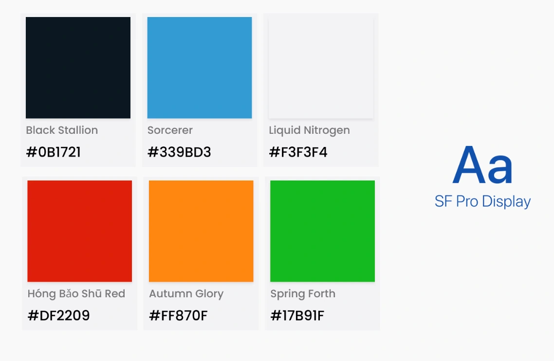
Color Palette and Typography
We incorporated light and dark modes to accommodate different environments and times of day. The aim in choosing this color palette was to convey trust and reliability, enhancing user experience.
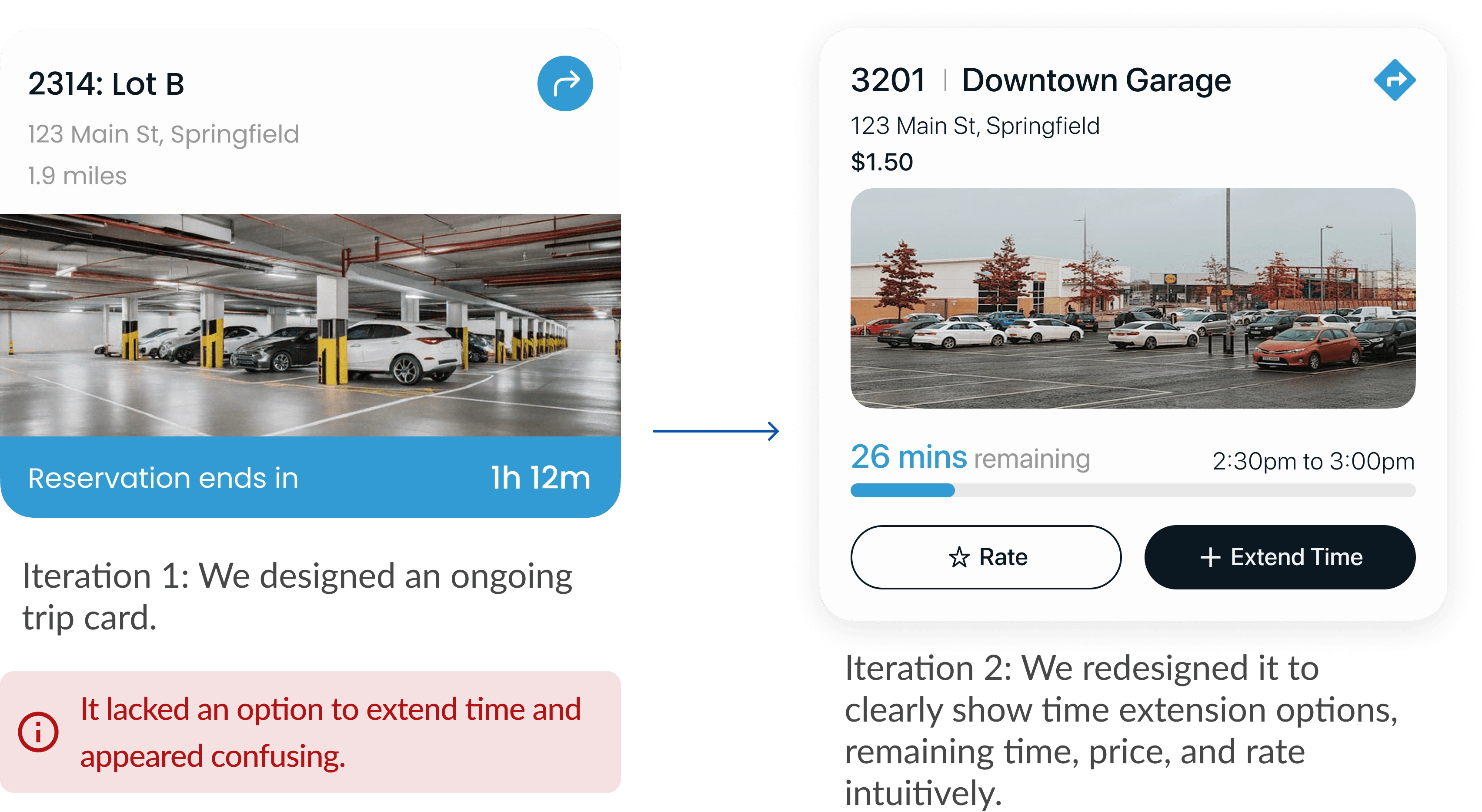
Iterations to improve UX
While designing, even the tiny components require iterations. Here, we made various changes to icons, shadows as well as background.
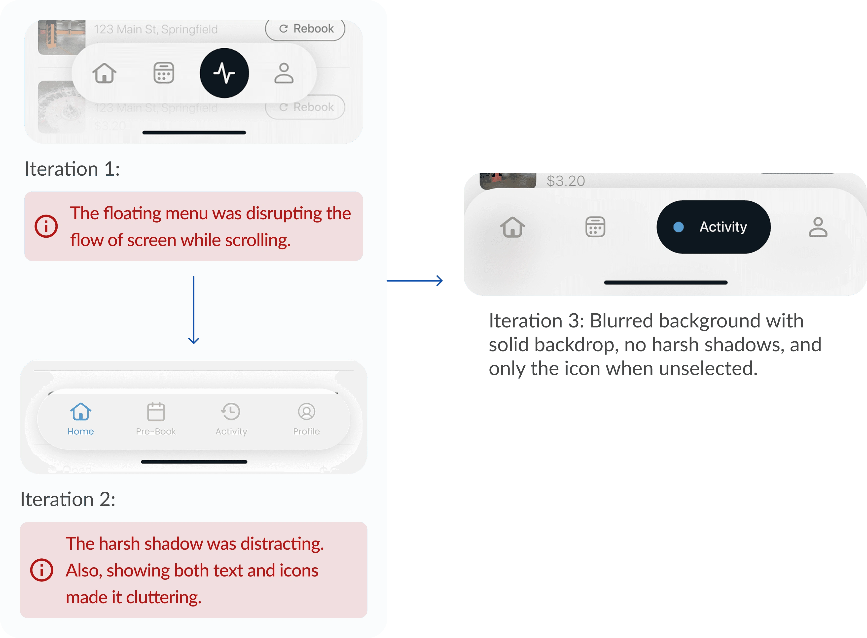
Navigation Buttons
Interview data showed that the users preferred to have an option for quick duration selection.
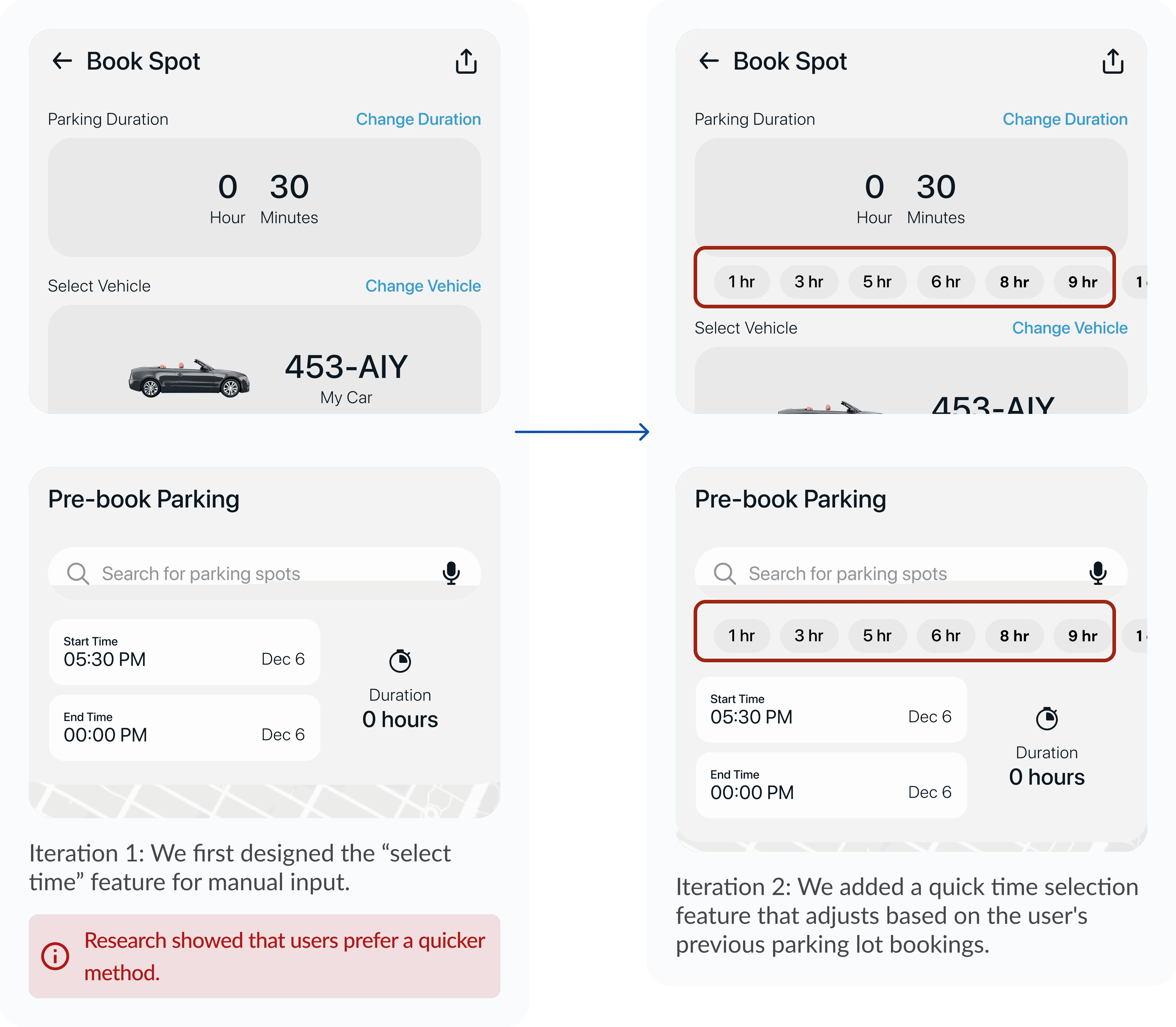
Modal for selecting parking time
Current Parking Activity
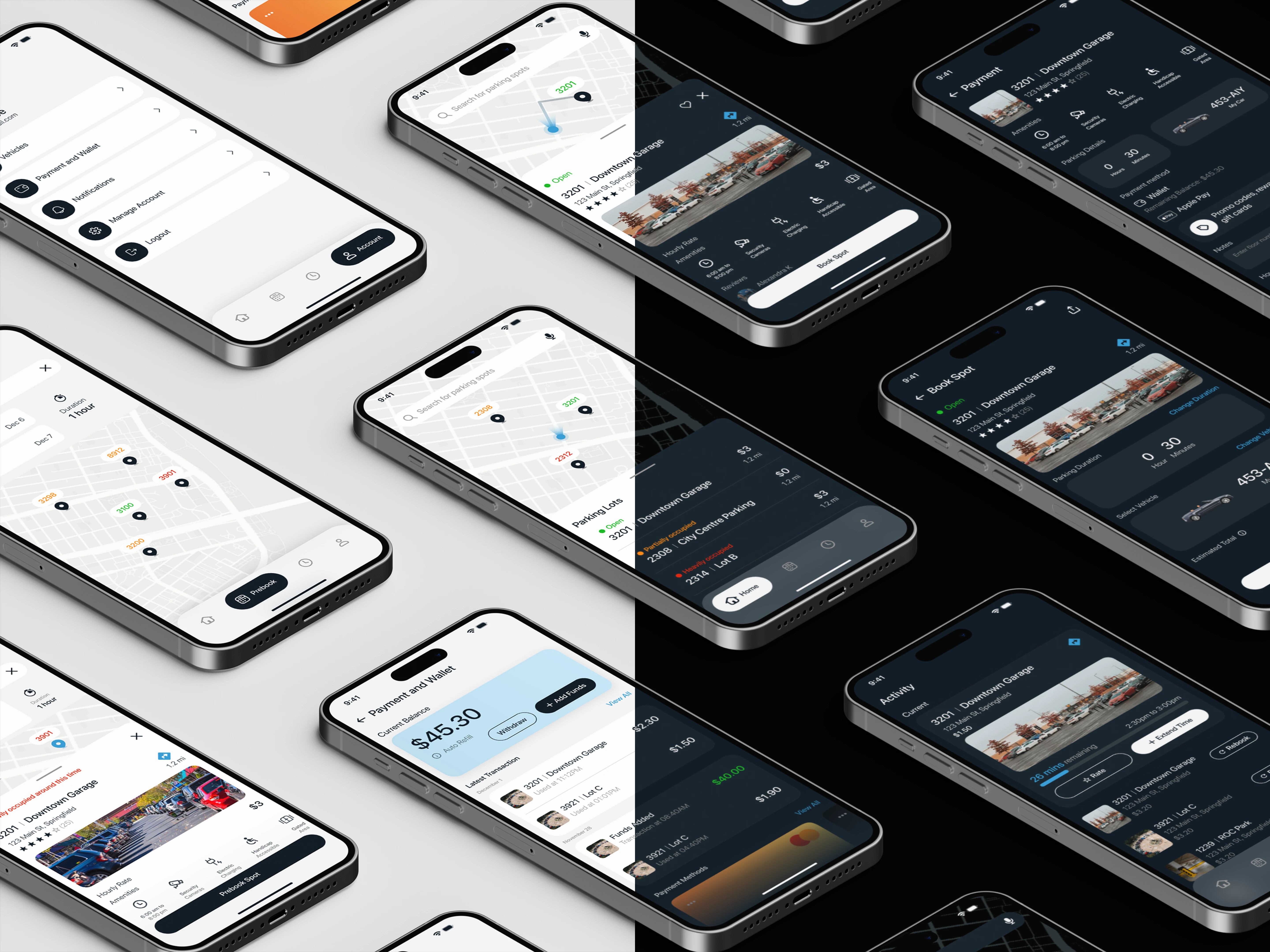
Prototypes
Flow 1: Color-coded Availability
The user can see green, orange, and red color codes that indicate availability for various parking lots. They can see this for pre-booking parking too.
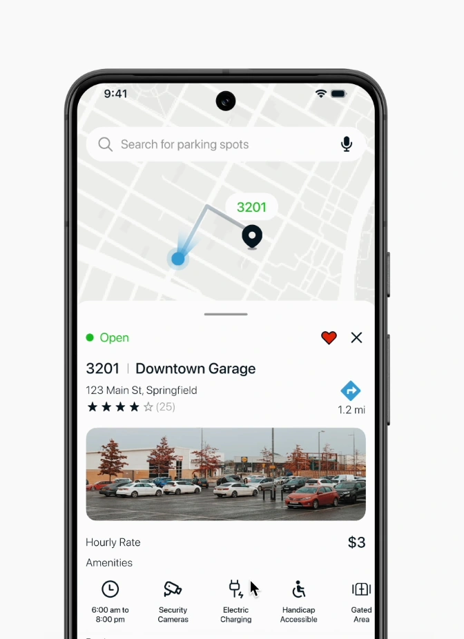
Color Coded availability
Flow 2: Wallet System
Users did not want separate payments on their card, so we created a wallet system for easy and quicker payments while booking.
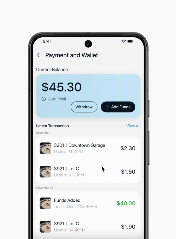
Wallet System
Flow 3: Location Confirmation
Users accidentally paid for an adjacent parking lot, leading to confusion and additional charges. So we added a confirmation pop-up.
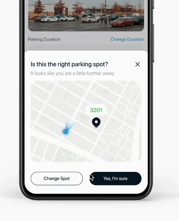
Booking Confirmation
Flow 4: Pre-Booking
While pre-booking, users can see potential availability depending on the time selected.
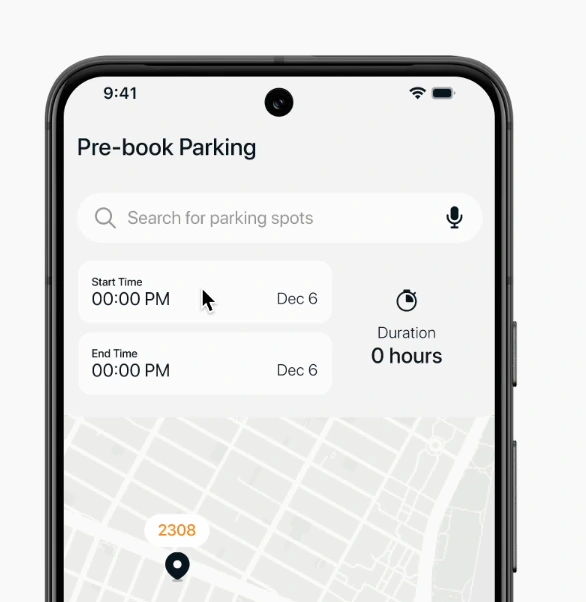
Pre-Booking
User Testing
I ran usability testing with 5 frequent parking app users to evaluate Parkway’s ability to make booking faster and reduce cognitive load compared to current apps. Below are the key tasks -
Questions asked
Metrics Measured
Task completion time
Number of errors/missteps
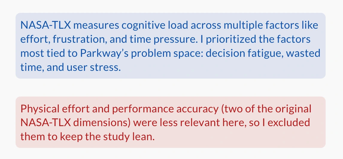
Perceived Cognitive Load (NASA-TLX, simplified 1–7 scale)
Metrics considered
Participant Feedback
51s booking a spot took less time with parkway's user flow
Speed and ease: 35% faster booking
Lower Mental Effort: 2.6 on a 7-point cognitive load scale
Limitations
Prototype Testing: This was a concept project, so the user testing took place in a controlled setting using a Figma prototype. The results represent perceived metrics from prototype interactions, and in real-world use, external factors could influence performance and outcomes.
Small group of participants: The testing was done with a small, homogeneous participant group, and findings may not fully represent broader audiences such as older drivers or people with accessibility needs.
Unbalanced method: Cognitive load was only measured directly in Parkway. If I had to change anything in the project, I would benchmark both Parkway and existing apps under the same conditions for a fairer comparison.
Reflection
Designing with real stories can change priorities. So, it's important to involve users in the process because we are solving their problems.
People don't want just "features", they want to get work done. So it's wise to not overload a product with unnecessary features.
Simplicity > UI polish. If apps aren't easy to use, no amount of pretty design can fix it. UX should always be the goal.
Like this project
Posted Oct 6, 2025
Developed Parkway app concept to simplify parking, achieving 35% faster booking.
Likes
0
Views
5
Timeline
Aug 20, 2024 - Dec 4, 2024