Portfolio website

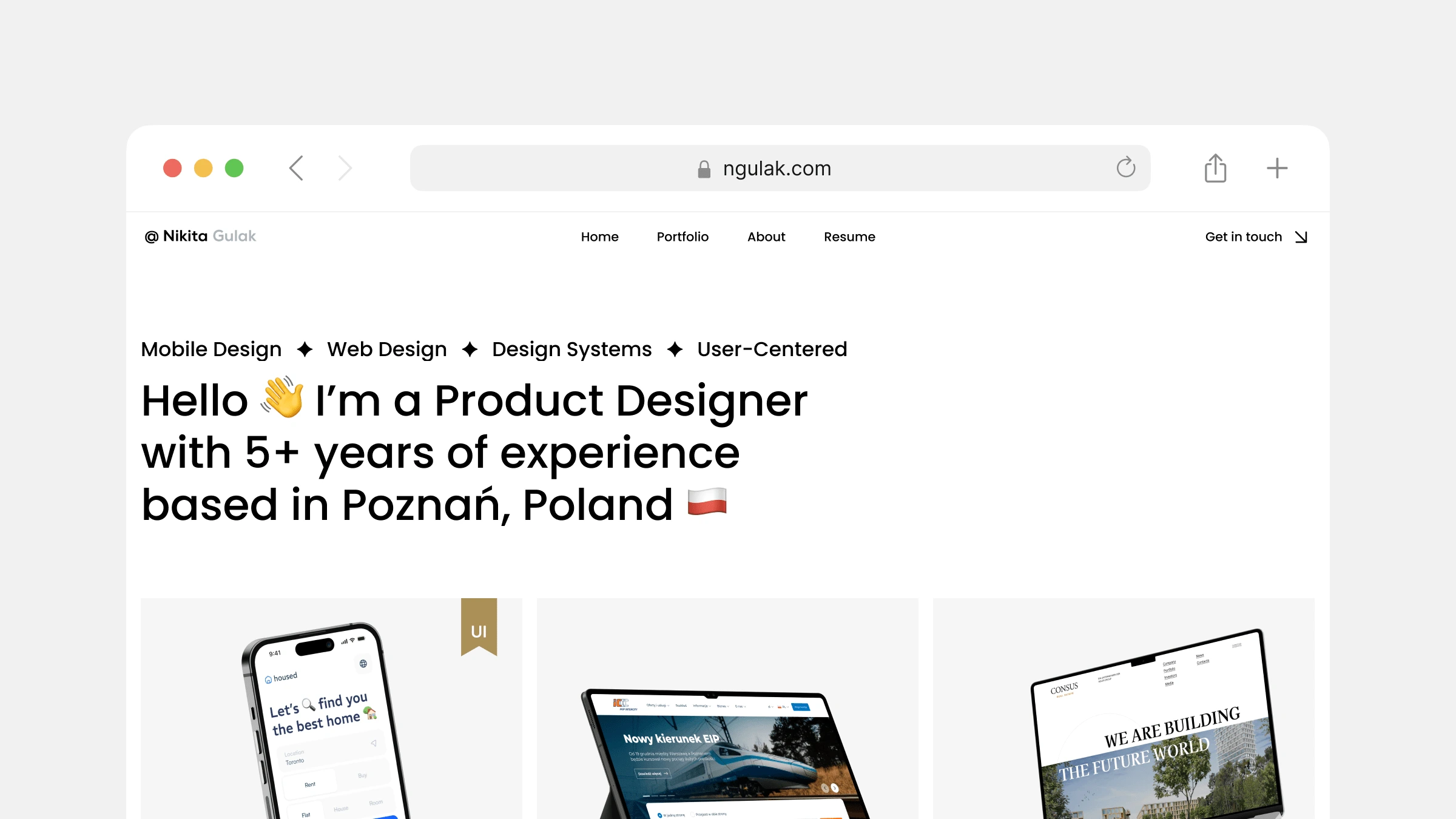
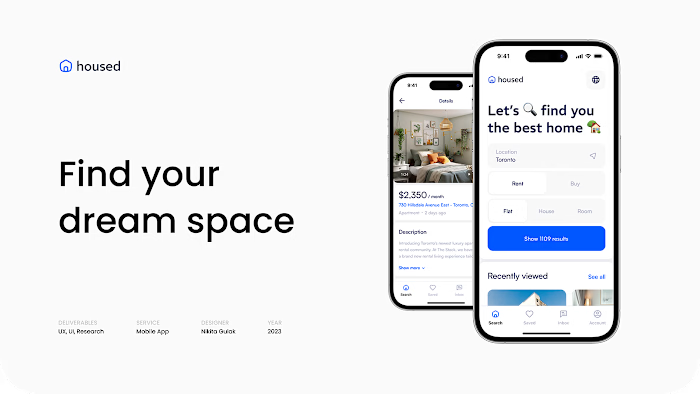
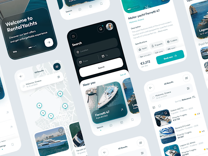
I've launched my portfolio website, where you can check out my latest work as a Product Designer.
🌐 Check it out here: https://ngulak.com/
I wanted my portfolio website to focus on my work, so I decided to avoid color in the UI and use only black and white. I think this helps to create a more minimalist and sophisticated look.
I also can’t help but share my impressions of Framer - the tool I used to develop this site. The incredibly intuitive and user-friendly interface took me literally a few hours to figure it out completely.

Like this project
Posted Oct 11, 2023
On my website, you can learn more about my design process, my experience, and my skills.
Likes
0
Views
35


