Designed these three screens for

Christian Williams

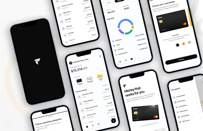
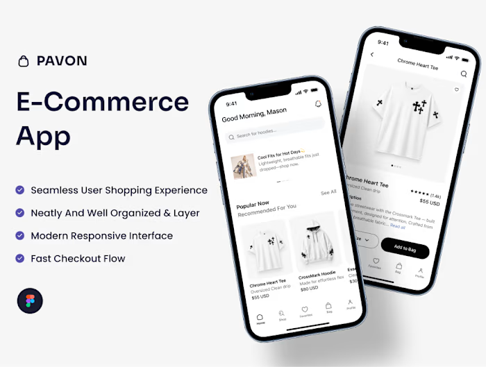
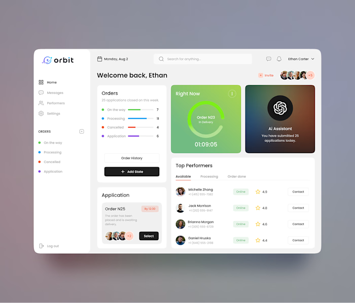
Designed these three screens for a travel app with one goal: make planning a trip feel effortless.
One of the biggest challenges was balancing beautiful visuals with usability. I wanted users to enjoy browsing destinations without feeling overwhelmed, so I simplified the layout, improved the information hierarchy, and made key actions easy to find.
Small design decisions like these can make a big difference in the overall experience.
Curious to hear your thoughts, what stands out to you the most? ✈️🌍
Like this project
Posted Jul 7, 2026
Designed these three screens for a travel app with one goal: make planning a trip feel effortless. One of the biggest challenges was balancing beautiful visu...
Likes
0
Views
2