Squared – Finance Management Web-App

Raj Kansagra


💰 Case Study: Squared
Category: FinTech / Finance Management Website
Tools Used: Figma, Notion, Miro, Illustrator
🧩 Overview
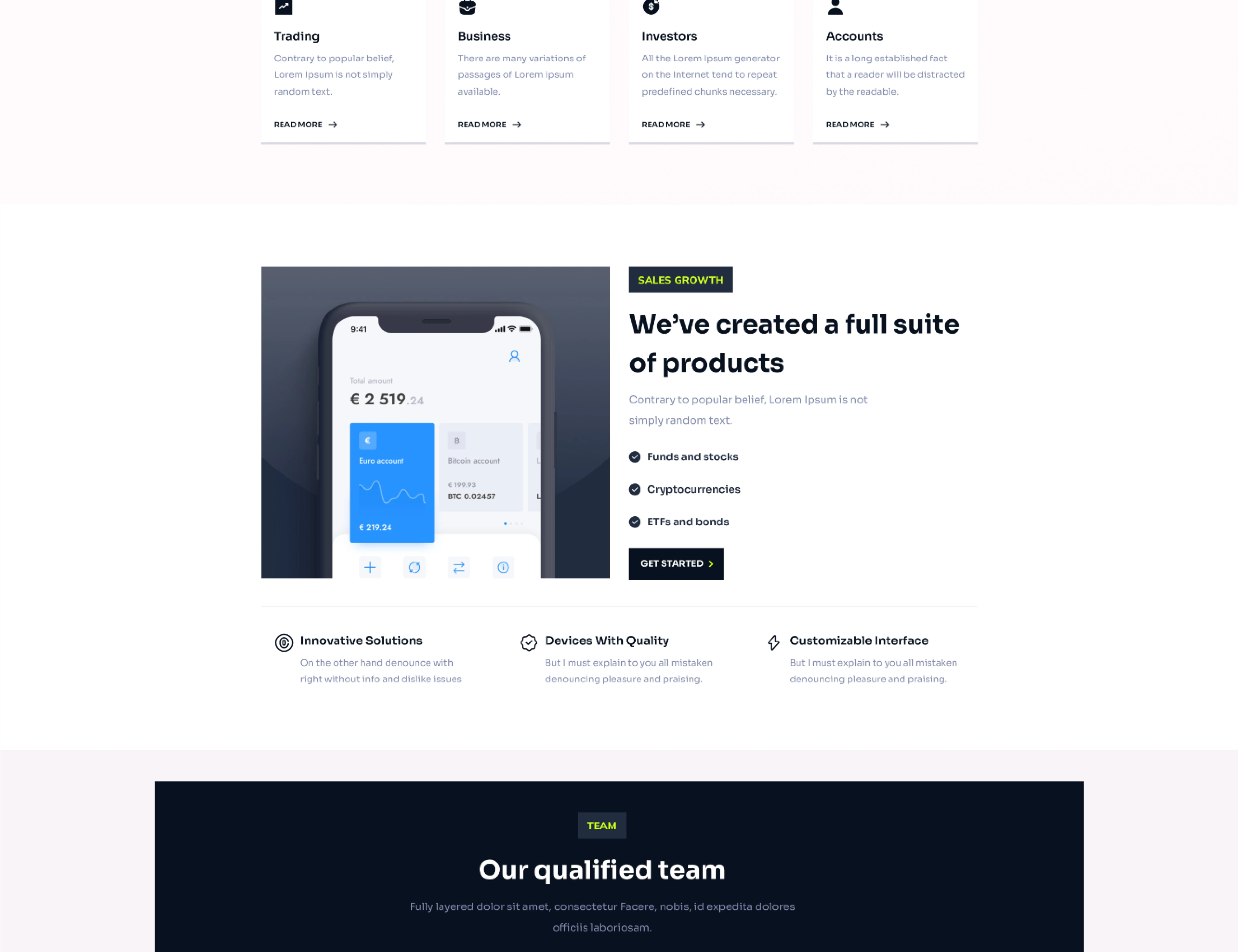
Squared is a modern finance management website designed to simplify how individuals and small businesses track, analyze, and manage their finances. The platform provides real-time insights, smart analytics, and an intuitive dashboard — helping users stay financially aware and make informed decisions with confidence.
The primary goal was to design a clean, data-driven, and user-centric experience that feels approachable even for non-financial users, while maintaining the credibility and precision expected in a FinTech product.
🎯 Problem Statement
Managing finances online can often feel complex and overwhelming, especially when data visualization is cluttered or difficult to interpret.
Most existing finance platforms focus heavily on features but lack clarity, emotional trust, and design simplicity.
The challenge was to design a digital experience that:
Simplifies complex financial data into clear visual insights.
Builds trust through design and tone.
Provides a seamless experience across devices.
💡 Solution
Squared turns financial complexity into clarity.
It’s a platform that makes tracking expenses, setting budgets, and analyzing performance as simple as checking your notifications.
Core experience pillars:
Clarity: Simple layouts and intuitive charts.
Control: Easy budgeting, goal setting, and auto-categorization.
Confidence: Real-time data visualization that builds user trust.
🧭 Research & Insights
Target Audience
Young professionals, freelancers, and small business owners.
Age group: 20–45.
Tech-savvy, yet prefer simplicity and automation.
User Research Highlights
70% of users found traditional finance dashboards “too technical.”
64% want visual insights instead of plain numbers.
81% prefer websites that feel secure yet minimal.
Insights:
Users need transparency and control, not jargon.
Data visualization should communicate stories, not spreadsheets.
A balance between trustworthiness and ease of use drives adoption.
🧱 Design Process
1. Empathize
Mapped pain points through interviews and surveys.
Common frustrations included:
Confusing layouts.
Overloaded dashboards.
Poor mobile responsiveness.
2. Define
Defined the core problem as:
“How might we help users understand and manage their finances with confidence, using design that feels intuitive, transparent, and empowering?”
3. Ideate
Generated ideas for:
Modular dashboard components.
Color-coded financial health indicators.
Predictive expense charts.
4. Wireframe
Low-fidelity sketches emphasizing hierarchy and white space — ensuring quick information scanning and emotional calm.
5. Design
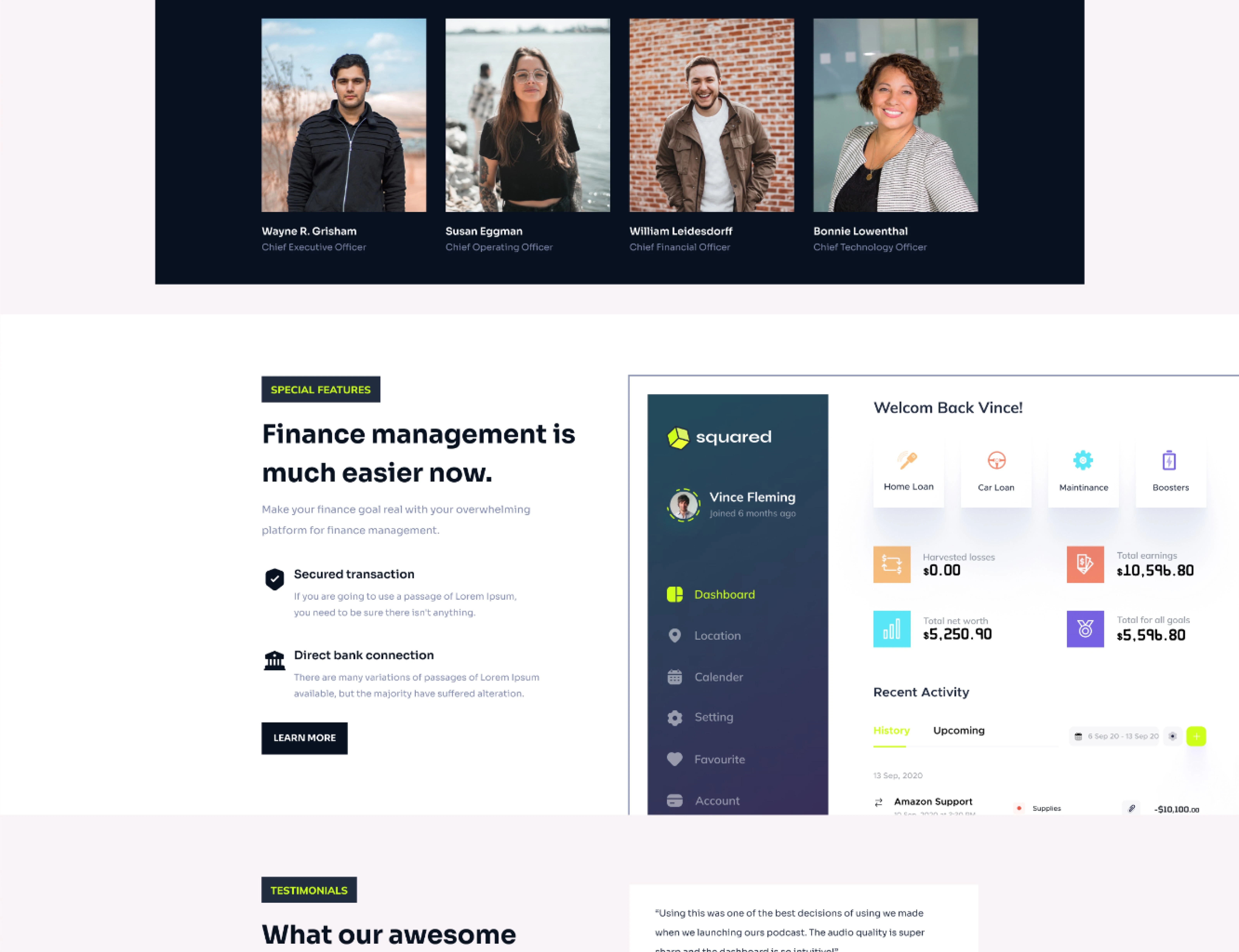
Minimal interface with clear data visualization (charts, graphs, indicators).
Focus on a trustworthy color palette — deep blues, whites, and mint accents.
Custom iconography to represent income, expense, and analytics.
Smooth hover states and transitions for interactivity.
6. Prototype & Test
Usability testing with 8 users (freelancers + small business owners).
Feedback:
Users appreciated clean dashboard hierarchy.
Suggested adding AI-based insights for better expense prediction.
Requested a dark mode for long usage sessions.
💻 Key Features
Unified Dashboard – All financial data in one place, clearly visualized.
Smart Categorization – Automatically groups income and expenses.
Budget Goals – Set monthly or yearly limits with progress tracking.
Financial Health Score – AI-driven metric summarizing financial stability.
Report Generator – One-click generation of exportable financial summaries.
Secure Cloud Sync – Encrypted data protection and auto backup.
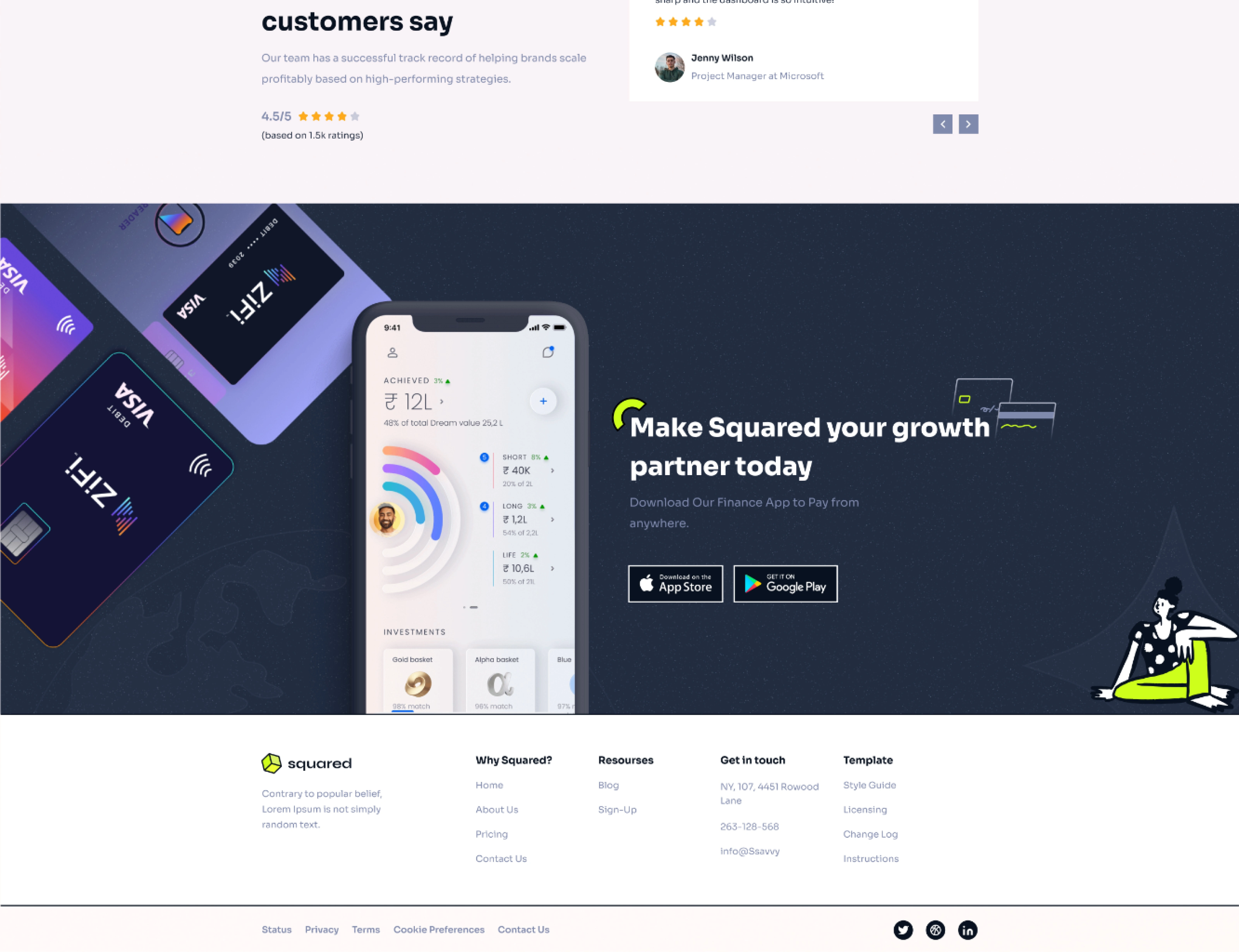
🎨 Visual Identity
Typography: Modern sans-serif for clarity (e.g., Inter / Poppins).
Color Palette: Navy blue for trust, mint green for positivity, white for simplicity.
UI Elements: Rounded cards, smooth gradients, and intuitive chart visuals.
Micro-interactions: Animated transitions when switching tabs or viewing reports.
Like this project
Posted Nov 13, 2025
Squared is a modern finance management platform designed to help individuals and businesses manage, track transactions, and grow their finances with confidence.