Praxis Clinical — branding & corporate materials
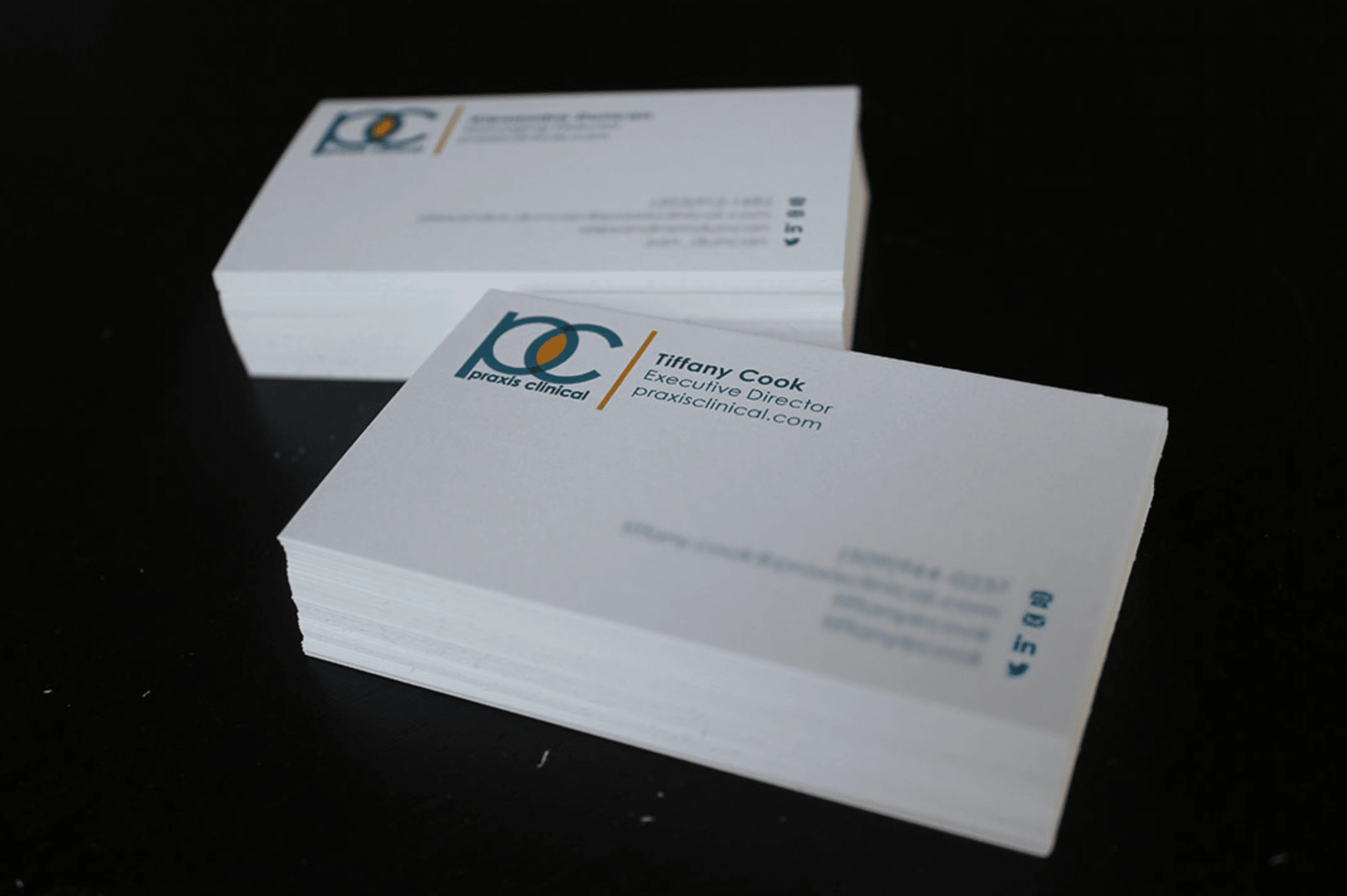
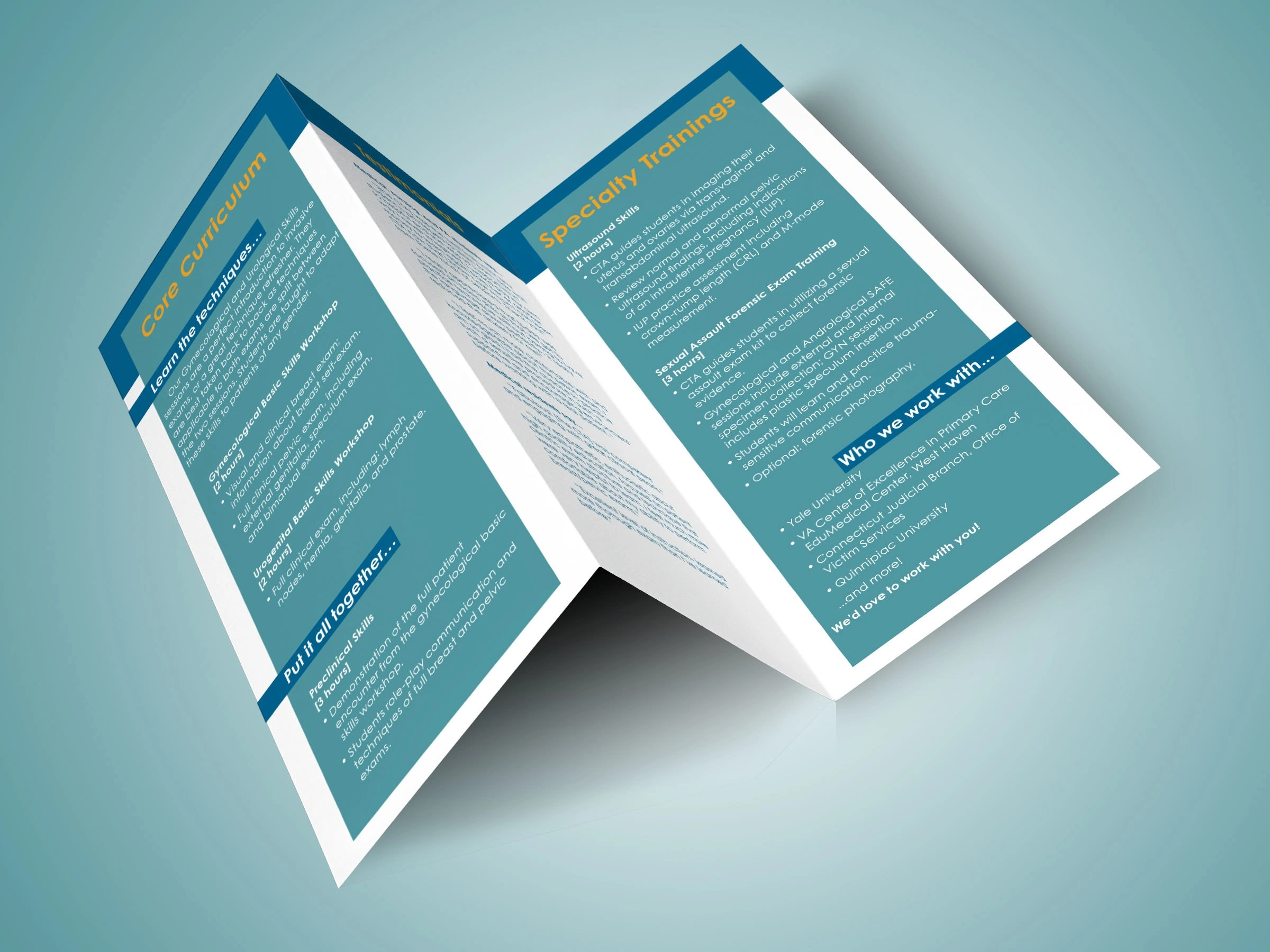
Medical clinical skills company Praxis Clinical first came to be to help with their branding (including business card & other corporate materials development) to ensure their visual presentation matched the quality and professionalism with which they worked.

The company came in knowing they wanted a blue, turquoise, and gold as their colours, and wanted to stick with a variation of their original logo to communicate the idea behind their name—that as a clinical education company, they married the worlds of theory and practice ("praxis"), with knowledge in both but expertise in bringing the two together. Add to it their beginnings in gynecological health, and the Venn diagram hints at their yonic beginnings.


Like this project
Posted Jan 19, 2024
Logo design, branding, and corporate materials to elevate the company's visual identity & reflect their values (and, more subtly, their yonic beginnings)


