Branding identity | Project Xin Chào
Xin Chào, we are
all-in-one online portal for foreigner newcomers RMIT staff to access information about living in Vietnam. But that's not all, we are here to ensure our friends fully experience Vietnamese life in its local contemporary essence.
Brand identity | logo
Logo Mark Variations
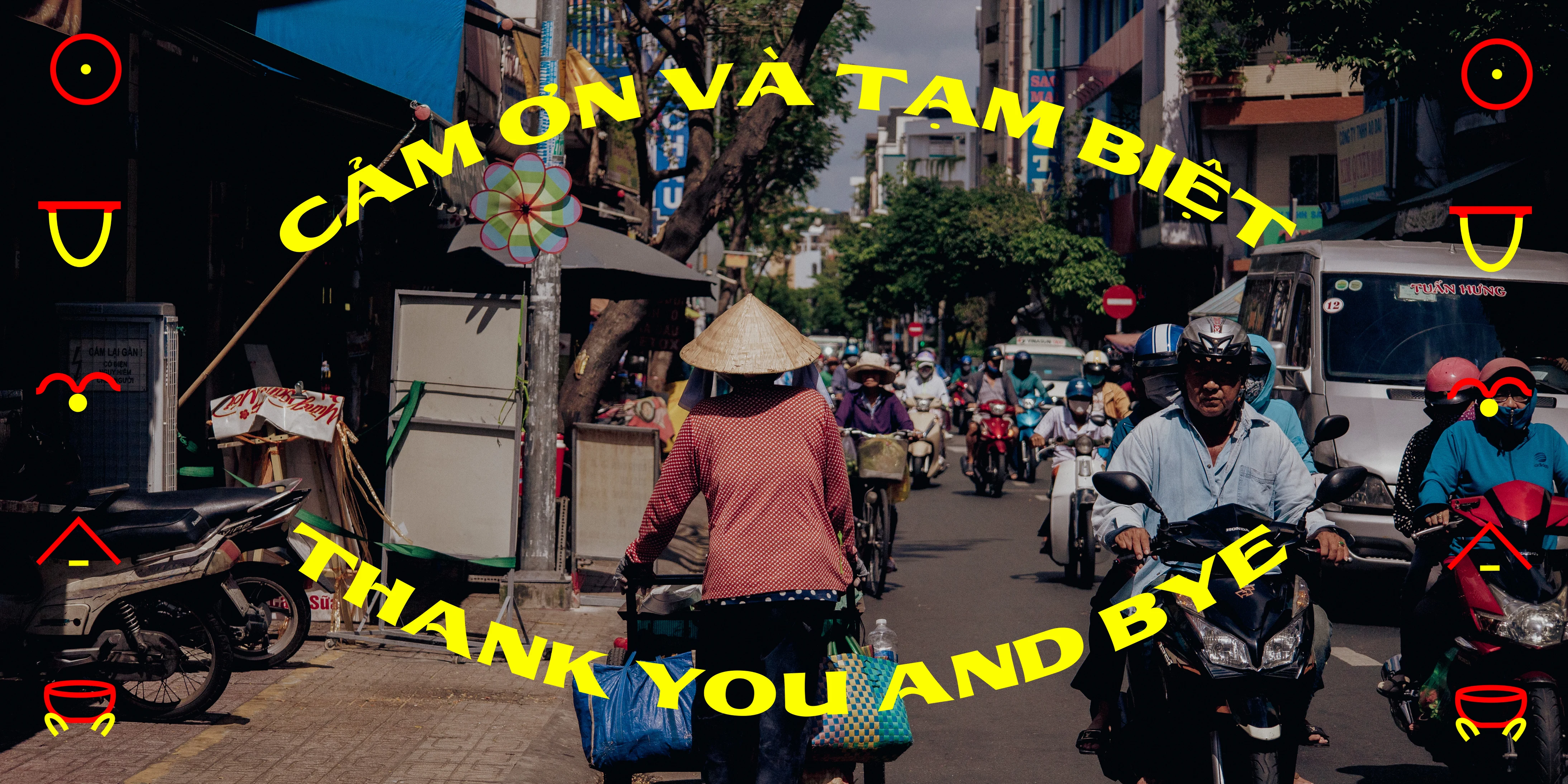
The visual identity started while we sitting at 'trà đá' vendors, observing vehicles running through the hustling street. The contradiction between the vibrant atmosphere with the stillness state on the blue chair sparked a cultural sense in our mind. In that sense, primary colors (red, yellow, blue) would be selected with typography (bold) to demonstrate the brand identity. For Photography, we captured the human - street around Sai Gon to make a closer connection to the audience in Vietnam.
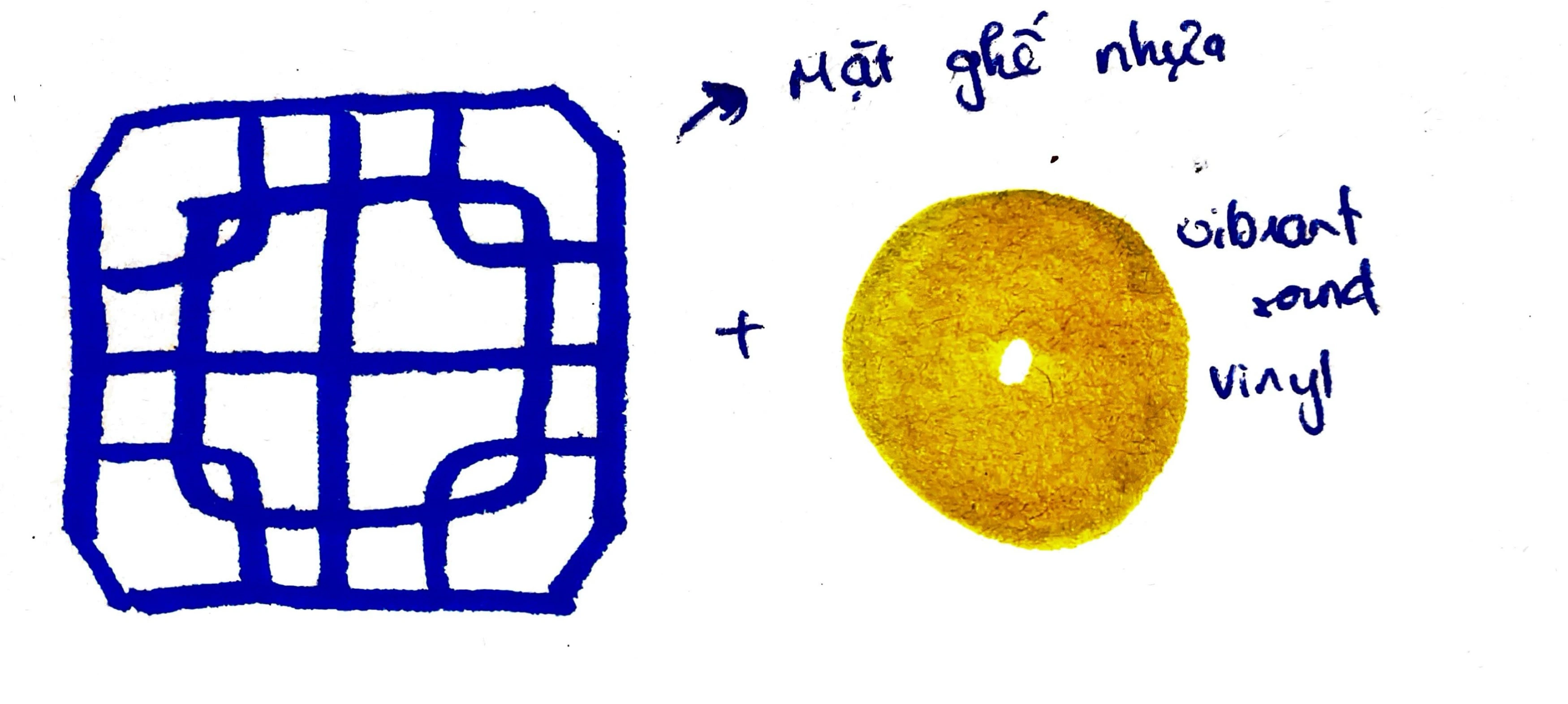
Front blue chair + Vinyl (symbol of sound)
With that logo creativity, we explore the multi-sensory concept through our key visual.
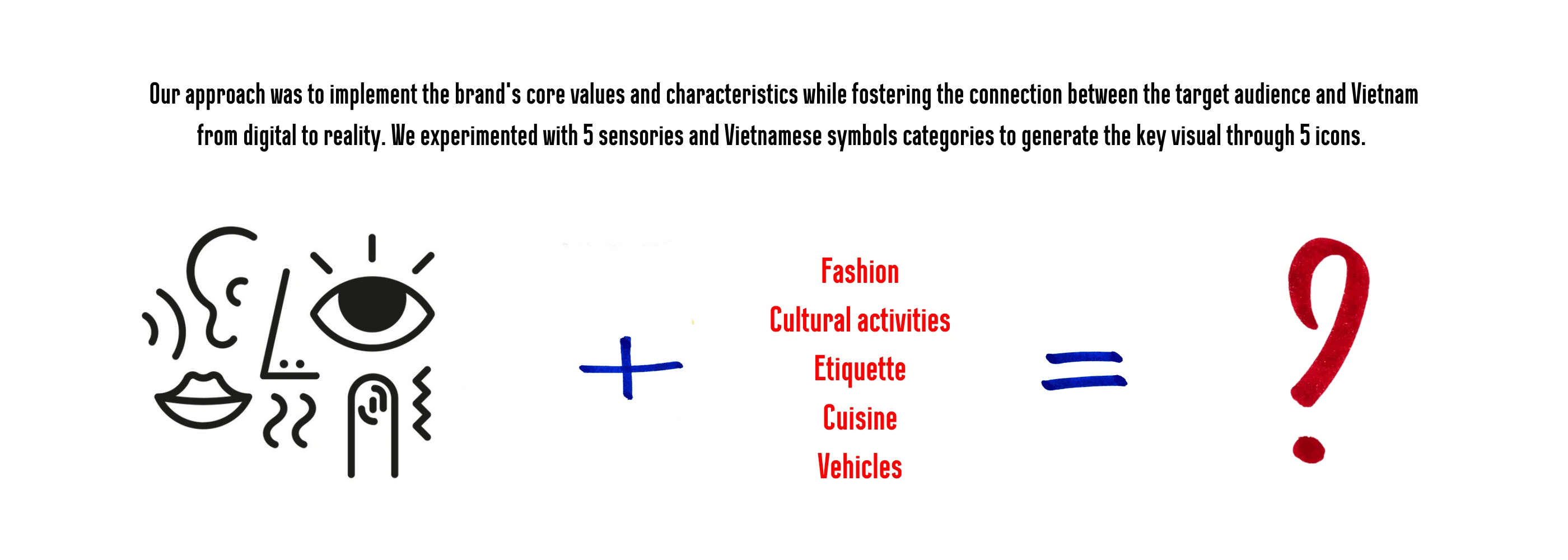
Key visual | icons
Promotional items
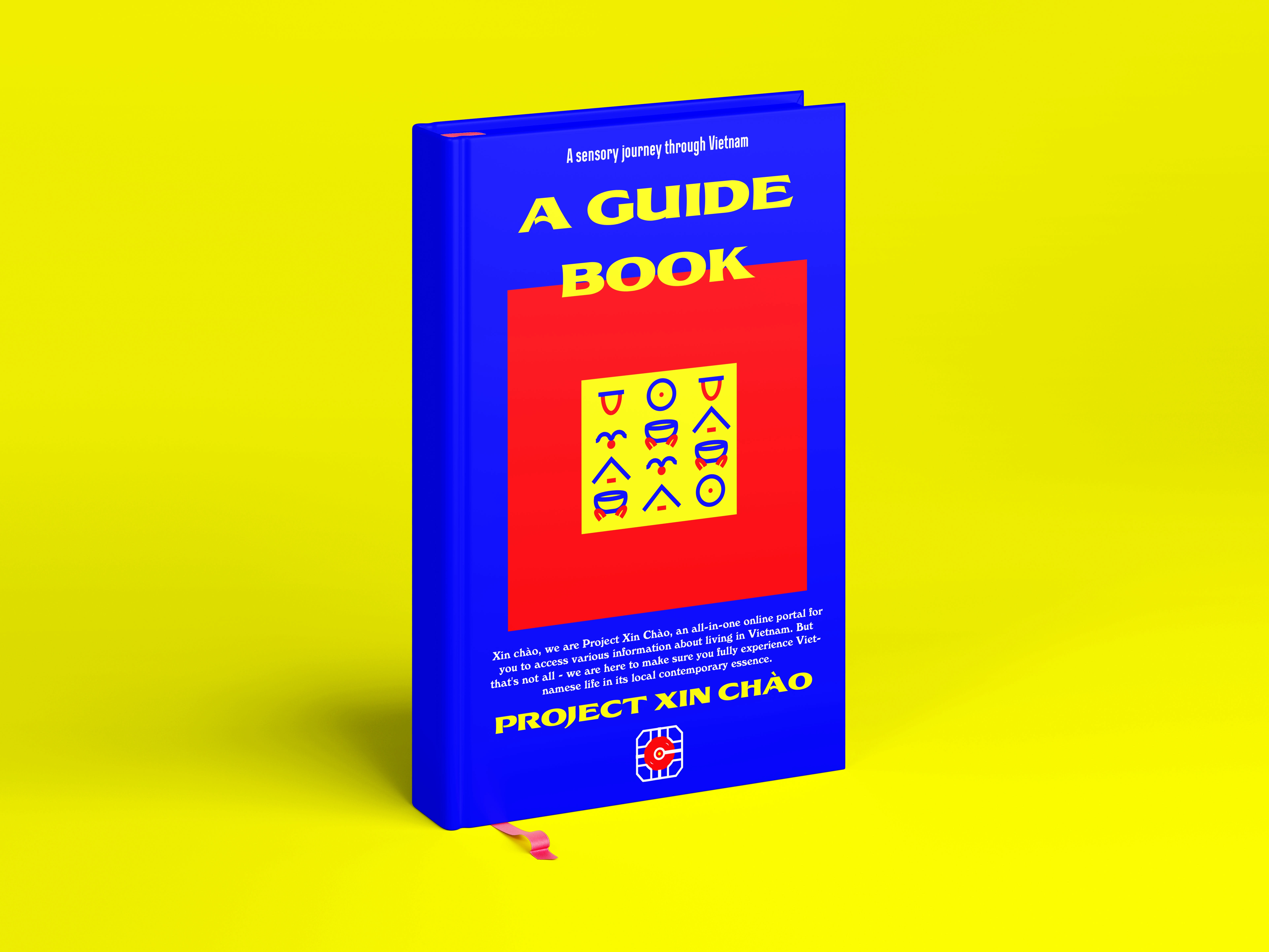
Guide physical book
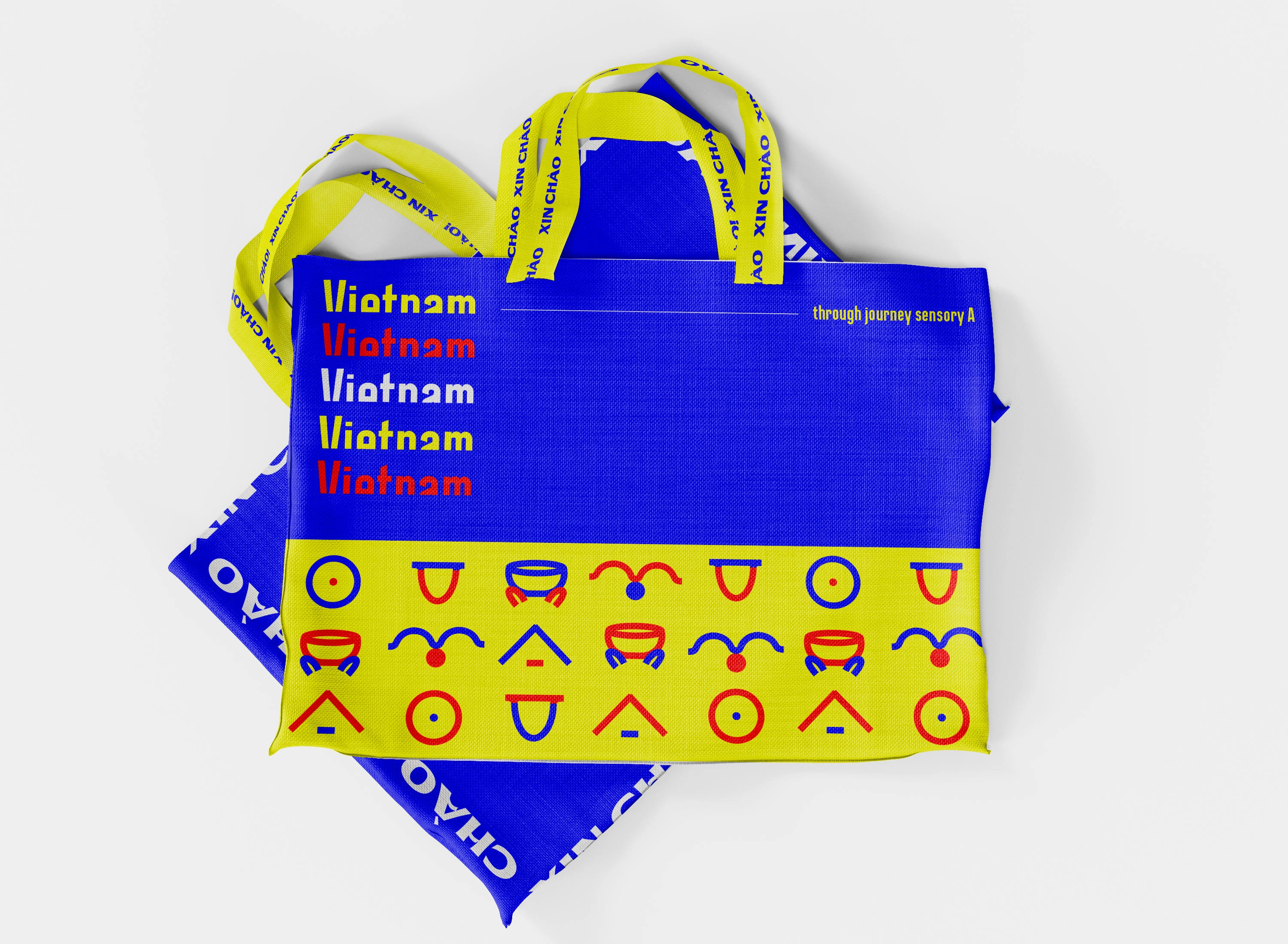
Tote-bag (Environmental-friendly materials)
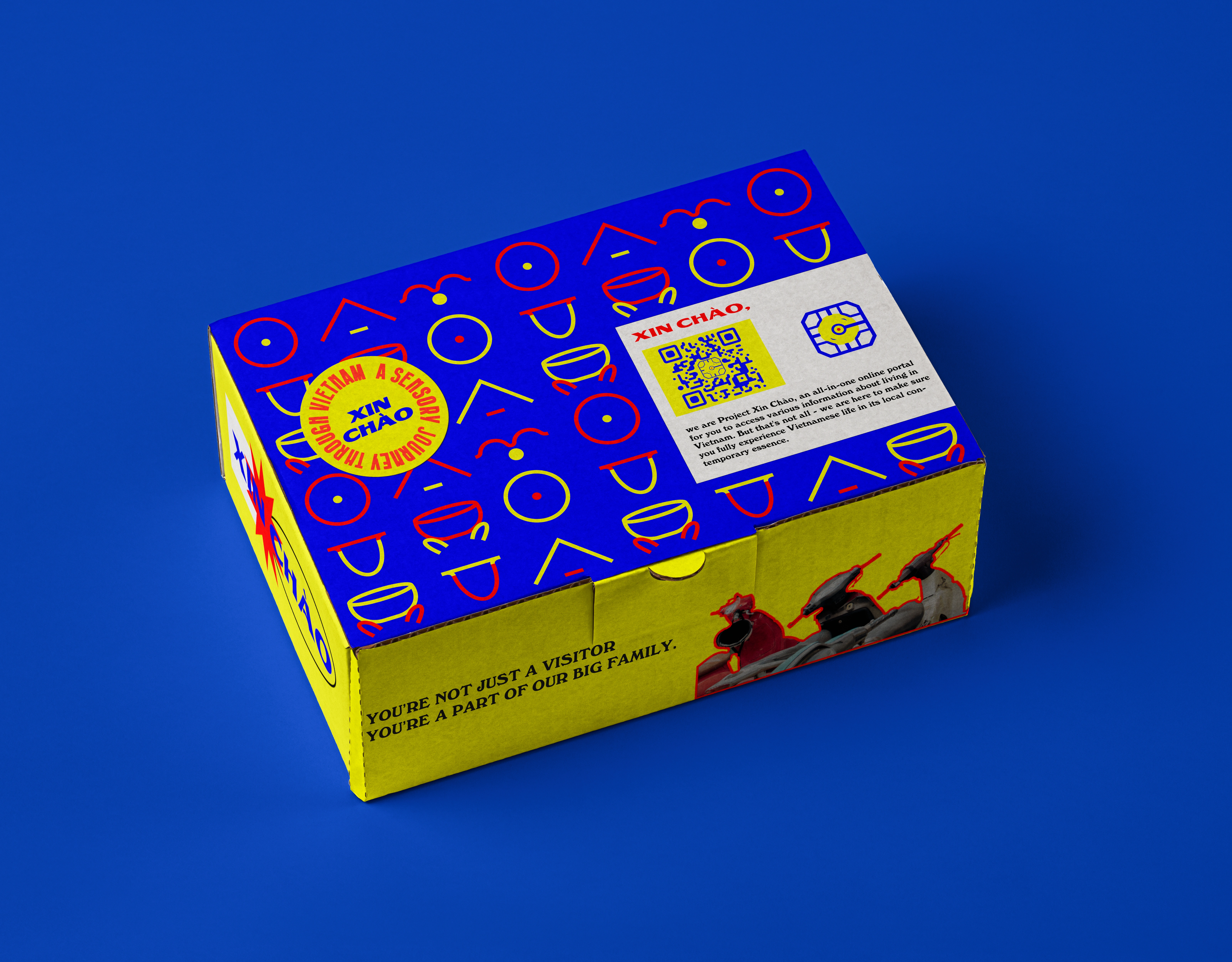
Packaging box
Like this project
Posted Jan 27, 2024
Project Xin Chào - an all-in-one online portal for you to access information about living in Vietnam in Vietnam's contemporary senses.
