Remer Australia — Aseem Gautam
Overview 🔎
Remer is an Australian company specializing in designing and manufacturing premium illuminated mirrors with an emphasis on technology.
I was approached by the brand to redesign their existing website. I was involved in creating an entirely new UI/UX for the website.
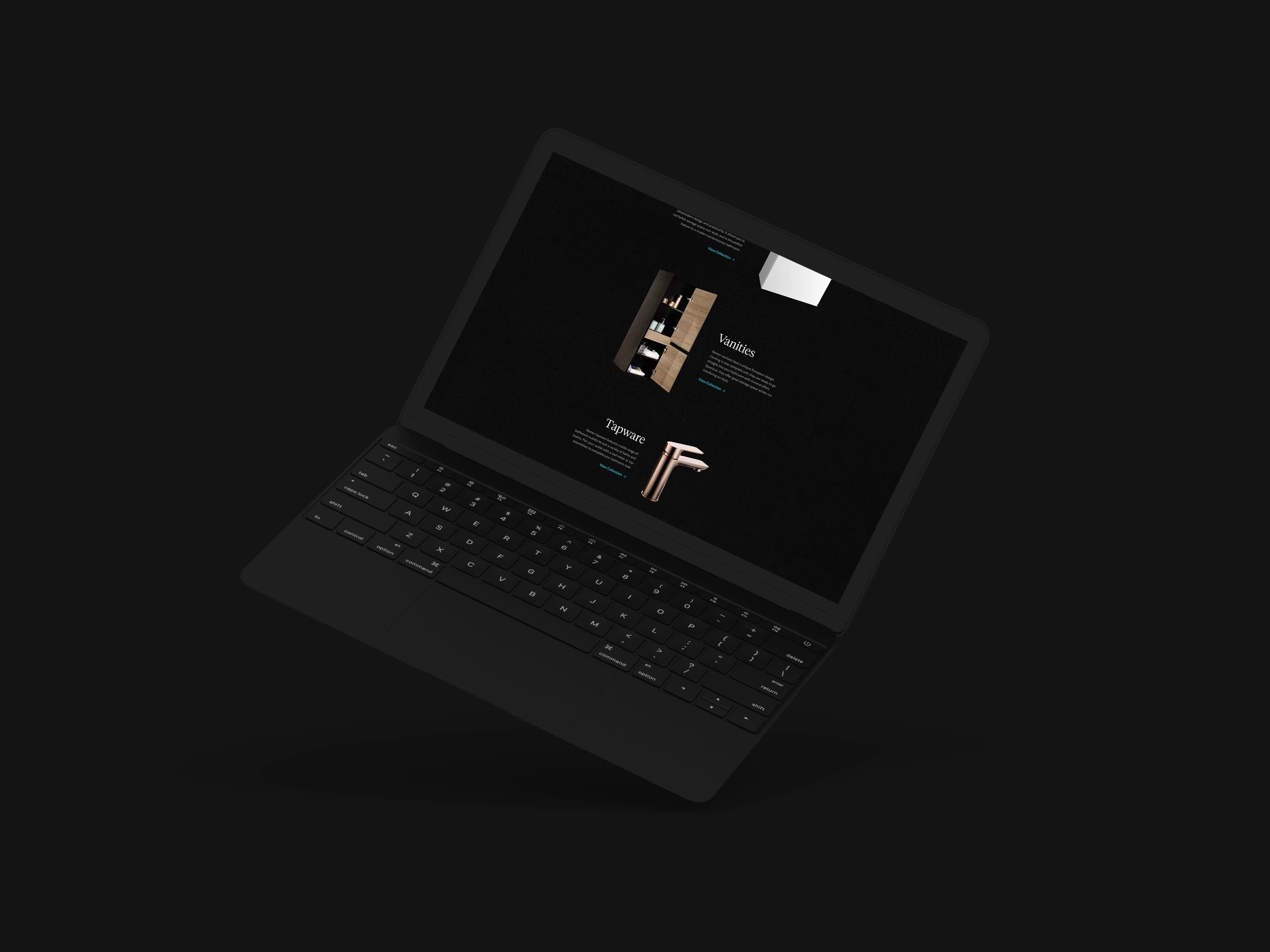
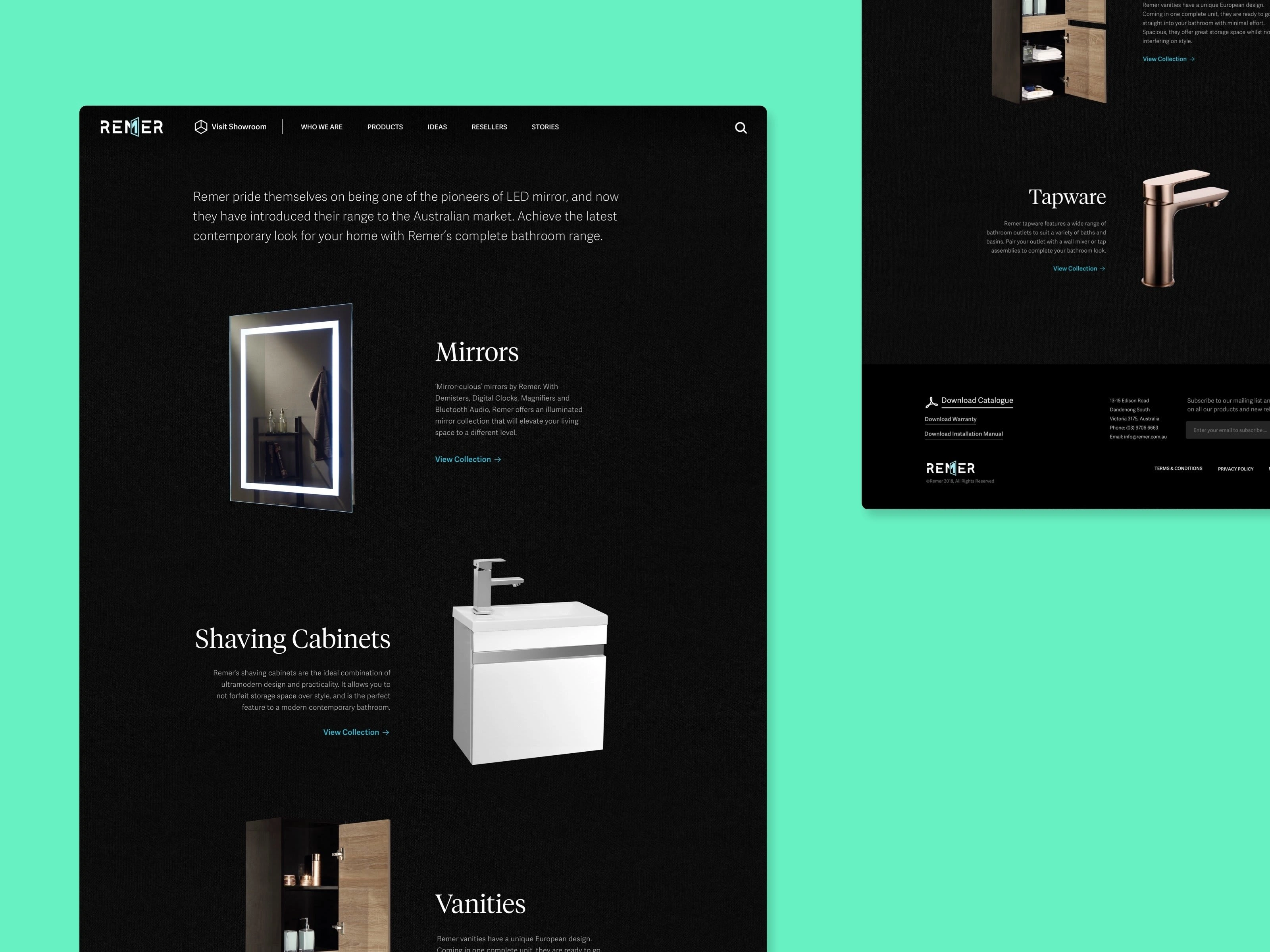
The end product of the redesign was a simple user interface with no fluff and to-the-point communication. A contrasting color scheme of blue, grey, white and black was used to best represent the design philosophy of the brand. Additionally, the serif typography added an element of sophistication to the design.
Remer’s customers and clients were able to get a great feel for the products and their usage virtually through their website carrying crisp design communication. This redesign helped increase client leads and also helped improve the conversion rate.
Like this project
Posted May 8, 2023
A sophisticated re-design. Remer is an Australian company specialising in designing and manufacturing of…

