Font Selection Feature for Fabrie

Muki Pan


01 Framing
In situations where layout and typography are crucial—such as early inspiration exploration with mood boards, or when creating slides and project proposals—a single default font is often not enough.
Users need more diverse fonts to present designs more accurately and clearly, without turning an online whiteboard into a professional design tool.
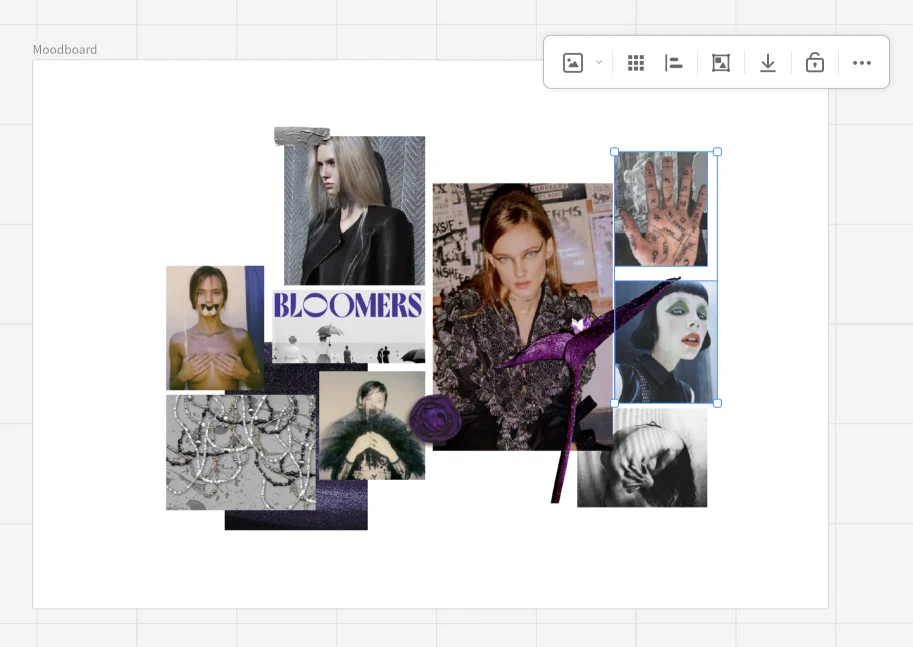
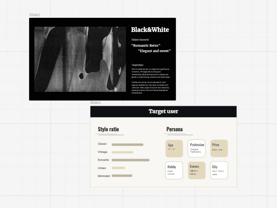
Creating moodboards, slides and proposals on Fabrie.
02 Discovering
After researching design tools such as Miro, Keynote, Figma, Illustrator, and Photoshop, I categorized font selector features into three types: Basic, Advanced, and Professional.
Basic features are usually essential. Advanced and Professional features depend on user scenarios.
In online whiteboards like Miro, users typically can’t modify font weights and are only provided with a bold option. Professional design software (Photoshop, Illustrator, Figma) provides font weights and more complex typography features.
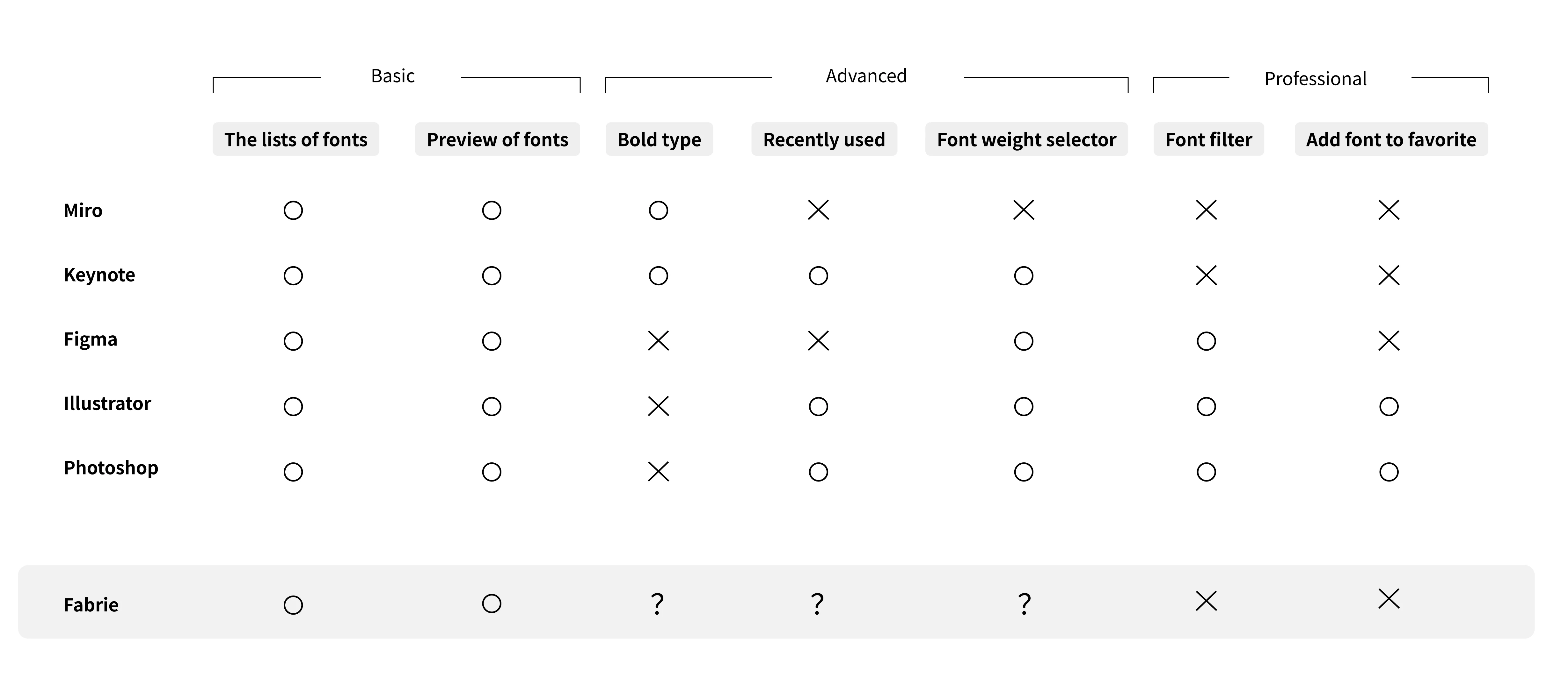
Feature comparison across tools (Basic / Advanced / Professional).
Fabrie sits between a whiteboard and a professional design tool. Professional typography controls would be too complex, but the question remained: should Fabrie provide bold type, recently used, and a font weight selector?
The core issue depended on whether we should include a “font weight selector.”
Benefits:
However, the disadvantages were critical:
Increased complexity: even though target users are designers, not all designers have strong visual design foundations, and not everyone understands font weight implications.
Bold becomes complex: once weight exists, the existing bold function becomes ambiguous (is it a toggle? which weight?).
Performance impact: font weights require additional packages, increasing load and risking performance degradation.
We chose: (1) Offer bold type, (2) Do not offer a font weight selector, (3) Offer recently used—balancing usability and complexity.
To solve the limitation of typography styles without exposing weight controls, we decided to offer a rich set of default fonts.
When designing the font list, some fonts use their light or bold variants as the default “Normal” value, resulting in a richer variety of styles while keeping the UI simple.
“Recently used” is both user-friendly and technically friendly, so we provided it without hesitation.

Decision matrix: bold, recently used, weight selector, filters, favorites, etc.
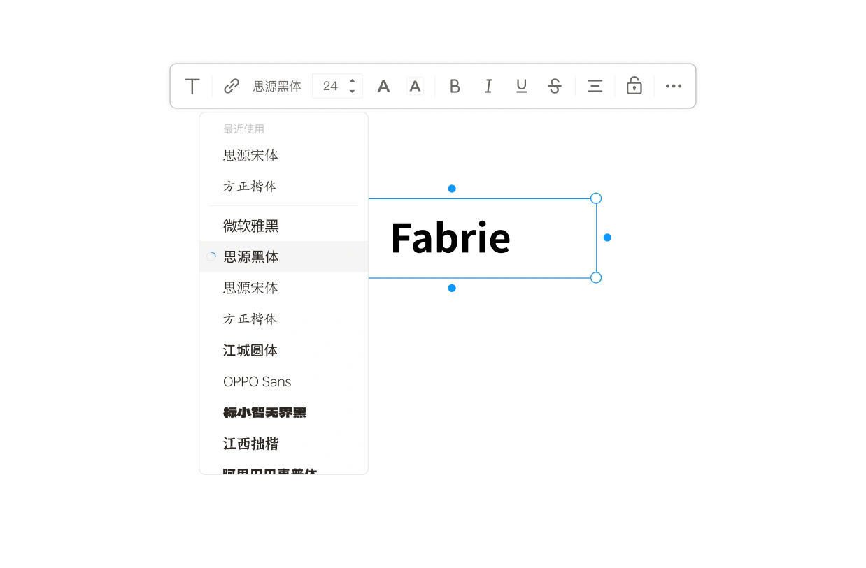
Final toolbar: bold + recently used, without full weight controls.
As an online whiteboard rather than a professional design tool, providing too many choices can be confusing. It is sufficient to offer a set of fonts that covers most styles and scenarios.
Fabrie is web-based and cannot access users’ local fonts. When rendering fonts, we must load fonts not already in cache.
To reduce user wait times and technical strain, we also needed to limit the number of fonts.
Ultimately, Fabrie.cn offers 10 Chinese fonts and 10 Western fonts, while Fabrie.com offers 20 Western fonts—what we believe is the minimum set that covers real user scenarios.
Using Fabrie.cn (Chinese site) as an example, our selection standards were:
Coverage of all scenarios: headings, body text, decorative text.
Comprehensive character set: at least 2–3 fonts with sufficiently large character coverage.
Commonly used fonts: avoid unconventional choices that reduce readability or adoption.
Free of copyright issues: licenses that avoid legal risk.
High quality: reliable outlines, hinting, and rendering stability.
Includes default and brand fonts when needed.
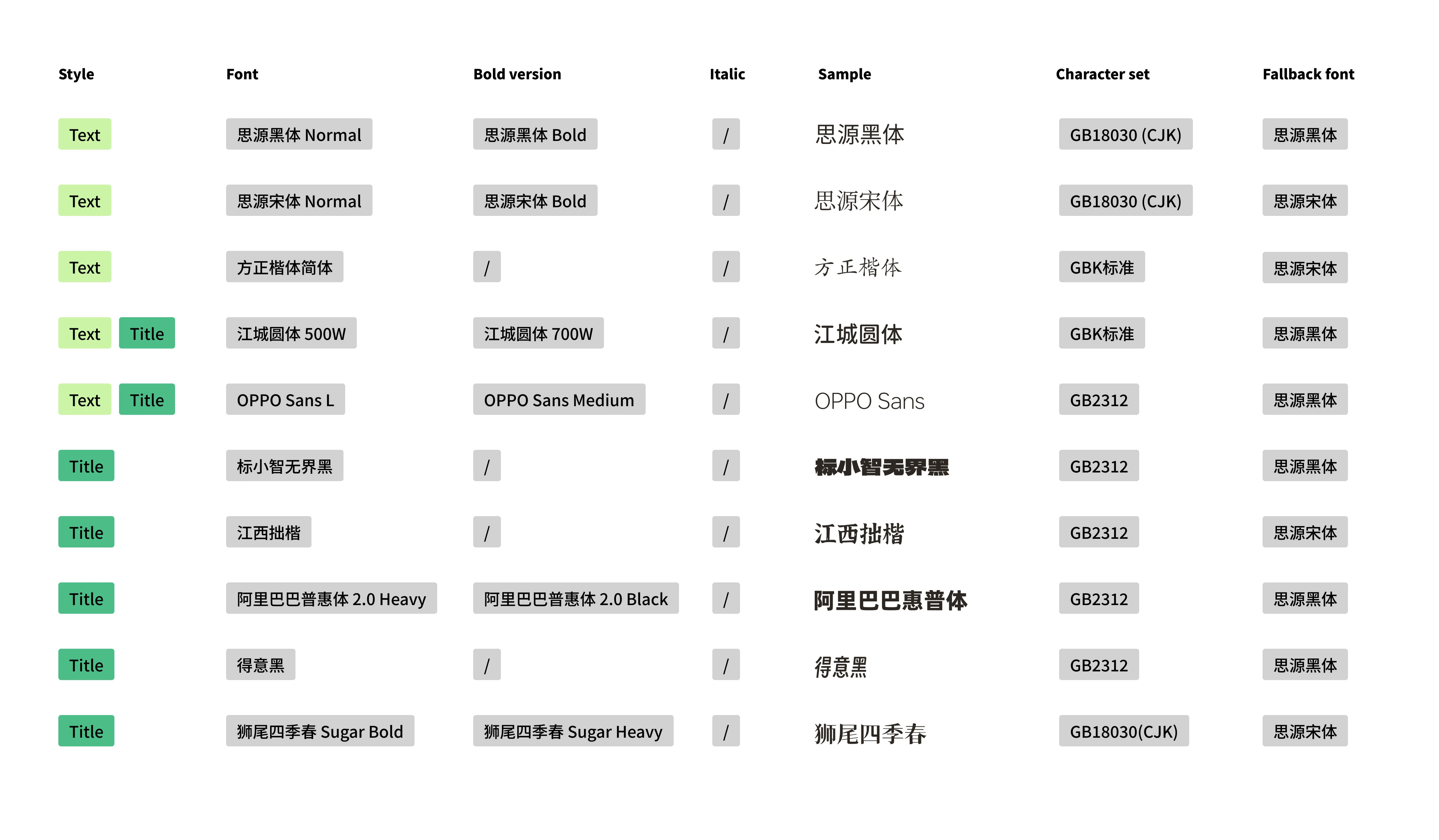
Chinese font list style guide: style, weight behavior, character set, and fallbacks.
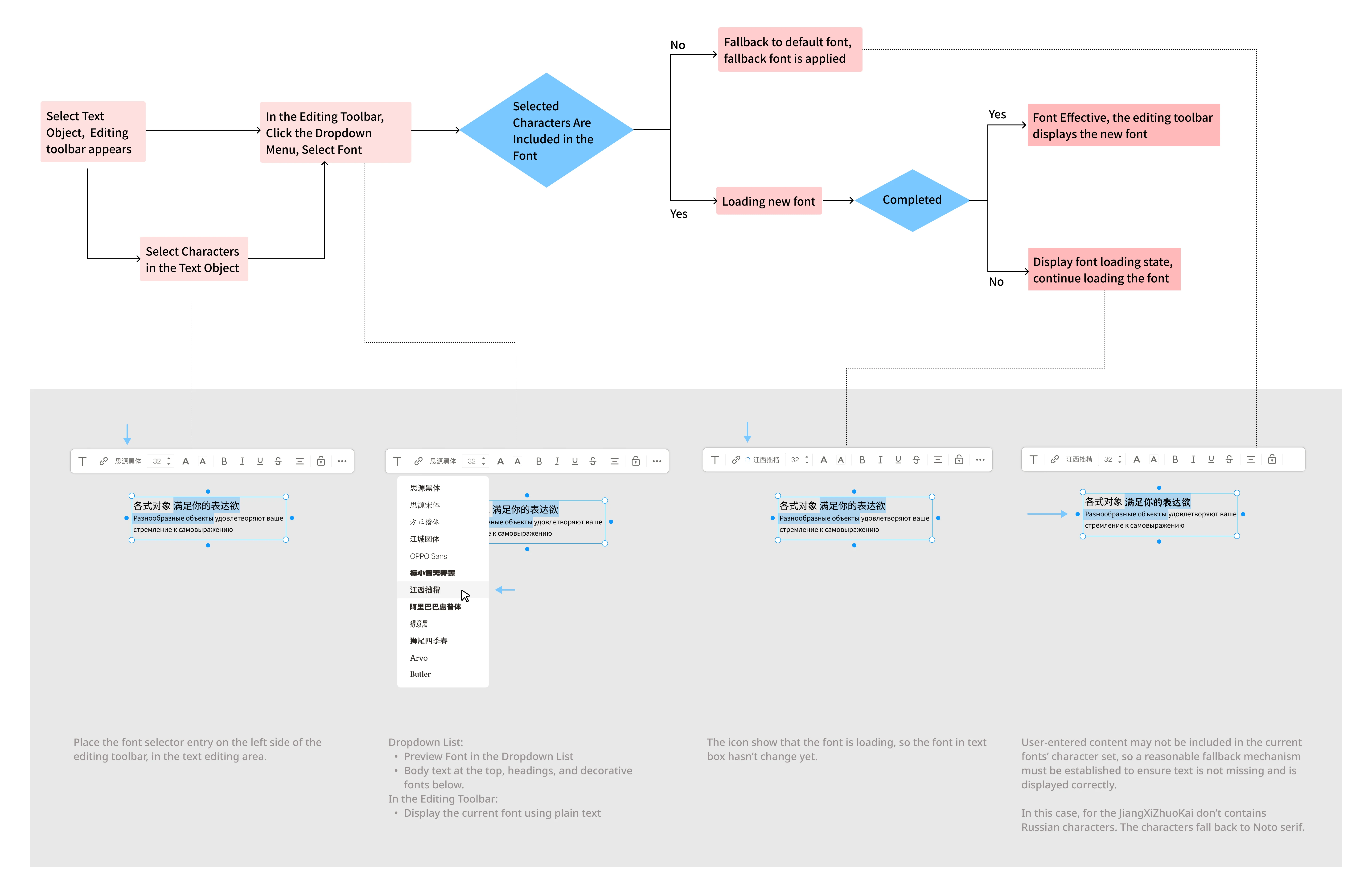
Flow & prototype: selecting, loading, and applying fonts in Fabrie.
After the feature was released, we found font usage to be very balanced.
This indicates the selection set works well and users actively engage with typography without being overwhelmed by excessive controls.
05 After Stories
In Fabrie, the “default font” issue has two parts: the default font for the UI interface, and the default font for text input boxes on the whiteboard. We encountered difficulties with both.
During internationalization, we selected TT Interface as the brand font and considered changing Fabrie.com’s UI font to TT Interface.
However, TT Interface did not align well with surrounding icons. We later discovered the baseline of TT Interface was significantly higher than Chinese fonts.
To resolve this, we used FontLab to modify the TT Interface font file, adjusting it based on the Pingfang baseline.
Early on, we used system fonts: Pingfang (Mac) and Microsoft YaHei (Windows). But these fonts differ in character width and spacing.
Microsoft YaHei typically wraps earlier and occupies more space than Pingfang. For UI, responsive layouts absorbed the differences.
On a whiteboard, text exists inside user-resized bounding boxes. When the same document is opened across different systems, font differences can change layout and line breaks.
Because company computers were all Macs, we discovered this late. We retroactively switched the default to a cross-platform font, Source Han Sans.
However, existing documents already stored Pingfang/YaHei. Changing defaults would break layout history, so we retained all three fonts. In the UI list, Pingfang and Microsoft YaHei display as “System Font.”
Product design: Muki, Chichi
UX design: Muki
UI design: Yoda
Front-end development: Guopeng
Quality assurance: Xiaoyang
Like this project
Posted Jun 13, 2026
Designing a font selection feature for Fabrie's whiteboard tool.