Indie Health Visual Identity
CLIENT:
Indie Health
SERVICES
Visual Identity Design
Landing Page Design
Newsletter Design
Indie Health empowers independent occupational therapists by streamlining their practice management and client services through an intuitive platform. This solution simplifies operations, enhances revenue growth, improves staff satisfaction, and enables therapists to focus on client outcomes without the burden of administrative tasks. What sets Indie Health apart is its revolutionary approach to accessibility for both therapists and their clients, breaking down the barriers and complexity often found in traditional rehabilitation clinics. Indie Health's vision is to create a platform that feels refreshing and welcoming, removing unnecessary obstacles and stressors so both therapists and patients can connect more freely.

Visual Identity
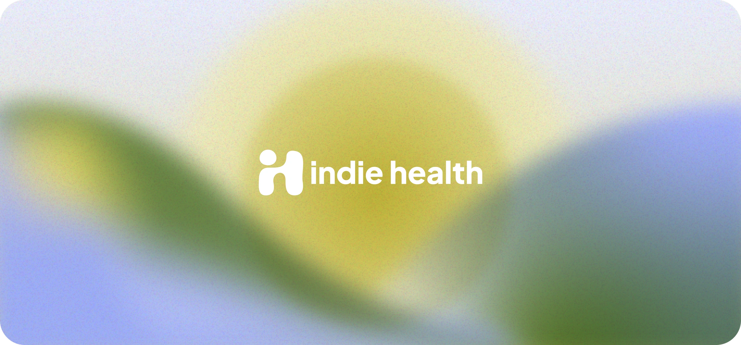
Indie Health’s visual identity is designed to evoke a sense of calm and approachability, reflecting the platform’s commitment to natural, user-friendly interactions. The palette draws on organic shades of green, inspired by nature, symbolizing hope, freedom, and optimism. The logo’s organic shape—hand-sketched and refined into a simple, welcoming form—represents human connection and warmth, setting Indie Health apart from the often sterile, impersonal look of medical aesthetics. The sans-serif font complements the icon with clarity and simplicity, reinforcing Indie’s clean, accessible approach to healthcare solutions.
Landing Page Design
The landing page combines contemporary, tech-forward design with Indie Health’s warm, inviting brand ethos. Featuring human-centered imagery in the hero section and clean, illustrative elements in the informational areas, the page provides a user-friendly experience. Overlapping soft, monotone gradients add color and lightness without being overly bold, bringing a gentle brightness that aligns with the brand's warmth.
Like this project
Posted Dec 16, 2024
Indie Health’s visual identity combines warmth and approachability with organic greens and a thoughtfully crafted logo symbolizing human connection. This des…
Likes
13
Views
190


