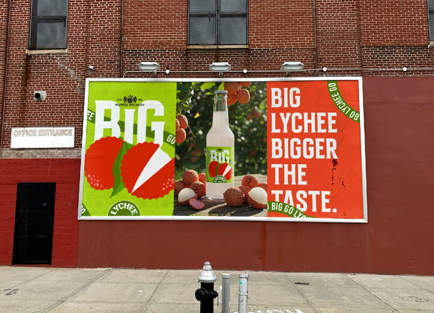
BIG lychee fruit drink | rebranding
Talha Bin Wasi
Ideation
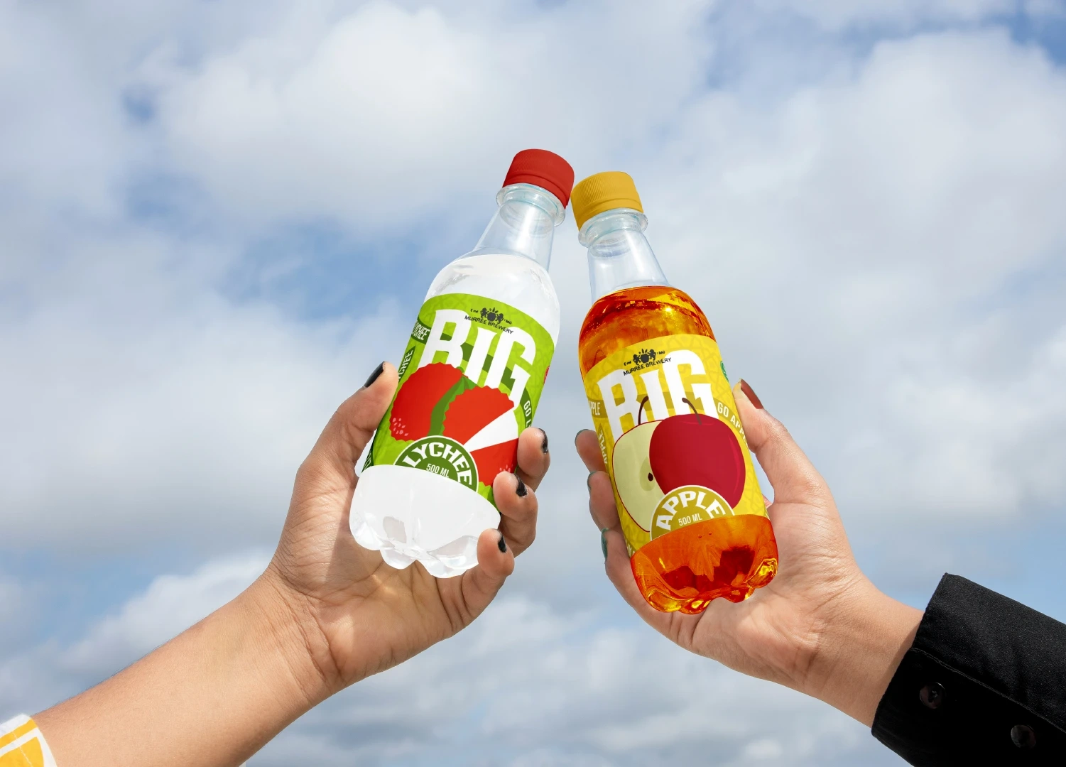
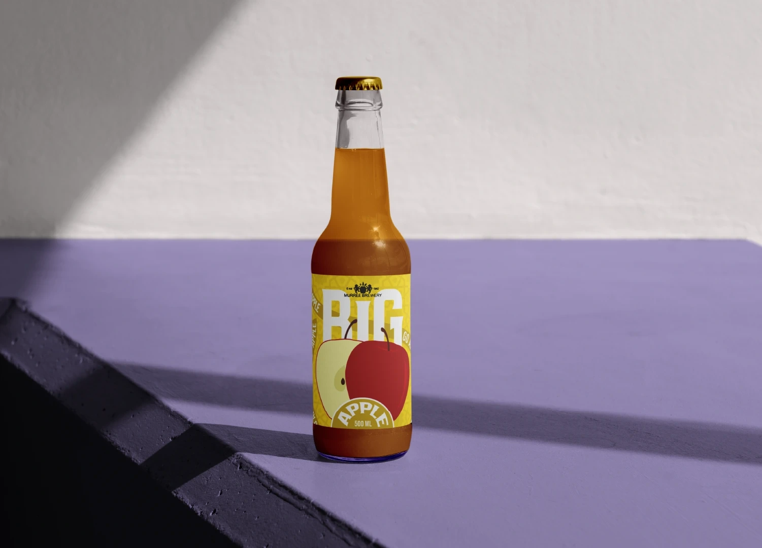
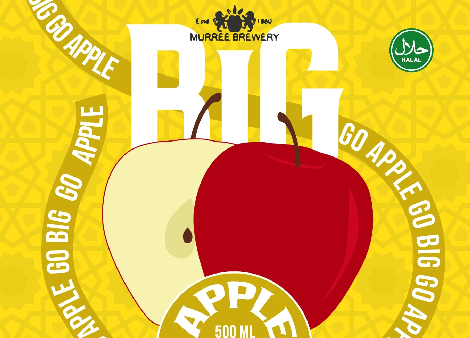
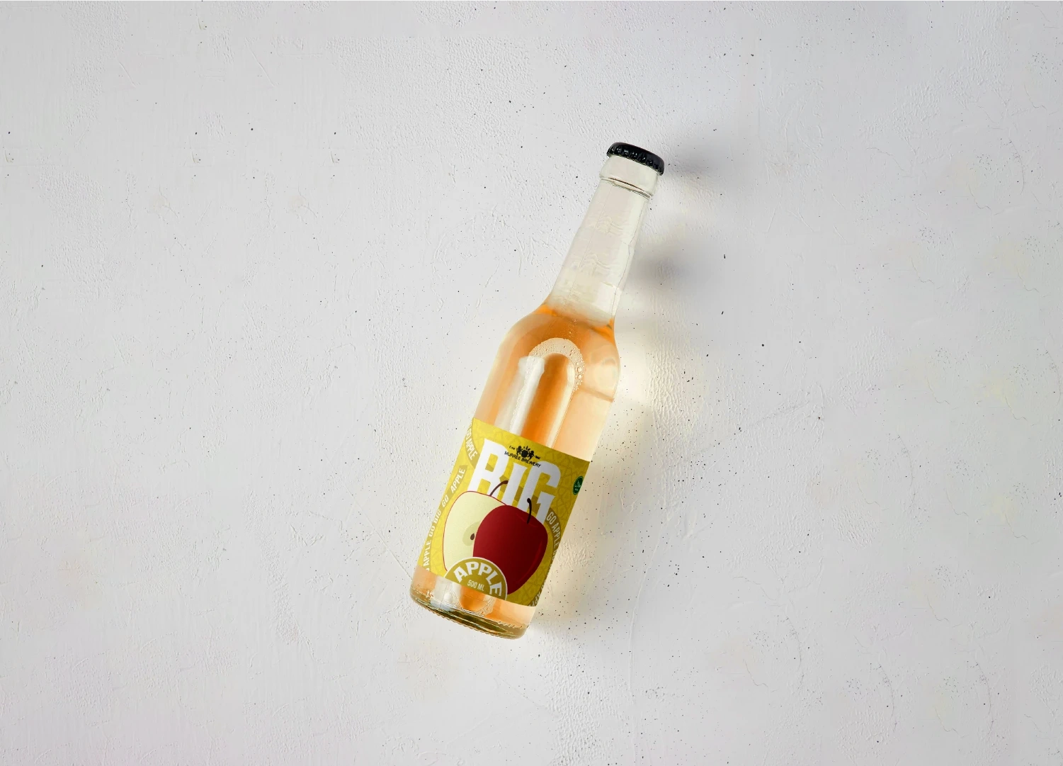
While redesigning this branding the main focus was that what are the things which doesnt work currently and immediately i came up with so many things like the contrast of the drink's color and the label was off the typography on the label also had low contrast issue plus the hierachy on the type wasnt working
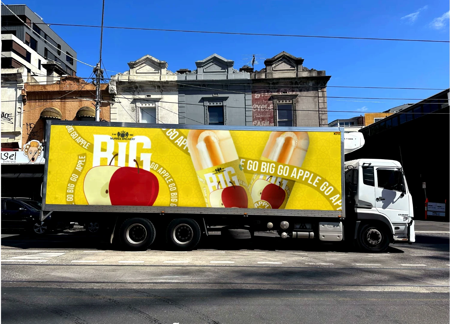
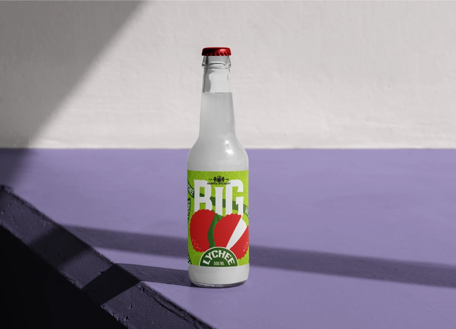
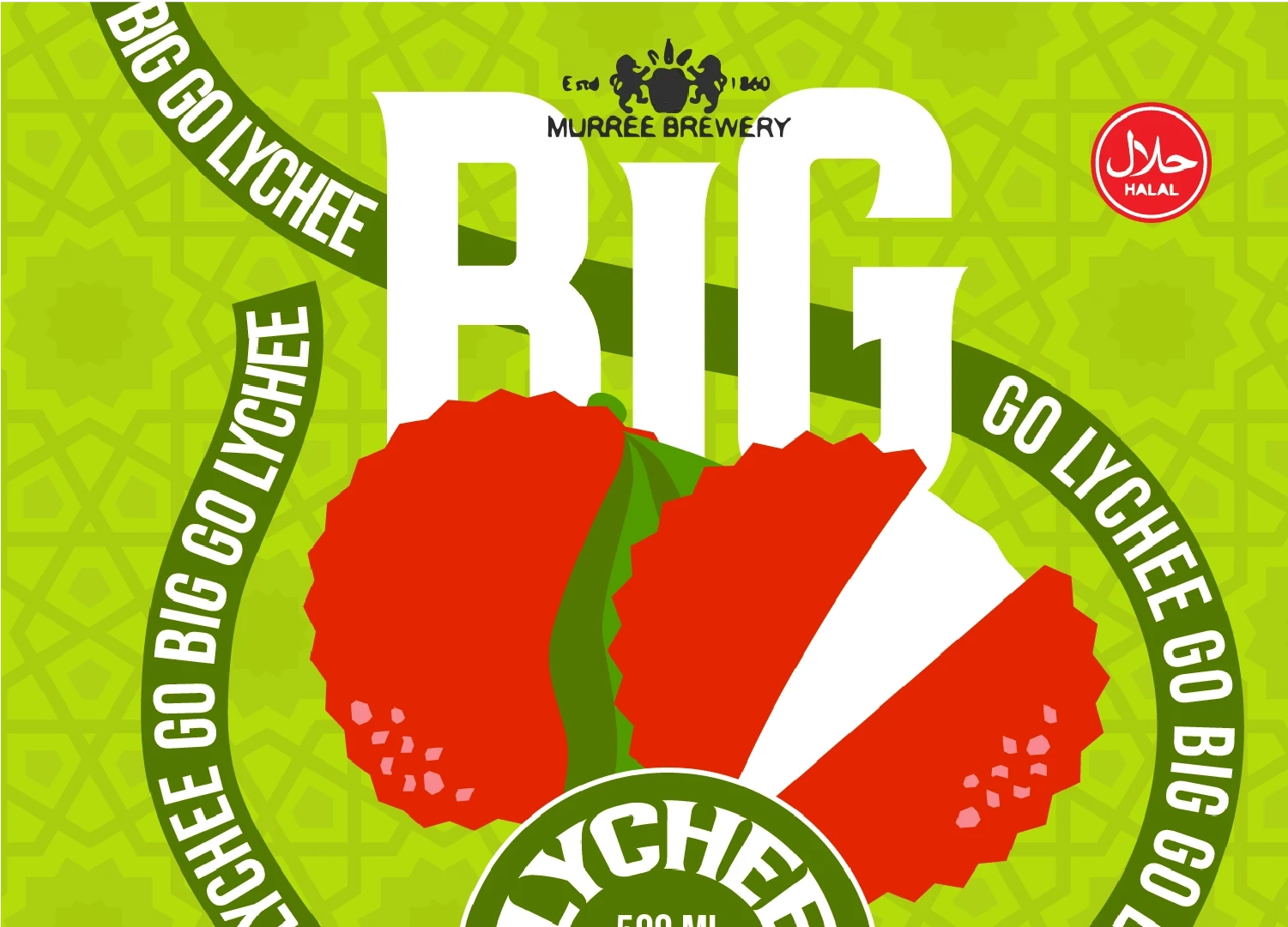
also the brand BIG and the flavour were together which implies that the drink only come in one flavour tho that is not the case they do have other flavours too, so making a system which is consistent across all the flavours was the right choice.
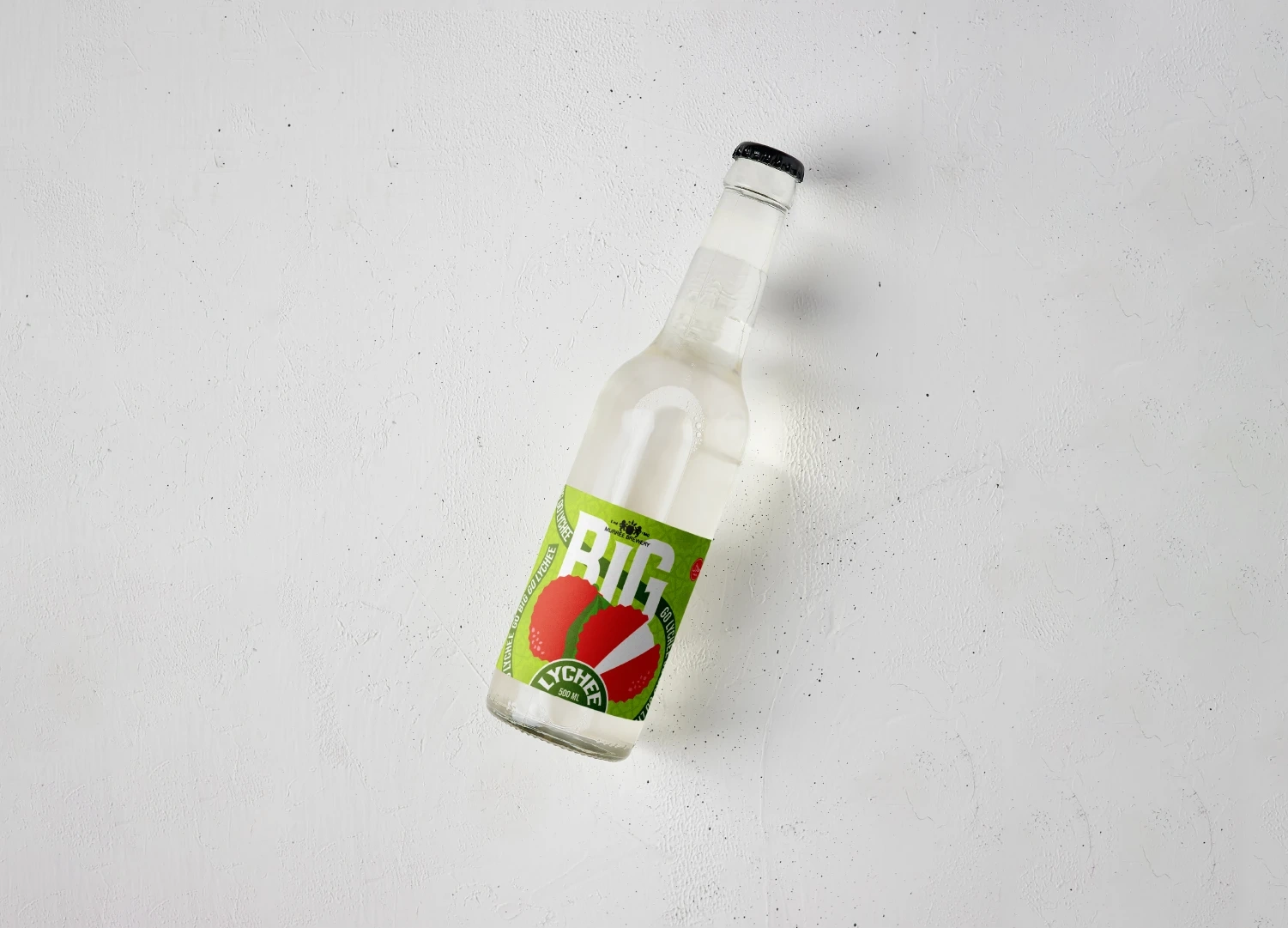
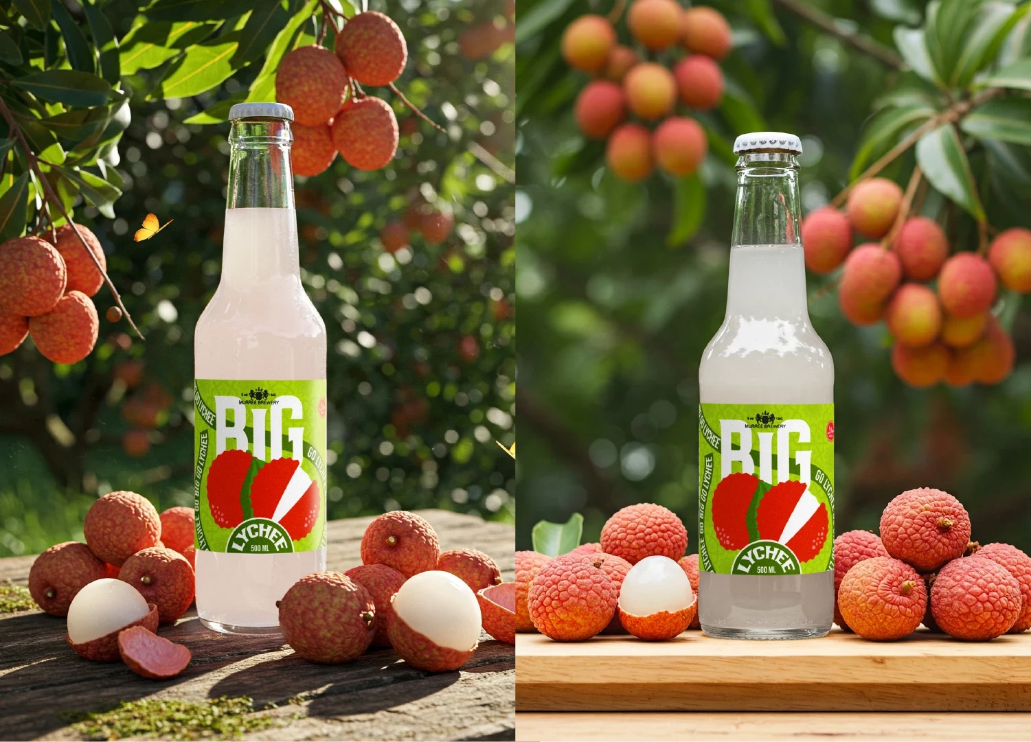
That way we can make the sub-brand BIG differentiate white the clean illustrative style of fruits can represent the flavours more prominently on the shelves.
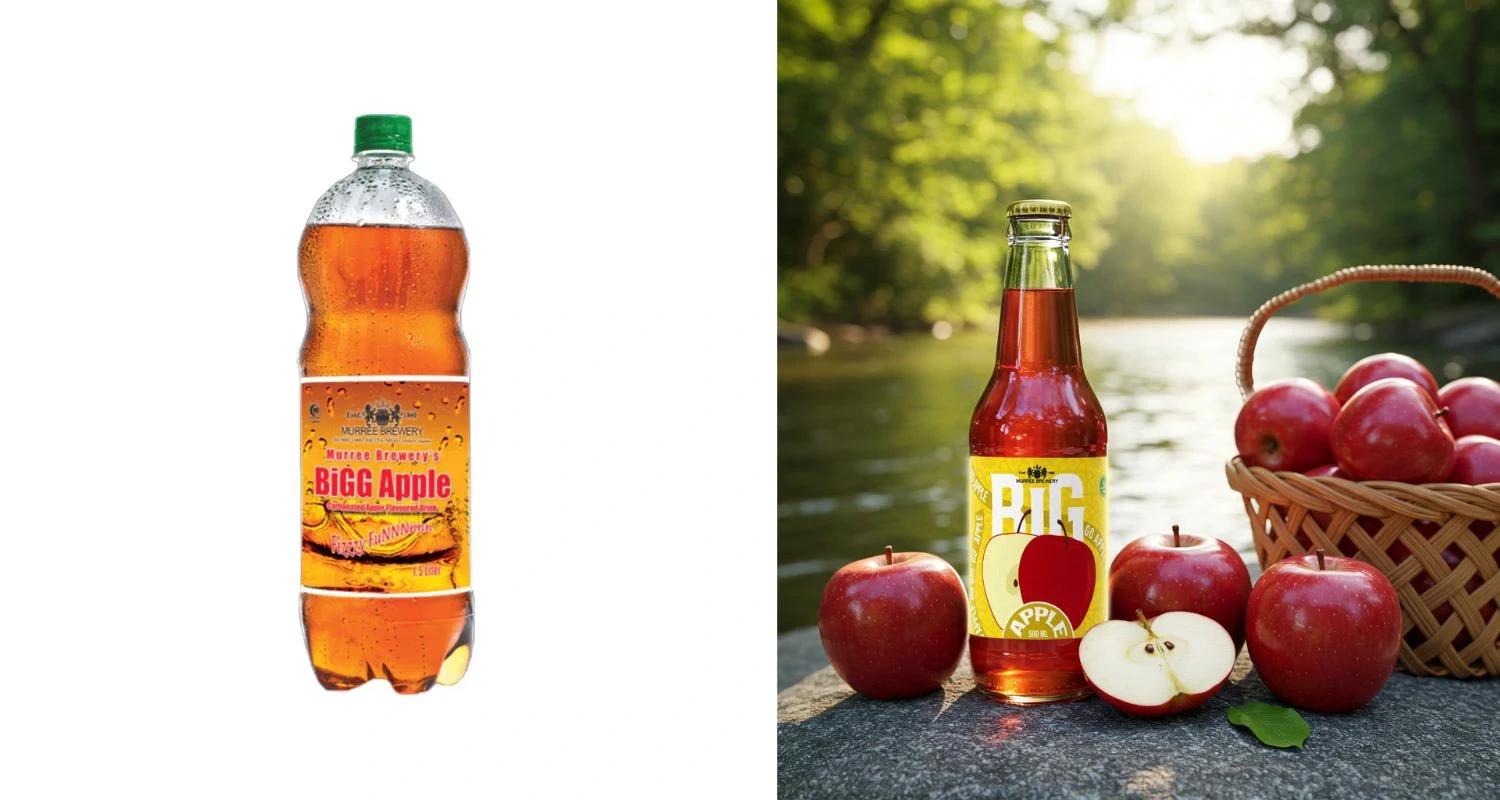
Before After
Like this project
Posted Feb 18, 2026
This rebranding project for BIG Lychee Fruit Drink is a bold exploration of identity transformation, aimed at breathing new life into a classic tropical bevera…