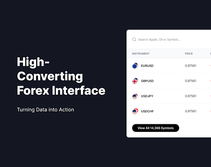
UI/UX Case Study: Trading Game

Nivya Manuel

UI/UX Case Study: Trading Game
"What if I could teach people trading through a 60-second game?"
Project Overview
Game: Trading Game — A browser-based micro-learning experience
Type: Educational Game / Gamified Learning
Duration: 60 seconds per session
Goal: Democratize trading knowledge through play
The Problem
Trading can be intimidating. Most people who want to learn trading face the same wall:
• Complex terminology they don't understand
• Fear of losing real money
• Long-form content with steep learning curves
• No safe space to experiment and fail
• Platforms built for experts, not beginners
The Knowledge Gap
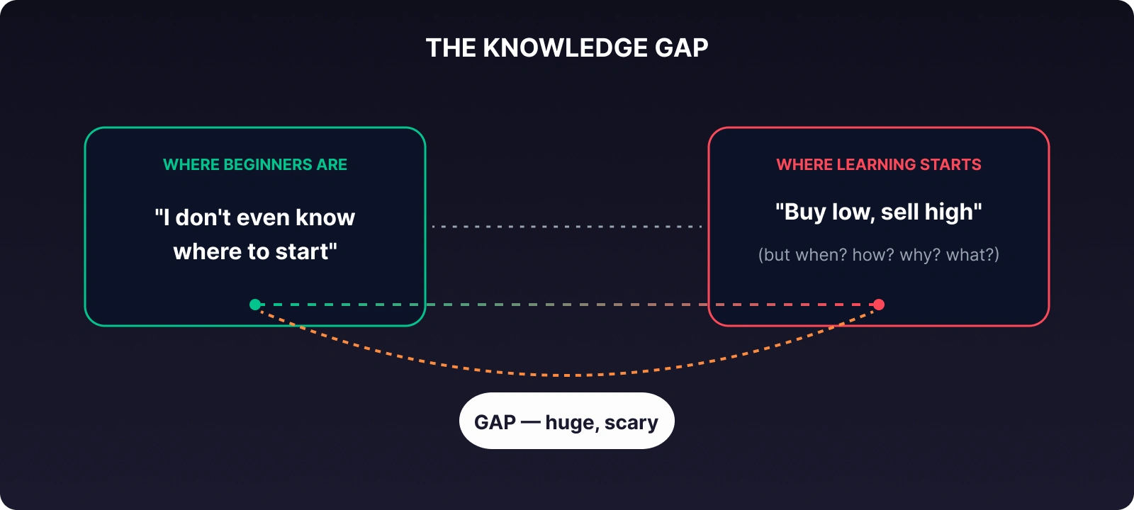
Traditional financial education fails because it teaches theory before feeling. People need to experience market decisions before they can understand them.
The Insight & Concept
Core Design Question: What if I could teach people trading through a 60-second game?
Why 60 Seconds?
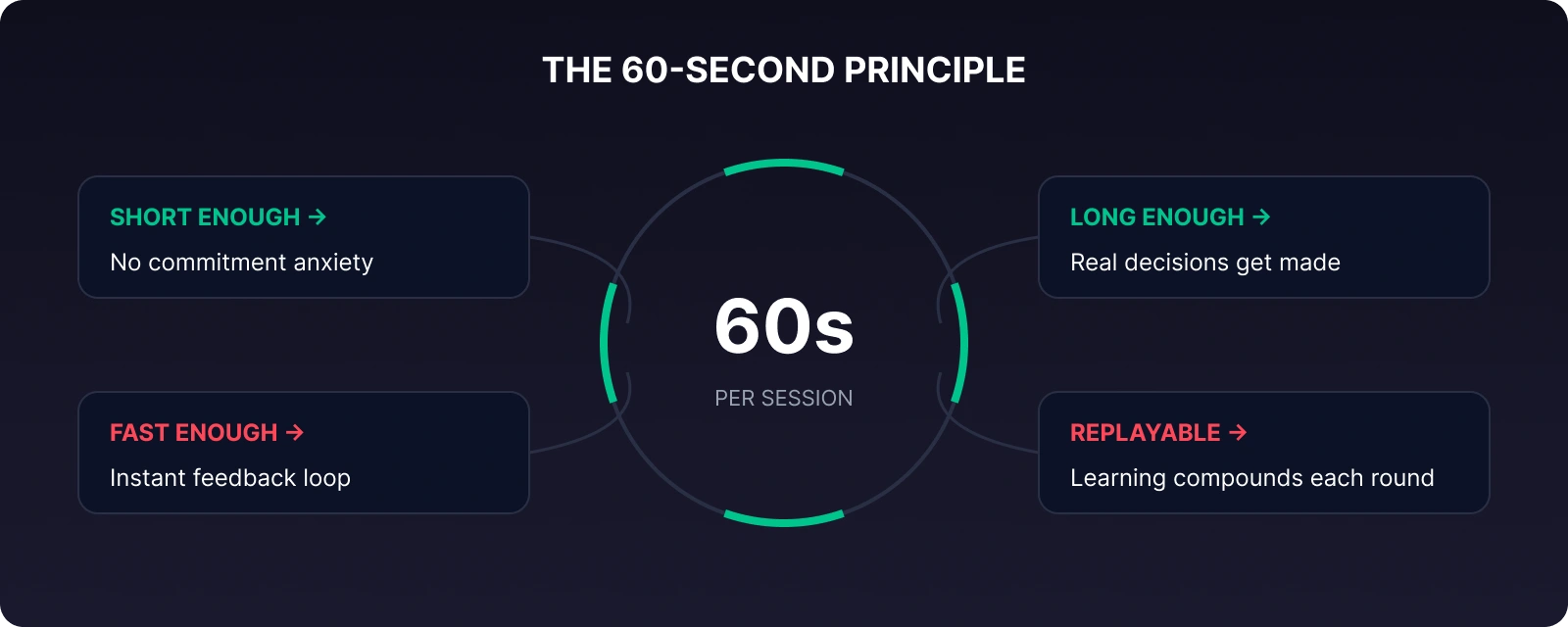
The 60-second constraint is not a limitation — it is the design.
It mirrors how real traders think:
• React quickly to market signals
• Make decisions under pressure
• Live with the consequences immediately
Target Audience
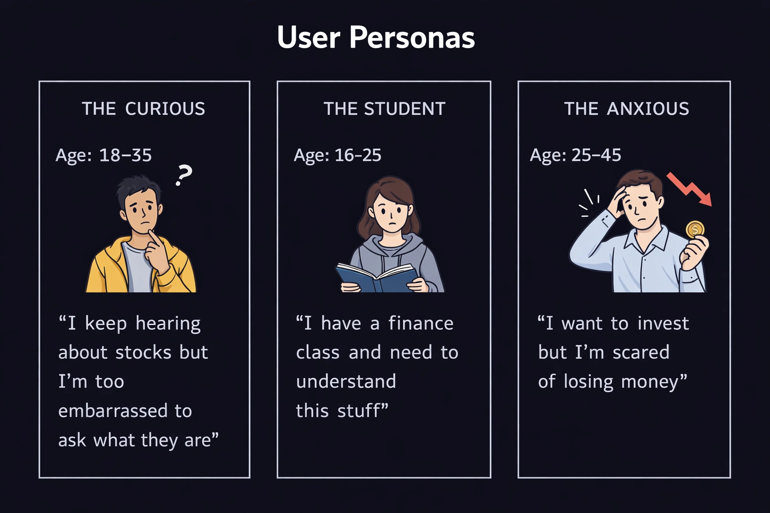
What They All Share:
• Low to zero trading experience
• Short attention spans for dense content
• Comfortable with browser/mobile games
• Want to learn but need a safe entry point
Design Goals
GOAL 1 — ZERO BARRIER ENTRY
No signup. No download. No money. Just play.
GOAL 2 — INSTANT COMPREHENSION
User understands what to do in under 5 seconds.
GOAL 3 — EMOTIONAL SAFETY
Failure feels like a game loss, not a life loss.
GOAL 4 — REAL KNOWLEDGE TRANSFER
Player walks away understanding buy/sell timing.
GOAL 5 — REPLAYABILITY
"One more round" = one more learning session.
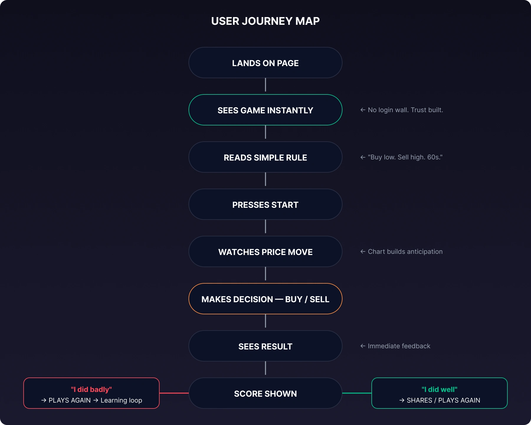
UX Flow
User Journey Map
Decision Moments (Where Learning Happens)
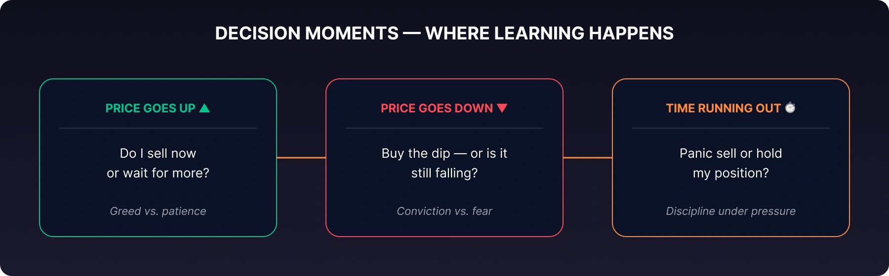
Each of these mirrors real trading psychology.
UI Design Breakdown
Visual Design Philosophy:
• Clarity over complexity: The user should never have to think about the UI, only about the trade.
• Signal over noise: Every element earns its place. If it doesn't help the player decide, it shouldn't exist.
• Familiar pattern, new context: Uses game conventions (timer, score) with finance conventions (charts, prices).
Screen Layout Analysis
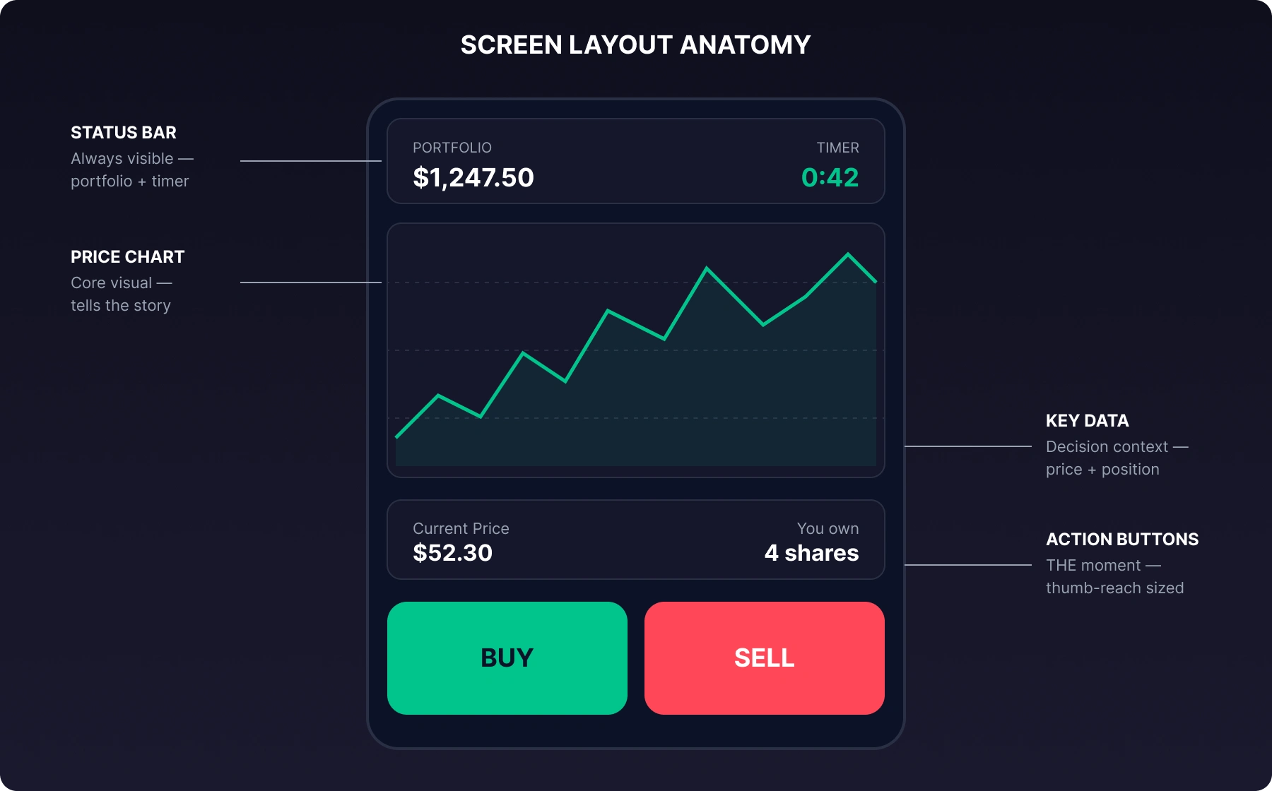
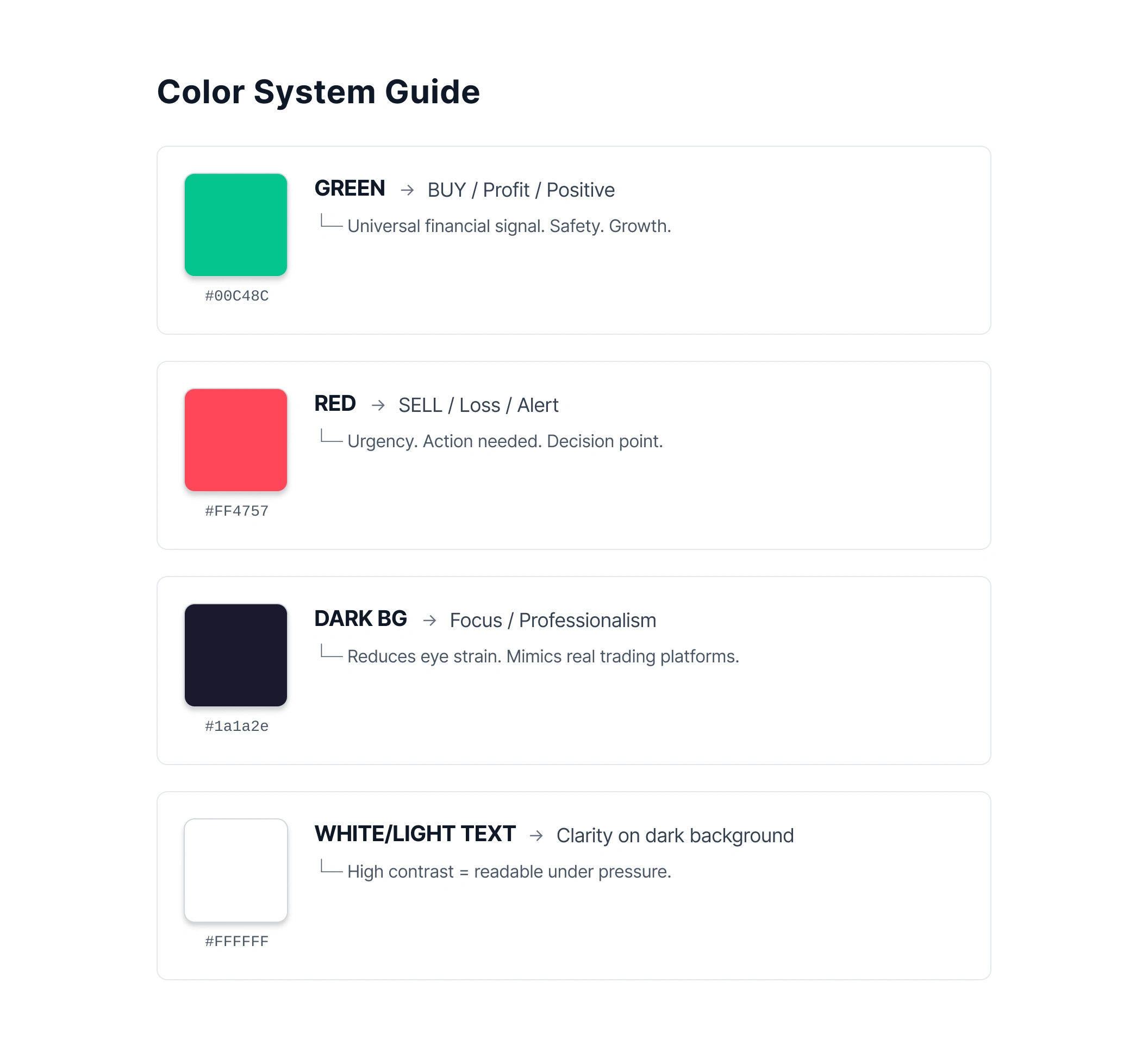
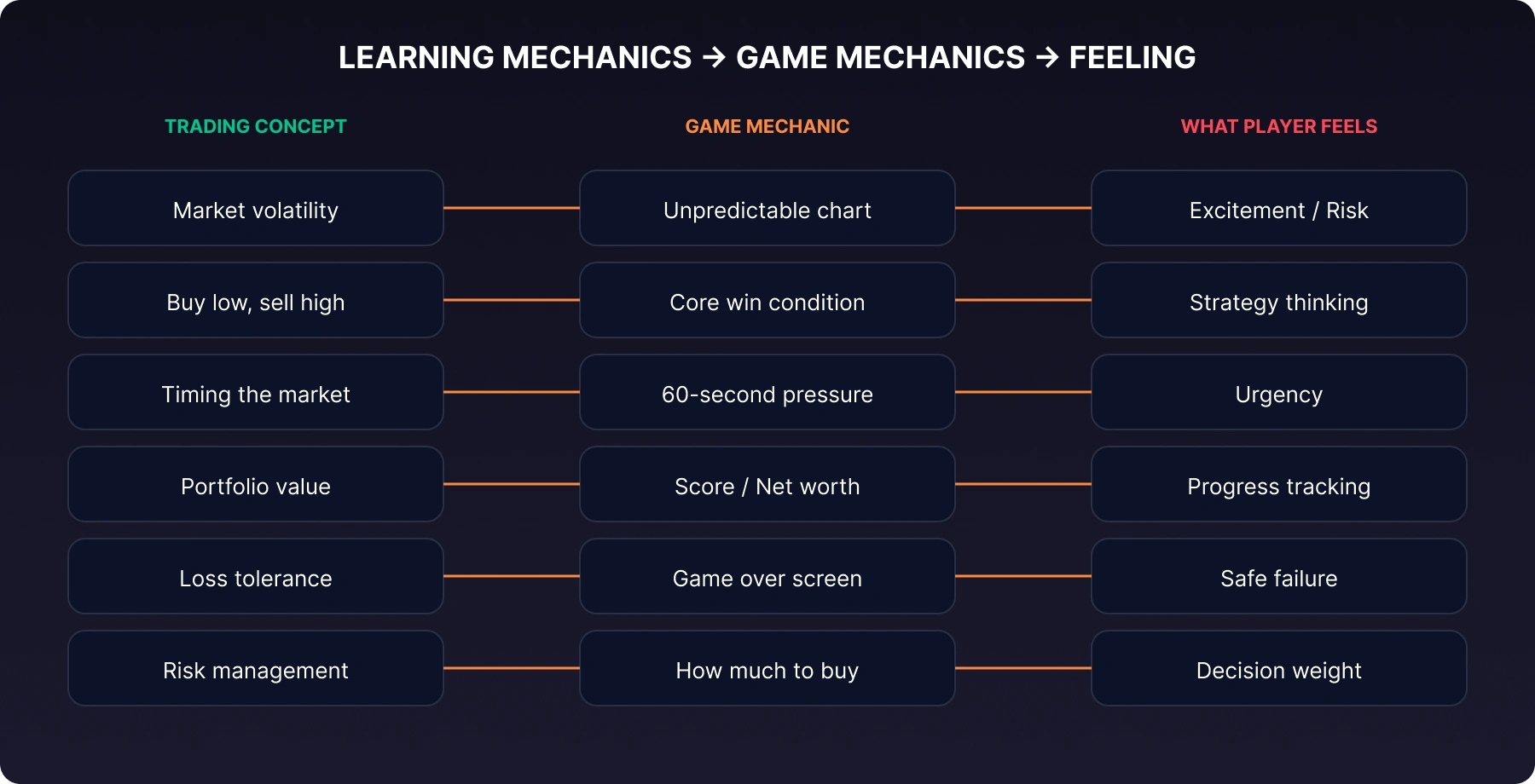
Gamification Analysis
The Learning Loop
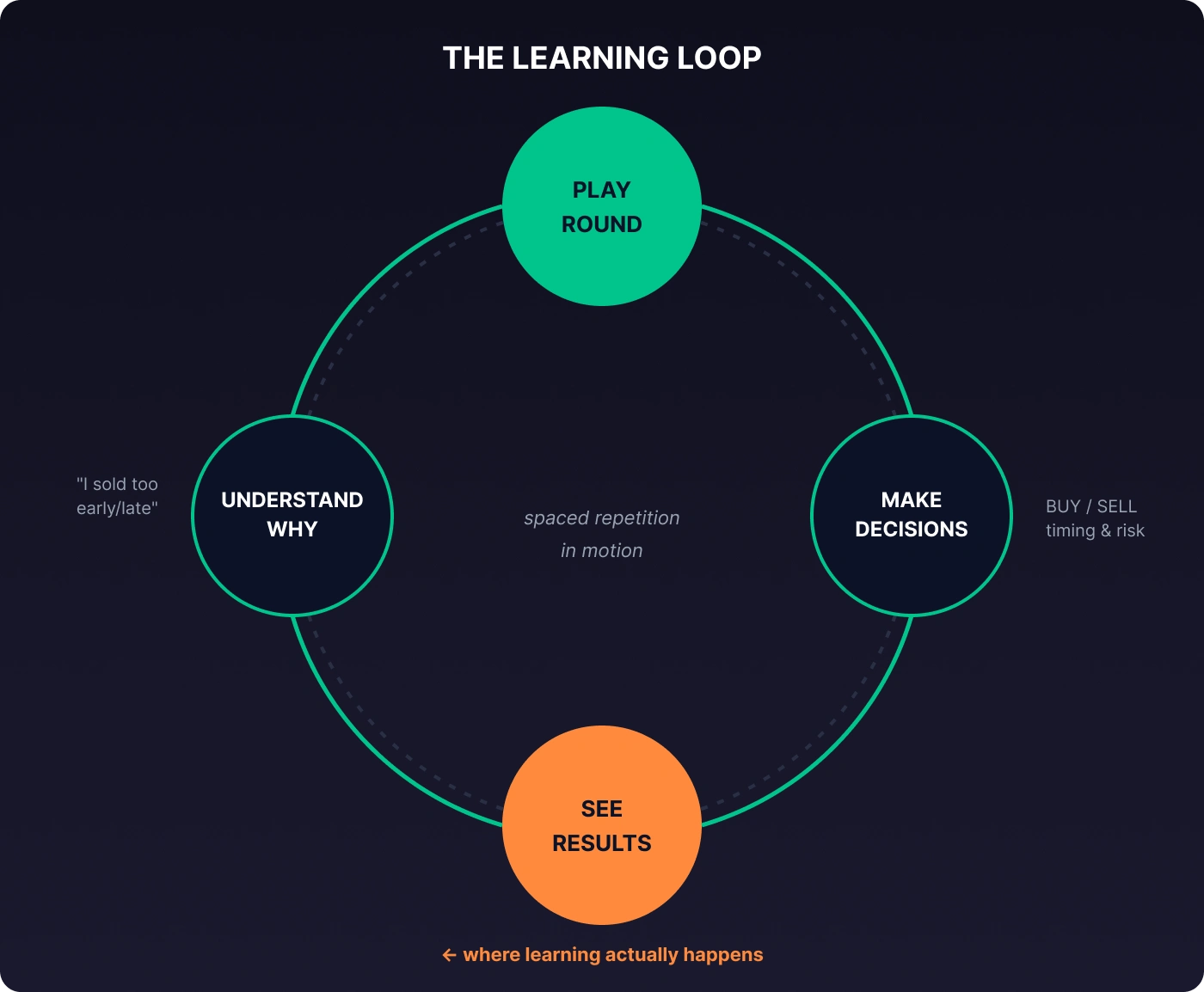
This mirrors spaced repetition — one of the most effective learning methods proven by cognitive science.
Emotional Design
The Safety Architecture
One of the most important UX decisions in this game is what's not there:
• No real money involved → Removes fear of loss
• No account required → Removes commitment anxiety
• No leaderboard pressure → Removes social anxiety
• No complex rules → Removes overwhelm
• What remains: Pure learning curiosity
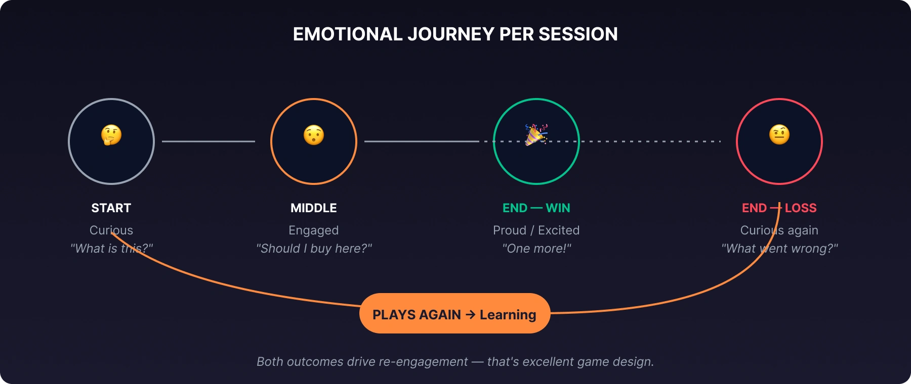
Emotional Journey Per Session
Impact & Metrics to Track
Engagement
• Avg. sessions per user
• Session replay rate (do they play again?)
• Time spent per session
Learning
• Do repeat players make better trades?
• Decision time (faster = more confident = learning)
• Win rate improvement over multiple sessions
Reach
• Organic shares
• Direct link traffic
• Social mentions
Conclusion
This project proves that financial education doesn't have to be boring, expensive, or exclusive. A single person with a clear concept, user empathy, and modern tools can create something that genuinely teaches people — 60 seconds at a time.
The game isn't just about trading. It's about lowering the barrier to financial literacy for an entire generation that's been priced out, talked down to, or simply ignored by traditional finance.
Like this project
Posted Aug 12, 2026
Likes
0
Views
1