The High-Conversion Trading UX

Nivya Manuel
Executive Summary: UX Audit for Trust Capital
The Objective:
The goal of this audit is to evaluate the end-to-end user experience of Trust Capital’s digital storefront. In the highly competitive and skeptical world of Forex and CFD trading, a website must do more than just provide data—it must establish immediate authority, bridge the "trust gap," and remove every possible friction point between a visitor’s curiosity and their first trade.
The Strategy:
This audit identifies where the current site is losing potential conversions due to Information Overload, Trust Deficits, and Technical Friction. While the platform has strong fundamental "trust anchors"—such as FSA regulation and MT5 integration—the current presentation often buries these advantages under a "data dump" of scrolling prices and generic messaging.
Core Areas of Focus:
• Visual Hierarchy: Moving from a cluttered, overwhelming "above-the-fold" experience to a clear, benefit-driven journey.
• Credibility Engineering: Replacing anonymous social proof and "hidden" regulatory info with high-transparency markers.
• Actionable Intelligence: Transforming the instrument tables from static lists into interactive tools that encourage immediate account opening.
• Functional Integrity: Fixing "dead-end" links and navigation conflicts that cause user hesitation.
By implementing the following categorized fixes, Trust Capital can shift its user experience from a "passive data provider" to a "conversion-optimized trading hub."
1. Navigation & Header: The Problem of Cognitive Overload
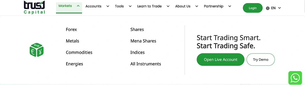
The current header suffers from "Action Collision," where multiple high-priority elements compete for the user's limited attention span. This lack of visual hierarchy creates a "noisy" environment that fails to distinguish between the needs of a new lead and a returning client.
The Core Issues:
• Competing Calls to Action (CTAs): The "Login," "Open Live Account," and "Try Demo" buttons all share similar visual weights and placements in image. This forces the user to pause and process three different options simultaneously, leading to "choice paralysis" and slowing down the conversion funnel.
• Undefined User Paths: There is no clear separation between acquisition (Open Live Account) and retention (Login). By placing the "Login" button—a tool for existing users—in a high-contrast green bubble, it pulls focus away from the primary business goal: getting new users to sign up.
• Lack of Persistent Accessibility: In its current state, the navigation is static. As users scroll down the page to learn about "Forex" or "Metals," the primary "Open Live Account" button disappears, forcing the user to scroll back to the top once they are ready to convert.
• Generic Headline: The headline "Start Trading Smart" is generic and doesn't offer a unique value proposition.
The Fix: The Problem of Cognitive Overload
1. Resolved Visual Conflict (Header)
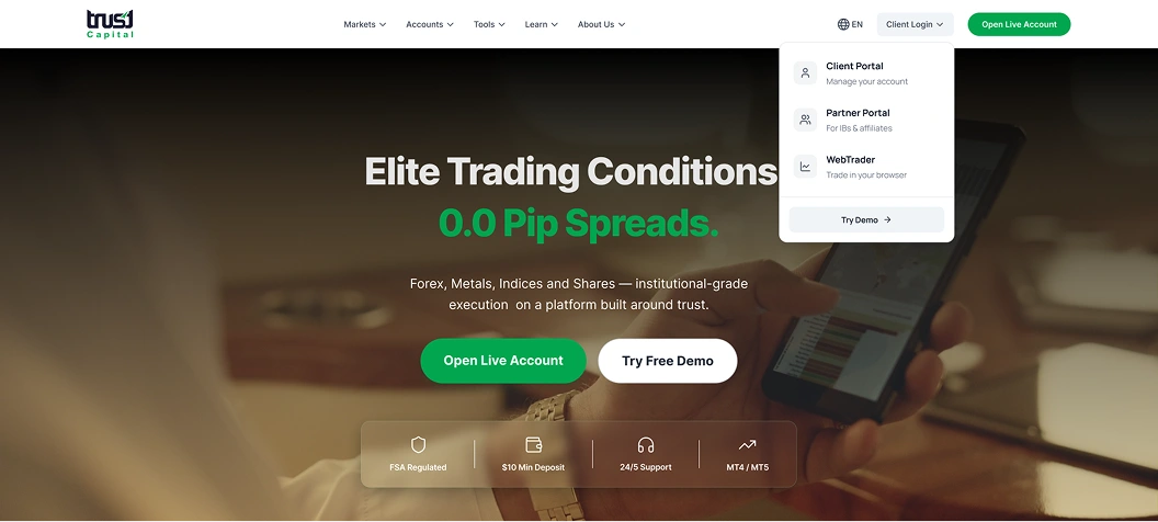
• Consolidated Login: The redundant "Login" and "Try Demo" buttons have been merged into a single "Client Login" dropdown menu. This houses the Client Portal, Partner Portal, and WebTrader, clearing visual noise for new users.
• Primary CTA Primacy: The "Open Live Account" button is now the only solid-colored element in the header, ensuring it acts as the primary focal point for conversion.
2. Benefit-Driven Hero Section
• Quantitative Headline: The generic messaging has been replaced with a high-value hook: "Elite Trading Conditions | 0.0 Pip Spreads". This immediately communicates the platform's competitive advantage to professional traders.
• Color-Coded Hierarchy: To stay on-brand, 0.0 Pip Spreads is highlighted in brand green, maintaining consistency while still capturing attention.
3. Action Button Logic
• Solid vs. Ghost Styling: In the hero section, "Open Live Account" button remains solid green (Primary), while "Try Free Demo" is styled as a white/outlined button (Secondary).
• Logic: This "Primary vs. Secondary" styling eliminates choice paralysis by visually "weighting" the live account over the demo.
4. Instant Trust & Accessibility
• The Trust Bar: A new horizontal tray at the bottom of the hero section displays key "Decision Drivers": FSA Regulated, $10 Min Deposit, and 24/5 Support.
• UX Benefit: This addresses the user’s subconscious objections (safety and entry cost) without requiring them to scroll or navigate to a secondary page.
5. Clean Utility & Navigation
• Simplified Language Switcher: The language tool has been reduced to a clean "EN" icon next to the login, keeping the right-hand utility cluster compact.
• Modern Aesthetics: Navigation links (Markets, Accounts, Tools, etc.) are given more breathing room, using a cleaner font weight that stands out against the darkened hero background.
2. Instrument Tables: Turning Data into Action
The Issues:
1. Extreme Navigation Friction
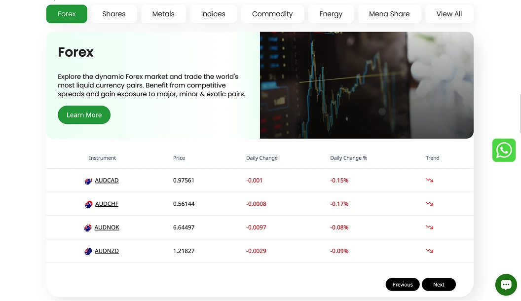
• The original table relies on extensive pagination (14+ pages) to organize its 14,000+ assets.
• Discovery Barricade: Forcing users to click through dozens of pages to find a specific symbol like "Apple" or "Oil" is an archaic navigation pattern that leads to high bounce rates.
• Lack of Direct Search: Without a search bar or robust filtering, the user is essentially "blind," making the platform feel less like a modern trading tool and more like a static spreadsheet.
2. The "Dead End" User Experience
• The data is strictly "read-only".
• Missing Call-to-Action (CTA): While the table lists price and change data, it fails to provide a "Trade" or "Invest" button.
• Broken Conversion Funnel: If a user sees a favorable price movement on AUD/CAD, they cannot act on it immediately. This forces the user to navigate away from the table to find a registration or login page, creating an unnecessary hurdle in the "moment of intent".
3. Low Information Density & Static Visuals
• The table presents data in a flat, numerical format that is difficult to process at a glance.
• Cognitive Load: Reading rows of raw numbers like "0.97561" without visual aids makes it a "chore" to identify market sentiment.
• Absence of Trend Visualization: The original design lacks sparklines or trend indicators. Without a visual representation of the last 24 hours of movement, the data feels "dead" and lacks the urgency required for an active trading environment.
4. Overwhelming Selection
• By attempting to show everything without a curated starting point, the original design triggers "choice paralysis".
• Lack of Curation: New traders are often overwhelmed by 14,000+ symbols. The original layout fails to highlight the most popular or high-volume assets (like EUR/USD or Gold), making the entry point for a beginner feel intimidating.
The Fix: Turning Data into Actionable Insights
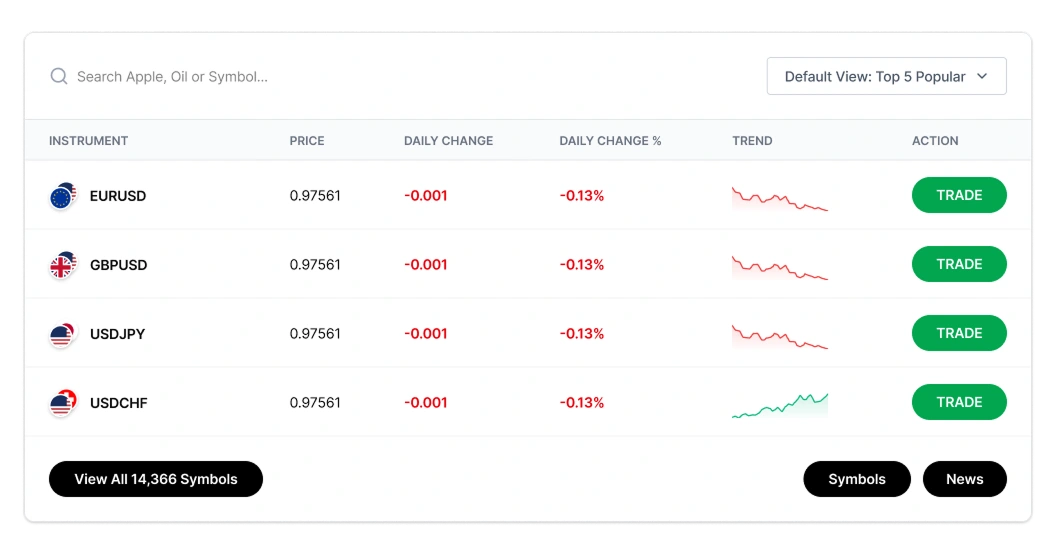
Reduced Friction & Choice Paralysis
• Curated Default View: Instead of forcing users through 14+ pages of pagination as seen in the original version, the table now defaults to a "Top 5 Popular" view.
• Search-First Navigation: A prominent search bar allowing queries for specific assets like "Apple" or "Oil" has been added to provide instant access to the symbol library.
2. Direct Conversion Funnel
• Actionable Rows: Every instrument row now features a high-contrast green "TRADE" button.
• Deep-Linking: These buttons transform the table from a "read-only" data set into a lead-generation tool that deep-links users directly to account registration.
3. Visual Trend Context
• Dynamic Sparklines: Static high/low numbers have been replaced with 24-hour Trend Sparklines.
• Immediate Interpretation: Red and green visual cues (line graphs and percentage changes) allow traders to gauge market sentiment at a glance without reading raw data.
4. Advanced Filtering for Power Users
• View Toggle: A "Default View" dropdown allows users to switch between "Popular," "Volatility," or specific asset classes.
• Global Access: A "View All" button at the bottom provides a clear secondary path for users wanting to explore the full catalog of 14,000+ symbols.
3. Social Proof: Proving Credibility
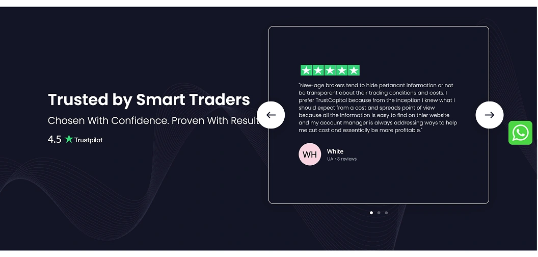
In the Forex industry, skepticism is high. "Anonymous" testimonials actually hurt trust more than they help.
The Issues:
• Lack of Consensus Data: The "4.5 Trustpilot" rating on the left is isolated. Without the total number of reviews (e.g., "based on 1,240 reviews"), users cannot tell if that score is from five people or five thousand.
• The "Placeholder" Aesthetic: The user "White" with the generic "WH" pink circle icon feels like a default placeholder. In the high-stakes forex industry, this lacks the personal "human" touch needed to build trust.
• Proofreading & Professionalism: The testimonial text contains a noticeable typo ("...easy to find on thier website"). For a financial broker, spelling errors in "customer" quotes can make the review look fabricated or unvetted.
• Low Contrast & Readability: The thin white font on the dark background, combined with a large block of justified-style text, makes the review difficult to scan quickly.
• Redundant Navigation: Having both large arrow buttons and pagination dots for only three slides creates unnecessary visual noise.
Fix: Proving Credibility
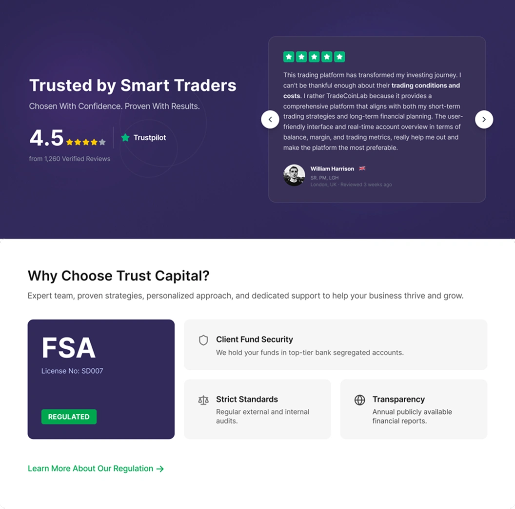
1. Humanizing the Social Proof
The transition from anonymous feedback to Identifiable Identity is the cornerstone of this fix.
• Contextual Credibility: By including "William Harrison" along with his professional title "SR. PM, LGH," the review shifts from a random quote to a testimonial from a high-value professional peer.
• Geographic Validation: The UK flag icon provides immediate visual proof of the brand’s international reach, countering skepticism about localized or "shell" operations.
• The "Freshness" Factor: The "Reviewed 3 weeks ago" timestamp is critical; it proves the platform is stable and actively servicing clients in the current market environment.
2. Anchoring Trust in Third-Party Data
Rather than asking users to "take our word for it," the redesign uses External Validation to close the sale.
• Platform Authority: Integrating the Trustpilot logo directly next to the 4.5-star rating leverages an existing "trust ecosystem" that users already recognize and believe.
• Statistical Power: Specifically citing "1,260 Verified Reviews" eliminates the suspicion that the rating was manufactured. It suggests a high volume of satisfied users, providing "safety in numbers".
3. Operationalizing Regulatory Excellence
The redesign treats the FSA license not as a legal burden, but as a Primary Value Proposition.
• From Footer to Feature: By moving "License No: SD007" into a prominent dark-themed "Authority Card," the design highlights the platform's legality at the exact moment a user is deciding whether to deposit funds.
• Visual Shortcuts: The high-contrast green "REGULATED" badge acts as a "trust lighthouse," providing a quick mental "check" for users who are scanning the page for security signals.
• Reassurance through Detail: The breakdown of "Client Fund Security" specifically mentioning "top-tier bank segregated accounts" addresses the most common trader fear: the safety of their underlying capital.
UX Breakdown: The "Safety Combo"
The primary strength of this layout is the vertical hierarchy of trust. By placing "What users say" (Social Proof) directly above "What the law says" (FSA Regulation), you create a dual-layered psychological safety net that significantly reduces the friction of signing up.
Conclusion: Transforming Trust into Conversion
The current state of Trust Capital represents a platform with a strong foundation—FSA regulation, competitive 0.0 pip spreads, and industry-standard technology—that is currently obscured by a cluttered and "noisy" interface. The primary friction is not a lack of features, but a lack of focus. By shifting from a "data-heavy" approach to a "trust-first" design, the site can better convert high-intent traffic into active traders.
Key Takeaways for Implementation
• Simplify the First Impression: Reducing the hero section's noise and highlighting hard numbers (like "0.0 pips") immediately answers the user's most important question: "Why trade here?".
• Bridge the Trust Gap: Moving away from anonymous testimonials and hidden regulatory licenses to verified, quantified social proof (e.g., "1,260+ reviews") is essential for building credibility in the skeptical Forex market.
• Empower User Action: Integrating "Trade" and "Demo" buttons directly into the instrument tables and hero sections removes the mental "dead ends" that currently stall the user journey.
• Mobile-First Polish: Addressing technical debt—such as broken links, typos, and non-responsive tables—ensures that the professional image of the brand is maintained across all devices.
By executing these targeted UX improvements, Trust Capital will move beyond being a passive data provider and become a streamlined, high-performance gateway for global traders.
Like this project
Posted Aug 12, 2026
A high-impact UX and Conversion Optimization (CRO) audit to transform Trust Capital from a data-heavy site into a high-converting trading hub
Likes
0
Views
0