Just shipped a high-converting product
John Tech
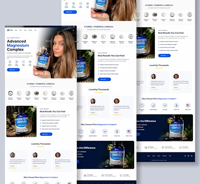
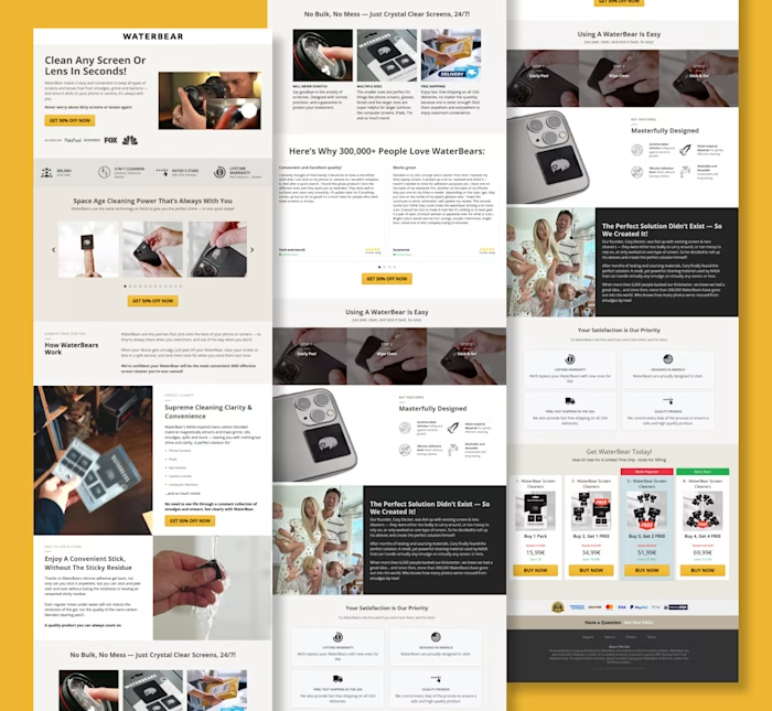
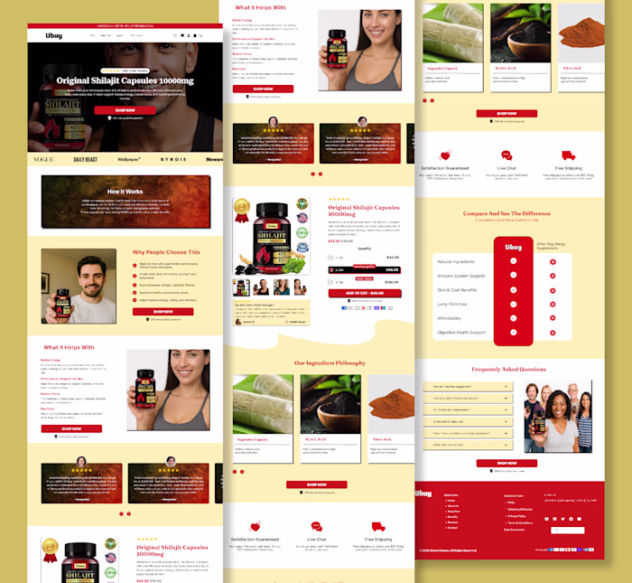
Just shipped a high-converting product page built in Replo and every section was designed with one goal in mind: turn attention into action.
This wasn’t about making it look “nice.”
It was about building a page that sells clearly and effortlessly.
Here’s what went into it:
• Strong hero section = instant understanding of product + value
• Benefit-led structure = clarity over confusion
• Clean, modular layout (Replo build) = smooth user flow
• Social proof placed at decision points = trust at the right moment
• UGC integration = real credibility, not just claims
• Clear CTA hierarchy = no friction in the buying journey
- The approach was simple:
Remove everything that doesn’t help the user decide.
Because in ecommerce:
Confusing pages don’t lose slowly they lose instantly.
- Result-focused design:
Built to guide the user from:
- curiosity → trust → decision → purchase
Not just a product page.
A conversion system built in Replo.
Like this project
Posted Jun 18, 2026
Just shipped a high-converting product page built in Replo and every section was designed with one goal in mind: turn attention into action. This wasn’t abo...
Likes
0
Views
0