John Tech - I Build an High converting landing page design on Figma, | ContraWork by John Tech
John  Tech

John Tech

I Build an High converting landing page design on Figma,

Ecommerce

Cover image for A high-converting product page is
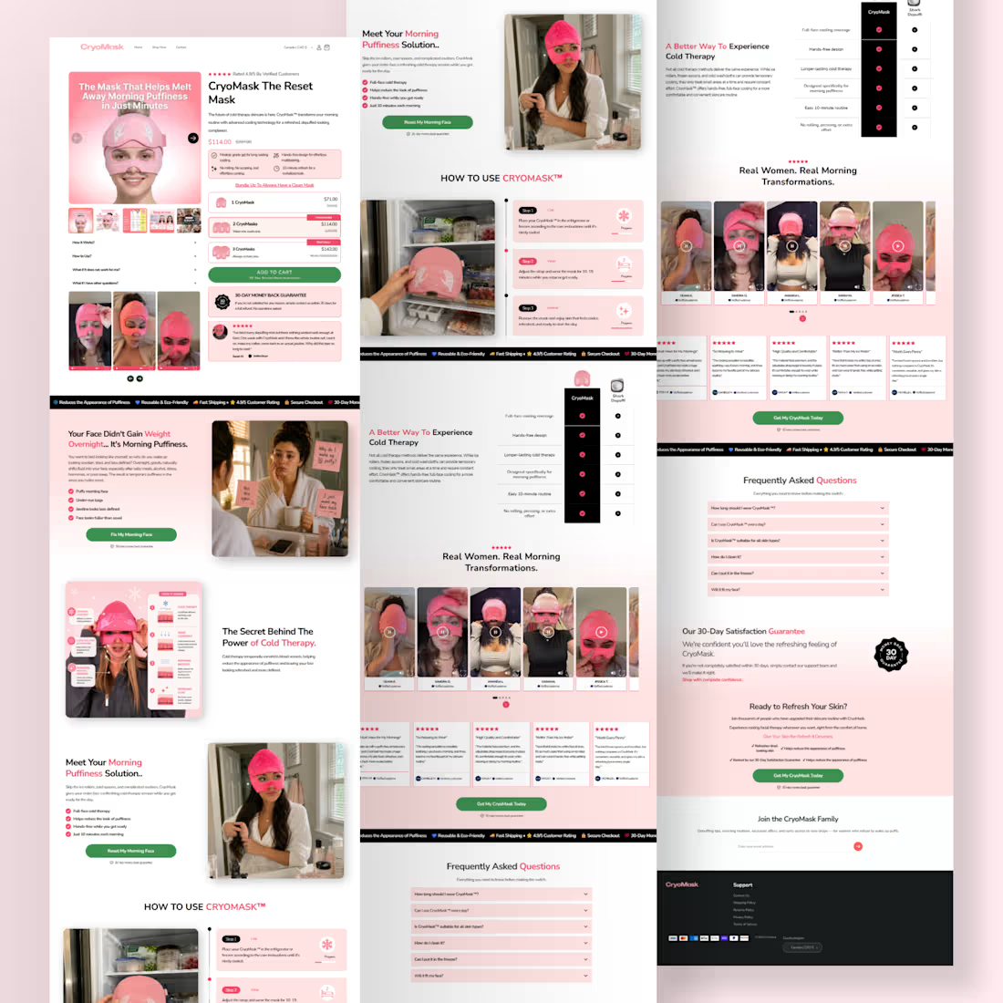
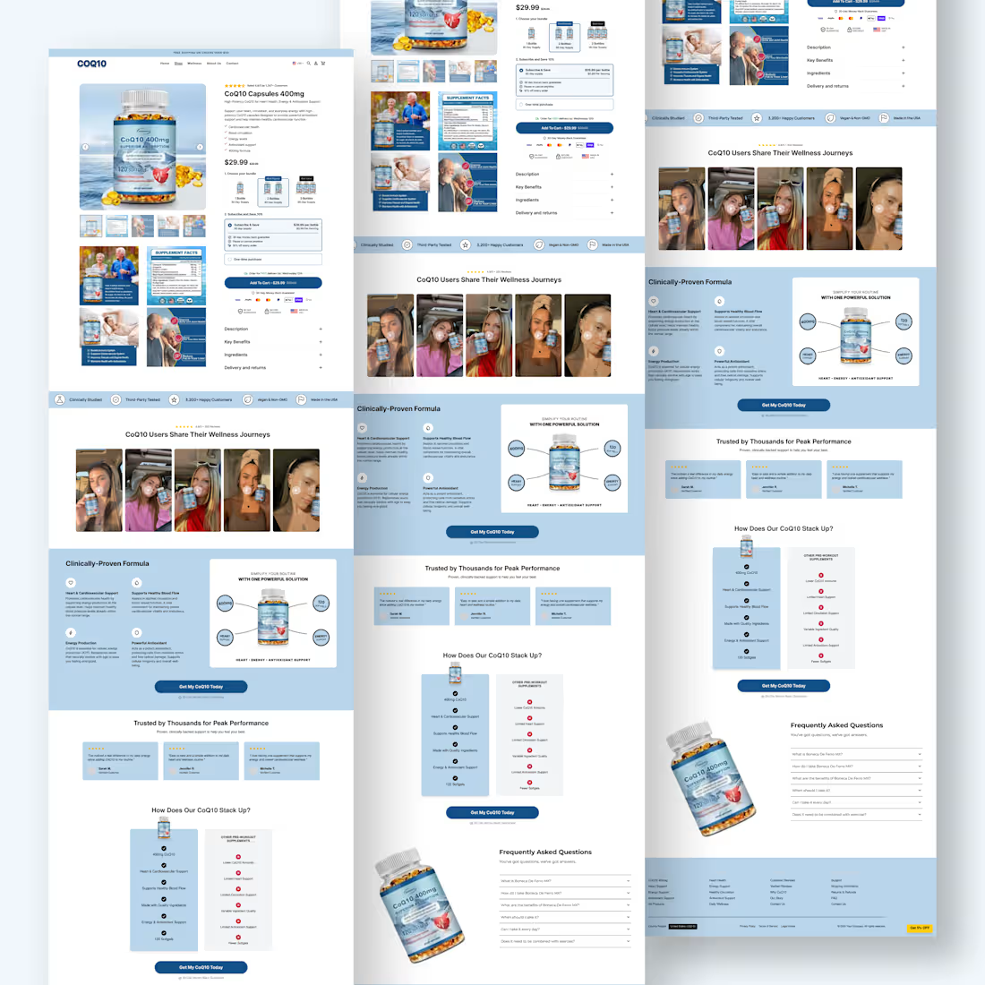
A high-converting product page is more than beautiful design it’s a sales system. Every section of this page was crafted to guide customers from curiosity to checkout with confidence. Here’s what makes it effective: Premium, clean UI that immediately builds trust. High-quality product imagery that showcases the product from every angle. Clear value proposition with benefits customers understand instantly. Strategic pricing, subscription offers, and savings that increase average order value and recurring revenue. Trust-building elements including ratings, guarantees, and secure checkout badges. Conversion-focused hierarchy that removes friction throughout the buying journey. Fully responsive across desktop, tablet, and mobile for a seamless shopping experience. The best ecommerce stores don’t rely on luck they rely on intentional design, user psychology, and a frictionless buying experience. Every pixel on this page was designed with one purpose: turn more visitors into loyal customers. If your product page isn’t converting, it’s not just a design problem it’s a conversion problem. Design. Develop. Optimize. Convert.
1
3
46
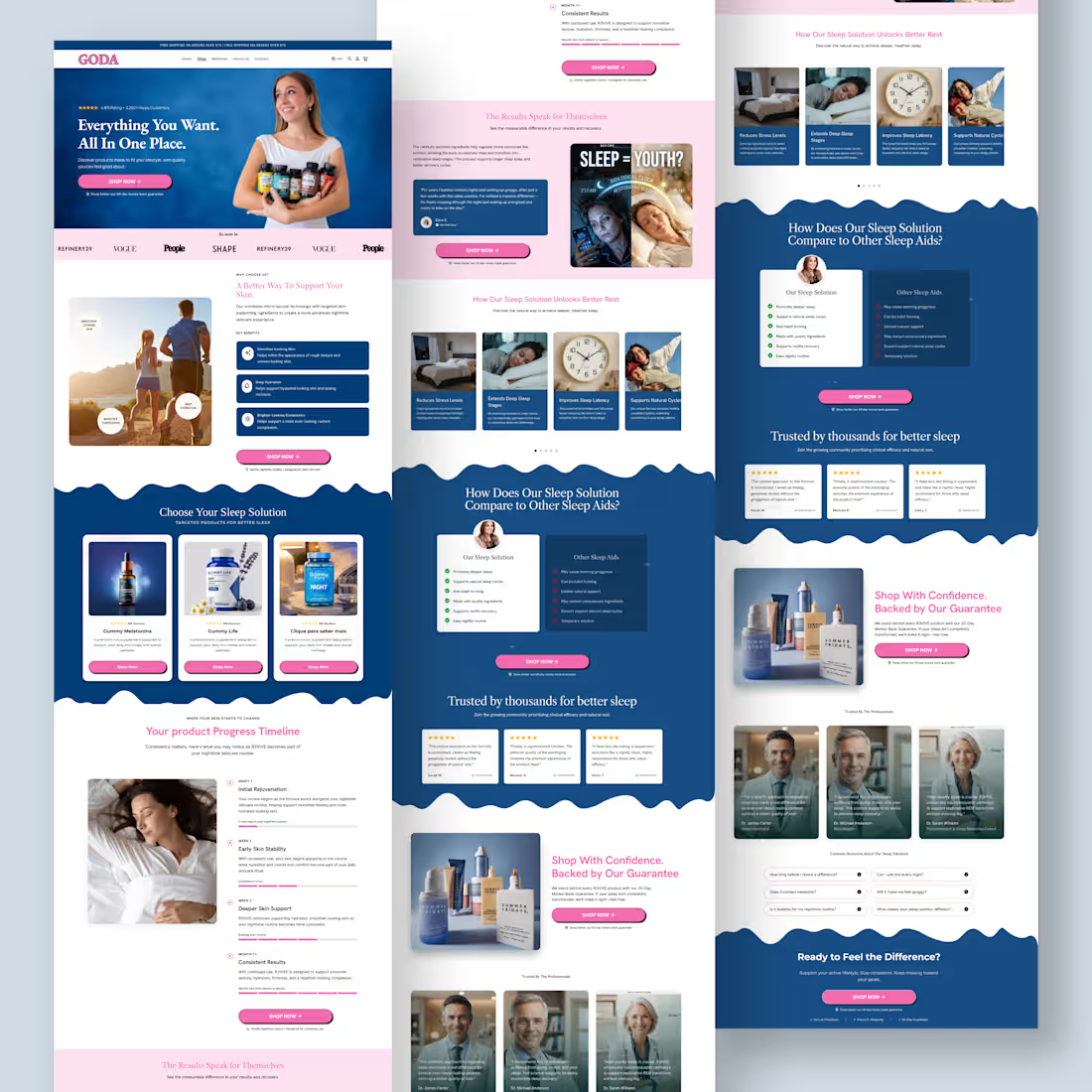
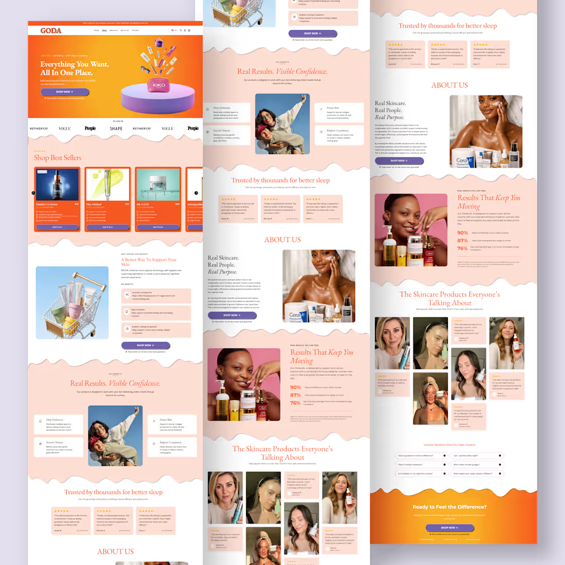
A homepage isn’t decoration. It’s your best salesperson. Built this homepage from the ground up with one goal: turn visitors into customers. Every section was intentionally designed to improve the shopping experience across desktop and mobile. High-converting hero section Clean, premium UI Mobile-first responsive development Strategic CTA placement Trust-building social proof Fast, seamless user experience Optimized for engagement and conversions The best ecommerce stores don’t win because they have more traffic they win because they convert more of the traffic they already have. This is what happens when design meets conversion strategy. @replohq (https://x.com/replohq)
0
14
Cover image for A great product page makes
A great product page makes buying feel effortless. Strong visuals. Clear benefits. Social proof. Smart bundle offers. A frictionless path to checkout. Every element should answer a question, build trust, and move the customer one step closer to clicking Add to Cart. That’s what conversion-focused design looks like.
0
25
Cover image for Maximize Conversions with Shopify Replo Homepage Design
A homepage isn’t just the first page visitors see it’s the first opportunity to earn their trust. I recently designed and developed this high-converting Shopify homepage in Replo for Kriath Pet Care, with a clear objective: transform first-time visitors into confident buyers. Every section was carefully planned to guide users through the customer journey from capturing attention to educating, building trust, and driving action. Here’s what I focused on: ✨ A bold hero section with a clear value proposition 📱 Fully responsive across desktop, tablet, and mobile 🎯 Benefit-driven storytelling that keeps visitors engaged ⭐ Social proof, customer testimonials, and before & after results 📊 Comparison tables that reduce buying hesitation 🐶 Educational sections that answer common customer questions 💚 Strong visual hierarchy for a seamless browsing experience 🛒 Strategic CTA placement to maximize conversions ⚡ Pixel-perfect development in Replo with Shopify integration Every scroll has a purpose. Every section answers a question. Every CTA moves the customer one step closer to purchasing. That’s what great eCommerce design is about not just creating beautiful pages, but creating experiences that convert. Proud to bring this vision to life for Kriath Pet Care, and excited to keep helping brands build Shopify experiences that drive measurable results. If you’re looking for a Replo developer to create high-converting homepages, landing pages, or product pages, let’s build something exceptional.
2
6
108
Cover image for Your homepage isn’t just a
Your homepage isn’t just a design. It’s your first sales pitch. If visitors land on your homepage and leave within seconds, it usually isn’t because your product is bad. It’s because your homepage failed to answer three simple questions: ❌ Why should I trust you? ❌ Why is your product different? ❌ Why should I buy from you today? That’s exactly what I solve when designing Shopify homepages. For this project, every section was built with a purpose: ✔️ Capture attention instantly with a compelling hero section ✔️ Build credibility through social proof and trust signals ✔️ Educate customers with benefit-driven content ✔️ Eliminate objections using comparisons, FAQs, and real customer results ✔️ Guide visitors naturally from curiosity to conversion with strategic CTAs A homepage shouldn’t just look beautiful it should work as your best salesperson, building trust 24/7 and turning traffic into revenue. That’s the approach I take with every homepage I build in Replo: combining strategy, user experience, and conversion-focused design to help brands grow. If your Shopify homepage is getting traffic but not generating enough sales, it may be time to redesign the experience not just the visuals. Build on @replohq
1
50
Cover image for Every product page has a
Every product page has a purpose. I recently designed and developed this high-converting Shopify product page in @replohq (https://x.com/replohq) for Kriath Pet Care, with a focus on creating a seamless shopping experience across desktop and mobile. This wasn’t just about making the page look good it was about building a product page that helps customers make confident buying decisions. Here’s what went into the build: Fully responsive across desktop and mobile Clean, conversion-focused layout Benefit-driven product presentation Strategic pricing and bundle offers to increase AOV Trust signals, reviews, and money-back guarantee Urgency elements that encourage action without overwhelming the user Mobile-optimized purchase flow for a frictionless checkout experience Pixel-perfect development in Replo with Shopify integration The best product pages don’t sell with flashy designs they sell by building trust, reducing hesitation, and making it easy for customers to say “Yes.” That’s the mindset I bring to every Replo project. If you’re an eCommerce brand looking to transform your product pages into high-performing sales assets, I’d be happy to help. Feel free to reach out if you need a Replo developer for Shopify.
6
111
high-converting Shopify product page delivered in @replohq (https://x.com/replohq) for Kriath Pet Care. Every successful eCommerce brand needs more than a beautiful product page it needs an experience that converts on desktop, tablet, and mobile. For this project, I developed a fully responsive product page that delivers a consistent shopping experience across every device, without compromising performance or usability. What I focused on: Pixel-perfect development in Replo Responsive design optimized for desktop, tablet, and mobile Clean product hierarchy for effortless browsing Conversion-focused pricing and bundle selection Trust-building reviews, guarantees, and social proof Strategic CTA placement to increase conversions Fast-loading, Shopify-ready implementation Smooth, intuitive shopping experience from first click to checkout Every breakpoint was carefully refined to ensure customers enjoy the same premium experience whether they’re shopping from a phone, tablet, or desktop. Great product pages don’t happen by chance they’re built with strategy, attention to detail, and a deep understanding of how people shop online. Proud to have brought this vision to life for Kriath Pet Care. Looking forward to helping more brands build product pages that not only look premium but also drive real results. If your Shopify store needs a product page that’s designed to convert across every screen, let’s connect.
3
80
Another high-converting Shopify product page built with @replohq (https://x.com/replohq) . Every successful product page does more than showcase a product it removes friction, builds trust, and guides customers toward checkout. For this project, I designed and developed a fully responsive product page in Replo, optimized for both desktop and mobile to deliver a seamless shopping experience across every device. Pixel-perfect responsive design Conversion-focused layout and hierarchy Mobile-first user experience Dynamic bundle and pricing options Subscription flow integration Trust signals, reviews, and money-back guarantee Fast-loading, Shopify-ready implementation The goal was simple: create a premium shopping experience that not only looks great but also helps increase conversions and average order value. It’s always rewarding turning high-fidelity designs into responsive, production-ready Replo pages that perform just as well on mobile as they do on desktop. If you’re looking for someone to build high-converting Shopify landing pages or product pages with Replo, let’s connect. #replo (https://x.com/hashtag/replo?src=hashtag_click) #Shopify (https://x.com/hashtag/Shopify?src=hashtag_click) #ShopifyDeveloper (https://x.com/hashtag/ShopifyDeveloper?src=hashtag_click) #Ecommerce (https://x.com/hashtag/Ecommerce?src=hashtag_click)
1
43
Your product page isn’t competing with another brand. It’s competing with your customer’s doubts. Every visitor lands on your page asking the same questions: “Will this actually work?” “Can I trust this brand?” “Is it worth the price?” “What if it doesn’t meet my expectations?” The brands that generate millions don’t leave those questions unanswered. They answer them before the customer even has to ask. A high-converting product page isn’t built by adding more sections. It’s built by removing friction. A headline that sells the outcome, not the product. Premium visuals that increase perceived value. Benefits that are easy to scan. Social proof that builds instant credibility. Offers that make buying feel like the smartest choice. Guarantees that eliminate risk. A checkout experience with zero distractions. Every pixel should have one purpose: Move the customer closer to saying “Yes.” Design alone doesn’t increase sales. Psychology does. Trust does. Clarity does. When your product page answers objections before they become reasons to leave, conversions stop being a guessing game. That’s how great product pages become powerful sales machines.
0
44
I recently developed this fully responsive ecommerce product page, ensuring a smooth and consistent shopping experience across desktop, tablet, and mobile devices. Every element was carefully designed and optimized to improve usability, build customer trust, and increase conversions. - What makes this product page effective? Fully responsive across all screen sizes Clean, intuitive UI with a mobile-first approach Optimized product gallery and content layout Trust-building reviews and social proof Clear pricing, bundle offers, and purchase options Conversion-focused “Add to Cart” section Fast, seamless user experience from product discovery to checkout Responsive design isn’t just about making a page fit different screens it’s about delivering the best possible experience for every customer, no matter what device they’re using. Building high-performing ecommerce experiences requires the perfect balance of design, development, UX, and conversion strategy. That’s exactly what I aim to deliver with every project. - What device do you use most for online shopping desktop, tablet, or mobile?
0
50
Another Shopify Product Page Built with Replo I recently completed the development of this product page in Replo, focusing on creating a shopping experience that’s clean, engaging, and built to convert. Rather than simply showcasing the product, I structured the page to guide customers through every stage of the buying journey from capturing attention to building trust and encouraging confident purchases. Some key features include: Clean, responsive design for desktop and mobile Conversion-focused layout and visual hierarchy Benefit-driven content sections Customer reviews and trust-building elements Product comparison to reduce buying hesitation FAQ section to address common objections Strategic CTA placement throughout the page Optimized for a smooth Shopify shopping experience Every section was designed with a purpose: reduce friction, increase engagement, and make purchasing feel effortless. I’m always excited to build product pages that combine thoughtful design with conversion-focused strategy. If you’re looking for a Replo developer to create high-performing Shopify product pages or landing pages, feel free to reach out.
0
47
I recreated this landing page for a meal replacement shake with a strong focus on conversion rate optimization (CRO) and clean user experience. What I focused on: Clear product hierarchy and visual storytelling Optimized above-the-fold layout for immediate engagement Conversion-focused pricing and bundle offers Subscription vs. one-time purchase options Trust-building elements (reviews, guarantee, product benefits) Mobile-responsive design with pixel-perfect implementation in Replo The goal wasn’t just to make it look good it was to guide visitors toward the “Add to Cart” button with minimal friction. Replo continues to be one of my favorite tools for building Shopify landing pages because it enables fast iteration while maintaining high design quality. Always looking to improve performance through better UX, layout optimization, and conversion-focused design. Feedback is always welcome!
0
46
A great product page doesn’t just look premium it drives sales. This Shopify product page for a dog salmon oil supplement was designed with conversion in mind. - Key conversion elements: • Strong hero section with lifestyle imagery • Instant trust through reviews and social proof • Subscription-first pricing strategy to increase recurring revenue • Clear product bundles that boost average order value (AOV) • Money-back guarantee to reduce purchase hesitation • Benefit-focused messaging that answers “Why buy?” • High-visibility CTA designed to maximize conversions • Fully responsive experience across desktop and mobile Every section is intentionally crafted to reduce friction, build trust, and guide customers from product discovery to checkout. Beautiful design gets attention. Strategic design generates revenue.
1
59
Crafted this conversion-focused product page using Replo. Built with one goal in mind: turning visitors into customers. Every element on this page was intentionally placed to create trust, increase order value, and make the buying process seamless. From eye-catching product visuals to persuasive copy and strategic offer stacking, the entire layout is optimized for performance. - Key conversion elements: Clear and compelling offer above the fold Powerful social proof with 88k+ customer reviews Bundle deals designed to increase AOV Free gift strategy to encourage bigger purchases Smooth product variant selection for better user experience Benefit-led messaging that highlights results Mobile-optimized layout for higher engagement Built on Replo for flexibility, speed, and scalability. Because high-converting product pages aren’t built by chance they’re built with strategy, user psychology, and performance in mind.
0
51
A High-Converting PDP Doesn’t Just Describe the Product. It Removes Every Reason Not to Buy. Every section should answer your customer’s biggest questions before they ask them. Why this product? Why this brand? Why now? The highest-converting product pages are built with intention: Scroll-stopping product visuals Benefit-driven copy that sells outcomes, not features Trust signals that reduce hesitation Social proof that builds confidence A frictionless buying experience from top to bottom A beautiful design gets attention. A strategic PDP gets conversions. Don’t just design a product page. Design the moment someone decides to buy.
0
68
Good product pages guide users toward action naturally. Every section should support the buying decision. If a section doesn't build trust, answer objections, or move users closer to checkout, it probably doesn't belong on the page.
1
81
How to Make a Product Page Feel TRUSTWORTHY Instantly Trust is not claimed on a PDP it’s engineered through design. Here’s what actually builds instant credibility: • Clean clinical-style layout = premium + authoritative first impression • Strong hierarchy (product → benefits → offer → CTA) = effortless scanning • Subscription option clearly placed = value without pressure • “Complete transparency” section = removes skepticism immediately • Reviews + UGC placed near decision points = trust reinforcement loop • Generous white space = less cognitive load, faster understanding The real strategy: They don’t choose between aesthetics. They combine: clinical, science-based credibility creator-style UGC trust That blend is extremely powerful for conversions. Why it works: • UGC near PDP can increase CVR by 15–35% • Clean layouts reduce bounce rates by ~20% • Subscription framing can lift AOV by 20–40% Pro insight: If you sell supplements, don’t design like a fitness ad. Design like: a medical-grade brand a premium wellness company a creator-backed lifestyle product All at once.
0
82
Cover image for Just shipped a high-converting product
Just shipped a high-converting product page built in Replo and every section was designed with one goal in mind: turn attention into action. This wasn’t about making it look “nice.” It was about building a page that sells clearly and effortlessly. Here’s what went into it: • Strong hero section = instant understanding of product + value • Benefit-led structure = clarity over confusion • Clean, modular layout (Replo build) = smooth user flow • Social proof placed at decision points = trust at the right moment • UGC integration = real credibility, not just claims • Clear CTA hierarchy = no friction in the buying journey - The approach was simple: Remove everything that doesn’t help the user decide. Because in ecommerce: Confusing pages don’t lose slowly they lose instantly. - Result-focused design: Built to guide the user from: - curiosity → trust → decision → purchase Not just a product page. A conversion system built in Replo.
0
88
Cover image for Your Homepage Has One Job:
Make
Your Homepage Has One Job: Make visitors want to keep scrolling. Most homepages try to say everything at once. The best ones focus on one thing: Clarity. A high-converting homepage should: • Explain what you sell in seconds • Show why you’re different • Build trust immediately • Guide visitors to the next step • Make buying feel effortless The biggest mistake? Filling the page with information instead of direction. If visitors have to think too much, they leave. Clear headline Strong visuals Obvious value proposition Strategic social proof Clear call-to-action A homepage isn’t just a welcome page. It’s the first sales conversation with your customer. Make it count.
0
92
Cover image for Just designed a homepage using auto layout, built for clarit...
Just designed a homepage using auto layout, built for clarity and conversions. Every section guides users to take action. If you want a homepage that converts, message me.
1
95