Homeowner App for a Premium Vacation Rental Platform

Utsav Sheth

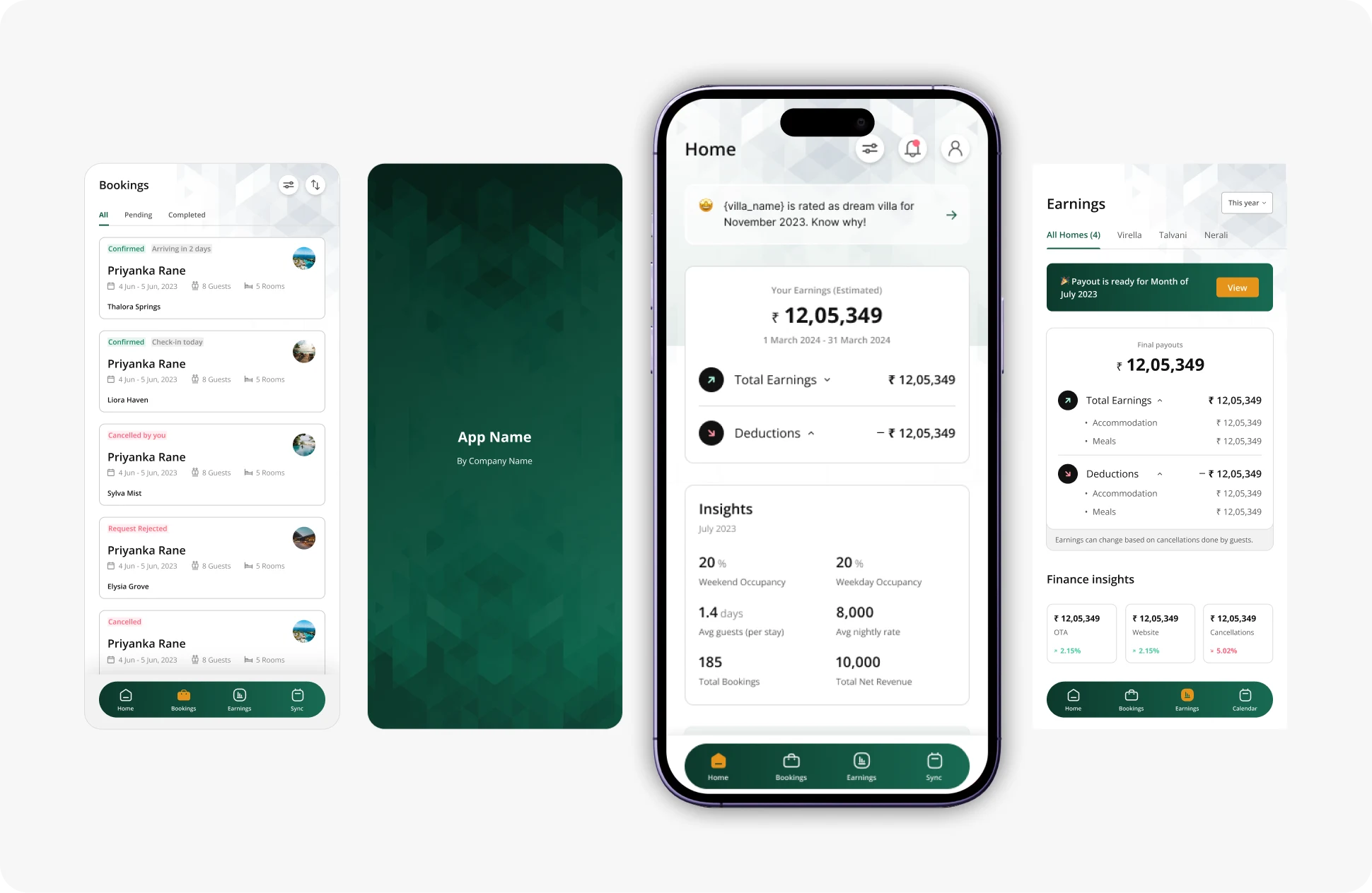
This project was driven by a simple goal: make property management effortless for homeowners. Through thoughtful information architecture, intuitive workflows, and features that surfaced meaningful insights instead of overwhelming users with data, the experience became easier to adopt and use. The result was 75% homeowner adoption, along with improved visibility into earnings, bookings, and overall property performance.
Role: Product Designer
Timeline: 2023 (3 Month)
Platform: iOS & Android
Industry: Hospitality
Disclaimer
Due to NDA restrictions, the client name and certain business details cannot be disclosed. This case study focuses on my design process and problem-solving approach.
Background
Managing a vacation rental property involves much more than simply listing a villa online.
Homeowners constantly need answers to questions like:
How much revenue did I generate this month?
When will I receive my payout?
Which bookings are confirmed?
What are guests saying about my property?
Unfortunately, this information was spread across multiple systems, making it difficult for homeowners to stay informed.
The goal was to design a mobile application that brings all of this information into one simple experience.
The Challenge
Homeowners struggled because important information was fragmented.
They needed to switch between different tools to understand:
Revenue and payouts
Booking status
Customer reviews
Property synchronization
The challenge wasn't adding more features.
It was reducing complexity.
Understanding the Users
Primary User
Amit Sharma (Villa Owner)
Owns multiple villas listed on the platform.
Goals
Track monthly earnings
Monitor bookings
Understand guest feedback
Manage multiple properties efficiently
Frustrations
Financial reports were difficult to understand.
Booking information wasn't centralized.
Revenue visibility was poor.
Multiple dashboards increased cognitive load.
Problem Statement
How might we help homeowners manage their properties without forcing them to navigate multiple systems?
The solution needed to simplify complex operational data while providing confidence and transparency.
Solution
Instead of creating another management dashboard, I designed an experience centered around the homeowner's daily workflow.
Design Principles
Before designing screens, I established a few principles.
Important information should be visible within seconds.
Financial information should be easy to understand.
Reduce unnecessary navigation.
Help homeowners make better decisions, not just access data.
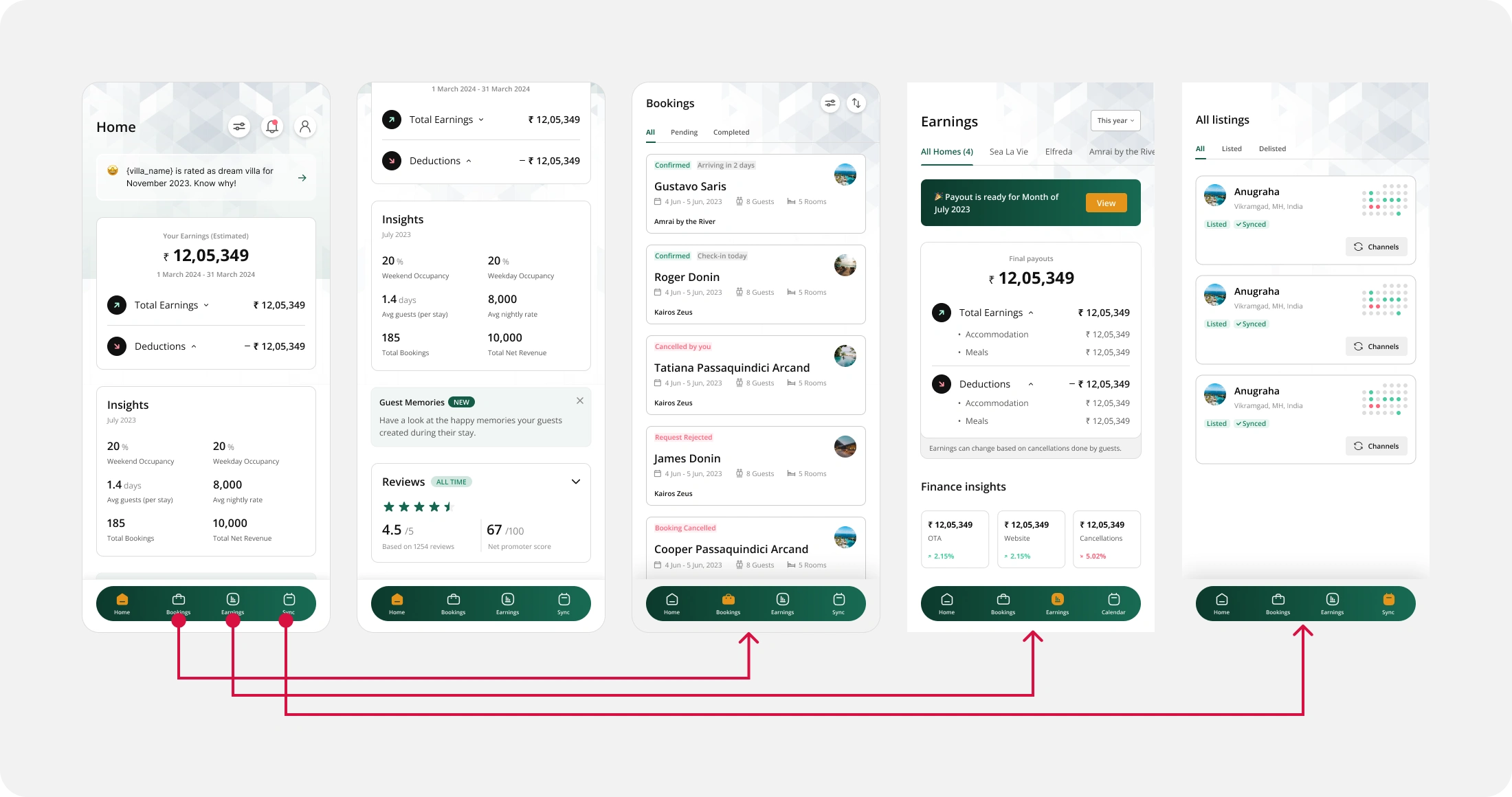
Home Tab
Dashboard (Home Tab)
Instead of overwhelming users with numbers, the home screen highlights what matters most.
Earnings summary
Booking overview
Guest review snapshot
Quick insights
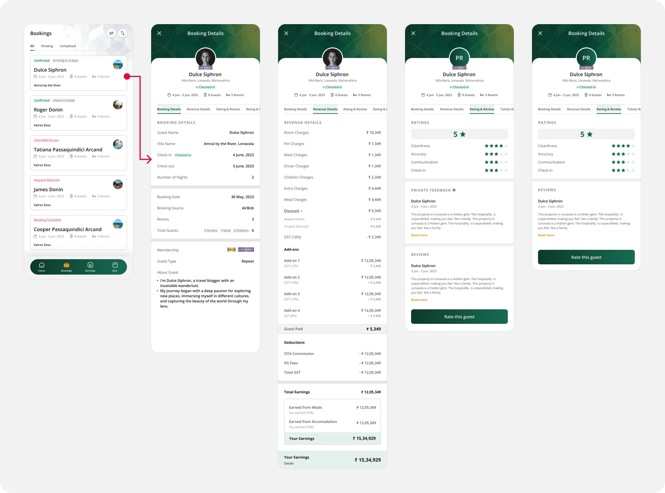
Booking Tab
Booking Management
A dedicated booking experience allows homeowners to:
View all bookings
Filter by status
Access complete booking information
Understand guest and revenue details
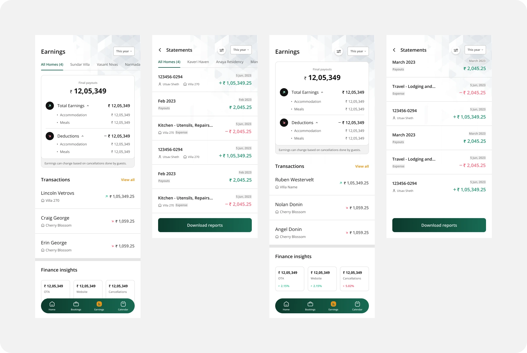
Earnings
One of the biggest challenges was simplifying financial information.
The earnings section provides:
Revenue breakdown
Final payouts
Deductions
Transaction history
Performance insights
Instead of lengthy reports, information is grouped into meaningful sections with visual summaries.
Additional Features
To further improve the homeowner experience, I introduced features that went beyond basic property management.
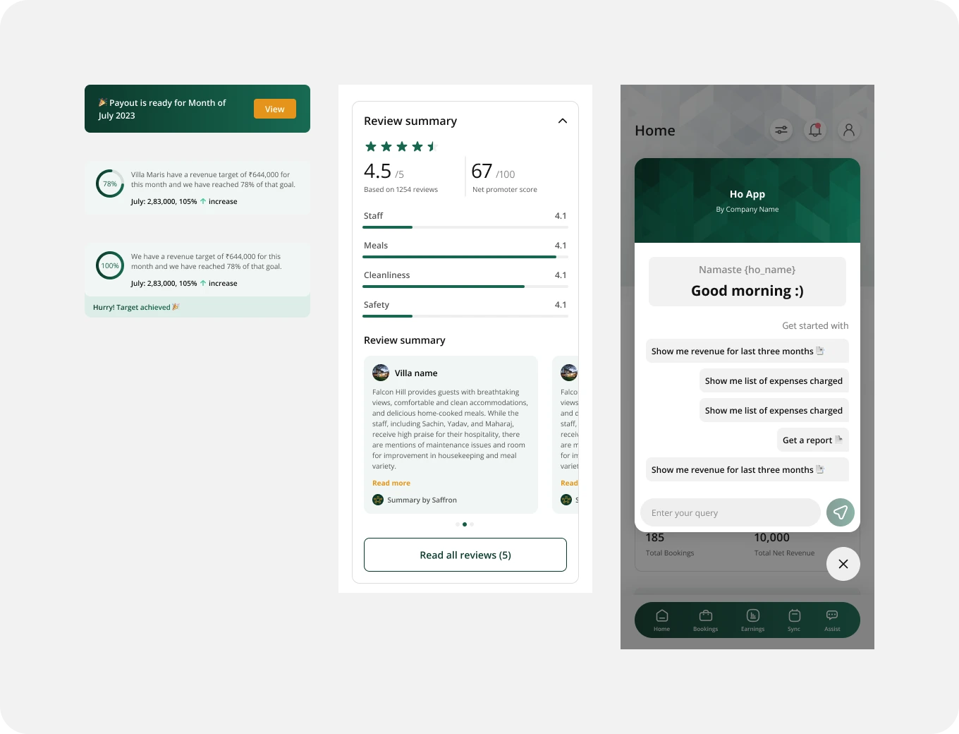
Monthly Revenue Target: Homeowners could set monthly revenue goals, track their progress, and compare performance with the previous month. This encouraged better planning instead of only reviewing past earnings.
AI-Powered Review Summary: Rather than reading dozens of guest reviews individually, homeowners received a concise monthly summary highlighting recurring compliments, concerns, and actionable insights.
In-App Assistant: Homeowners could ask questions and get instant assistance directly within the app, reducing the need to search through help articles or contact support.
This version reads as a cohesive enhancement to the product rather than three unrelated features, and it clearly communicates the value each feature provides.
Design Decisions
Throughout the project, every decision focused on reducing cognitive load.
Examples include:
Dashboard-first information hierarchy
Progressive disclosure for financial details
Consistent card layouts
Action-oriented navigation
Clear visual hierarchy
Outcome
The solution successfully simplified property management for homeowners.
Results
75% homeowner adoption
Better visibility into revenue
Improved booking transparency
Easier financial planning through projected revenue Reflection
This project reminded me that great product design isn't about adding more features.
It's about helping users understand complex information with confidence.
Designing for homeowners required balancing business needs with clarity, ultimately creating an experience that felt approachable despite the complexity behind it.
Let's Build Better Products Together
If you're building an AI or B2B SaaS product and looking to improve adoption, activation, and retention through thoughtful UX and product design, I'd love to help.
Like this project
Posted Jul 27, 2026
The case study covers the design process, key decisions, and how the product achieved 75% homeowner adoption.
Likes
0
Views
0