Eko Homepage
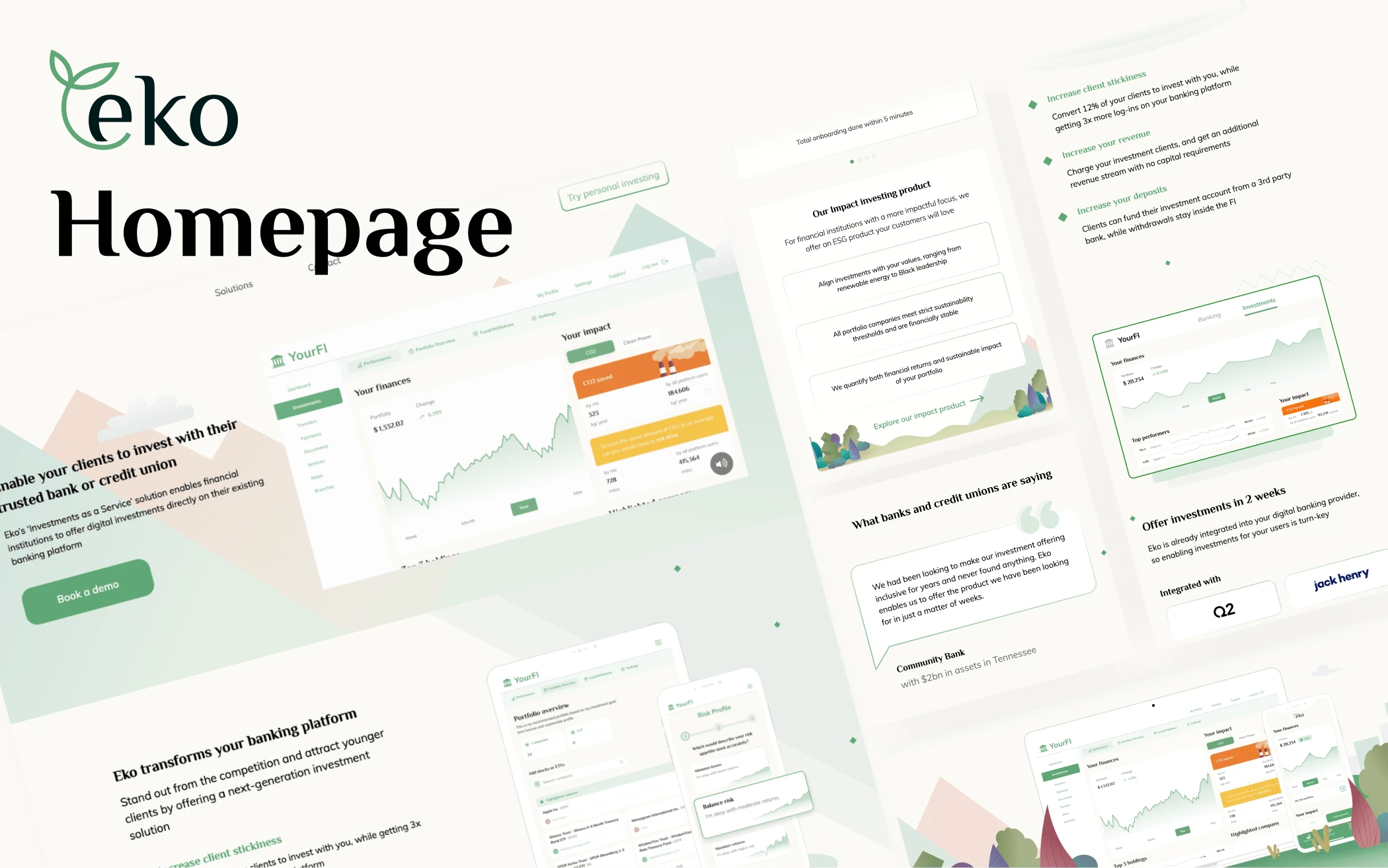
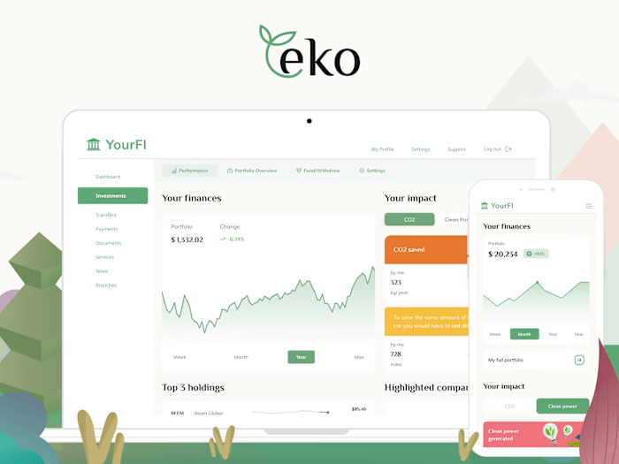
Eko is a white-label ‘Investments as a Service’ platform, helping financial institutions offer a modern investing solution inside their existing platform. As part of my work, I’ve designed an updated homepage to showcase the value of Eko to banks and credit unions.
Previous versions of the homepage, 2022
The Challenge
As Eko continued to grow, we started to become limited by our previous web presence. Earlier version of the homepage were built as banking integrations were still coming together and focused a lot on the product itself, as opposed to benefits it provides for our customers. We knew what we had to offer could improve their business — the goal was communicating this clearly enough.
To fix that, we’ve decided to start from first principles and focus on our core audience — community banks and credit unions — and solving their pains.
What they were worried about was:
Client retention and attracting younger clients;
Ability to compete with digital-native services and big banks;
Attracting more deposits;
Increasing revenue;
New services taking away their resources to implement and support;
Technical integration is a complex process taking a long time and syphoning resources.
Taking a page from the ‘Jobs-to-be-done’ playbook, we focused on putting the value first and speaking to what’s important for our customers.
We knew that product can speak for itself — so we decided to focus less on features and just display core parts of it in action.
Homepage
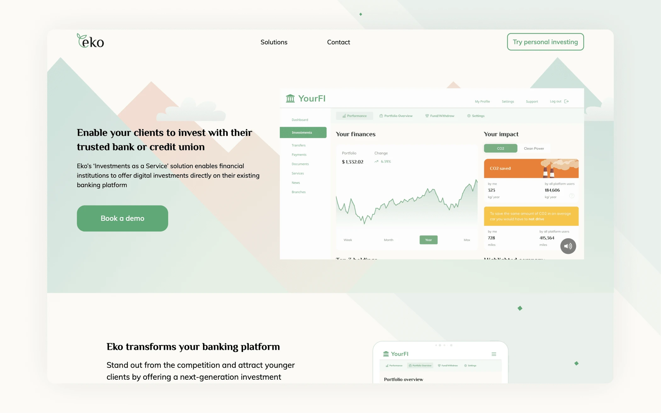
The headline immediately frames the problem and answers core question (what’s the benefit?), with the sub elaborating on key points: the product being offered, the target audience for this page and Eko’s unique selling point.
The demo video is designed to get people familiar with the product and showcase key experiences in less than a minute.
Page layout also teases continuation, with the next section focused specifically on customer benefits.
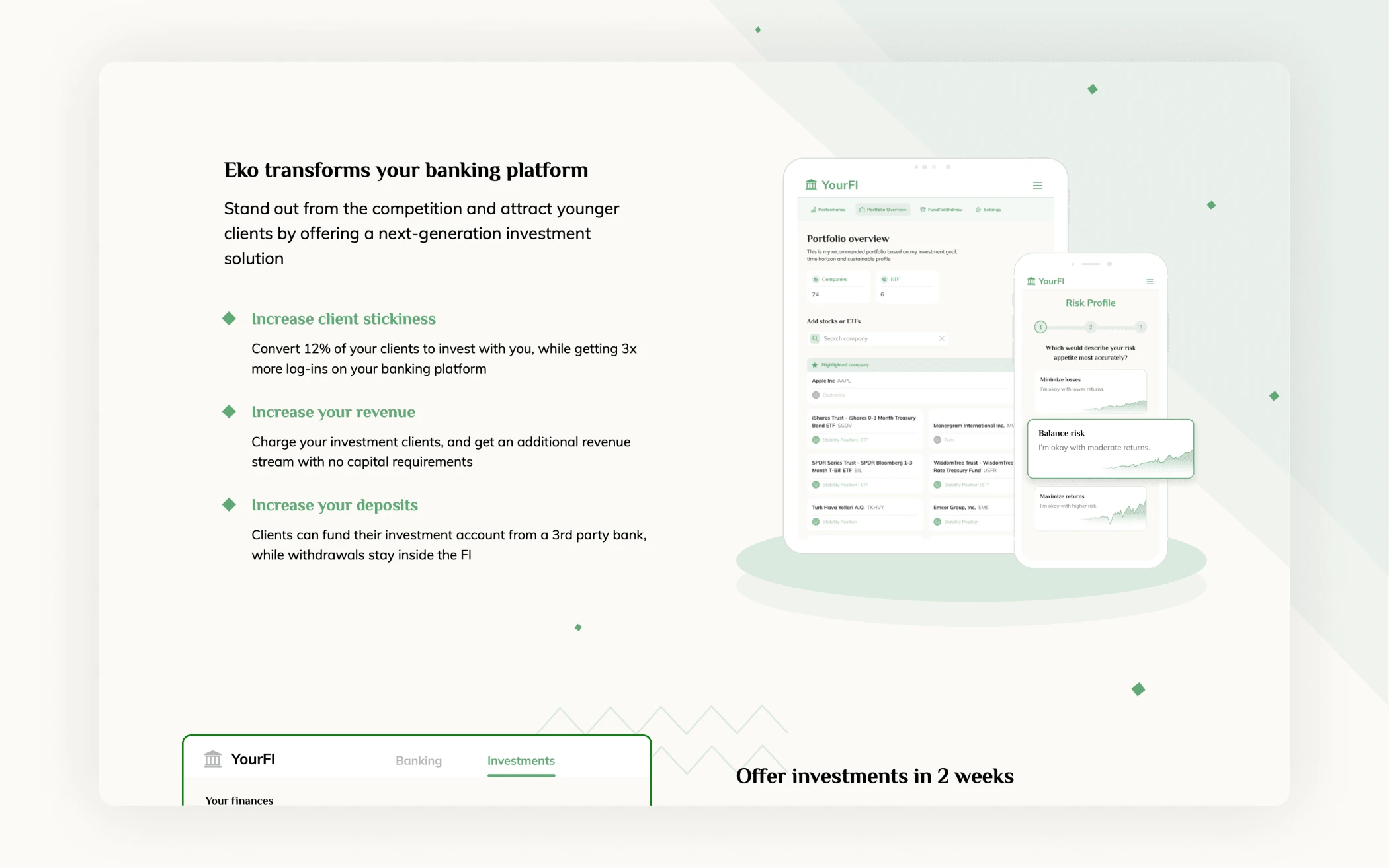
First section is focused on key benefits — tangible outcomes that Eko provides to financial institutions that integrate it.
To do that, we address some of the key pain points for community banks and credit unions outlined above, and the benefits Eko brings to their business.
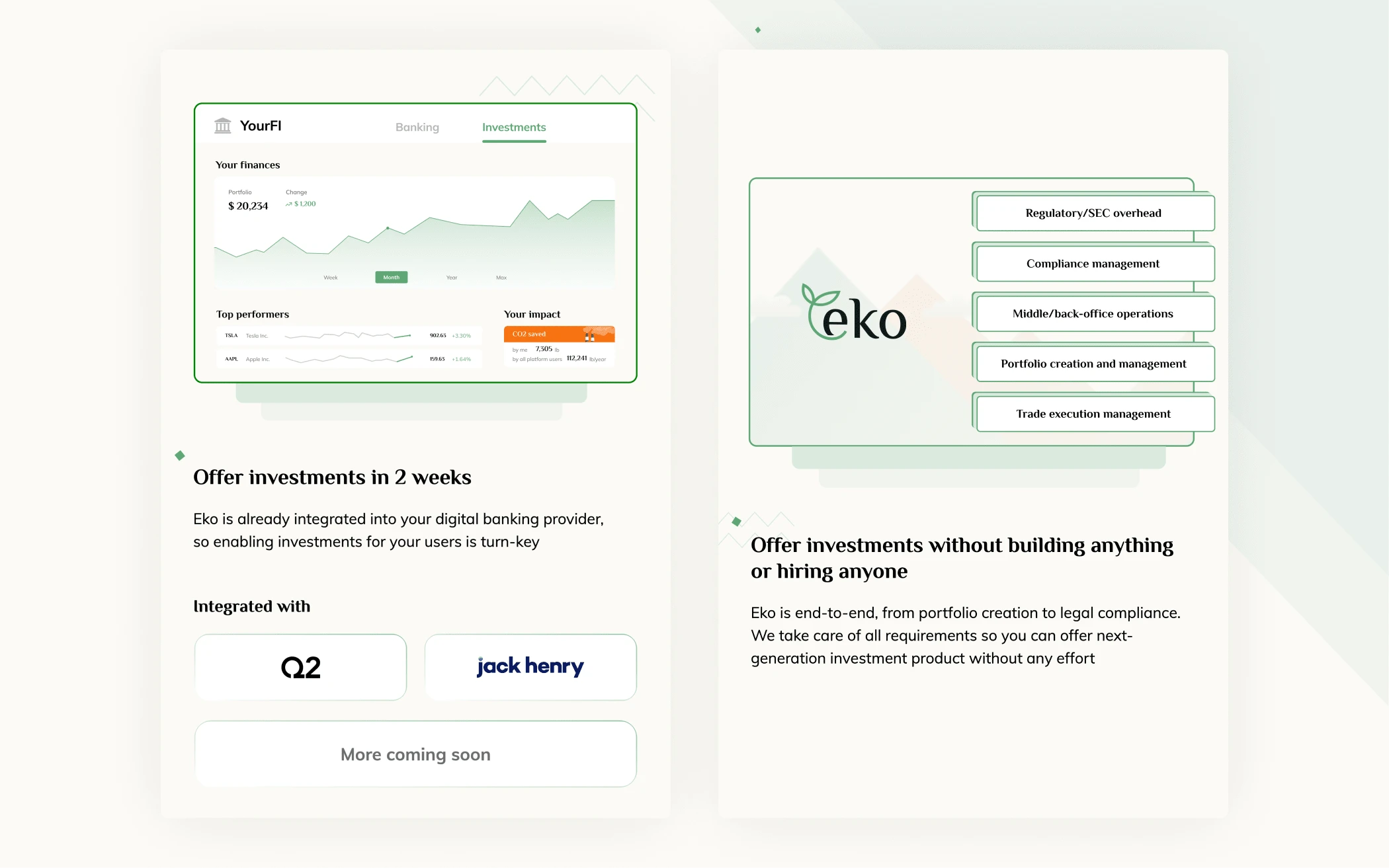
Subsequent sections address important objections that clients might have. Concerns about integration being technically challenging or new offering taking up limited resources are more than justifiable!
To address that, we again focus on the benefits: that investments can be offered in 2 weeks and without involvement from the FI. We also use this opportunity to strengthen our case by highlighting that Eko is already integrated with the two most widely-used platforms.
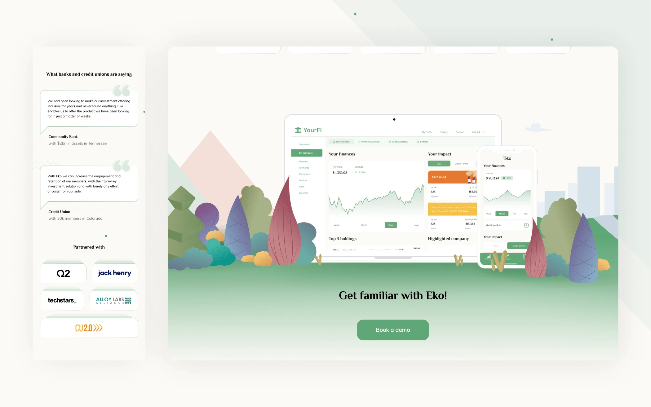
Finally, there’s some social proof with quotes from banks and credit unions, our partnerships in the industry, and a final hero shot of the product leading into a call-to-action.
Outcomes
Overall homepage revamp took 1 month from initial work on copy to the release, including producing an all-new demo video.
Results
2.5x demo sign-ups from the website
Increased awareness of the solution & more successful harnessing of industry events
Thanks to Yuliia Ananchenko for contributing to this page in refinement stages
Solutions Page
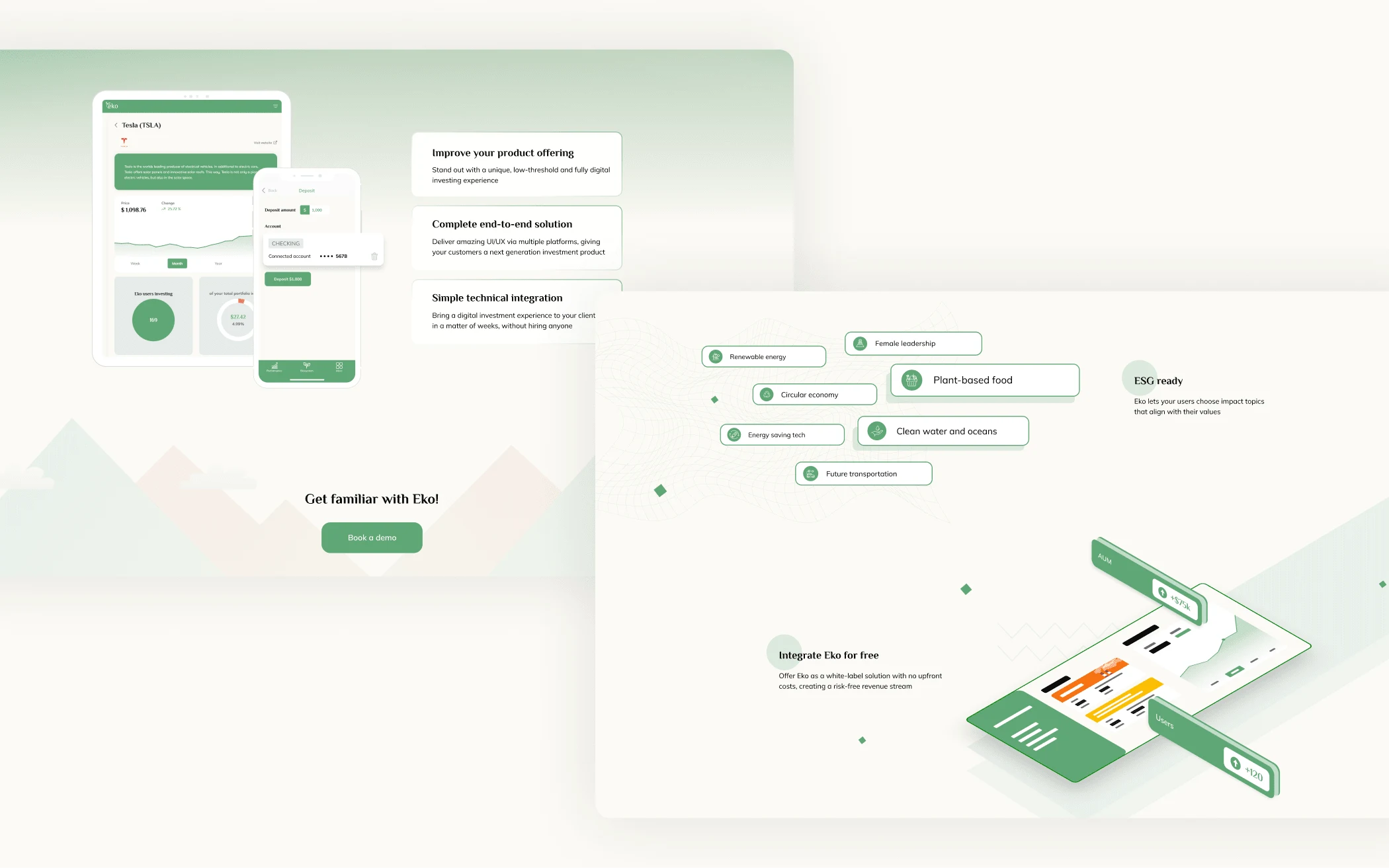
This page was built quite a bit earlier to showcase different aspects of Eko’s investment solution. As we were pivoting from an exclusive focus on ESG, we wanted to highlight the product as an overall investment solution, with additional functionality as part of our Impact product.
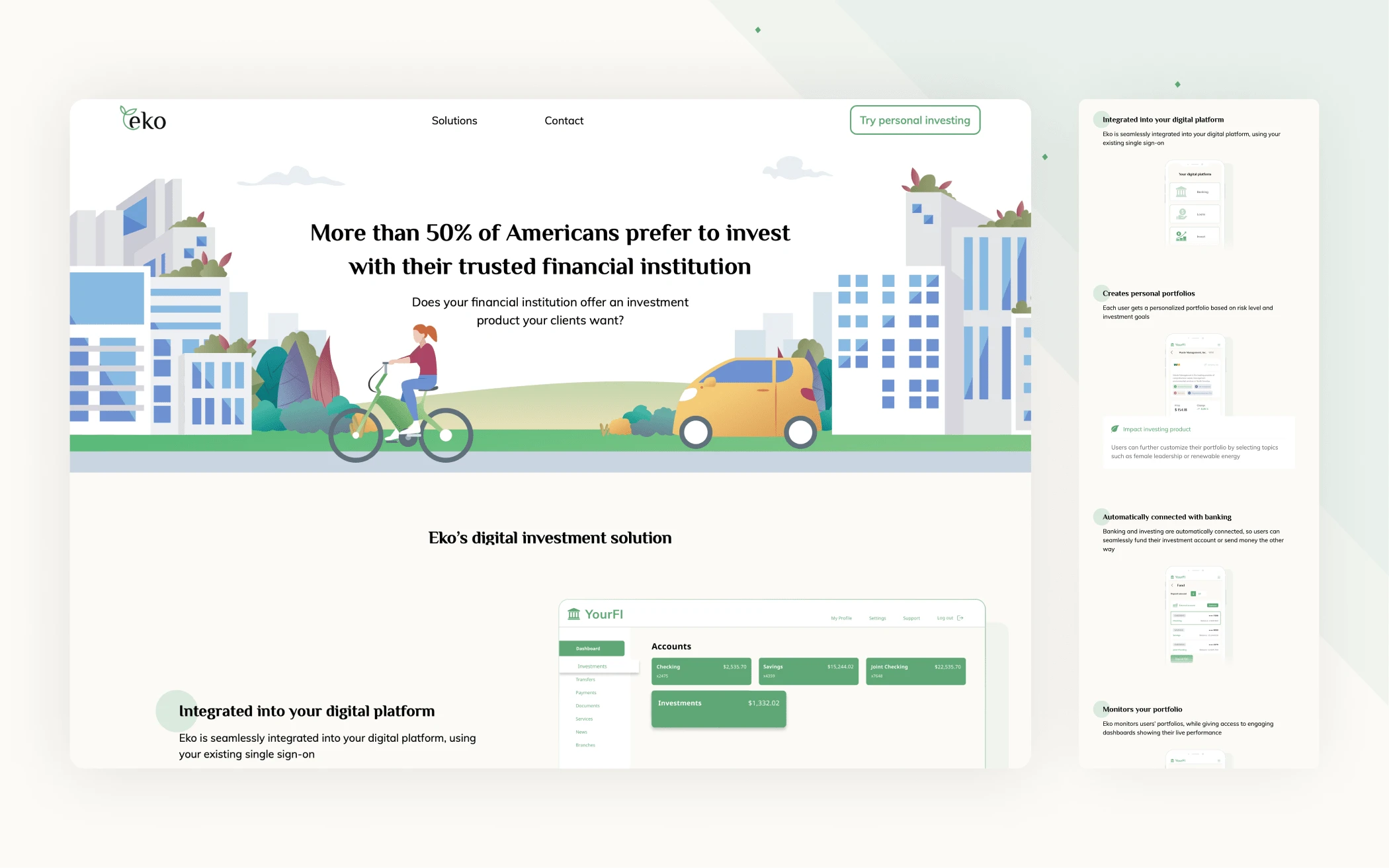
Main section explains how Eko’s digital investment solution covers everything from integration into the banking platform through user journey selecting stocks to monitoring their portfolio performance.
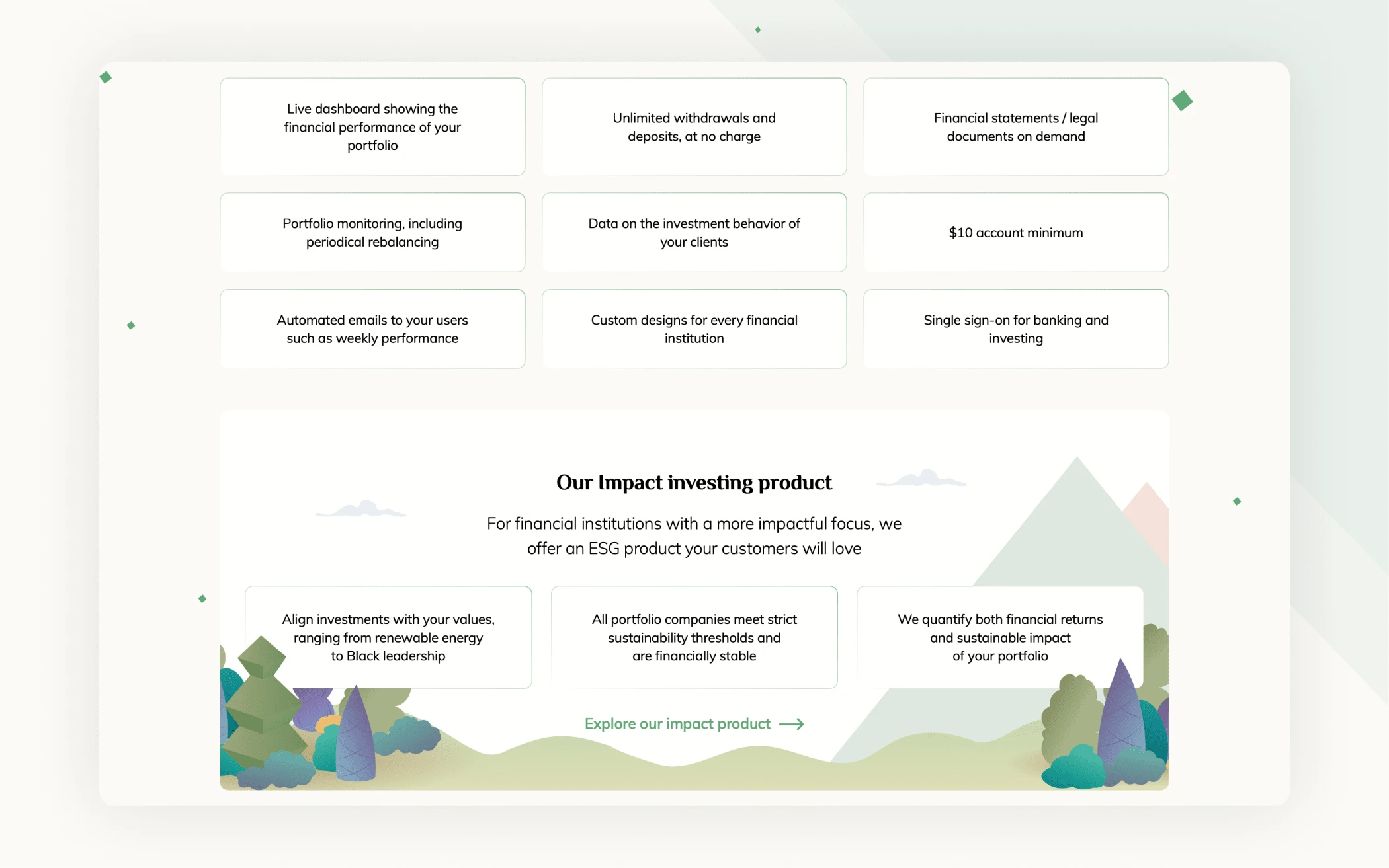
Later section shows Eko features, as well as additional functionality offered in the impact investing product.
This page was co-designed with Yuliia Ananchenko
Like this project
Posted Mar 10, 2024
Landing page design & development for Eko, a white-label ‘Investments as a Service’ platform for community banks and credit unions.
Likes
0
Views
9

