Logo & Branding Design • "Going Green" :: JacobsHack (2022)
KAV @ VRTKX
A » About this project
A1 »» The Project Overview
In 2022 I led a team of 5 brilliant student designers and content marketers.
We handled the Design & Marketing for the JacobsHack 2022 event.
In this particular subproject, we designed a logo and brand image for the event,
where we shared much of our expertise, design techniques and laughter.
A2 »» The Client: JacobsHack 2022
Jacobshack, was a student-led hackathon at Jacobs (now Constructor) University Bremen in Germany.
I say "was", as the event is expecting a name rebrand following the university's rebrand.
A3 »» The Project Goal
The goal of the project was to make a professional-looking logo to bolster the event's visual branding, as this logo was then used on all marketing material.
We needed the logo to be simple, yet communicate well, the event's theme, "Going Green".
B » The Process
This is the "Behind The Scenes" peek into my design process.
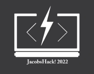
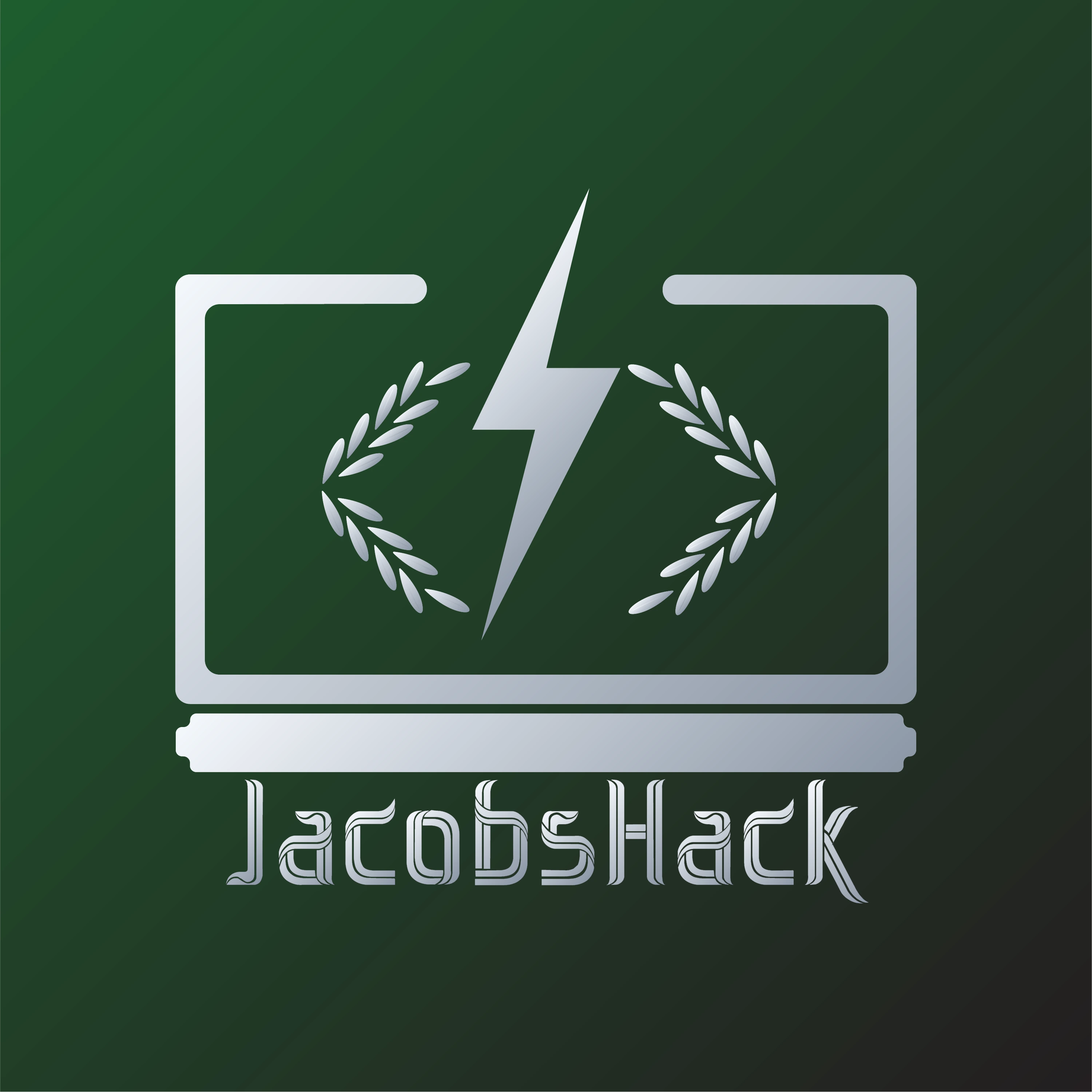
B0 »» The Final
Here's a look at the final result, so you have a reference as you go over the process.

K4--JH22_Logo--Final
.
B1 »» Phase 1: Brainstorming
B1.1 »»» Logo v0 - Old Logo Reference & Symbols
This is an upscaled version of the logo from one of the past hackathon event editions.
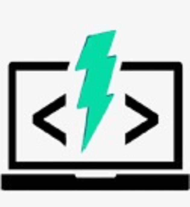
K4--JH22_Logo--v1_1
Here's an explanation of the symbols that were purposefully chosen to makeup this logo.
The laptop
The Lightning Bolt
The Angular Brackets
.
B1.2 »»» Logo v1_1 -- Simple Remake
I used Canva to trace and remake a very simple version of the logo above.
I also added the requested logo text.
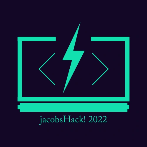
K4--JH22_Logo--v1_1
.
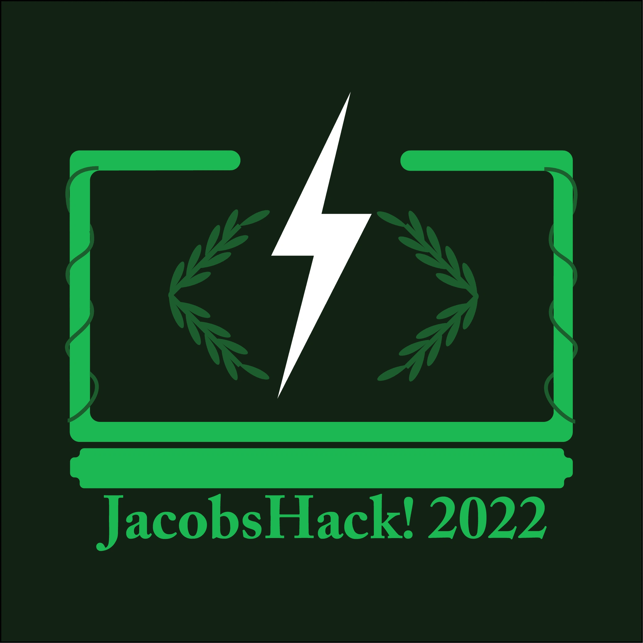
B1.2 »»» Logo v1_2 -- "Add a little Green"
This is a 2nd version of Logo v1_1. I added some leaf elements as a way of brainstorming how to incorporate the Nature theme of the event.
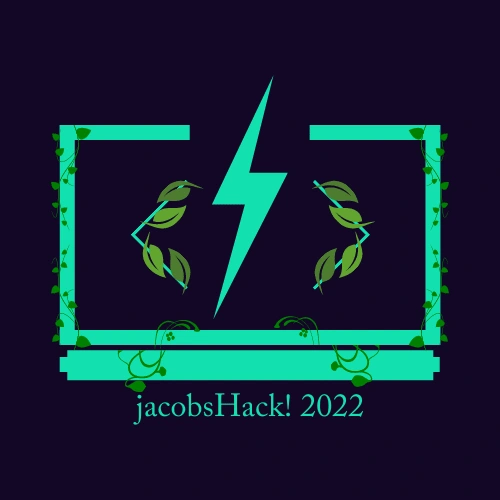
K4--JH22_Logo--v1_2
.
B1.3 »»» Logo v1_3 -- The White Lightning Bolt
In version 1_3, one of my team members present her retake on my Logo v1_2, including a white thunderbolt instead of the green one.
It was a great idea, but later on, we had to leave it in order to go with the "negative space" version of the logo.
K4--JH22_Logo--v1_3 -- White Bolt
.
B1.4 »»» Logo v2 -- Canva To Adobe Illustrator / Mockup #1
Once we had our mock-ups from Canva ready, one of my team members imported Logo v1_1 into Illustrator, keeping very simple colours before we decided on appropriate colours.
K4--JH22_Logo--v2
.
B2 » Phase 2: Refinement
B2.1 »»» Logo v6
I've skipped a few steps in between that were mostly bits of experimentation to get here.
At this point, we were closer to the kind of output we were aiming for.
We added some rounding to the elements that made up the computer screen for a softer look, and refined our ideas on how to incorporate the theme of nature.
We still needed to rectify some vector-related errors, like the partly "incomplete" vines on the sides; then add some effects for a higher-quality logo.
K4--JH22_Logo--v6
.
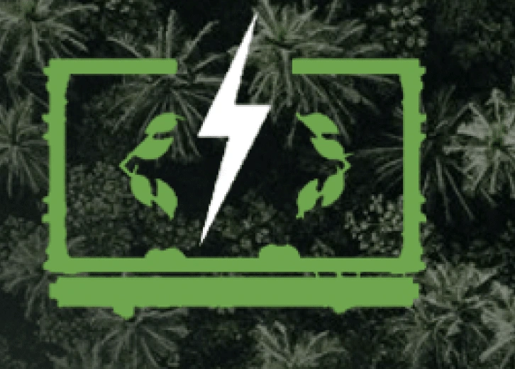
B2.2 »»» Brand Colour Palette
I think that consistency/coherency in colours can make or break the image of a brand.
This is why we decided on a colour palette that was both simple to work with and properly represented the event theme.
A great source for sample colour palettes to branch-off from,
is https://colorpalettes.net/.
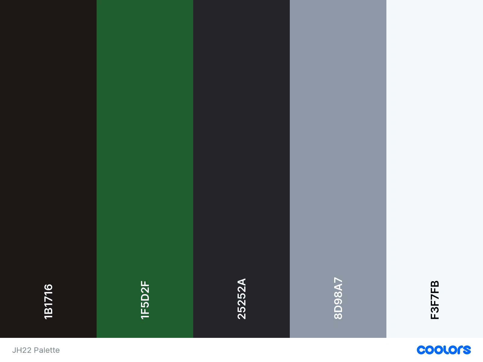
K4--JH22_Colour_Palette--v3
.
B2.3 »»» Logo v7 -- Mockup #1
Here, we had a pretty satisfactory logo.
It communicates the theme;
it has a simple, yet fitting colour scheme;
it's got an "mostly okay" font type;
it's got some "cool leaves" ...
.. buh,
if you know me well, then you know I go the extra mile.
I wanted this logo to be CAPTIVATING ... to be, MEMORABLE.

K4--JH22_Logo--v7
.
B3 »» Stage 3: "Make It Pop"
At this point in the design process,
I wanted to make this logo into something that someone would look at,
and say: "Wow, this is really cool".
That's when the 2 pivotal ideas hit me ... gradients and negative space.
B3.1 »»» Logo v8_1: Gradients & Negative Spacce
Creating a gradient is more intuitive and easier to explain,
compared to using pathfinder window to perform an exclusion boolean operation.
To put things in simple terms,
• Gradient = making one colour gradually blend into another one.
• Negative-Space by Boolean excllusion = Cutting one object out of another.
That's what I did here; for no other reason than that
.
B3.1 »»» Logo v8_2: Less is more
The team also FINALLY agreed on a font for the logo: Loveleaves.
I think it slapped perfectly right onto the design.
Previously, the JH Logo had a lowercase "j", and an exclamation mark at the end.
I had to make the partly unpopular decision to change that.
Why?
Well ... uniformity.
Both the lowercase letter and the exclamation mark were throwing off visual balance.
Sometimes, it's wise to let go of what's not working.
“Perfection is achieved, not when there is nothing more to add, but when there is nothing left to take away.” — Antoine de Saint-Exupéry
• Wise Experiments: "breathe a little"
Design - in a way - is a systematic problem-solving process.
One could say it's a form of engineering.
Yet ... the systematic nature of design, doesn't mean that we don't have room to experiment.
Some of our favourite forms of technology were born out of experiments.
Still, the focus must be to benefit the client and the main purpose of the project.
// this is just something I felt like sharing.
.
B4 »» Stage 4: Finalizing
What good is a great project that never gets to see the light?
If you're a growing designer going through this,
I encourage you to consider documenting your creative process and sharing it with someone.
It's a beautifully reflective self-discovery process.
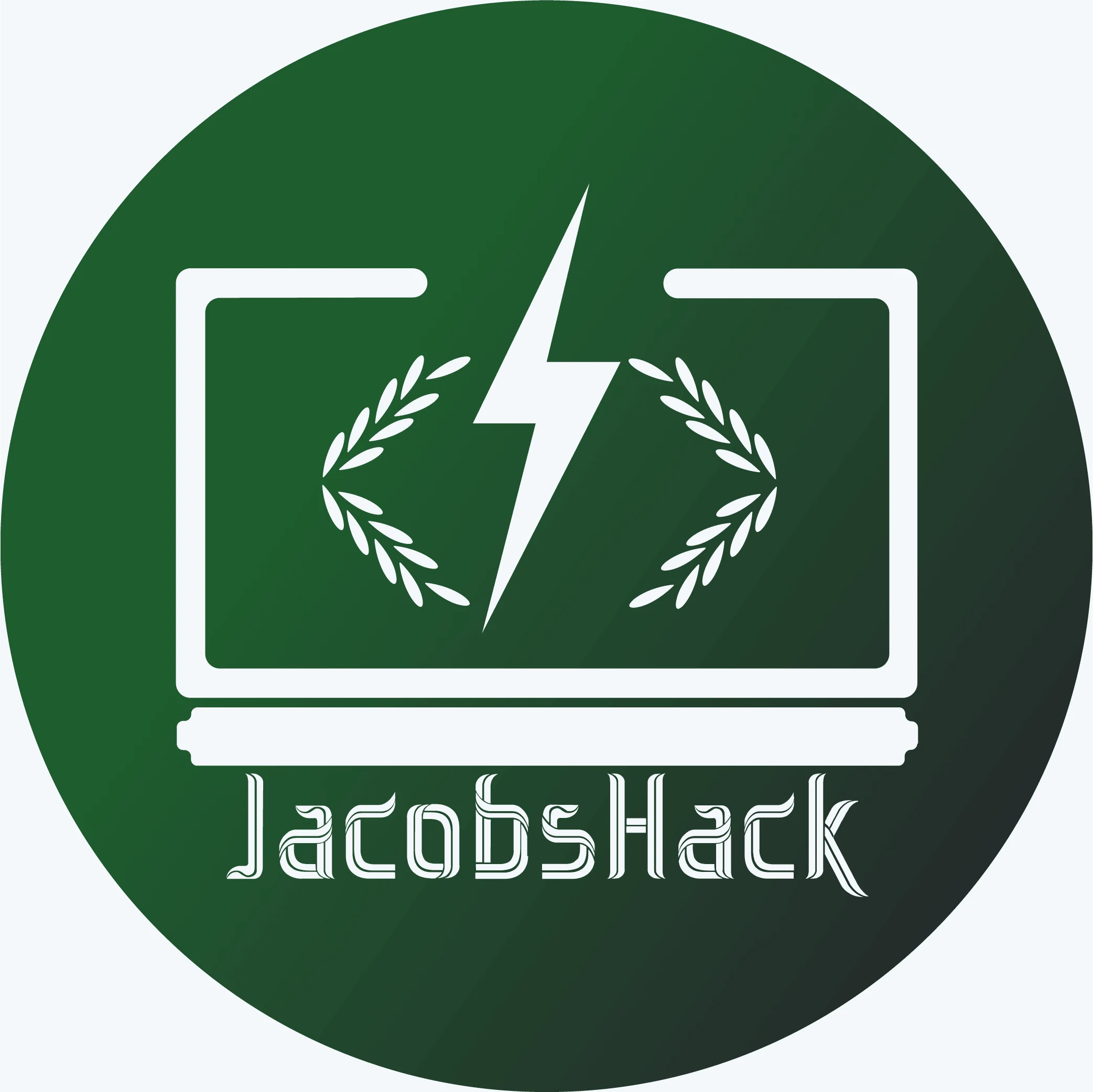
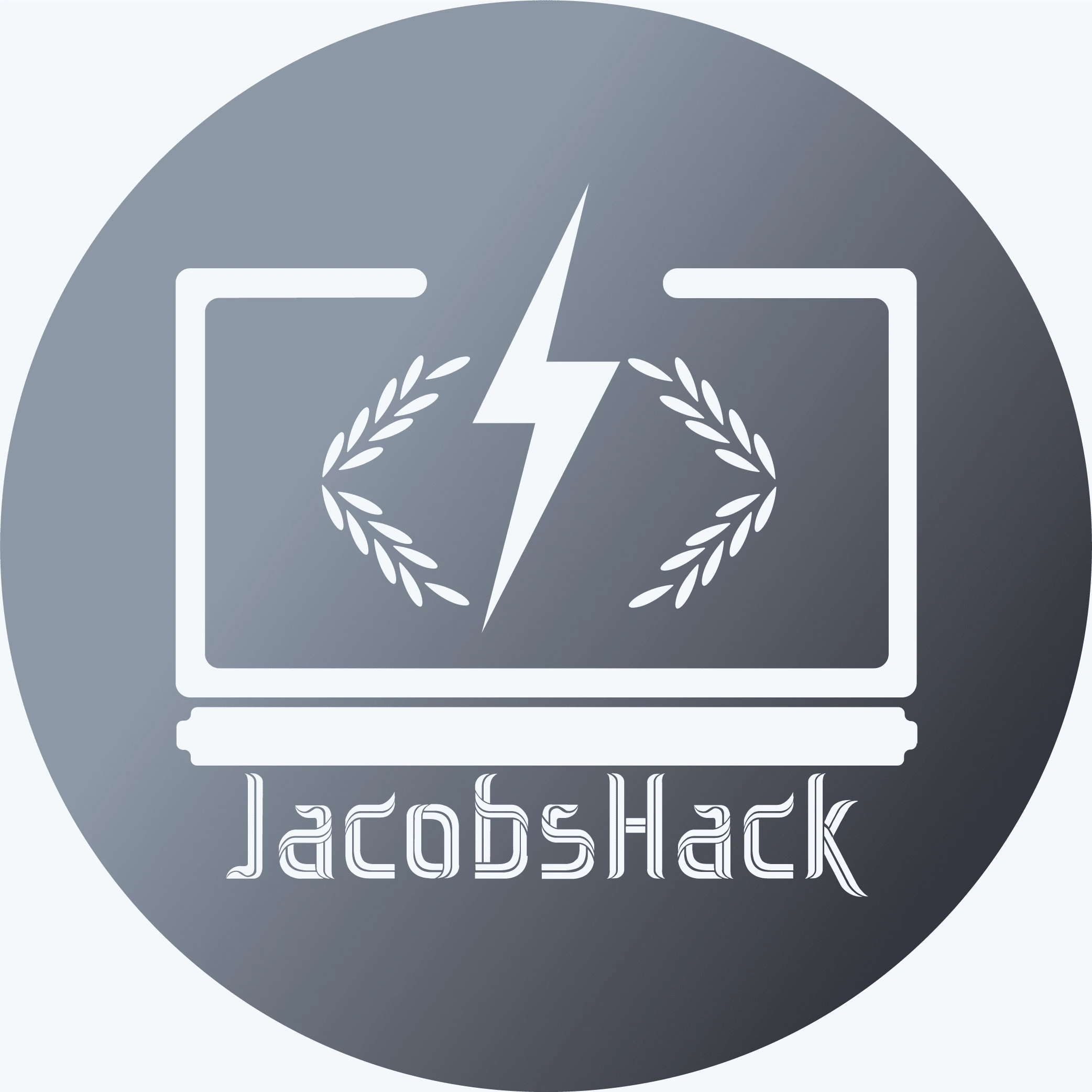
B3.1 »»» Logo v9_1
Voila ... this is the circle-cropped version of the logo,
for use on social media profile photos;
and for deliberate shadow-branding of media and merchandise related to JacobsHack.
.
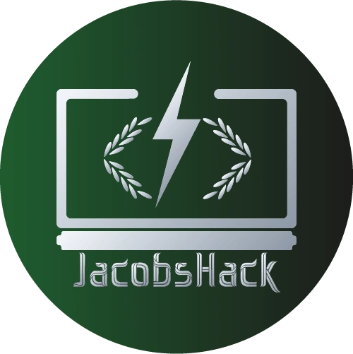
B3.1 »»» Logo v9_2
This is the full and final high resolution logo for JacobsHack 2022.
.
C » In Closing
C1 »» More on This Project
If you'd like to see more, here's Jacobshack's main website
https://jacobshack.com/
Here's their Instagram page:
https://www.instagram.com/jacobshack.jub/
C2 »» Project Reflection
I am grateful for the failure, learning, connection and joy that came from designing this logo.
Shout out to everyone who was involved, directly and indirectly.
It feels great every time I wear the JacobsHack merchandise hoodie;
knowing that I ... that we, designed it.
All this learning and process-documentation is a continual effort towards giving my clients,
a repetitively BETTER service each time.
Thank you ... yes you. Thank you for scrolling through. I appreciate you.
[End Scene]
[Exit Stage]
C3 »» Let's Work Together
If you like what I do and how I do it;
if you have a project that's important to you;
& you'd like it to be handled with deliberate care ...
if you're struggling to reach & captivate your audience,
and you believe you need high quality Marketing Assets ...
... then let's have a chat. Help me understand what you need.
Reach out:
© THE KAVERIK 2022
Like this project
Posted Apr 27, 2023
People see iconic brands like Nike, Marvel, Google, MacD's and they're AMAZED. Many don't know what goes into designing a brand. Well, here's one example?